DiviFlash Star Rating module provides a simple way to display star ratings on your website.
Activation Required: This module is disabled by default. To use it, you need to enable it manually. Refer to our guide for step-by-step instructions.
Let’s see the settings in brief and how to make better use of it —
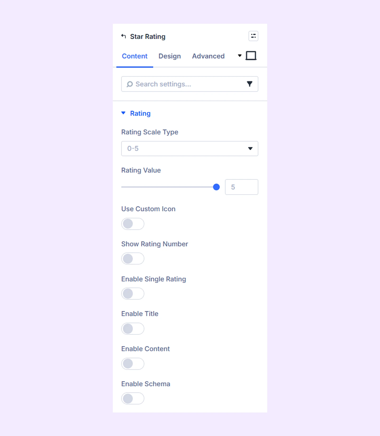
Content Tab
This tab contains the essential settings for configuring the rating.
Rating
- Rating Scale Type: Choose whether to use a 5-star or 10-star rating system.
- Rating Value: Set the rating value you want to display.
- Use Custom Icon: Enable this option to use custom icons instead of the default star icons.
- Show Rating Number: Enable this option to display the numerical rating value.
- Rating Number Type: Choose how the rating number will be displayed.
- Rating Number Placement: Choose whether the rating number appears on the left or right side of the rating.
- Enable Single Rating: Enable this option to display a single icon instead of multiple rating icons.
- Enable Title: Enable this option to display a title for the rating.
- Title: Enter the title for the rating.
- Title Tag: Choose the HTML heading tag (H1–H6) for the title.
- Title Display Type: Choose whether the title appears on the same line as the rating or above/below it.
- Title Placement: Choose the position of the title relative to the rating. If Inline is selected as the Title Display Type, you can place the title on the left or right. If Block is selected, you can place the title above or below the rating.
- Enable Content: Enable this option to add descriptive content below the rating.
- Enable Schema: Enable schema markup for SEO.
Link: Use this default Divi setting to add a link to the entire module.
Background: Add a background color, gradient, image, video, pattern, or mask to the module.
Element Label: Rename the module to organize it more easily in the Divi Builder. (Only you can see this label.)
Design Tab
Use this tab to customize the visual appearance of the Star Rating module.
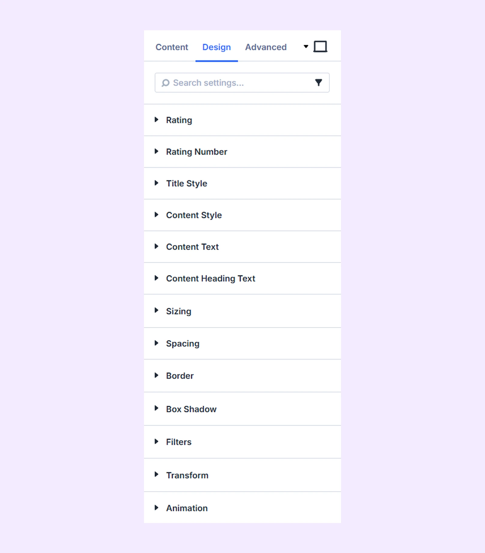
Rating: Customize the color, size, alignment, and border of the rating icons.
Rating Number: Customize the typography settings for the rating number.
Title Styles: Customize the color, typography, and border settings for the rating title.
Content Style: Customize the background and border of the rating content area.
Content Text: Customize the typography settings for the content body text.
Content Heading Text: Customize the typography settings for headings inside the content.
Sizing: Adjust the width, height, and alignment of the module.
Spacing: Add custom margin and padding to the module’s container.
Border: Customize the border style, width, and color. And style each border separately or apply the same style to all sides.
Box Shadow: Add shadow effects to the module.
Filters: Apply color filters to enhance the appearance.
Transform: Scale, rotate, move, or skew the module.
Animation: Apply reveal animation effects and customize delay, duration, repeat settings, and animation type.
Advanced Tab
This tab provides additional settings for advanced users who want greater control over the module with custom code, conditions, and more.
Need Help?
If you have any questions or need assistance, contact our support team: [email protected]