The DiviFlash Timeline module allows you to create visually engaging and highly customizable timelines for your website.
Activation Required: This module is disabled by default. To use it, you need to enable it manually. Refer to our guide for step-by-step instructions.
Let’s see the settings in brief and how to make better use of it —
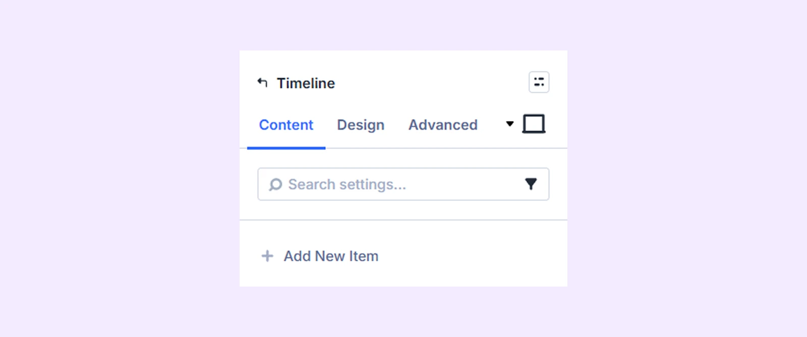
Content Tab
This contains all the essential settings to add, configure, and manage timeline items.
Add New Timeline Item
Click the + Add New Item button to create a new timeline entry. This will open the Timeline Item Settings, where you can add content and customize each item individually. To learn more about customizing timeline items, click here.
General Settings
Inside General Settings, you will find two sub-tabs:
All
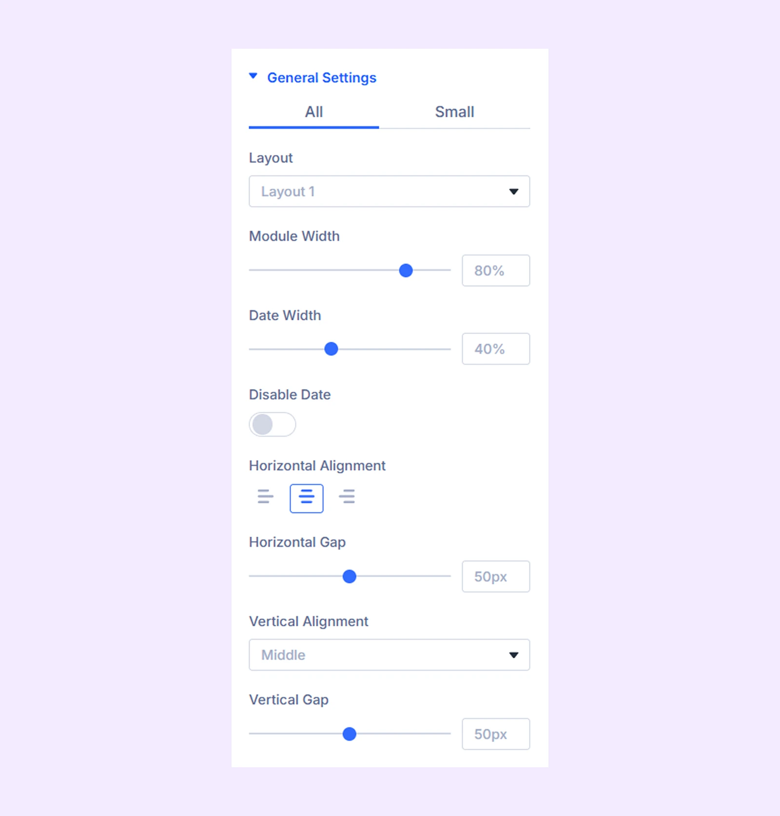
- Layout Style: Choose from three timeline layouts.
- Module Width: Adjust the overall width of the timeline module.
- Date Width: Control the width of the date section.
- Disable Date: Hide the date from timeline items.
- Horizontal Alignment: Set the alignment of timeline content.
- Horizontal Gap: Control spacing between timeline elements horizontally.
- Vertical Alignment: Adjust alignment of items vertically.
- Vertical Gap: Define vertical spacing between items.
Small
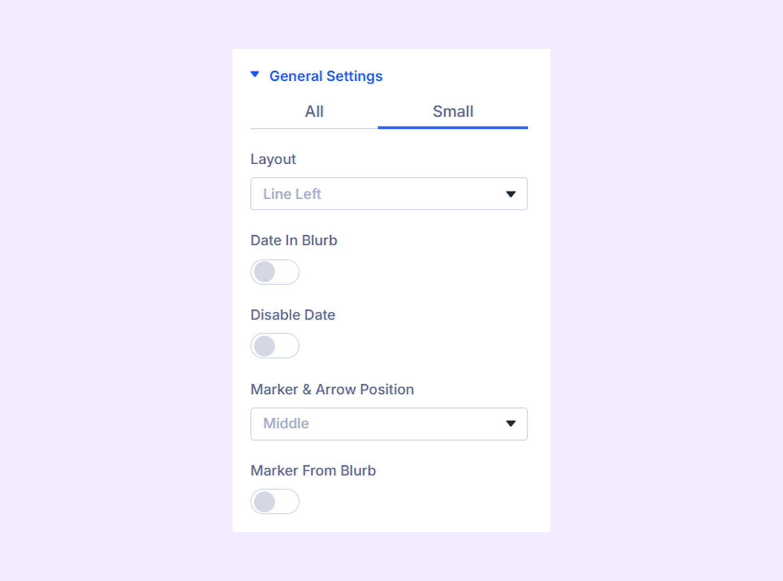
- Layout: Select the layout type specifically for mobile devices
- Date In Blurb: Toggle whether the date should appear inside the blurb (content box) on mobile devices.
- Date Alignment: Adjust the horizontal alignment of the date.
- Disable Date: Hide the date entirely on mobile devices.
- Marker & Arrow Position: Control the placement and alignment of markers and arrows for smaller screens.
- Marker From Blurb: Adjust the marker’s position relative to the blurb.
Line Settings
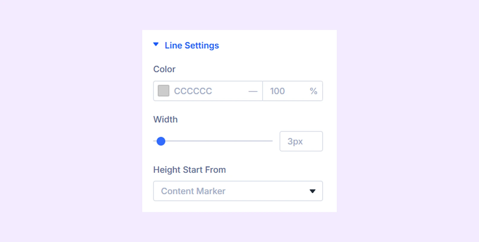
- Color: Choose the timeline line color.
- Width: Adjust the thickness of the line.
- Height Start From: Select where the line should begin (Content Marker or Content Top to Bottom).
Note: If Content Marker is selected, the line will start from the marker point instead of the top of the content.
- Top marker: Add an image, icon, or text to the top of the marker and adjust its height (available only for Content Top to Bottom layout).
- Bottom Marker: Add an image, icon, or text to the bottom of the marker and adjust its height (available only for Content Top to Bottom layout).
Arrow Settings
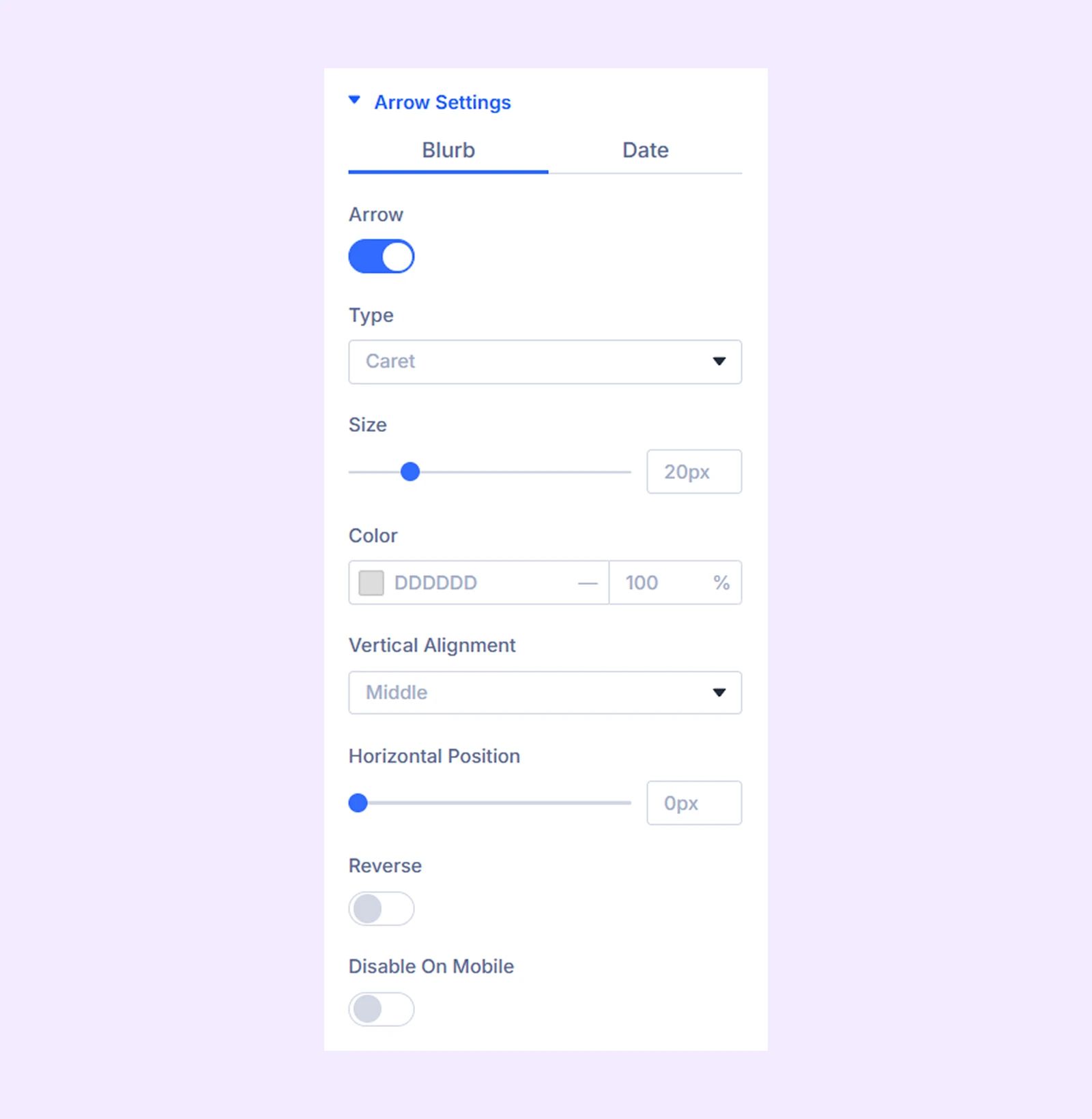
Inside Arrow Settings, there are two sub-tabs (Blurb and Date), and both share the same set of options that work identically.
- Arrow: Enable this option to display arrows.
- Type: Choose the arrow style (Caret, Icon, or Line).
- Icon: Select an icon from the available options (only when Type is set to Icon).
- Line Type: Choose a line style (only when Type is set to Line).
- Thickness: Adjust the thickness of the arrow.
- Size: Control the overall size of the arrow.
- Color: Set the arrow color.
- Vertical Alignment: Adjust the vertical position of the arrow.
- Horizontal Position: Control the horizontal placement of the arrow.
- Reverse: Flip the direction of the arrow.
- Disable on Mobile: Hide arrows on smaller devices.
Animation
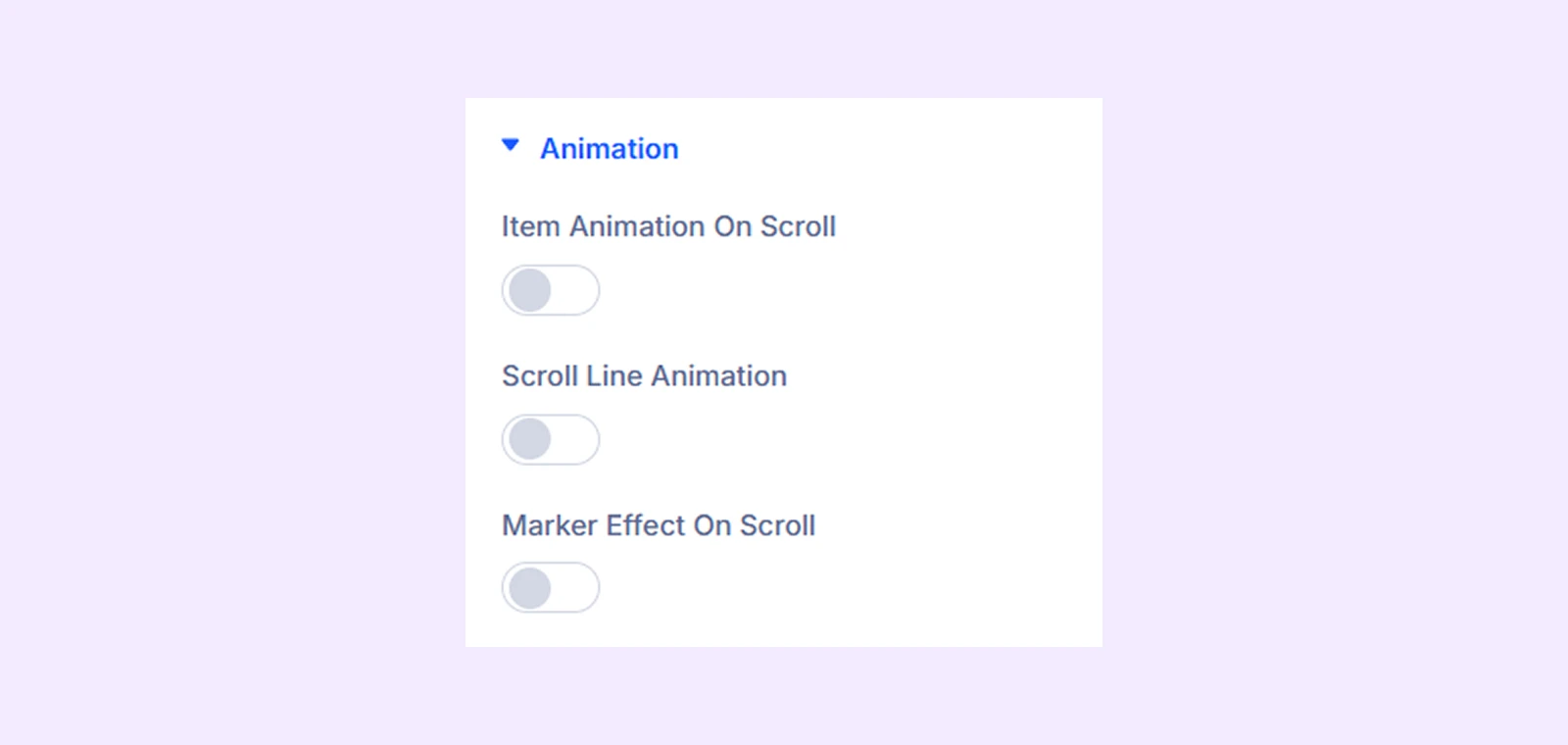
- Item Animation On Scroll: Enable this to add scroll animation to timeline items.
- Timeline Animation: Choose from 8 different animation options.
- Scroll Line Animation: Animate the timeline line during scrolling.
- Scroll Line Color: Set the color for the animated line.
- Marker Effect On Scroll: Apply scroll animations to markers.
- Background and Maker Color: Customize the colors of the background and timeline markers.
Blurb Item Order
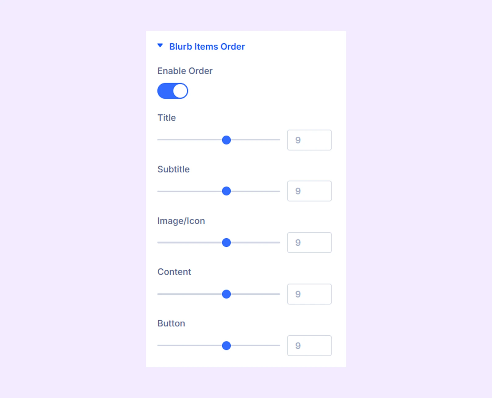
- Enable Order: Reorder timeline elements (title, subtitle, media, content, button) using numeric values.
Link: Use this default Divi setting to add a link to the entire module.
Background: Add a background color, gradient, image, video, pattern, or mask to the module.
Element Label: Rename the module to organize it more easily in the Divi Builder. (Only you can see this label.)
Design Tab
This tab allows you to fully customize the visual appearance of every timeline element.
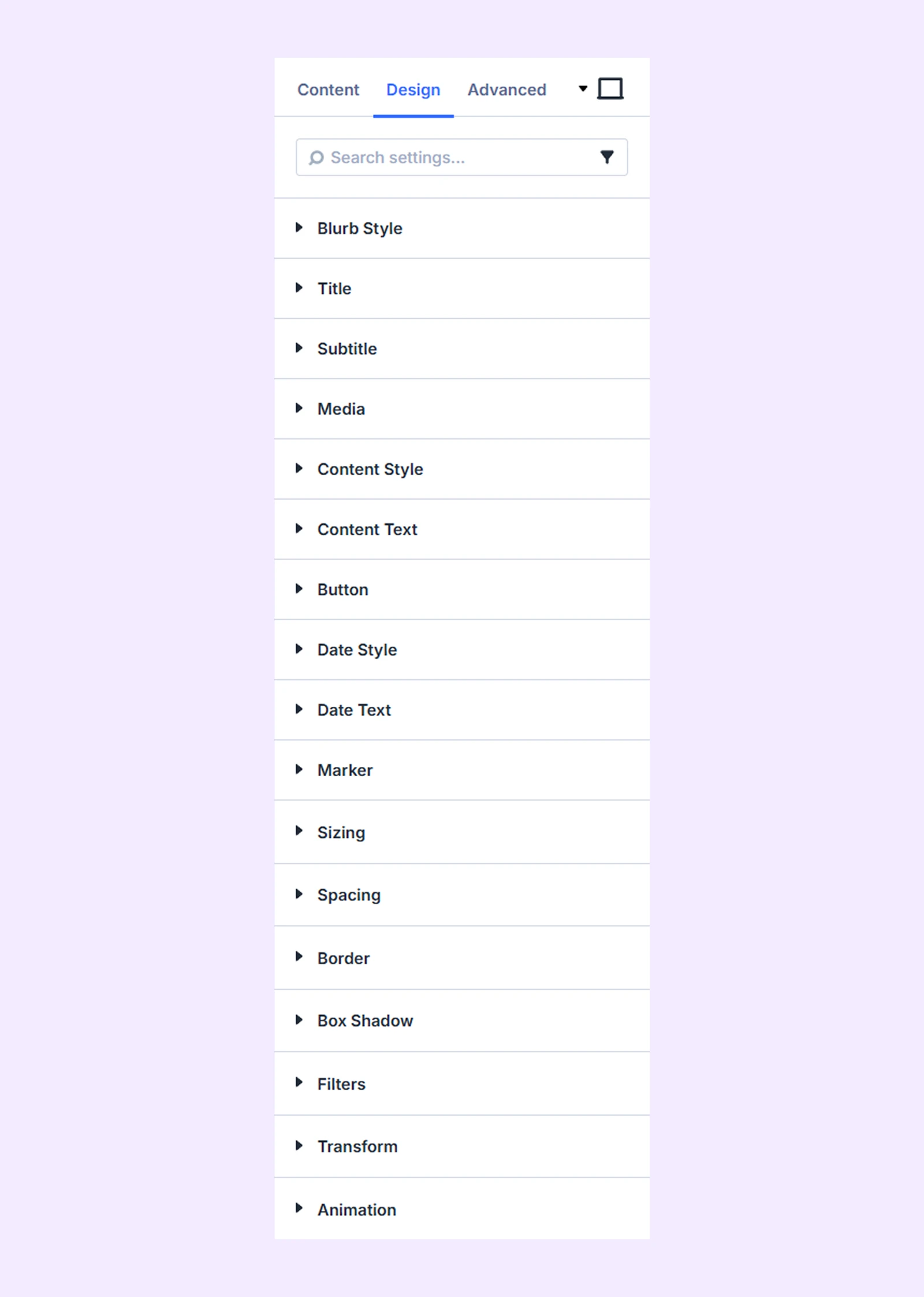
Blurb Style: Customize the background, spacing, and borders of the timeline item container.
Title: Style the title with options for background, spacing, typography, and borders.
Subtitle: Same styling options as title, applied to subtitle.
Media: Adjust the background, spacing, borders, size, and alignment of images or icons added to timeline items.
Content Style: Customize the content container’s background, spacing, borders, and box shadow.
Content Text: Customize the content container’s typography.
Button
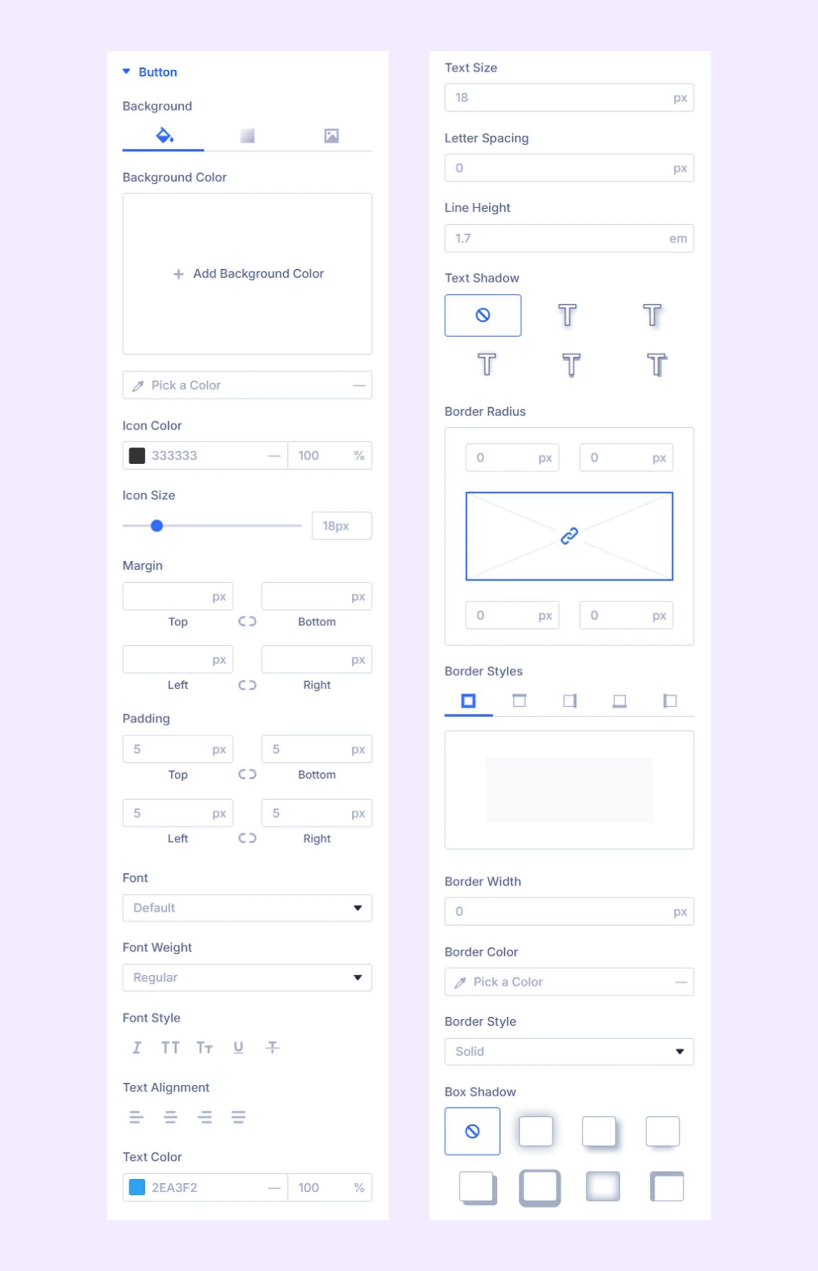
- Icon Color: Set the color of the icon inside the button to match your design.
- Icon Size: Adjust the size of the button icon for better visibility.
Additional options include background, spacing, typography, border, and box shadow settings.
Date Style: Customize the background, spacing, border, and shadow of the date container.
Date Text: Adjust typography, including font, size, spacing, and style for both date title and subtitle.
Marker
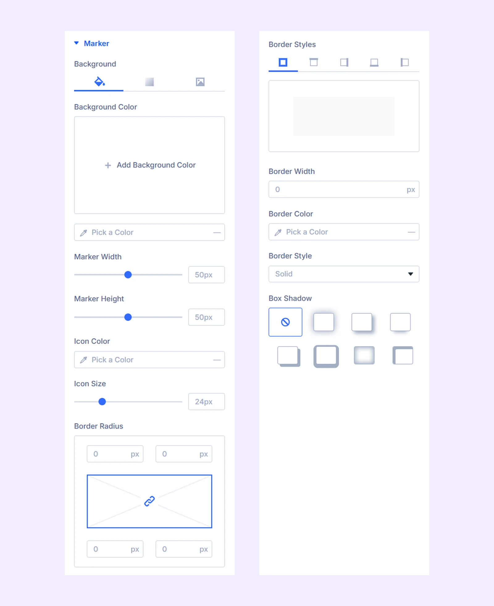
- Marker Width: Adjust the width of the timeline marker to control its visual size.
- Marker Height: Adjust the height of the timeline marker for proper proportion.
- Icon Color: Customize the color of the marker icon to match your design.
- Icon Size: Adjust the size of the marker icon for better visibility.
Additional options include background, border, and box shadow.
Sizing: Adjust the width, height, and alignment of the module.
Spacing: Add custom margin and padding to the module’s container.
Border: Customize the border style, width, and color. And style each border separately or apply the same style to all sides.
Box Shadow: Add shadow effects to the module.
Filters: Apply color filters to enhance the appearance.
Transform: Scale, rotate, move, or skew the module.
Animation: Apply reveal animation effects and customize delay, duration, repeat settings, and animation type.
Advanced Tab
This tab provides additional settings for advanced users who want greater control over the module with custom code, conditions, and more.
Timeline Item Settings
Each timeline item acts as a child of the main module. Any changes made here will override the parent module settings.
Content Tab
Content
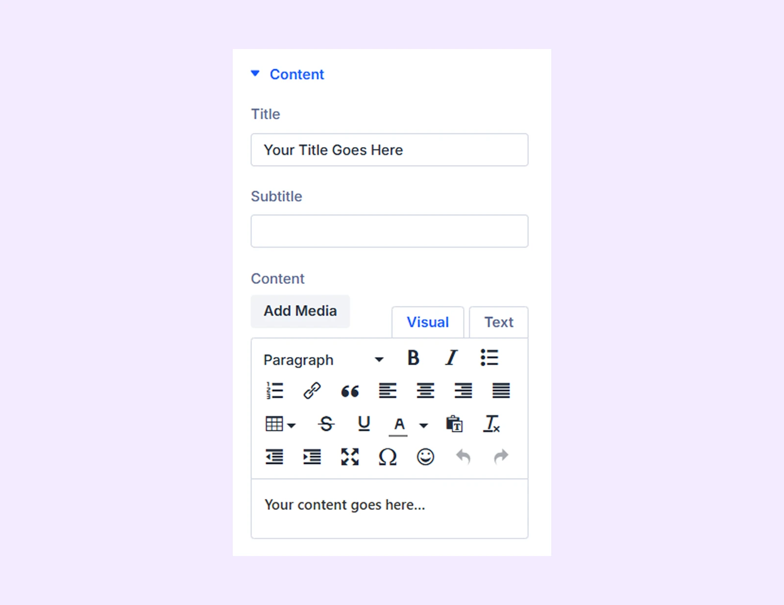
- Title: Enter the main heading for this timeline item.
- Subtitle: Add a secondary heading to provide additional context.
- Content: Add descriptive text explaining the timeline event.
Media
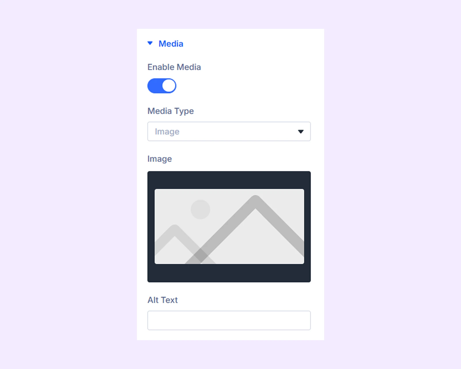
- Enable Media: Toggle media display for this timeline item.
- Media Type: Choose whether to display an image or an icon.
- Image: Upload the desired image for the timeline item.
- Alt Text: Add accessibility text for the image.
Button
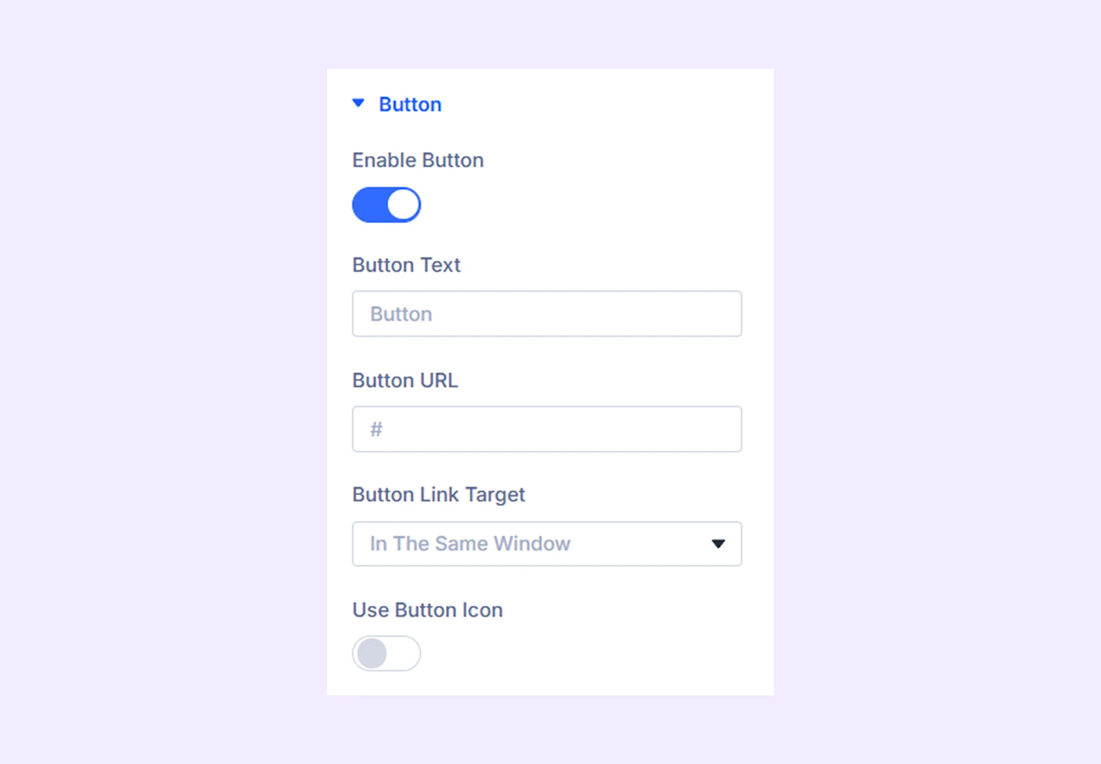
- Enable Button: Show or hide the button for this timeline item.
- Button Text: Enter the label text for the button.
- Button URL: Add the link the button should open.
- Button Link Target: Choose whether the link opens in a new tab or the same tab.
- Use Button Icon: Enable an icon inside the button.
- Icon Placement: Set the position of the icon relative to the button text.
Date
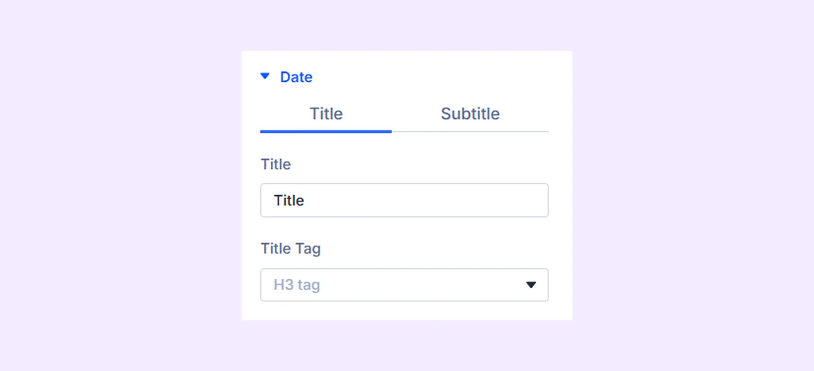
The Date section contains two sub-tabs (Title and Subtitle) with identical settings.
- Title: Add date text for the timeline event.
- Title Tag: : Choose the HTML tag for the date text (e.g., H2, H3).
Marker
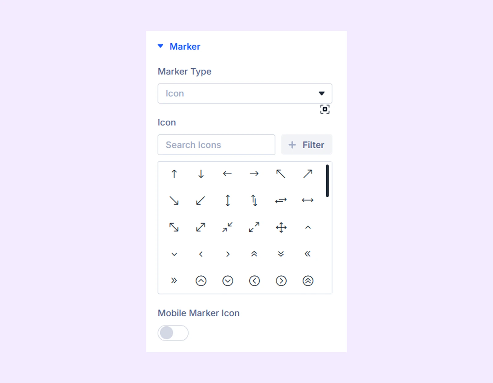
- Marker Type: Select whether to display an icon, text, or image as the marker.
- Icon: Select icon (for icon type).
- Marker Text: Add text (for text type).
- Image: Upload image (for image type).
- Image Alt Text: Add image alt text
- Image Width: Adjust the width of the marker image.
- Mobile Marker Icon: Use a separate marker icon specifically for mobile displays.
Custom Position
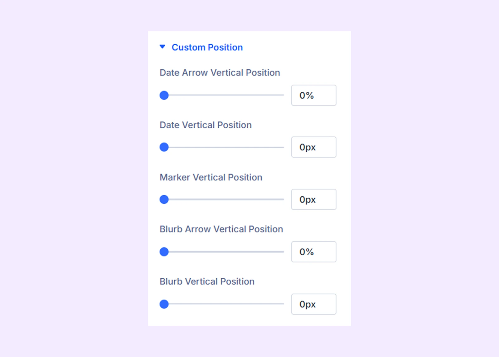
- Date Arrow Vertical Position: Adjust vertical alignment of the date arrow.
- Date Vertical Position: Set vertical placement of the date container.
- Marker Vertical Position: Adjust marker alignment vertically.
- Blurb Arrow Vertical Position: Set vertical alignment for the content arrow.
- Blurb Vertical Position: Control vertical alignment of the content section.
Link: Add a custom link for the timeline item.
Background: Apply a custom background for this specific timeline item.
Element Label: Rename the timeline item for easier organization in the builder (only visible to you).
Design Tab
Blurb Style: Customize background, border, spacing, and box shadow of the timeline content.
Title: Full styling control including typography, spacing, and background.
Subtitle: Full styling control including typography, spacing, and background.
Media
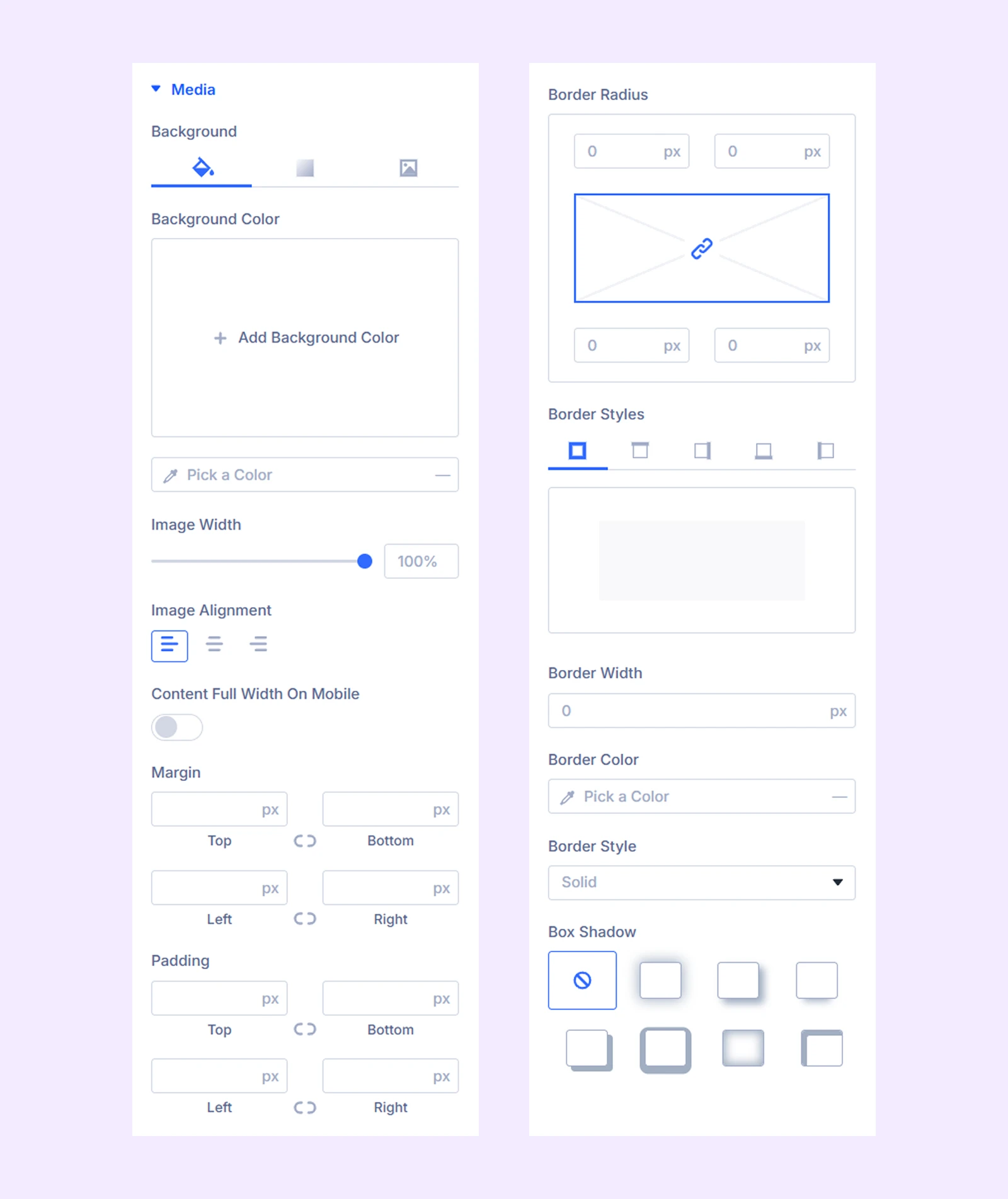
- Image Width: Adjust media width.
- Image Alignment: Set alignment for images or icons.
- Content Full Width On Mobile: Optimize the timeline content layout for smaller screens.
Additional options include background, spacing, border, and shadow.
Content Style: Adjust background, spacing, border, and box shadow of the content container.
Content Text: Set typography for the main content.
Button
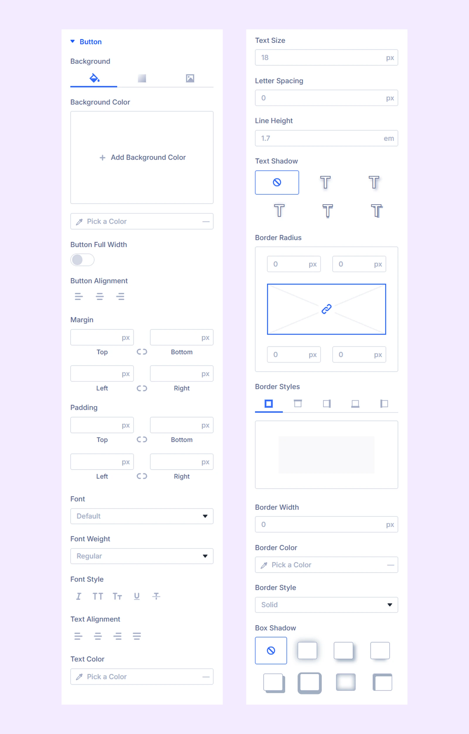
- Button Full Width: Enable the button to span the entire width of the timeline item.
- Button Alignment: Align the button (left, center, or right).
- Icon Color: Customize the button icon color.
- Icon Size: Adjust the button icon size.
- Ocpm Space: Set spacing between button text and icon.
Customize background, margins, padding, typography, border, and box shadow.
Date Style: Adjust background, spacing, border, and box shadow.
Date Text: Set typography and spacing for date title and subtitle.
Blurb & Date Arrow
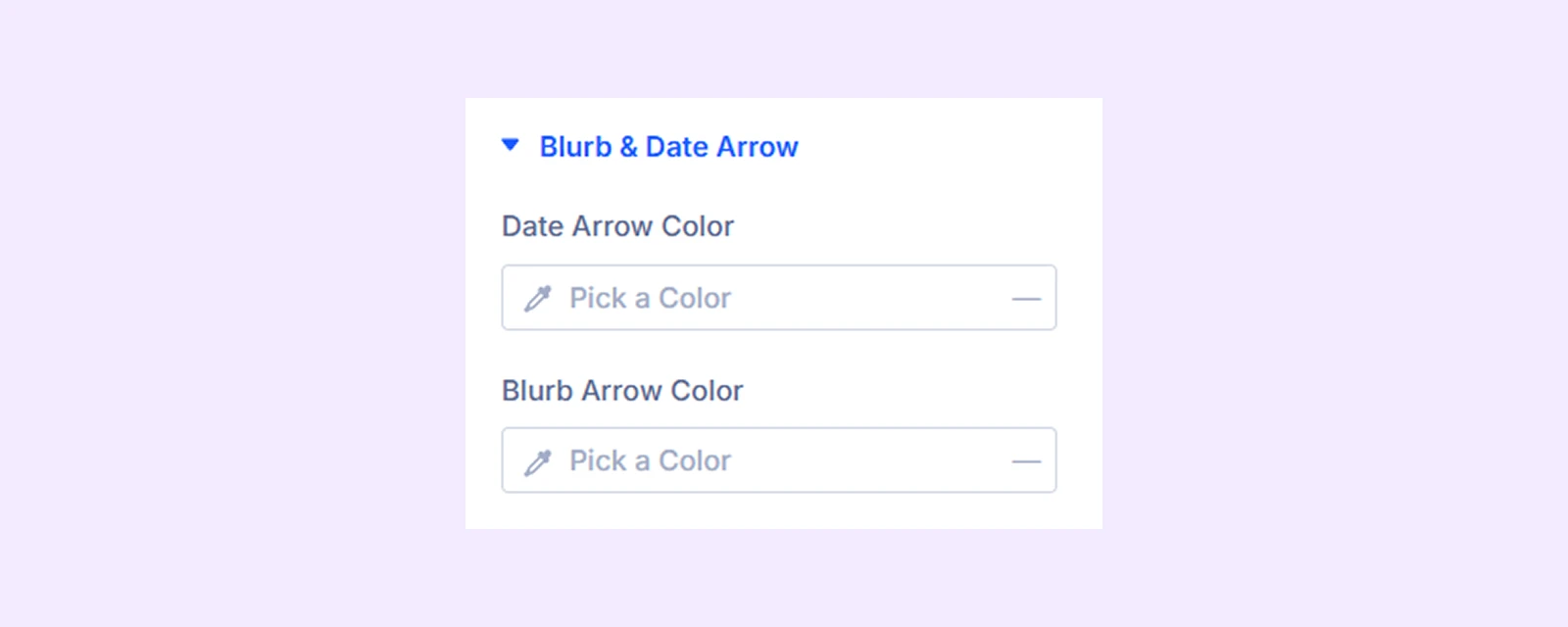
- Date Arrow Color: Set the color of the arrow connected to the date section.
- Blurb Arrow Color: Set the color of the arrow connected to the content section.
Maker
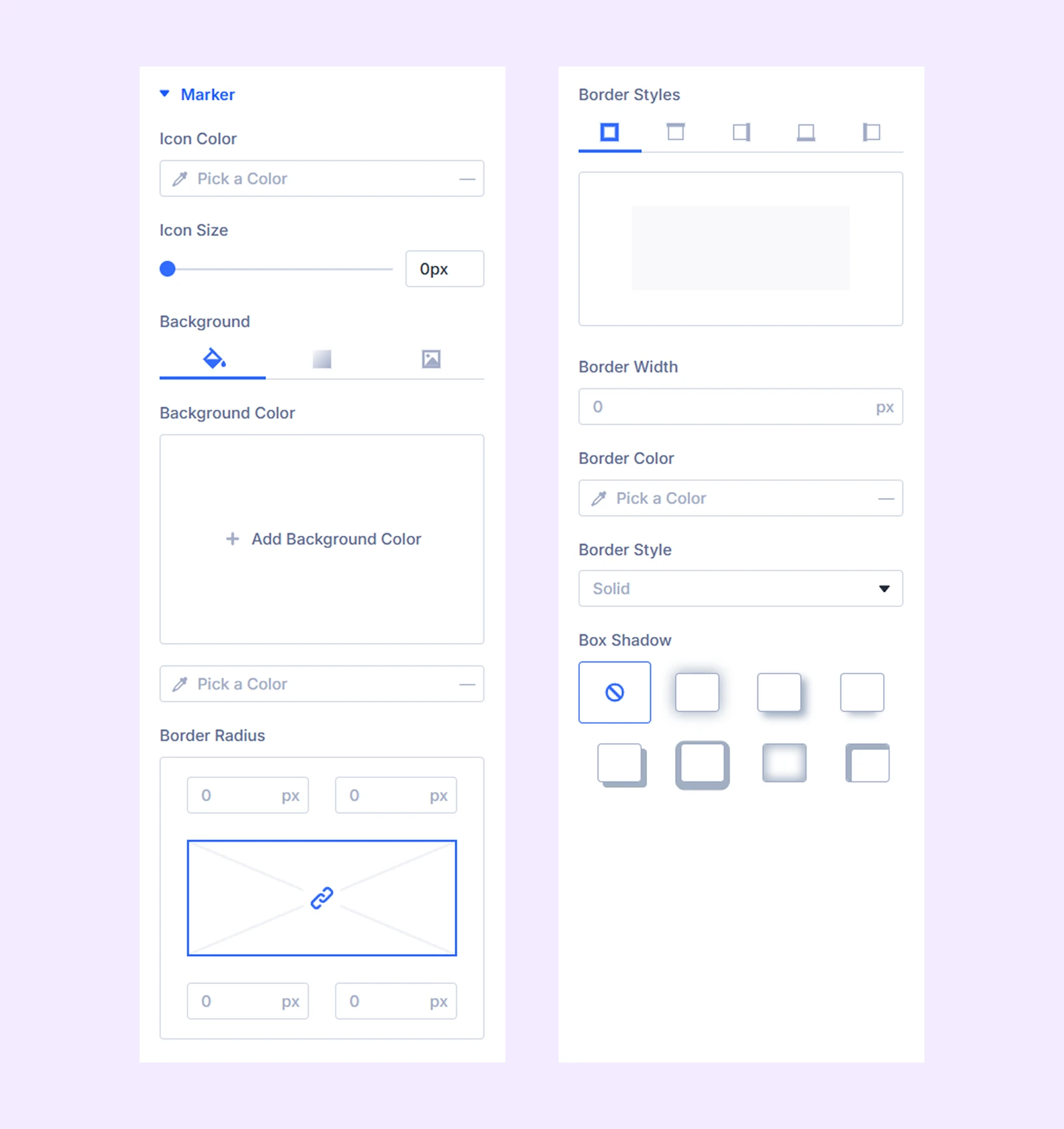
- Icon Color: Set marker icon color.
- Icon Size: Adjust marker icon size.
- Mobile Icon Color: Set a separate icon color for mobile.
- Mobile Icon Size: Adjust marker size for better visibility on small screens.
You will also find additional options for border and box shadow.
Advanced Tab
Add custom CSS, visibility conditions, or other advanced controls for individual timeline items.
Need Help?
If you have any questions or need assistance, contact our support team: [email protected]