DiviFlash Advanced Person module helps you display detailed profiles of team members, authors, or contributors.
Let’s see the settings in brief and how to make better use of it —
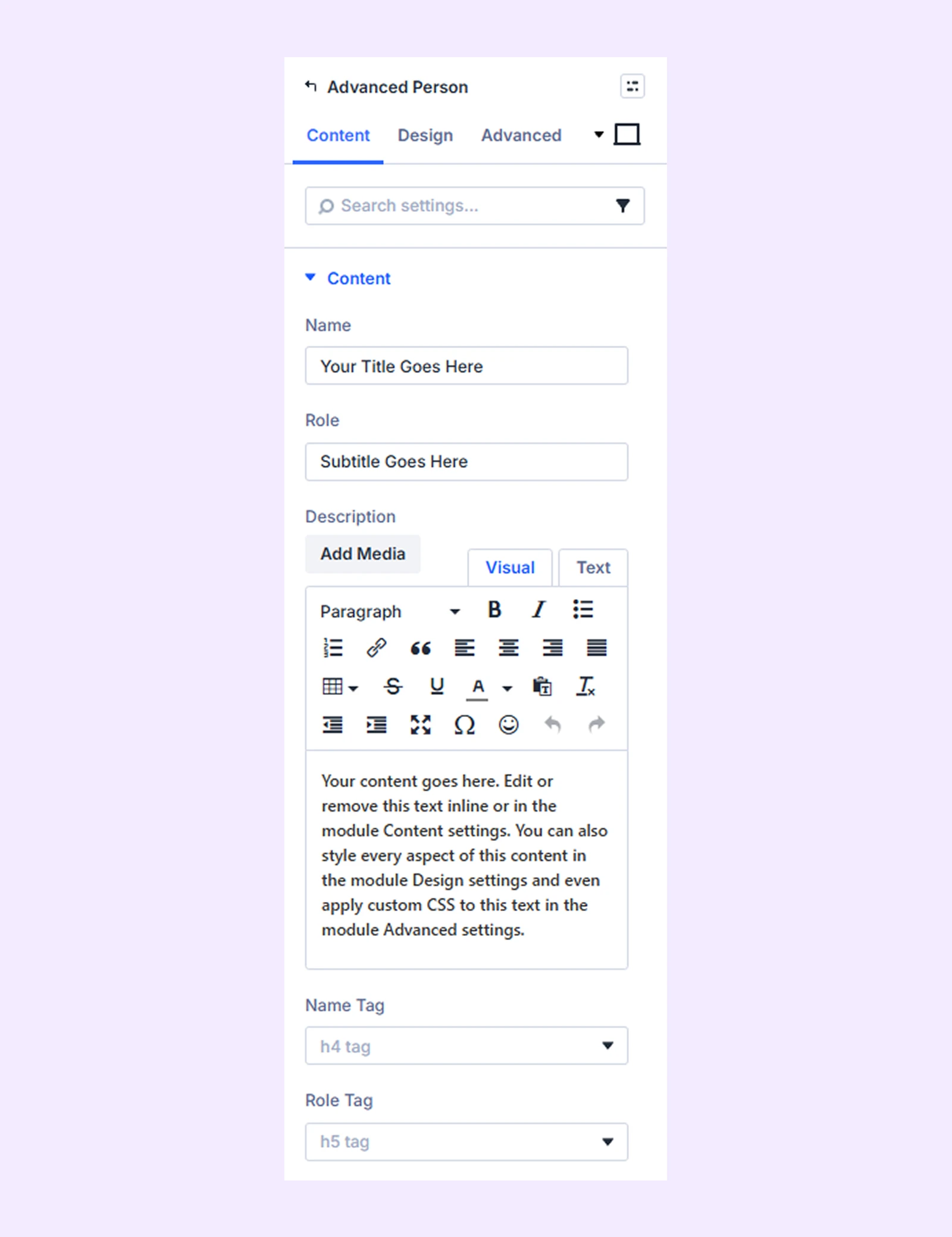
Content Tab
This tab contains the settings for adding profile information such as text content, images, and social links.
Content
Enter the name, role, and description of the person you want to display. You can also choose the heading tag (H1–H6) for the name and role.
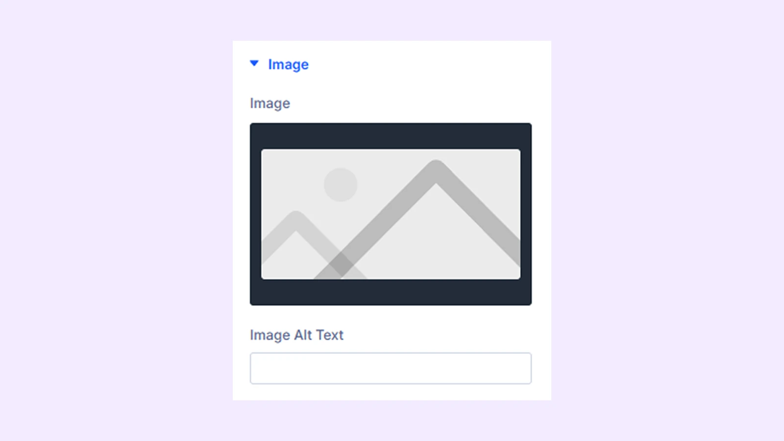
Image
Upload the profile image. You can also add alt text for the image.
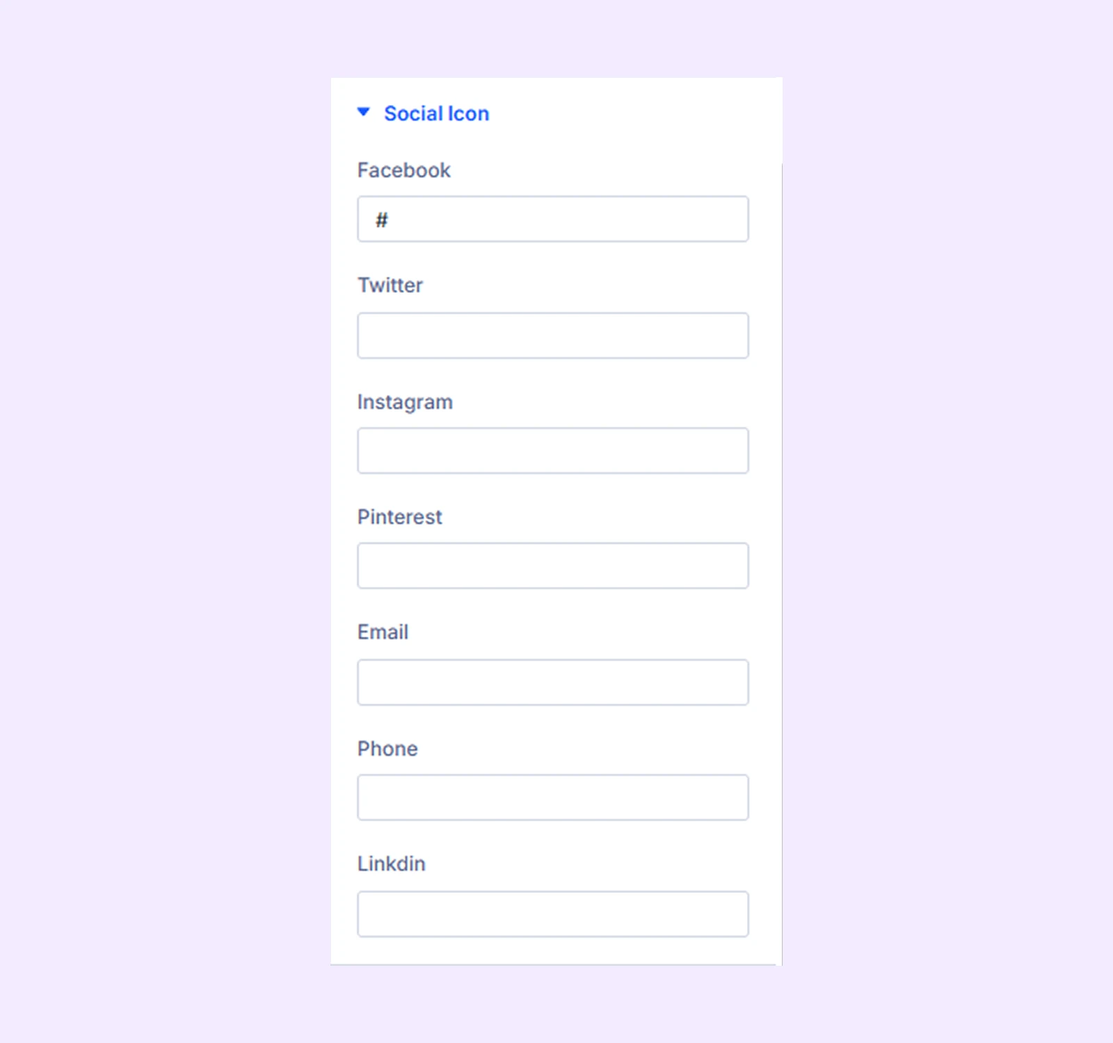
Social Icon
Add links to the person’s social media profiles.
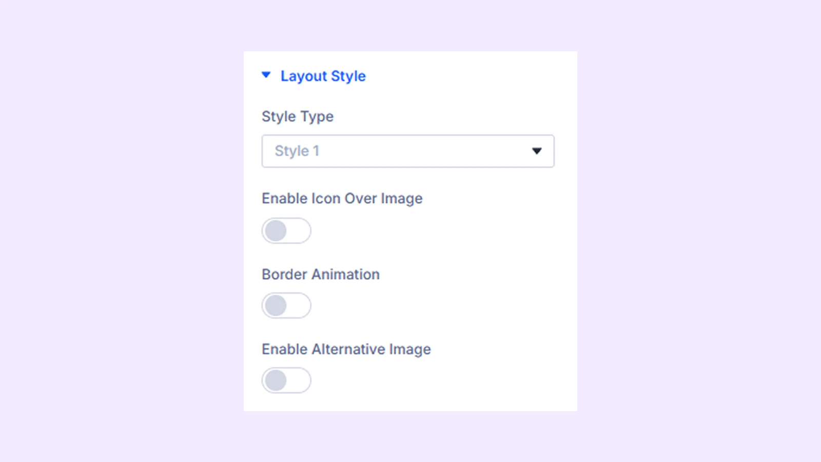
Layout Style
Style Type: Select one of the three available layout styles. If you select Style 1, additional options become available:
- Enable Icon Over Image: Place an icon over the image and control its spacing, visibility, and reveal behavior.
- Border Animation: Add an animated border around the image and customize its color, width, spacing, and animation style.
- Enable Alternative Image: Show an alternate image on hover. You can also add alt text for the alternative image. (This option is not available when Border Animation is enabled.)
Link: Use this default Divi setting to add a link to the entire module.
Background: Add a background color, gradient, image, video, pattern, or mask to the module.
Element Label: Rename the module to organize it more easily in the Divi Builder. (Only you can see this label.)
Design Tab
Use this tab to control the visual appearance of the module.
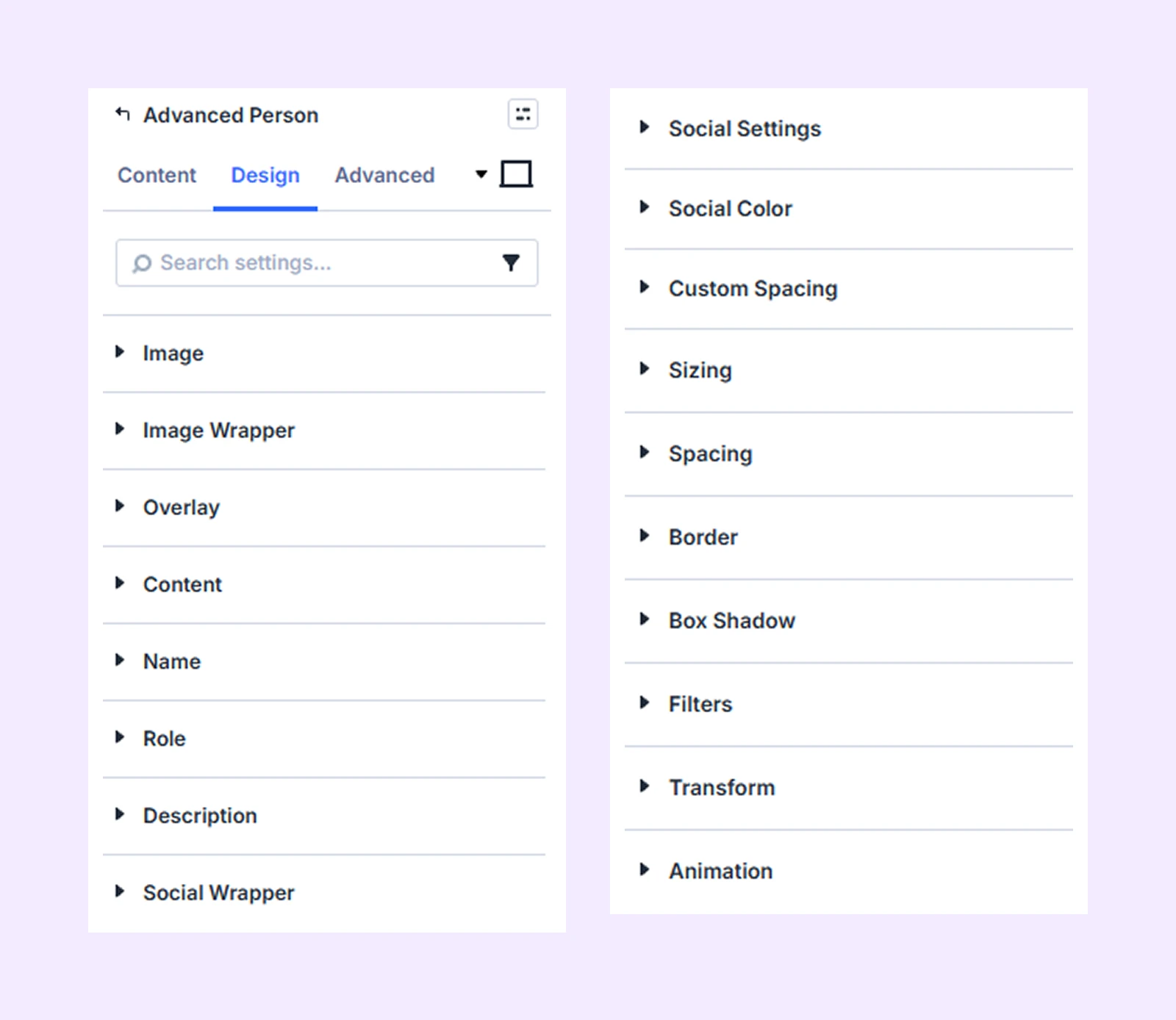
Image: Customize the profile image by adjusting its width, scaling behavior, border radius, and more.
Image Wrapper: Control the container that holds the image. You can adjust its background, maximum width, alignment, Z-index, border styles, and box shadow.
Overlay: Enable a color overlay on top of the image and customize its background color.
Content: Customize the content area by adjusting its background, typography, spacing, border styles, and more.
Name: Control the typography and styling of the person’s name.
Role: Customize the typography and styling of the role text.
Description: Control the typography and styling of the description text.
Social Wrapper: Customize the container that holds the social icons. You can adjust its background, border radius, border style, border width, and border color.
Social Settings
Control how the social media icons appear:
- Icon Alignment: Change the horizontal position of the icons inside the container.
- Vertical Icon: Display the icons vertically instead of horizontally.
- Full Width: Spread the icons across the entire container width.
- Icon Size: Adjust the size of the social icons.
- Icon Color: Choose the color of the icons.
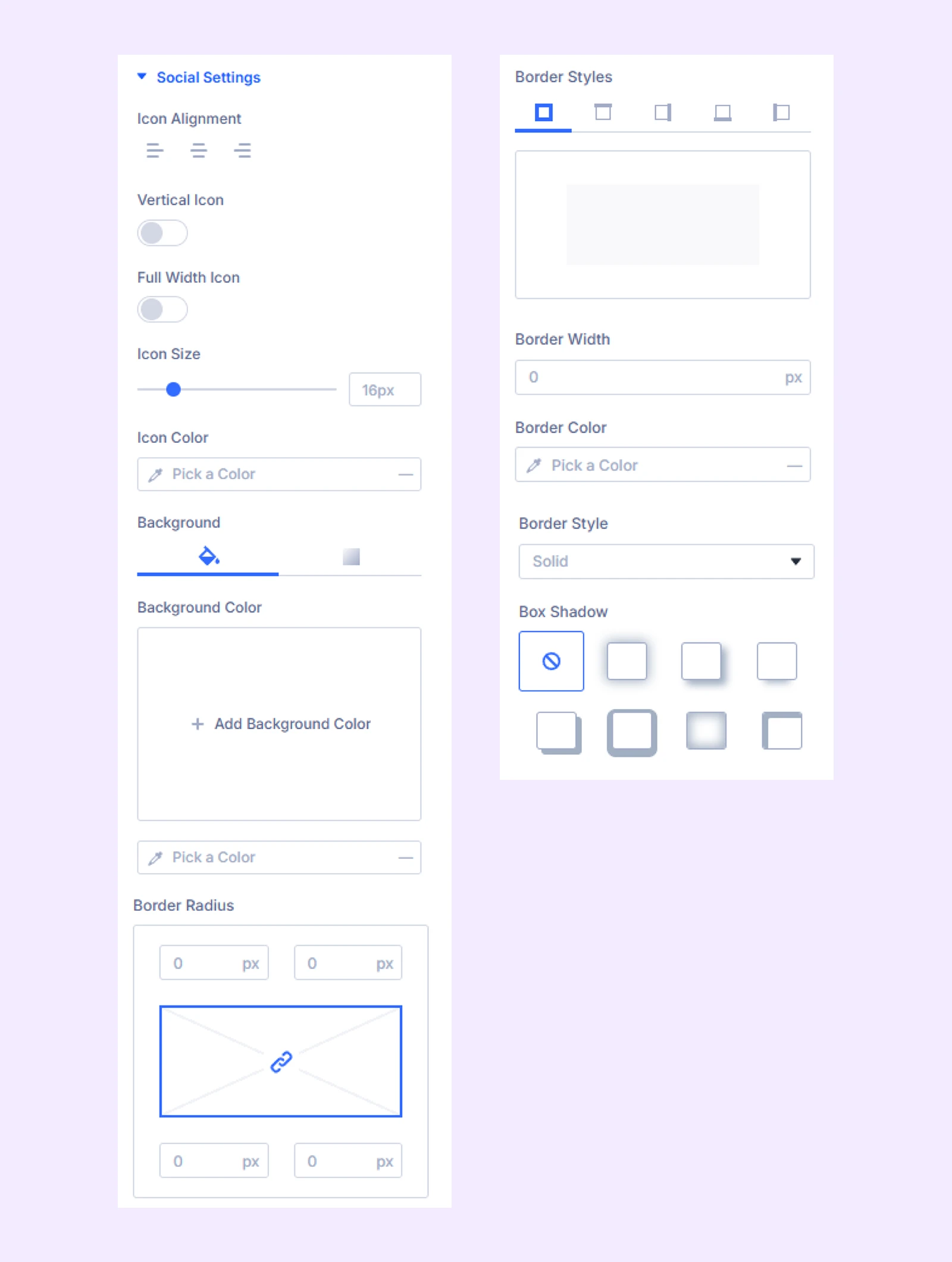
The remaining settings allow you to customize the background and border styles of the social icons.
Social Color: Customize the color and background of each social icon individually.
Custom Spacing: Adjust the margins and padding of individual module elements.
Sizing: Adjust the width, height, and alignment of the module.
Spacing: Add custom margin and padding to the module’s container.
Border: Customize the border using radius, style, width, and color settings.
Box Shadow: Add shadow effects to the module.
Filters: Apply color filters to enhance the appearance.
Transform: Scale, rotate, move, or skew the module.
Animation: Apply reveal animation effects and customize delay, duration, repeat settings, and animation type.
Advanced Tab
This tab provides additional settings for advanced users who want greater control over the module with custom code, conditions, and more.
Need Help?
If you have any questions or need assistance, contact our support team: [email protected]