The DiviFlash Scroll Text Reveal module adds an engaging animation effect that gradually reveals text as users scroll down the page.
Activation Required: This module is disabled by default. To use it, you need to enable it manually. Refer to our guide for step-by-step instructions.
Let’s see the settings in brief and how to make better use of it —
Content Tab
This tab contains the settings for configuring the text and reveal animation.
Text
Enter the text you want to reveal with the scroll animation.
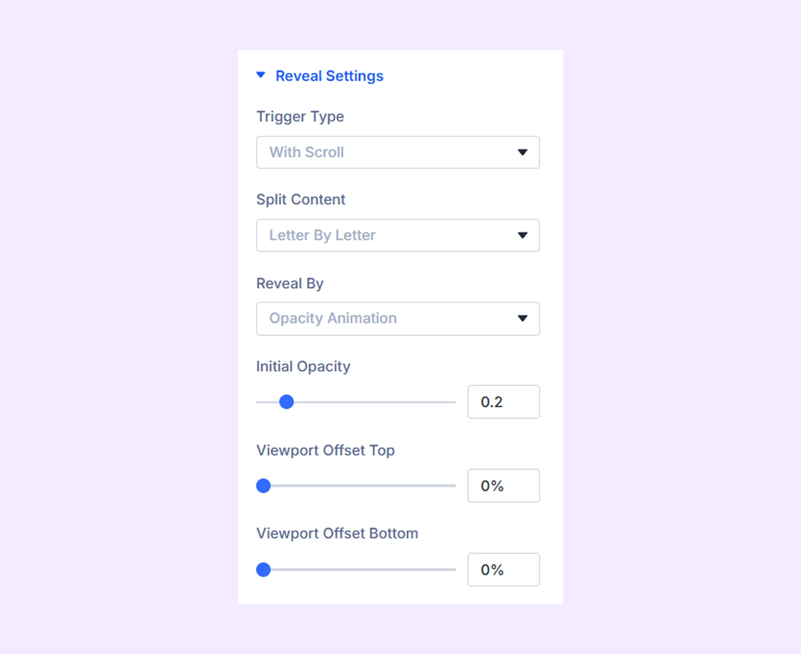
Reveal Settings
- Trigger Type: Choose how the text reveal animation is triggered. Available options include Auto, With Scroll, and On Viewport.
- Split Content: Choose whether the text is revealed word by word or letter by letter.
- Reveal By: Choose how the text will be revealed. You can animate the reveal using opacity or text color.
- Reveal Color: Choose the color used during the reveal animation. (Available only when Dual Color is selected in the Reveal By option.)
- Initial Opacity: Set the starting opacity of the text before the reveal animation begins.
- Animation Duration: Set the total duration of the reveal animation. (This option is not available when With Scroll is selected as the Trigger Type.)
- Animation Delay: Set a delay before the reveal animation starts. (This option is not available when With Scroll is selected as the Trigger Type.)
- Viewport Offset Top: Define how much of the viewport area should be excluded from the top when triggering the animation. (Not available when Auto is selected as the Trigger Type.)
- Viewport Offset Bottom: Define how much of the viewport area should be excluded from the bottom when triggering the animation. (Not available when Auto is selected as the Trigger Type.)
Background: Add a background color, gradient, image, video, pattern, or mask to the module.
Element Label: Rename the module to organize it more easily in the Divi Builder. (Only you can see this label.)
Design Tab
Use this tab to customize the visual appearance of the Scroll Text Reveal module.
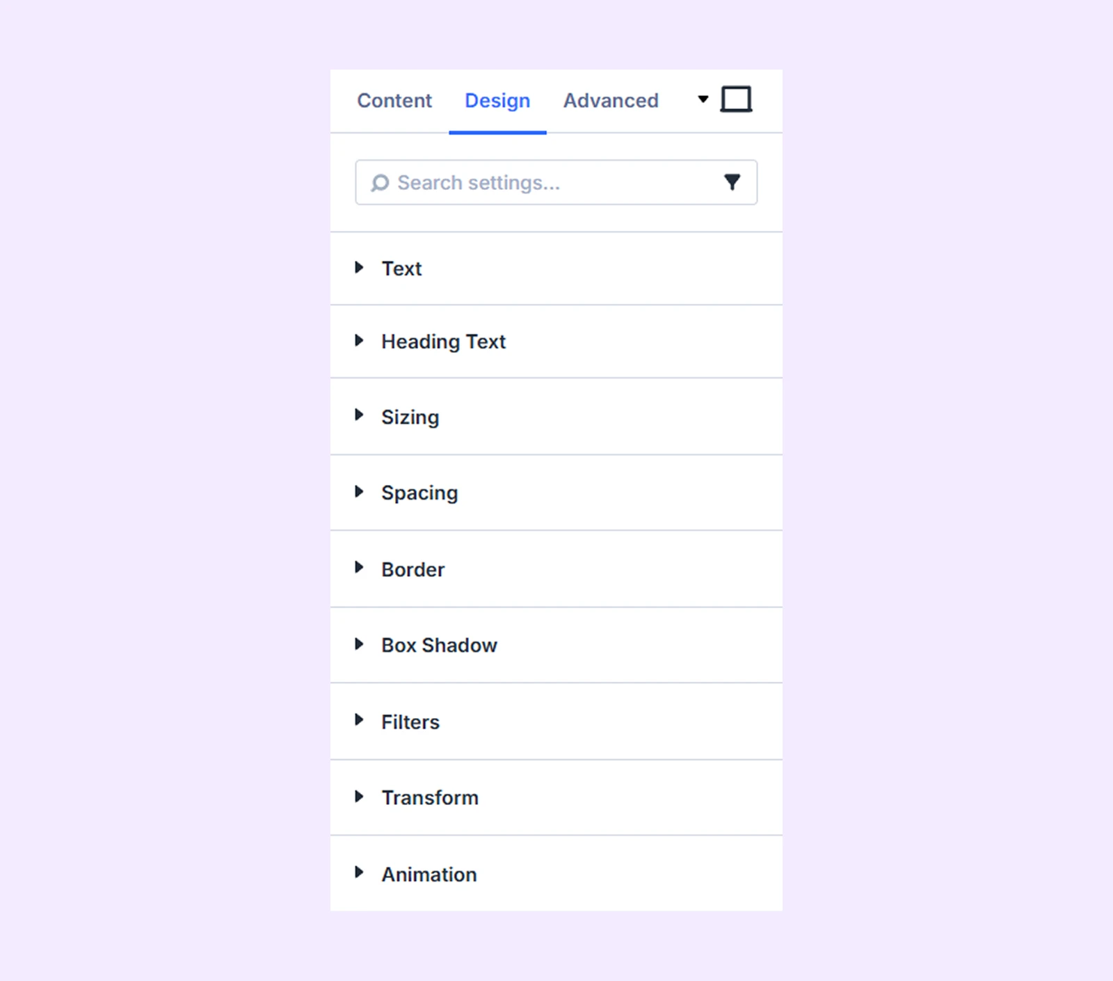
Text: Customize the typography settings for the main text content.
Heading Text: Customize the typography settings for heading elements within the module.
Sizing: Adjust the width, height, and alignment of the module.
Spacing: Add custom margin and padding to the module’s container.
Border: Customize the border style, width, and color. And style each border separately or apply the same style to all sides.
Box Shadow: Add shadow effects to the module.
Filters: Apply color filters to enhance the appearance.
Transform: Scale, rotate, move, or skew the module.
Animation: Apply reveal animation effects and customize delay, duration, repeat settings, and animation type.
Advanced Tab
This tab provides additional settings for advanced users who want greater control over the module with custom code, conditions, and more.
Need Help?
If you have any questions or need assistance, contact our support team: [email protected]