
The Off Canvas module (introduced in v5.6.0) lets you reveal hidden content in a panel using triggers like clicks, hovers, CSS selectors, or page load. You can add any Divi or DiviFlash module inside and customize the panel with nine transition styles.
Important Note: The Off Canvas module is built for Divi 5 only. Also, it will be disabled by default and to use it, you must enable it manually. Refer to our guide for step-by-step instructions.
Let’s see the settings in brief and how to make better use of it —
Content Tab
This tab includes the essential settings to control how the Off Canvas panel opens, what appears inside it, and how visitors can close it.
Trigger
Inside it, you will find the Trigger Type dropdown where you can choose how the Off Canvas panel opens:
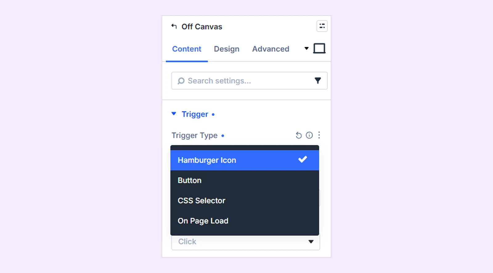
- Hamburger Icon: Display a hamburger icon that visitors can use to open the panel.
- Button: Create a custom trigger using an icon, image, text, or a combination of them.
- CSS Selector: Use an existing element on the page as the trigger by targeting its CSS ID or class.
- On Page Load: Open the panel automatically when the page loads.
If you choose Hamburger Icon:
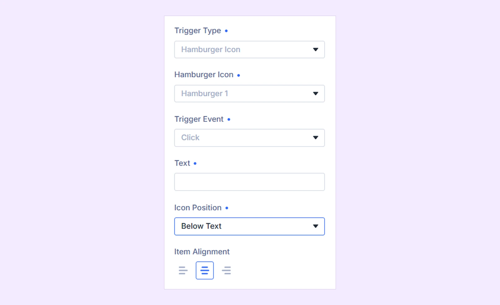
- Hamburger Icon: Choose from five different hamburger icon styles.
- Trigger Event: Choose whether the panel opens when visitors click or hover over the trigger.
- Text: Add optional text beside the hamburger icon.
- Icon Position: Choose whether the hamburger icon appears before, after, above, or below the text.
- Item Alignment: Align the icon and text to the left, center, or right. (Available only when Icon Position is set to Above Text or Below Text.)
If you choose Button:
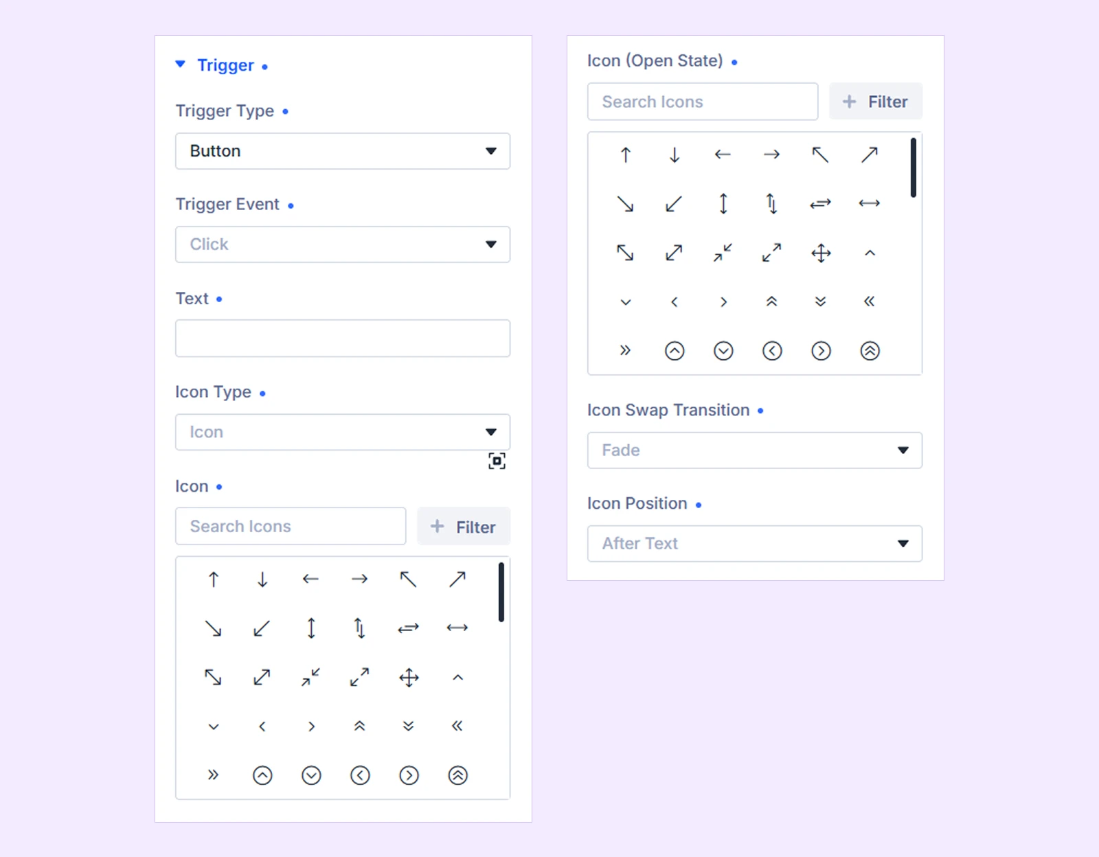
- Trigger Event: Choose whether the panel opens on click or hover.
- Text: Add custom text to the trigger.
- Icon Type: Choose whether to use an Icon, Image, or None.
- Icon: Select the icon displayed when the panel is closed. (Available only when Icon Type is set to Icon.)
- Icon (Open State): Select a different icon to display while the panel is open. Leave it empty to keep the same icon. (Available only when Icon Type is set to Icon.)
- Image: Upload the image you want to use as the trigger. (Available only when Icon Type is set to Image.)
- Image (Open State): Upload a different image to display while the panel is open. Leave it empty to keep the same image. (Available only when Icon Type is set to Image.)
- Icon Swap Transition: Choose from None, Fade, Rotate, or Scale to control how the trigger switches between its closed and open-state icon or image. (Available only when Icon Type is set to Icon or Image.)
- Icon Position: Choose whether the icon or image appears before, after, above, or below the text. (Available when Icon Type is set to Icon or Image.)
- Item Alignment: Align the icon or image and text to the left, center, or right. (Available only when Icon Position is set to Above Text or Below Text.)
If you choose CSS Selector:
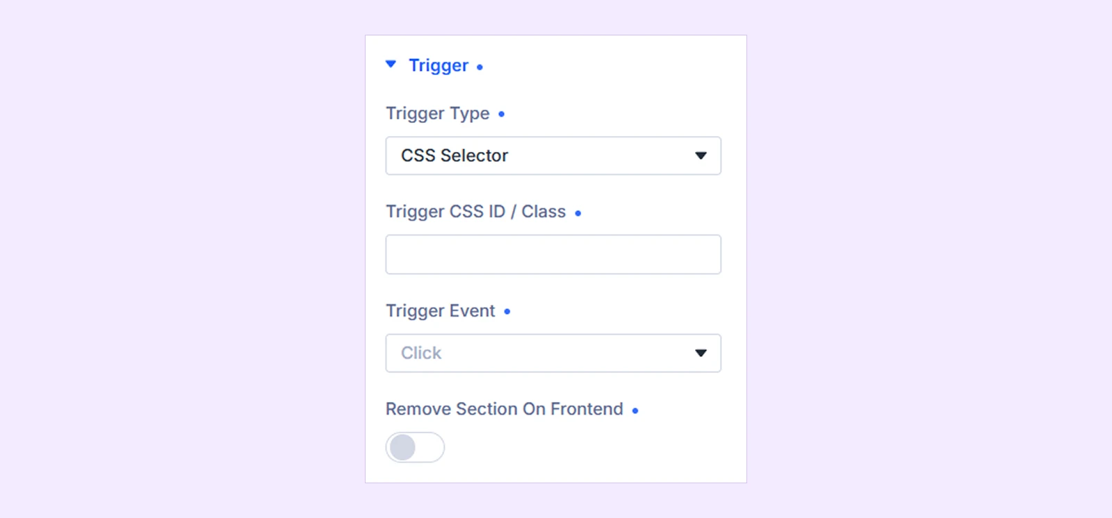
- Trigger CSS ID / Class: Enter the CSS ID or class of the existing element you want to use as the trigger. You can also add multiple selectors separated by commas.
- Trigger Event: Choose whether the targeted element opens the panel on click or hover.
- Remove Section On Frontend: Hide the entire section containing the Off Canvas module on the frontend.
Note: Enabling Remove Section On Frontend will hide the entire section containing the Off Canvas module. When using CSS Selector, keep the module in a separate section so no other content gets hidden.
If you choose On Page Load:
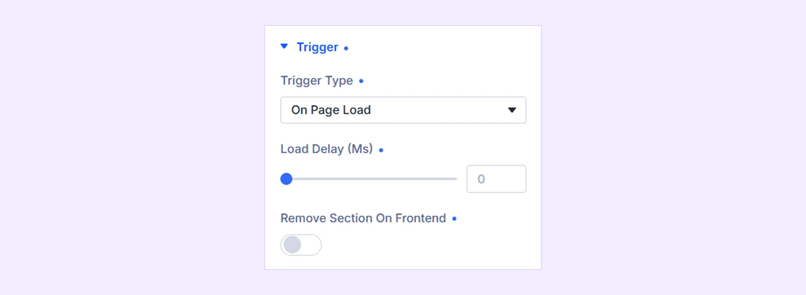
- Load Delay (ms): Set how long the module should wait after the page loads before opening the panel. Set it to 0 to open immediately.
- Remove Section On Frontend: Hide the entire section containing the Off Canvas module on the frontend.
Note: Enabling Remove Section On Frontend will hide the entire section containing the Off Canvas module, so make sure no other modules are placed in that section.
Panel
Use these settings to control the size, transition, direction, and overall behavior of the Off Canvas panel.
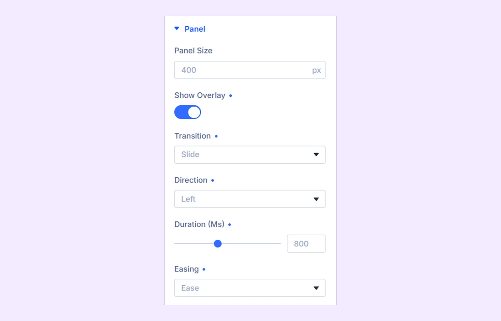
- Panel Size: Set the width of the Off Canvas panel.
- Panel Height: Set the height of the panel. (Available only when Transition is set to Corner Morph.)
- Show Overlay: Enable or disable the backdrop behind the open panel.
- Transition: Choose how the panel appears. Available options are:
- Slide: Slides the panel into view from the selected direction.
- Fade: Fades the panel into view.
- Push: Slides the panel in while pushing the page content aside.
- Reveal: Moves the page aside to reveal the panel underneath.
- Slide Along: Moves the page while the panel also slides into view.
- Scale Up: Reveals the panel with a scaling effect while moving the page.
- Elastic: Opens the panel with an elastic curved-edge motion.
- Corner Morph: Expands the panel from a selected screen corner with a spring-like effect.
- None: Opens and closes the panel instantly without an animation.
- Direction: Choose whether the panel opens from the Left, Right, Top, or Bottom. (Available for all transitions except Corner Morph.)
- Corner: Choose the screen corner from which the panel appears. Options include Top Left, Top Right, Bottom Left, and Bottom Right. (Available only when Transition is set to Corner Morph.)
- Duration (ms): Control how long the opening and closing transition takes. (Available for all transitions except None.)
- Easing: Choose the animation speed curve from Ease, Linear, Ease In, Ease Out, or Ease In Out. (Available for all transitions except None.)
Add Element

Use Add Element to build the content inside the Off Canvas panel. You can add any Divi or DiviFlash module, such as menus, images, buttons, search, forms, and more.
Close
These settings control how visitors can close the Off Canvas panel.
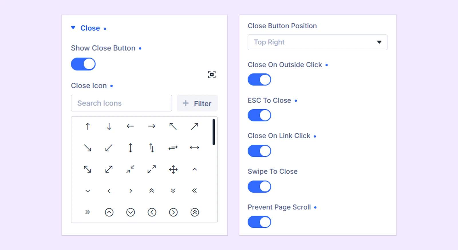
- Show Close Button: Show or hide the close button inside the panel.
- Close Icon: Choose the icon used for the close button.
- Close Button Position: Place the close button at the Top Right, Top Left, Bottom Right, or Bottom Left of the panel. (Available only when the Show Close Button is enabled.)
- Close On Outside Click: Close the panel when visitors click outside it.
- ESC To Close: Allow visitors to close the panel by pressing the Escape key.
- Close On Link Click: Automatically close the panel when visitors follow a link inside it, including links that navigate to another section of the same page.
- Swipe To Close: Allow visitors on touch devices to swipe the panel toward its edge to close it.
- Prevent Page Scroll: Stop the page behind the panel from scrolling while the panel is open.
Meta: Rename the module to organize and identify it more easily in the Divi Builder. This label is only visible to you.
Design Tab
This tab lets you customize the layout and appearance of the trigger, panel, overlay, and close button.
Layout: Use this default Divi setting to control the layout and alignment of the panel content.
Trigger
These settings let you customize the appearance and positioning of the Hamburger Icon or Button trigger. (Available when Trigger Type is set to Hamburger Icon or Button.)
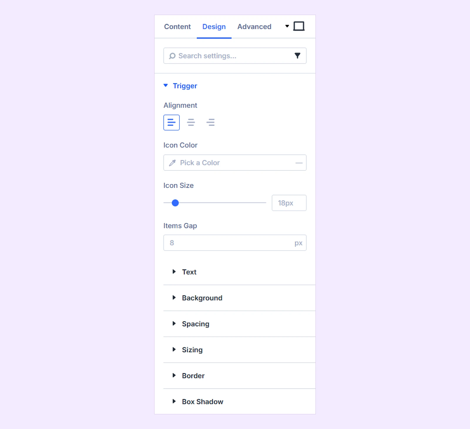
- Alignment: Align the trigger to the left, center, or right within its column.
- Icon Color: Set the color of the hamburger or button icon and customize its hover color. (Available when the trigger uses an icon instead of an image.)
- Icon Size: Adjust the size of the trigger icon. (Available when the trigger uses an icon instead of an image.)
- Items Gap: Control the space between the icon or image and the trigger text.
- Image Width: Set the width of the trigger image. (Available when Trigger Type is Button and Icon Type is set to Image.)
- Image Height: Set the height of the trigger image. (Available when Trigger Type is Button and Icon Type is set to Image.)
- Image Object Fit: Choose how the trigger image fits within its defined dimensions using Contain, Cover, or Fill. (Available when Trigger Type is Button and Icon Type is set to Image.)
You can also use the design settings to customize the trigger’s Text, Background, Spacing, Sizing, Border, and Box Shadow.
Panel
Use these settings to customize the Off Canvas panel itself.

- Z Index: Control the stacking position of the panel. Increase it when another element, such as a sticky header or chat widget, appears above the panel.
- Horizontal Offset: Adjust the horizontal distance between the panel and the edge of the screen. (Available only when Transition is set to Corner Morph.)
- Vertical Offset: Adjust the vertical distance between the panel and the edge of the screen. (Available only when Transition is set to Corner Morph.)
There you will also find settings like background, spacing, border and box shadow.
Overlay
Customize the backdrop that appears behind the Off Canvas panel. (Available only when Show Overlay is enabled.)
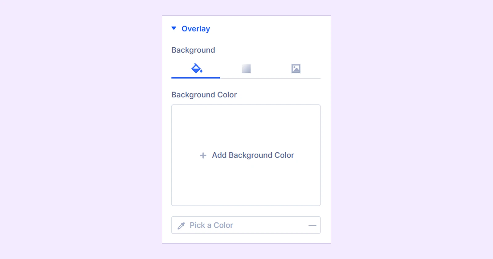
- Background: Set a color, gradient, or image for the overlay.
Close
Use these settings to customize the close button inside the panel. (Available only when Show Close Button is enabled.)
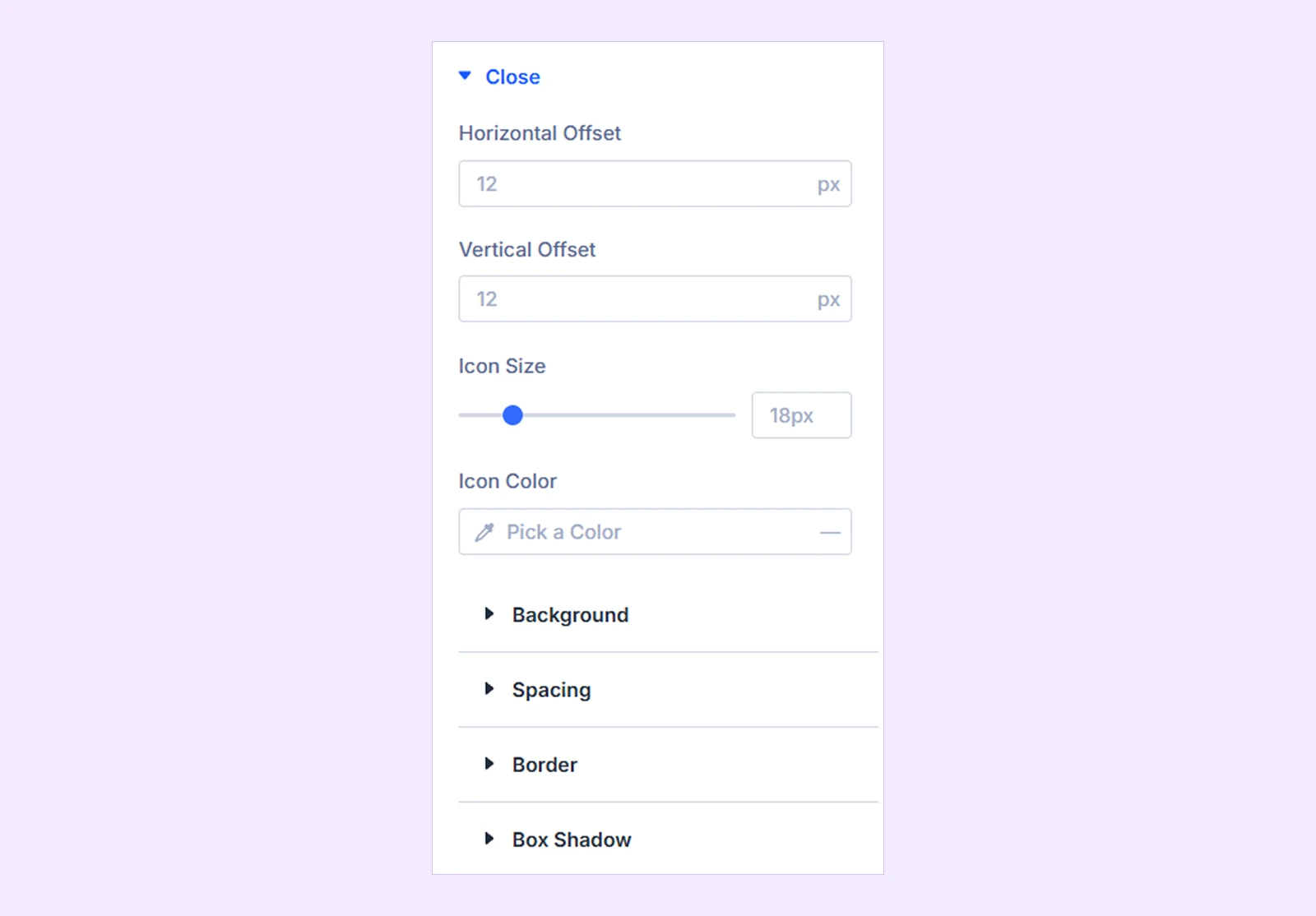
- Horizontal Offset: Adjust the close button’s horizontal distance from the selected panel edge.
- Vertical Offset: Adjust the close button’s vertical distance from the selected panel edge.
- Icon Size: Adjust the size of the close icon.
- Icon Color: Set the close icon color and customize its hover color.
You will also see settings like background, spacing, border and box shadow.
Filters: Apply color filters to change the visual appearance of the module.
Transform: Scale, rotate, move, or skew the module.
Animation: Apply reveal animation effects and customize the animation type, duration, delay, and more.
Advanced Tab
This tab provides additional settings for advanced users who want greater control over the module with custom code, conditions, and more.
Need Help?
If you have any questions or need assistance, contact our support team: [email protected]