The Advanced Countdown Timer is a DiviFlash module (introduced in DiviFlash 5.2.0) that lets you create eye-catching and fully customizable countdown timer.
Important Note: Advanced Countdown Timer module is built for Divi 5 only. Also, it will be disabled by default and to use it, you must enable it manually. Refer to our guide for step-by-step instructions.
Let’s see the settings in brief and how to make better use of it —
Content Tab
This tab includes all the essential settings to control how the countdown works.
General Settings
Inside it, you will find the Countdown Type dropdown where you can choose from these four options:
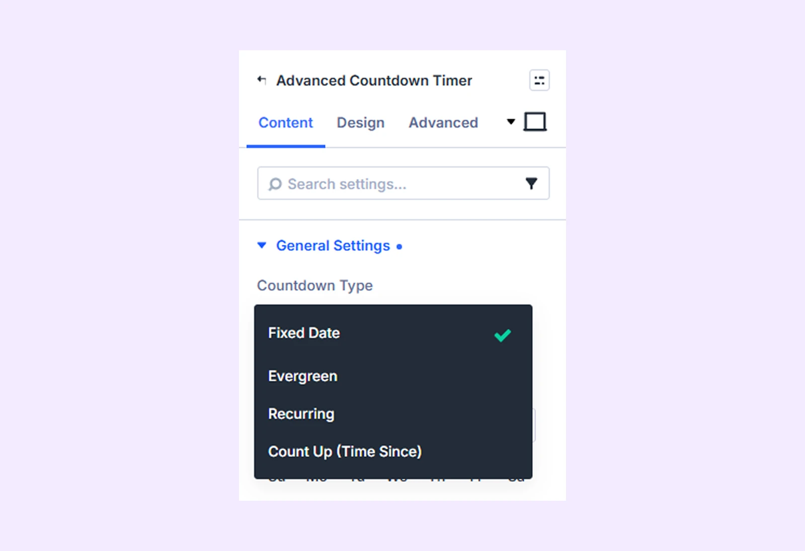
- Fixed Date: Count down to one specific date and time that is the same for all visitors.
- Evergreen: Start a personal countdown for each visitor when they open the page.
- Recurring: Automatically reset the countdown on a repeating schedule such as daily, weekly, or yearly.
- Count Up (Time Since): Count forward from a past date and show how much time has passed since that moment.
If you choose Fixed Date:
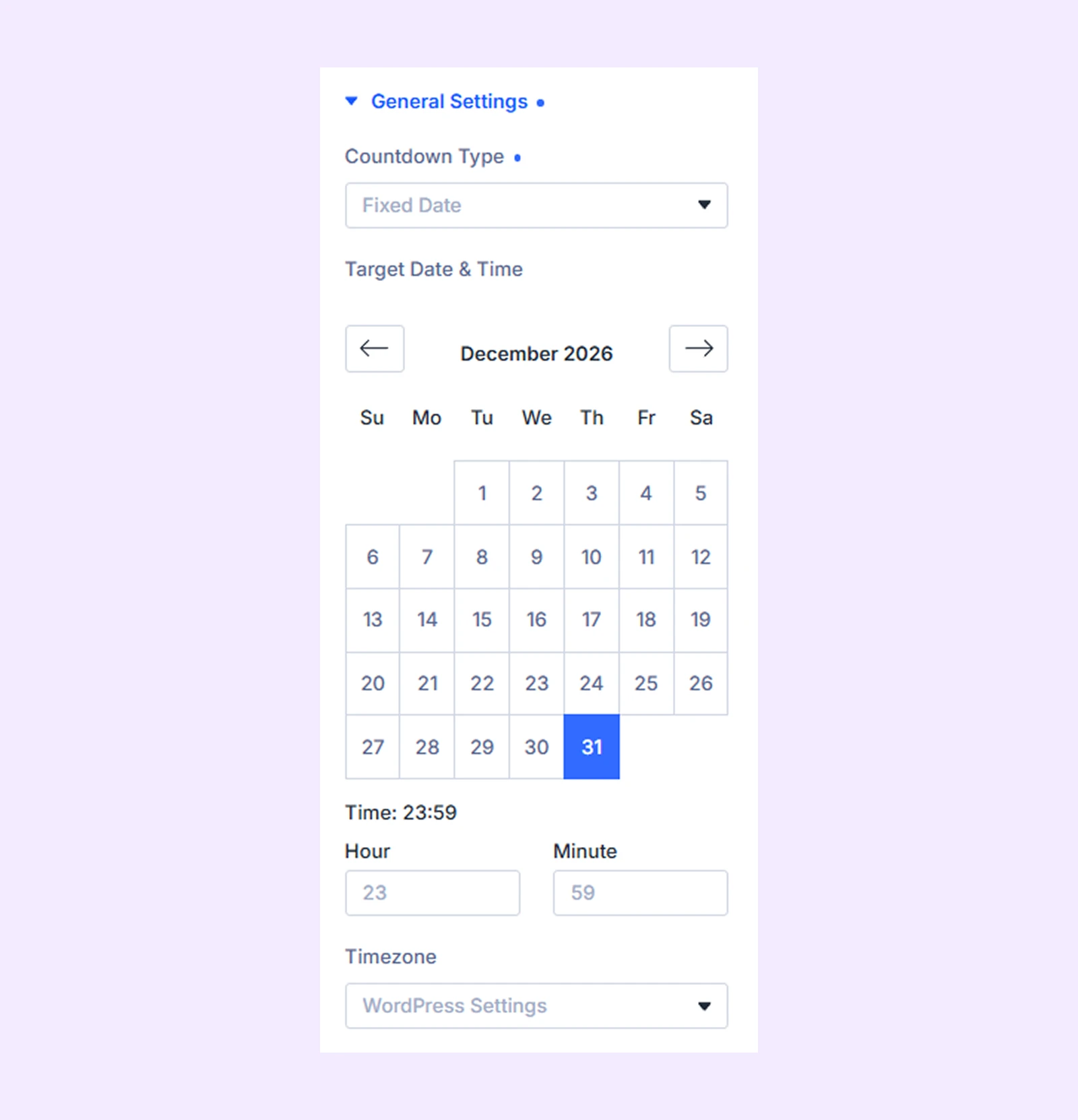
- Target Date & Time: Set the exact date and time when the countdown should end.
- Hour and Minute: Define the precise time of the target day.
- Timezone: Choose the timezone so the countdown stays accurate for your audience.
If you choose Evergreen:
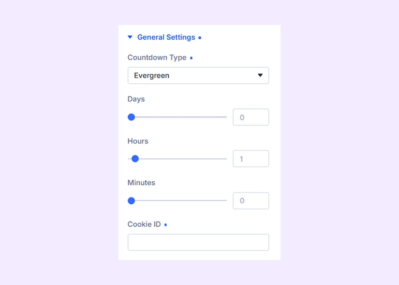
- Days: Set the countdown duration in days for each visitor.
- Hours: Set the countdown duration in hours for each visitor.
- Minutes: Set the countdown duration in minutes for each visitor.
(You can use days, hours and minutes individually or combine them together to create the countdown duration.)
- Cookie ID: Set a unique identifier to store and control each visitor’s countdown state in their browser.
Note: You can use the same Cookie ID across multiple timers to make them share the same saved state and stay synchronized for each visitor. Or if you leave the field empty, a unique identifier will be created automatically for each timer, and each visitor will get their own separate countdown.
If you choose Recurring:
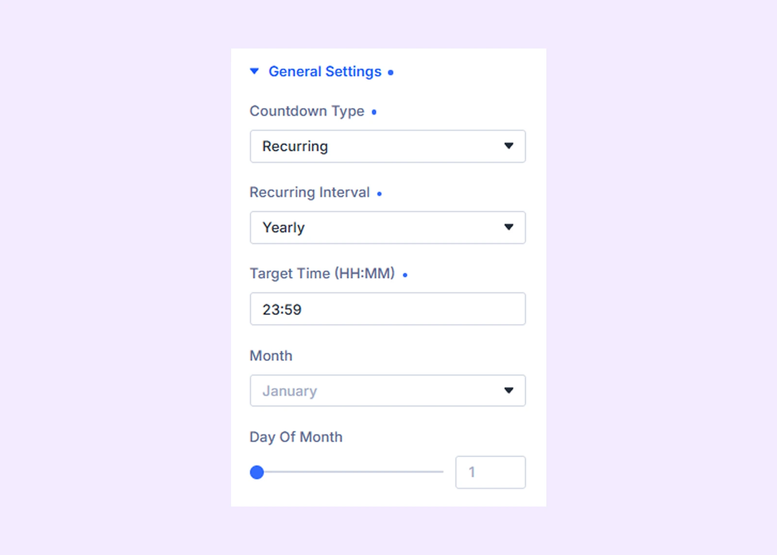
- Recurring Interval: Choose how often the countdown repeats, such as daily, weekly, or yearly.
- Target Time (HH:MM): Set the exact time of day when the countdown should reset.
- Weekday: Select the day of the week for weekly recurring timers.
- Month: Select the month for yearly recurring timers.
- Day of Month: Set the exact date for yearly recurring timers.
If you choose Count Up (Time Since), you will get these settings:
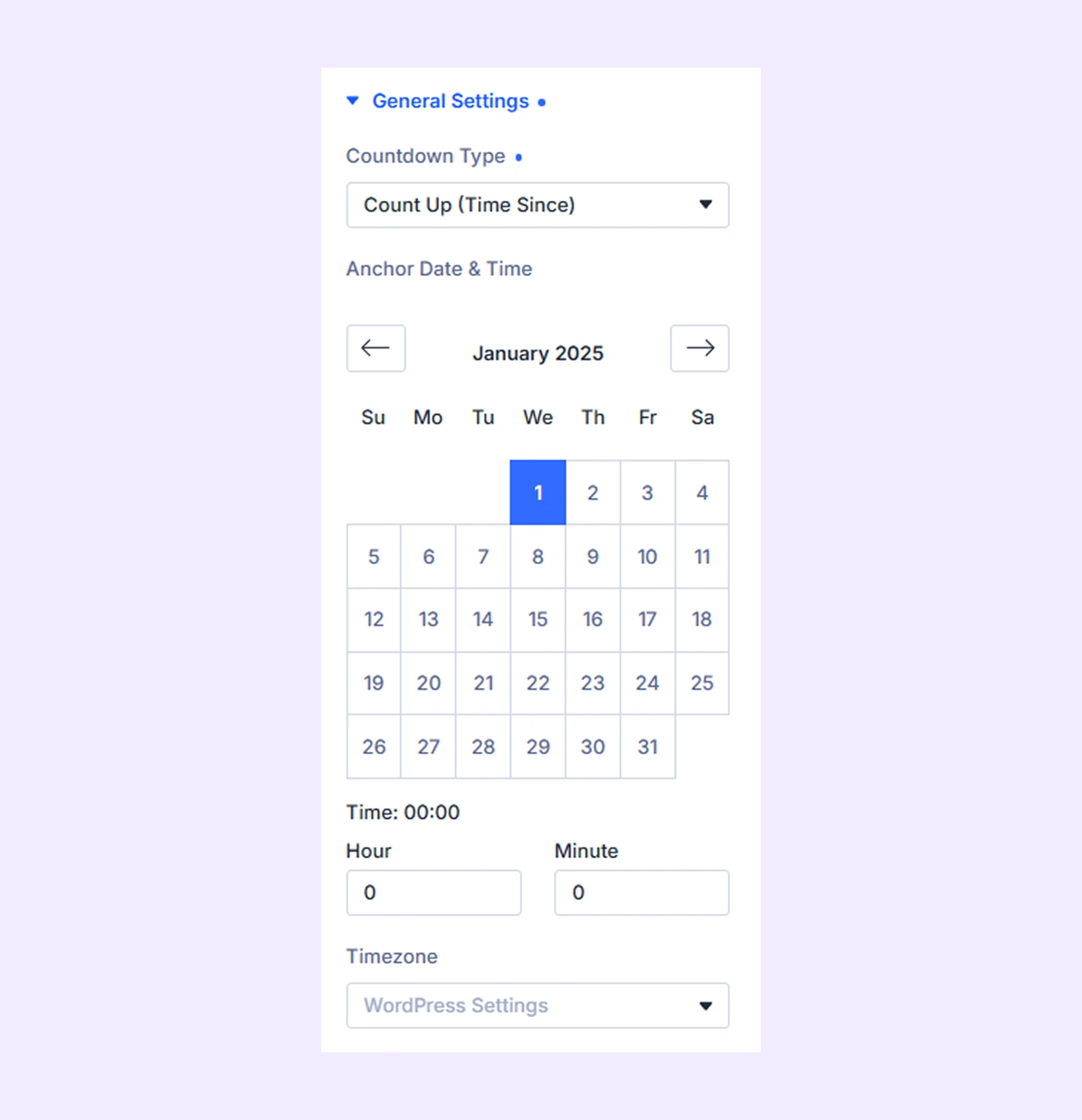
- Anchor Date & Time: Choose the date and time from which the counter should start counting.
- Hour and Minute: Set the exact time for the starting point.
- Timezone: Choose the correct time zone for accurate tracking.
Display Units
Choose which time units you want to show in the countdown:
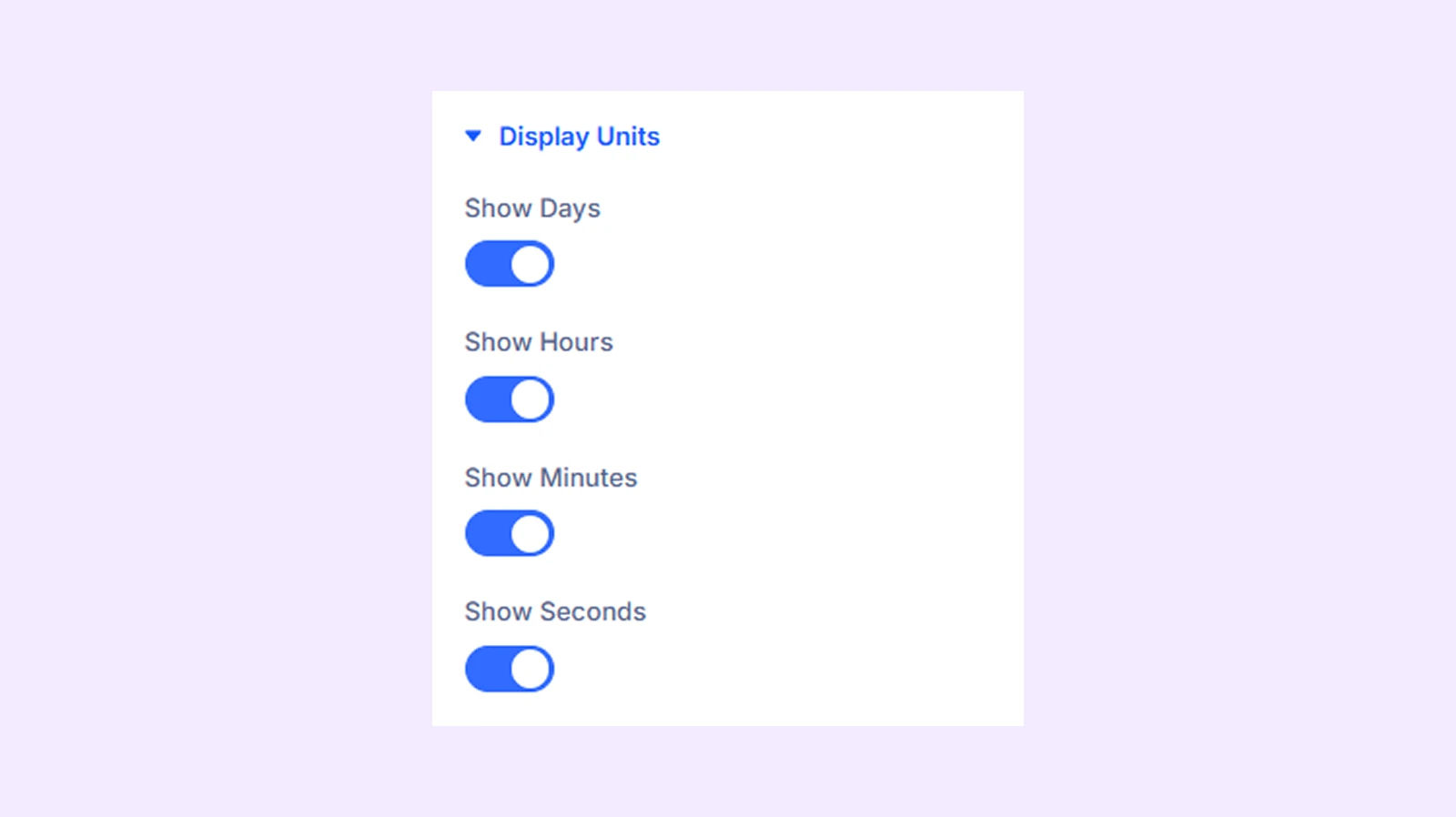
- Show Days: Display the days in the countdown
- Show Hours: Display the hours in the countdown
- Show Minutes: Display the minutes in the countdown
- Show Seconds: Display the seconds in the countdown
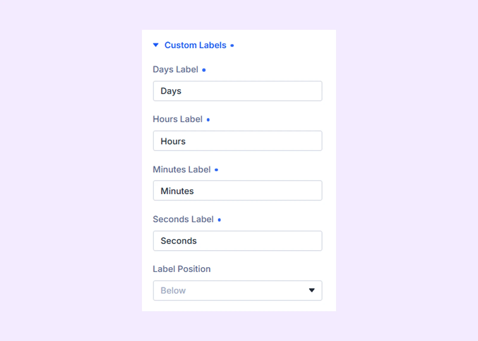
Custom labels
- Days, Hours, Minutes, Seconds Label: Customize the text displayed for each time unit.
- Label Position: Choose whether the labels appear above or below the numbers.
Expiration
Choose what happens when the countdown reaches zero:
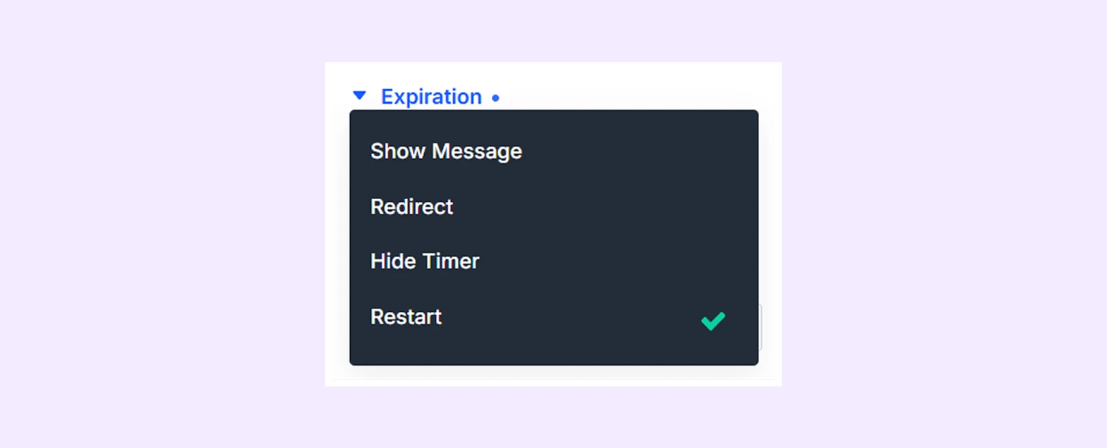
- Show Message: Display a custom message after the timer ends.
- Redirect: Send visitors to a specific URL when the countdown finishes.
- Hide Timer: Remove the timer from the page once it expires.
- Reset: Restart the countdown automatically after it ends.
If you choose Show message:
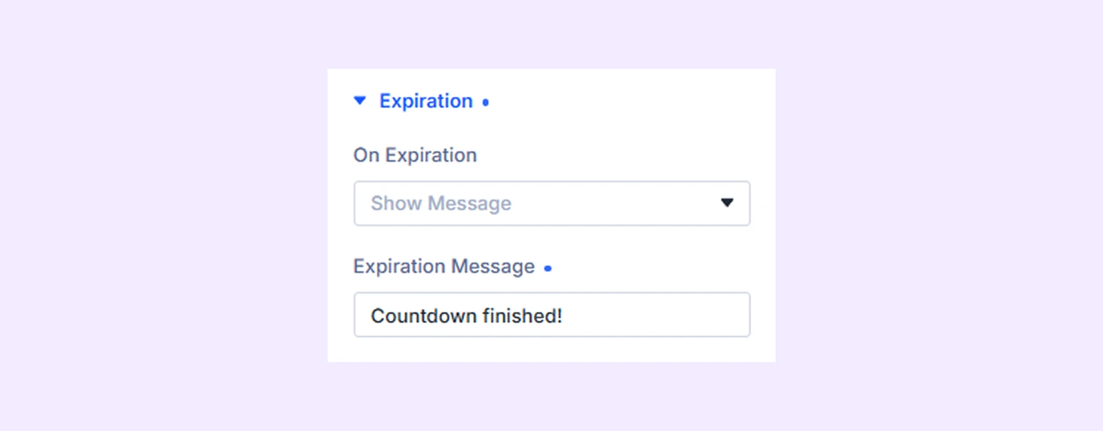
- Expiration Message: Set the custom message that will appear when the countdown reaches zero.
If you choose Redirect:
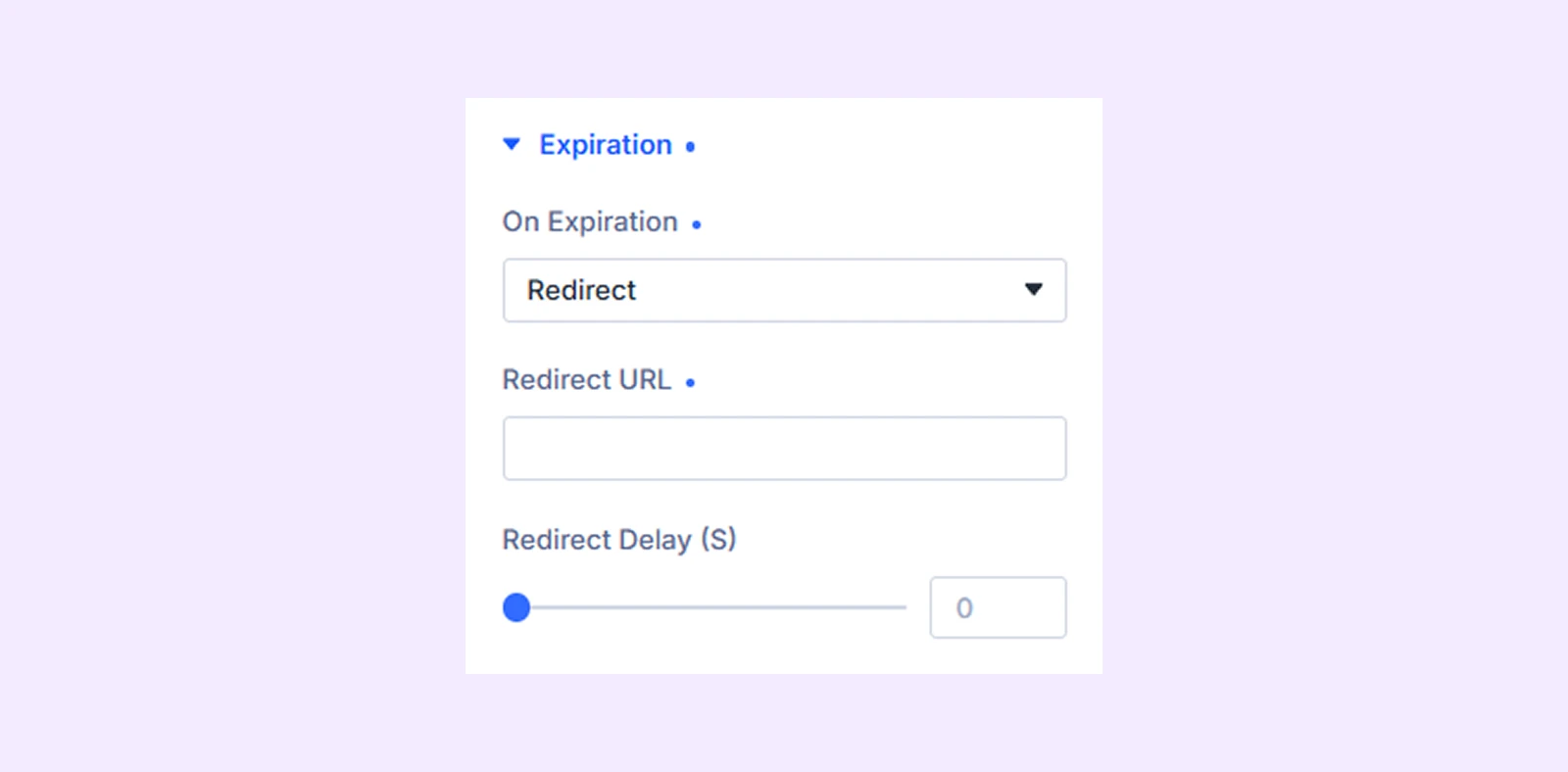
- Redirect URL: Set the page URL where visitors will be sent after the countdown ends.
- Redirect Delay (S): Set the number of seconds to wait before redirecting visitors.
If you choose Restart:
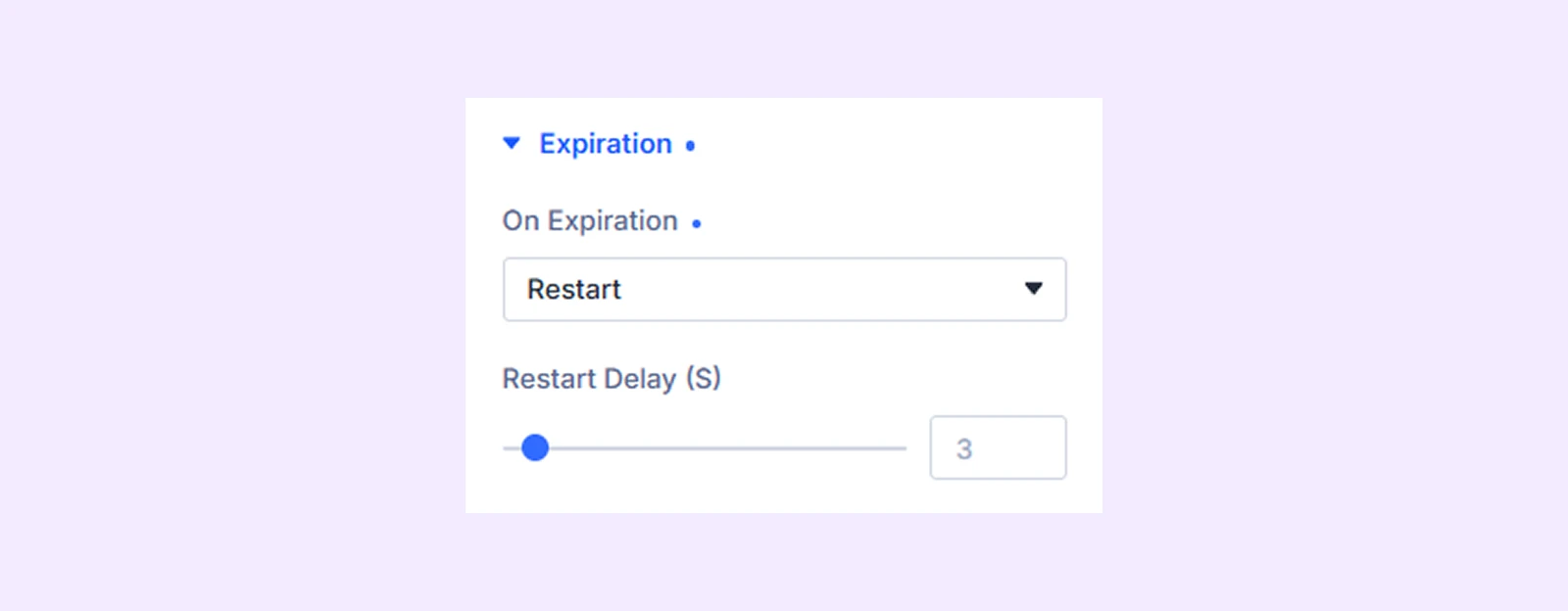
- Restart Delay (S): Set the number of seconds to wait before the countdown starts again after it expires.
If you choose Hide Timer: The countdown will be removed from the page once it reaches zero.
Link: Use this default Divi setting to add a link to the entire module.
Background: Add a background color, gradient, image, video, pattern, or mask to the module.
Meta: Rename the module to organize it more easily in the Divi Builder. (Only you can see this label.)
Design Tab
This tab lets you customize the overall look of the Advanced Countdown Timer module.
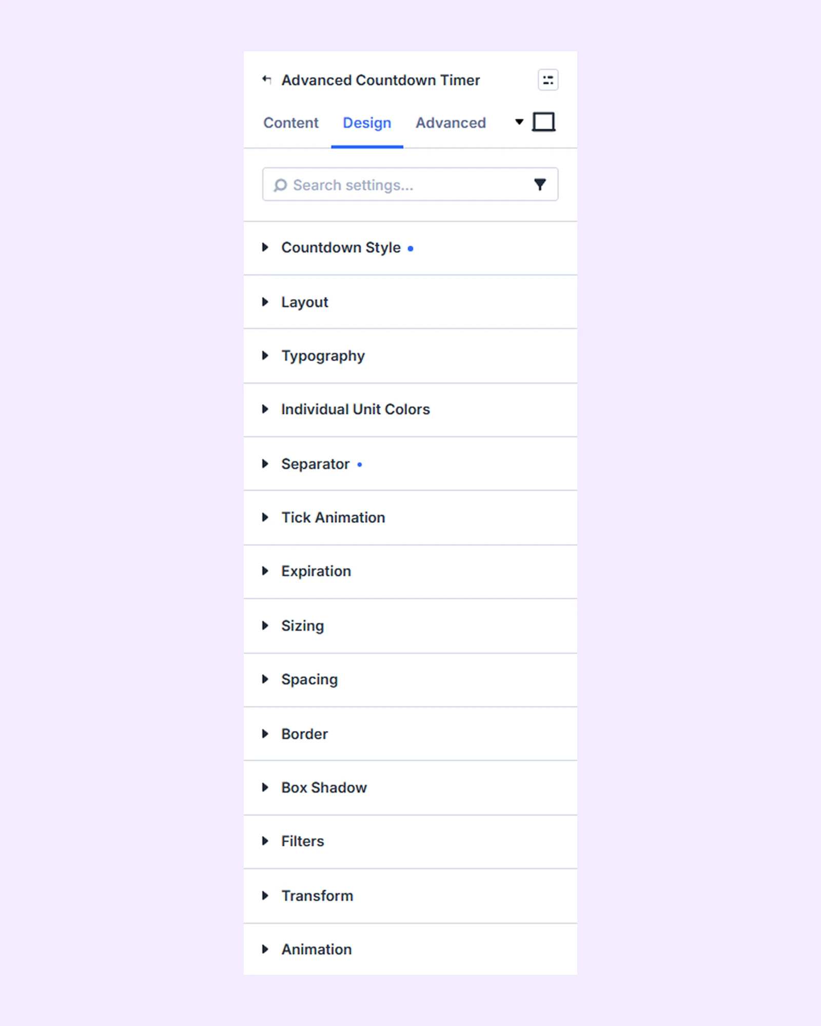
Countdown Style
Choose the layout style of the countdown timer:
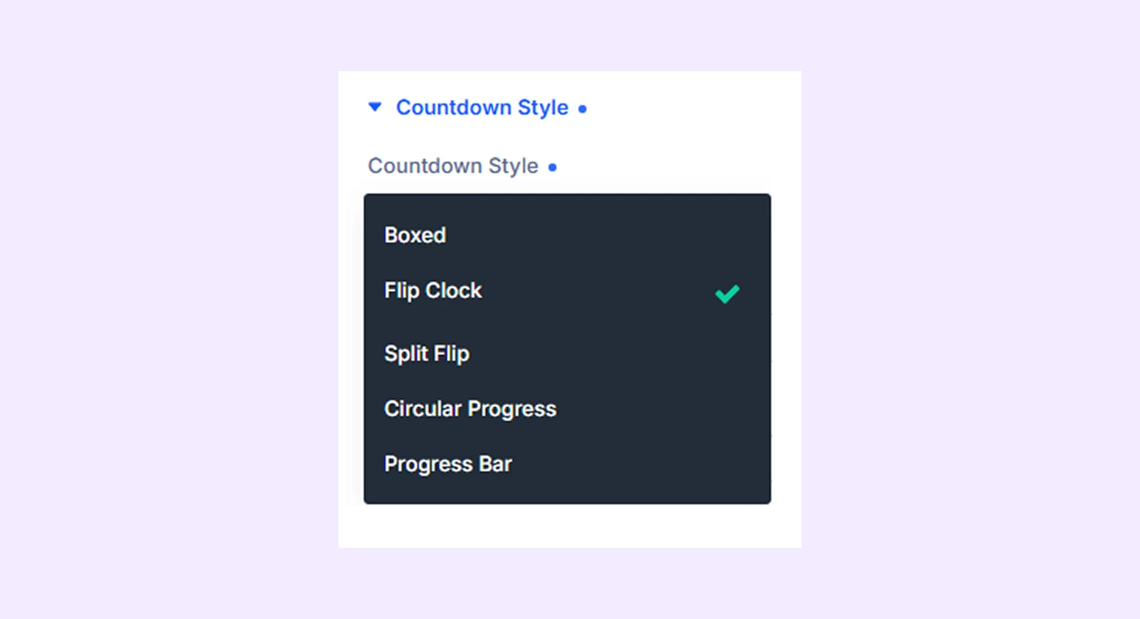
- Boxed: Displays each time unit inside clean boxed containers.
- Flip Clock: A classic flipping number animation style.
- Split Flip: A modern split-style flip animation for each digit.
- Circular Progress: Shows time using circular progress rings.
- Progress Bar: Displays countdown as a horizontal progress bar.
If you choose Boxed:
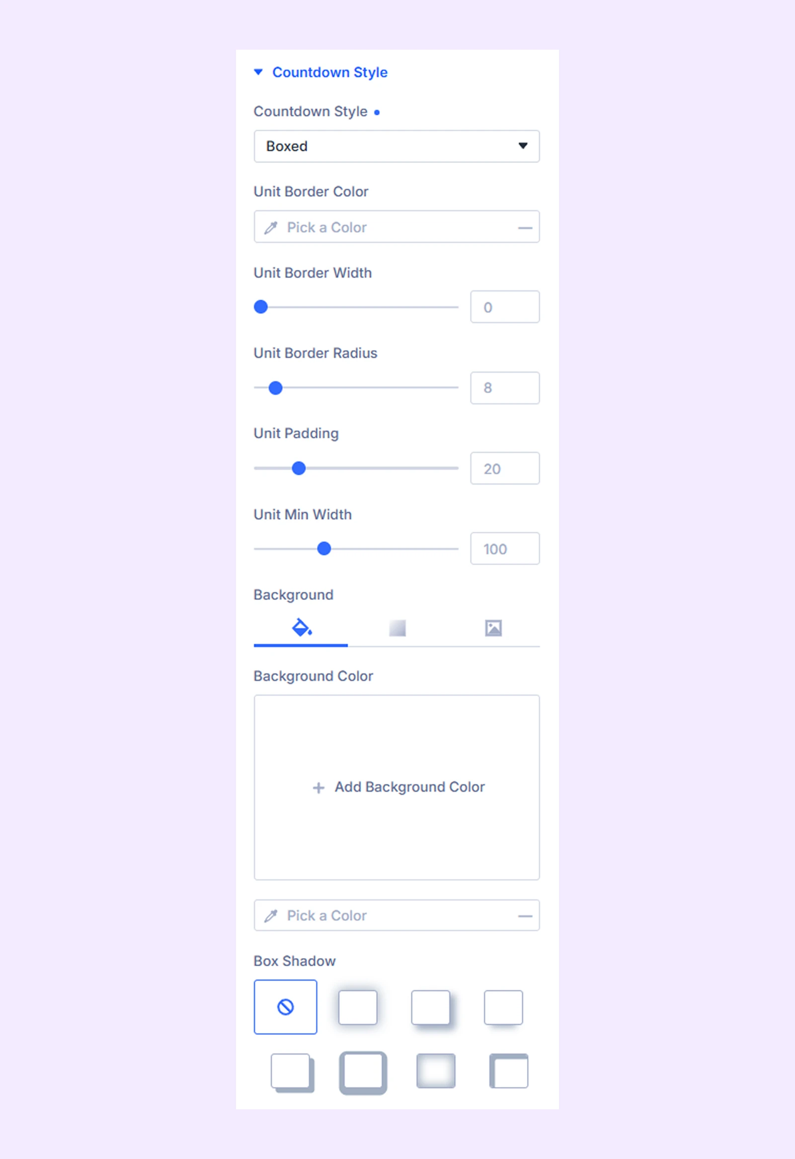
- Unit Border Color: Set the color of the borders around each unit box.
- Unit Border Width: Set how thick the borders should be.
- Unit Border Radius: Round the corners of the boxes.
- Unit Padding: Add space inside each box.
- Unit Min Width: Set the minimum width for each unit box.
- Background Color: Set the background color of the boxes.
- Box Shadow: Add shadow to create a depth effect.
If you choose Flip Clock:
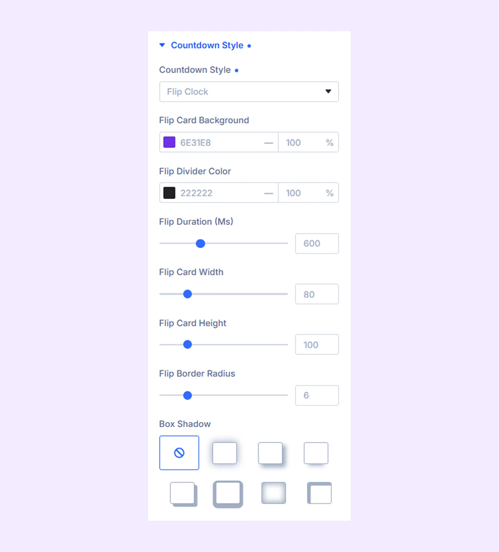
- Flip Card Background: Set the background color of the flip cards.
- Flip Divider Color: Set the color of the line separating the flip cards.
- Flip Duration (Ms): Set the speed of the flip animation in milliseconds.
- Flip Card Width: Adjust the width of each flip card.
- Flip Card Radius: Round the corners of the flip cards.
- Flip Card Height: Adjust the height of each flip card.
- Box Shadow: Add shadow effects to create depth for the flip cards.
If you choose Split Flip:
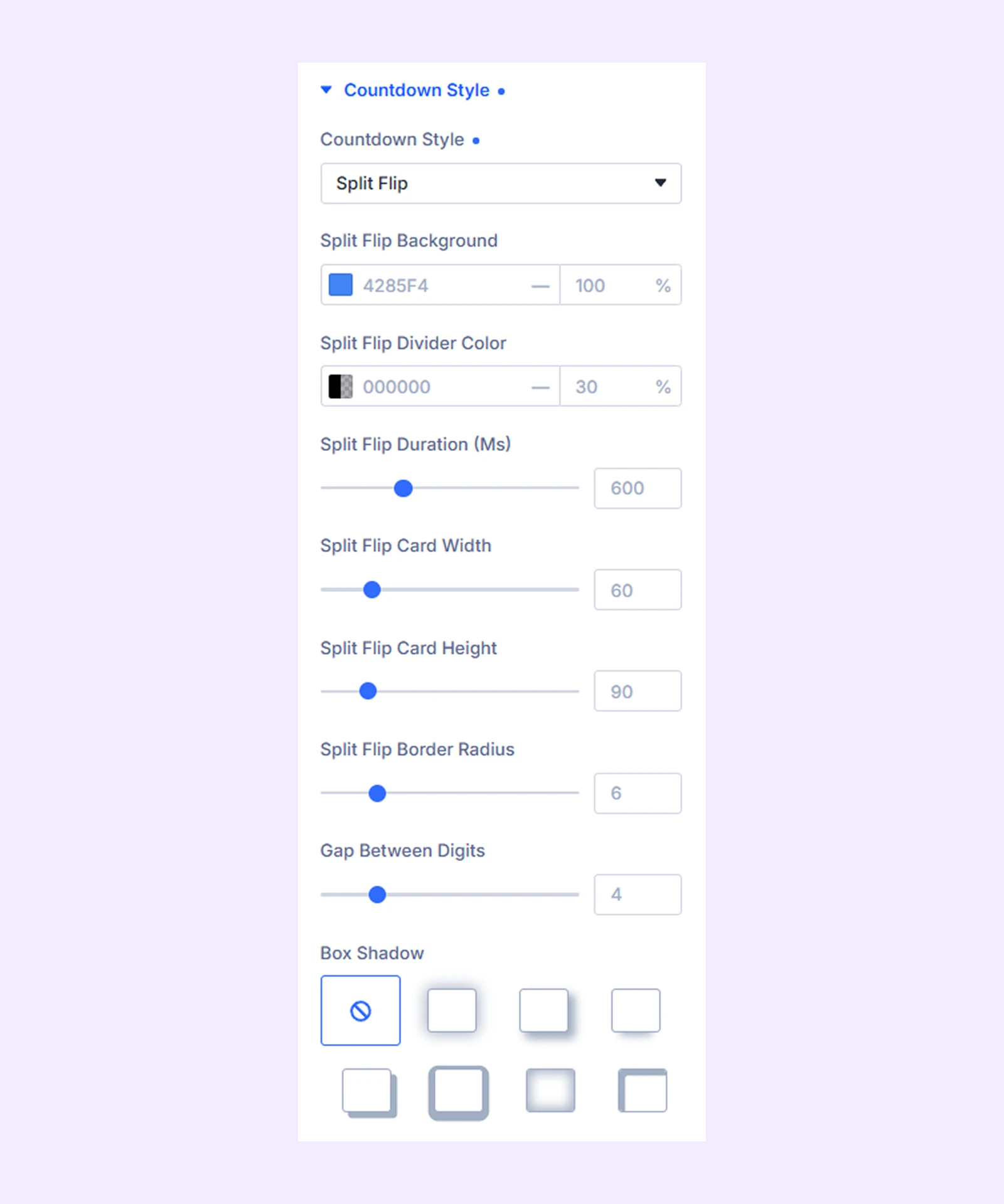
- Split Flip Background: Set the background color of the flip cards.
- Split Flip Divider Color: Set the color of the divider line.
- Split Flip Duration (Ms): Control the speed of the flip animation.
- Split Flip Card Width: Set the width of each card.
- Split Flip Card Height: Set the height of each card.
- Split Flip Border Radius: Round the corners of the cards.
- Gap Between Digits: Adjust the spacing between each digit.
- Box Shadow: Add shadow effects to the cards for depth.
If you choose Circular Progress:
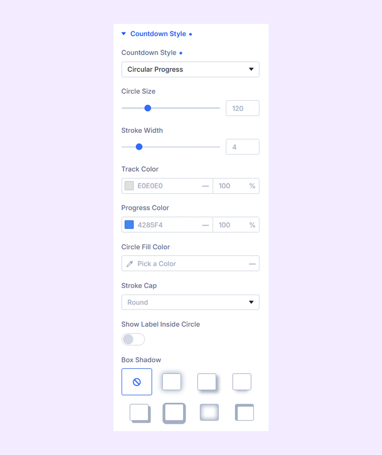
- Circle Size: Set the overall size of the circular timer.
- Stroke Width: Adjust the thickness of the progress ring.
- Track Color: Set the color of the background track.
- Progress Color: Set the color of the active progress indicator.
- Circle Fill Color: Set the background color inside the circle.
- Stroke Cap: Choose the style of the ring ends (rounded or flat).
- Show Label Inside Circle: Enable or disable labels inside the circle.
- Box Shadow: Add shadow effects to the circle for depth.
If you choose Progress Bar:
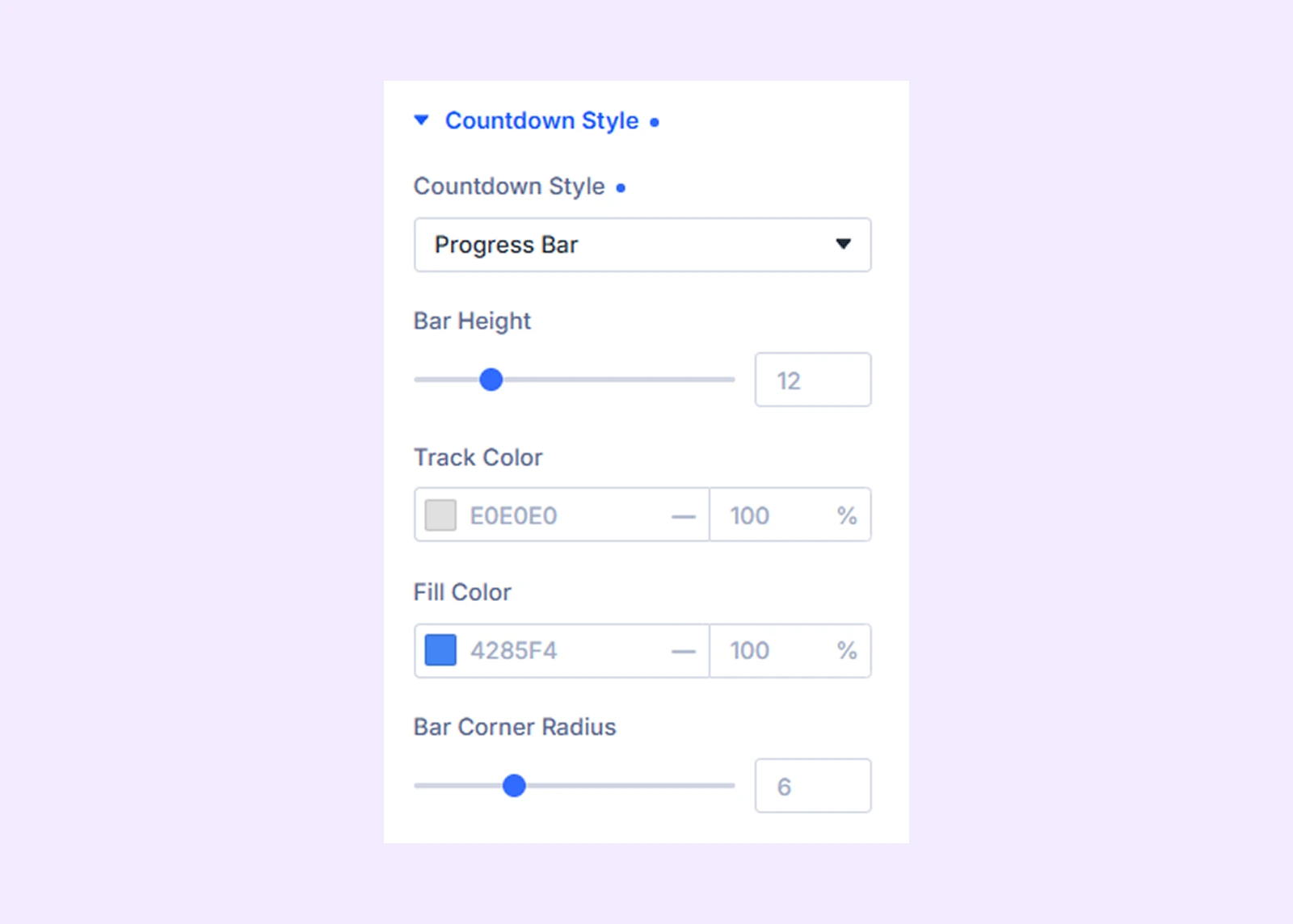
- Bar Height: Set the thickness of the progress bar.
- Track Color: Set the background color of the bar track.
- Fill Color: Set the color of the filled progress area.
- Bar Corner Radius: Round the corners of the progress bar.
Layout
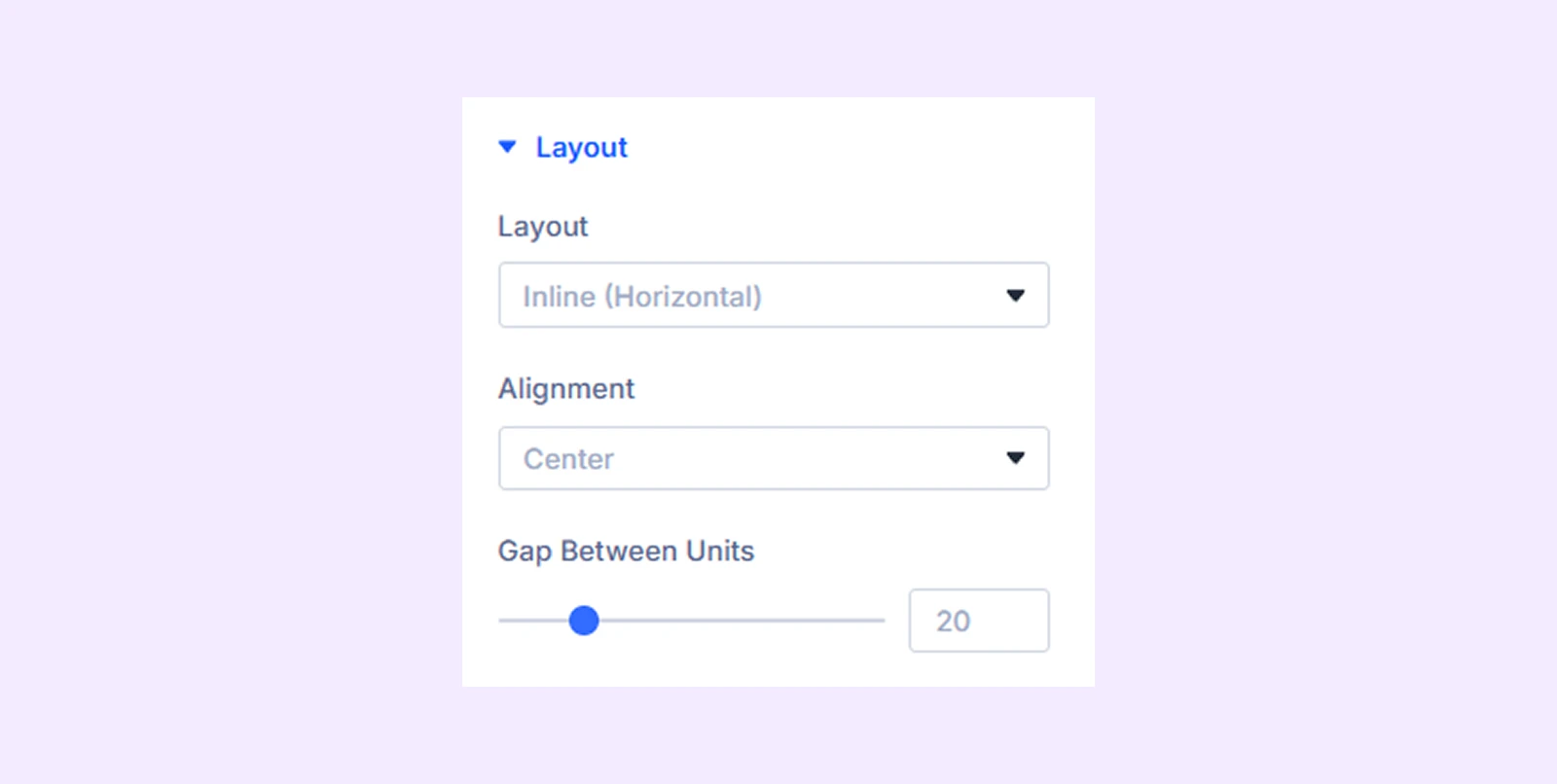
- Layout: Choose how the countdown units are arranged (Inline/Horizontal or Stacked/Vertical).
- Alignment: Set the position of the timer (left, center, right, space-between, or space-around).
- Gap Between Units: Adjust the spacing between each time unit (Days, Hours, Minutes, Seconds).
Typography: Customize the number, label and separator’s typography.
Individual Unit Colors
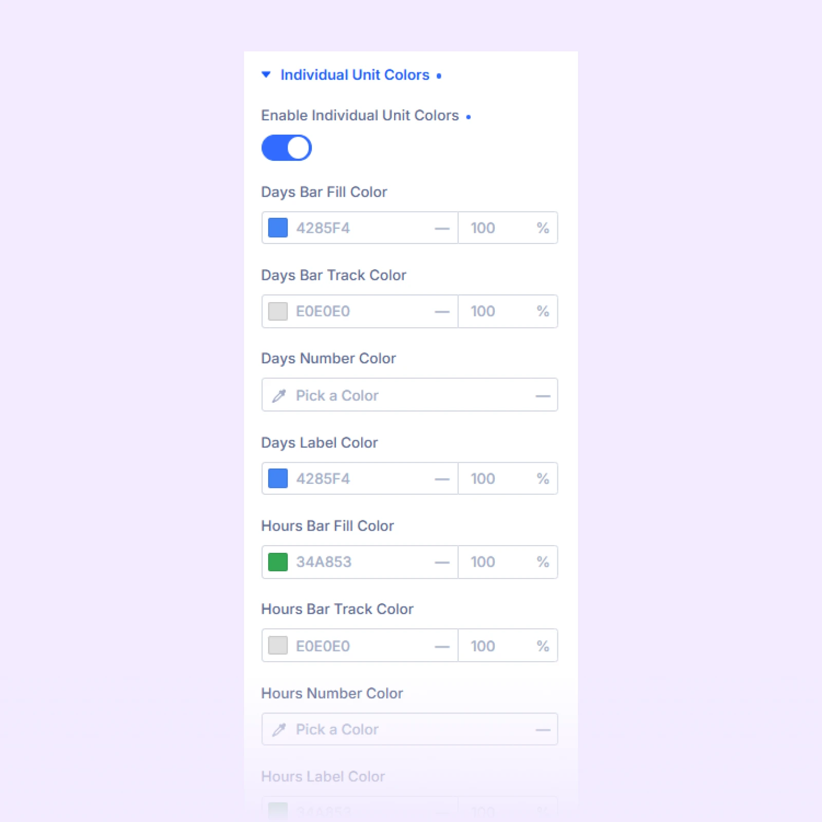
- Enable Individual Unit Colors: Allow setting different colors for each time unit (Days, Hours, Minutes, Seconds). You can customize colors for numbers, labels, backgrounds, and (if using Circular Progress) the ring.
Separator
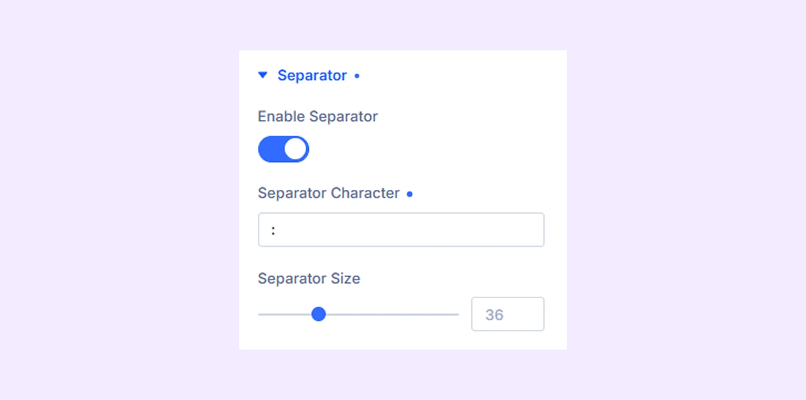
- Enable Separator: Turn separators on or off between time units.
- Separator Character: Choose the symbol used between units (such as :, -, or |).
- Separator Size: Adjust the size of the separator to control how visible it appears.
Tick Animation
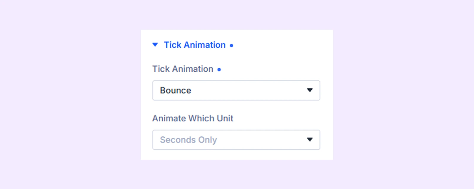
- Tick Animation: Enable animation effects for countdown updates (choose from 3 animation styles).
- Animate Which Unit: Select which unit(s) will animate when the timer updates (all units or only seconds).
Expiration: Customize the style of the content shown when the countdown ends, including typography, background, spacing, border, and box shadow settings.
Sizing: Adjust the width, height, and alignment of the module.
Spacing: Add custom margin and padding to the module’s container.
Border: Customize the border style, width, and color. And style each border separately or apply the same style to all sides.
Box Shadow: Add shadow effects to the module.
Filters: Apply color filters to enhance the appearance.
Transform: Scale, rotate, move, or skew the module.
Animation: Apply reveal animation effects and customize delay, duration, repeat settings, and animation type.
Advanced Tab
This tab provides additional settings for advanced users who want greater control over the module with custom code, conditions, and more.
Need Help?
If you have any questions or need assistance, contact our support team: [email protected]