The Post Carousel Module is a versatile tool to create visually engaging carousel of posts.
Let’s see the settings in brief and how to make better use of it —
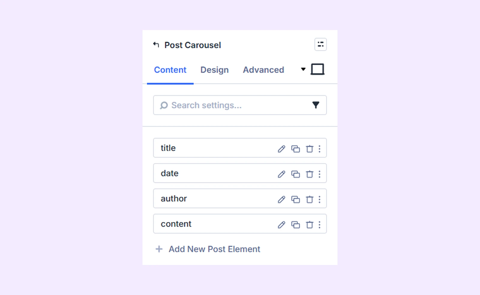
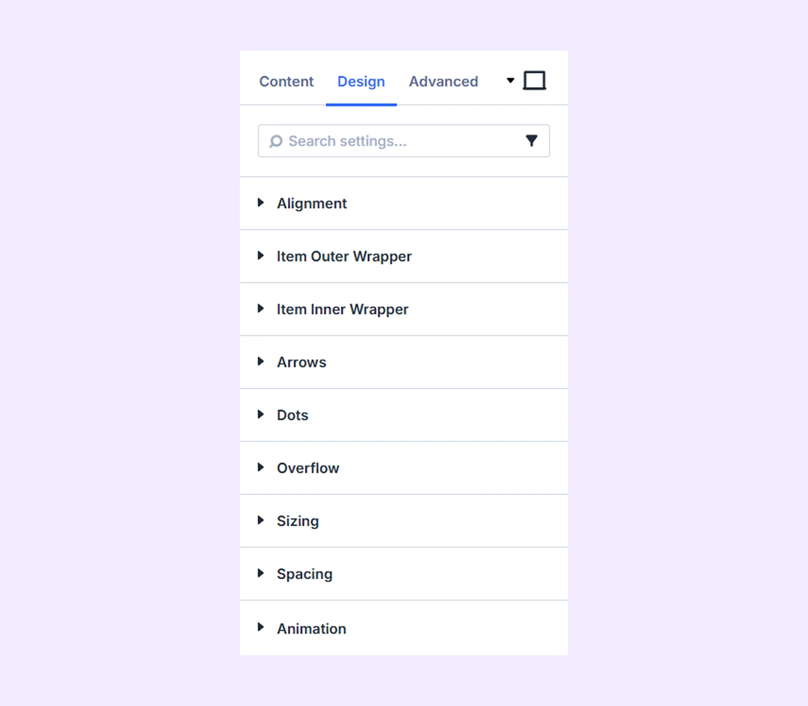
Content Tab
This tab contains all the essential settings to select, arrange, and customize the post elements in the carousel.
Add New Post Element
To add a new post element to the carousel, click the plus (+) icon labeled “Add New Post Element.” This lets you select elements such as the post image, title, author, and more to include in the carousel display. By default, four elements are preloaded, which you can edit, delete, or rearrange by dragging the element bars. To learn how to customize the post elements, click here.
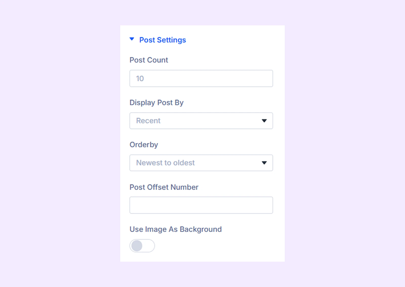
Post Settings
- Posts for Current Page: Display only posts related to the current page or category (visible in Theme Builder).
- Post Count: Select the number of blog posts to display in the carousel.
- Display Post By: Select the types of posts you want to display. You have three options: Recent, By Tag, and By Category.
- Orderby: Set the order of the displayed posts. Only available if “Recent” posts are selected.
- Include Categories: Choose the categories of the posts. Only available if “By Category” is selected.
- Include Tags: Choose the tags of the posts. Only available if “ByTag” is selected.
- Posts Offset Number: Choose some posts to be excluded from the display, starting from the latest ones.
- Use Image as Background: Use the featured images of the posts as the background of the other post elements.
- Background Image Scale on Hover: Enable this option to make the background image zoom in when you hover over it.
Carousel Settings
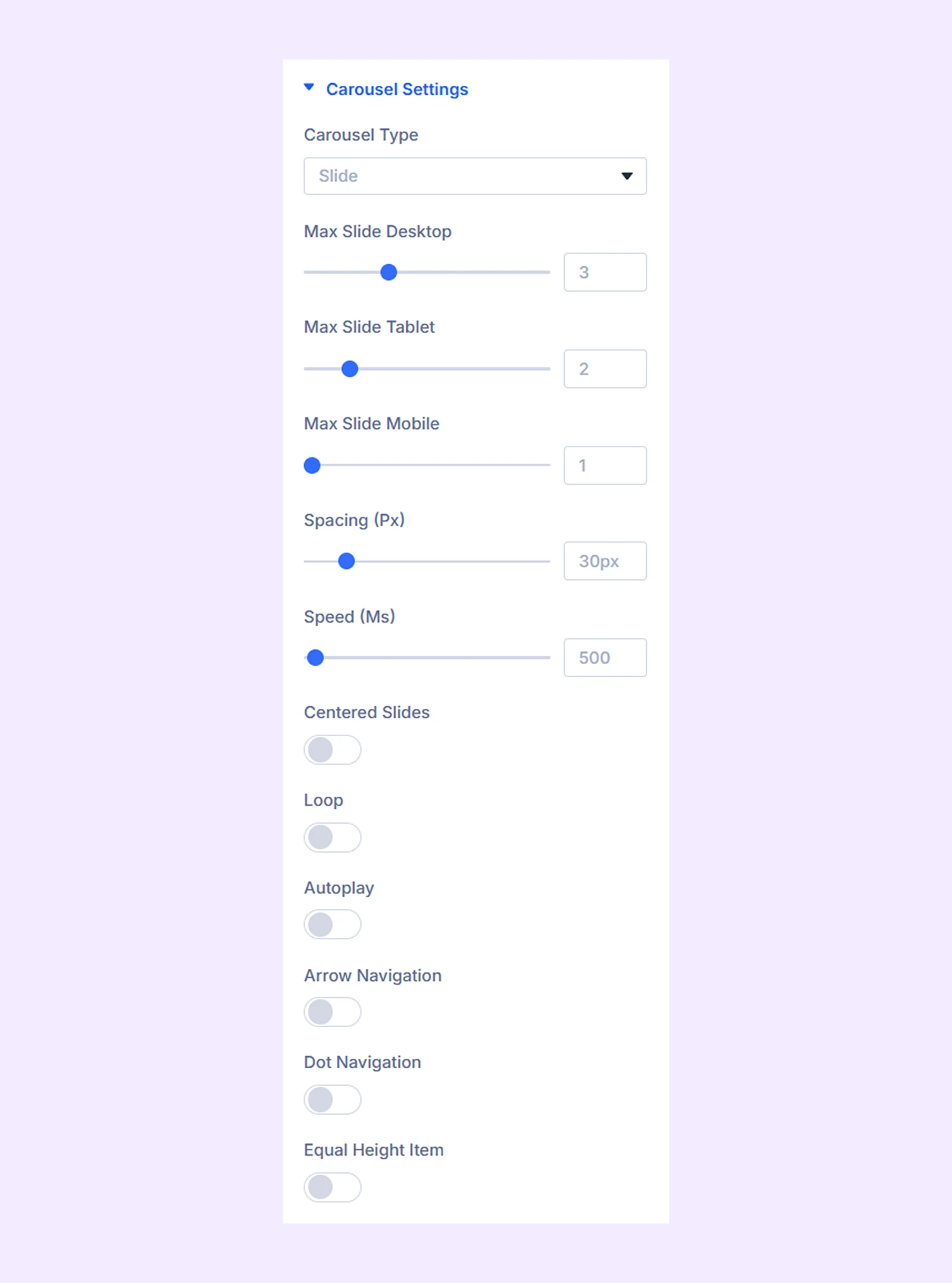
- Carousel Type: Choose the type of the carousel you want to use. You have two options: Slide or Coverflow.
- Max Slide Desktop: Choose the number of carousel items you want to display on desktop devices.
- Max Slide Tablet: Choose the number of carousel items you want to display on tablets.
- Max Slide Mobile: Choose the number of carousel items you want to display on mobile devices.
- Spacing: Adjust the space between the carousel items.
- Speed: Define the slide speed for the carousel items.
- Centered Slides: The first slide will be placed at the center when this option is toggled on.
- Loop: Enable this option to add a loop effect to the post carousel.
- Autoplay: Enable this option to have the sliders rotate automatically.
- Autoplay Speed: Define the speed of the autoplay effect. Only available when autoplay is enabled.
- Pause on Hover: When enabled, the auto-playing slide will pause when hovered. Only available when autoplay is enabled.
- Arrow Navigation: Turn on to enable arrows to navigate the post sliders.
- Dot Navigation: Turn on to enable dots to navigate the post sliders.
- Equal Height Item: Enable this to make all the post sliders equal in height.
Advanced Settings
If you select “Coverflow” as the “Carousel Type,” you’ll gain access to coverflow slider customization settings.
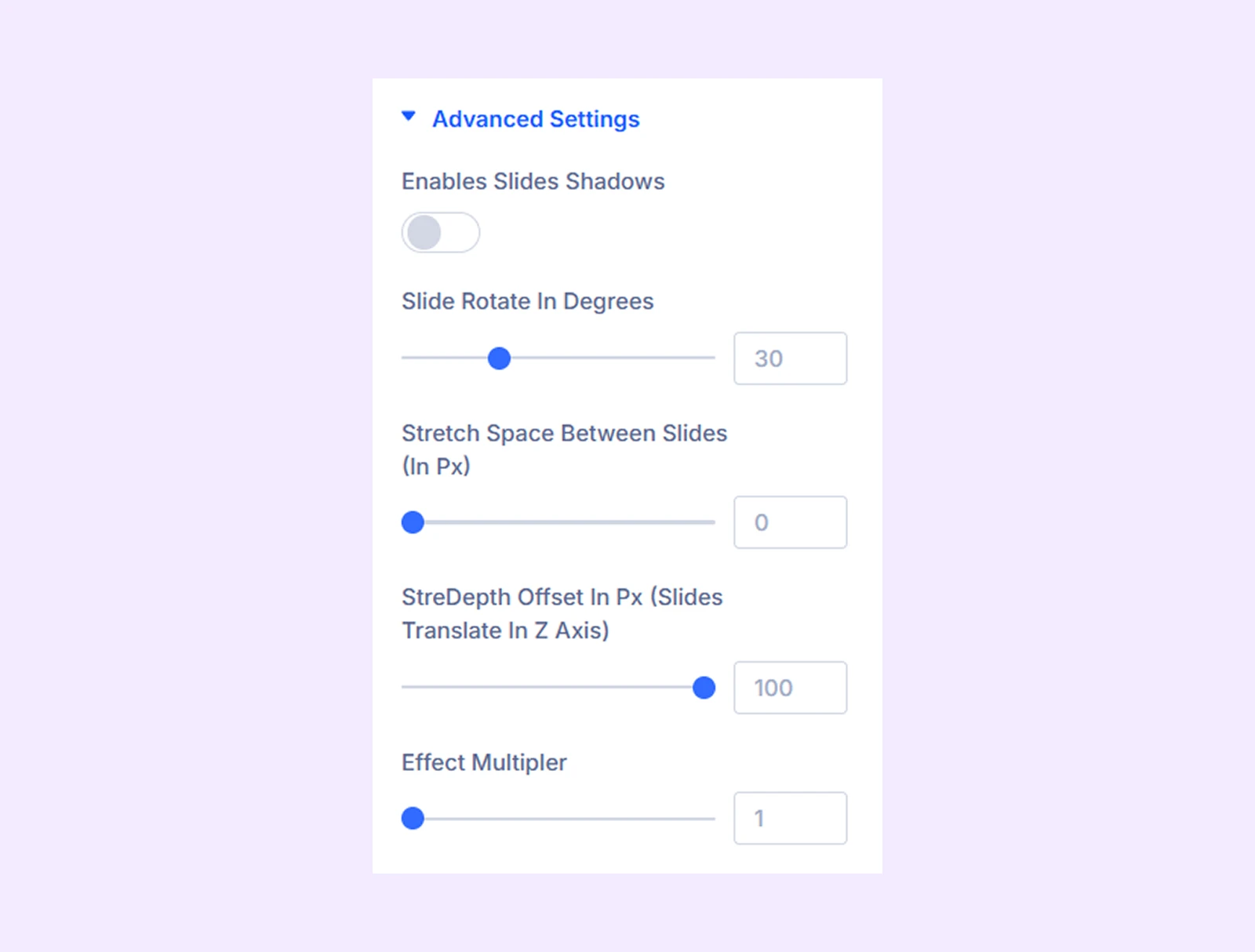
- Enables Slides Shadows: Turn on to add a shadow effect to the coverflow sliders.
- Shadow Color Dark: Choose the darker shade for the shadow effect.
- Shadow Color Light: Choose the lighter shade for the shadow effect.
- Slide Rotate in Degrees: Adjust the angle of the carousel items.
- Stretch Space Between the Slides: Adjust the gap between the slides.
- StreDepth Offset In Px (Sliders Translate In Z Axis)
- Effect Multiplier: Determines how many times the carousel items will slide or rotate.
Item Background: Add a background color, gradient, or an image to all the carousel sliders.
Background: Add a background color, gradient, image, video, pattern, or mask to the module.
Element Label: Rename the module to organize it more easily in the Divi Builder. (Only you can see this label.)
Design Tab
Customize the appearance of the Post Carousel Module with advanced design settings.
Alignment: Change the placement of all the post elements relative to the carousel sliders’ containers.
Item Outer Wrapper: Border customization options for the outer wrapper of the carousel sliders.
Item Inner Wrapper: Border customization options for the inner wrapper of the carousel sliders.
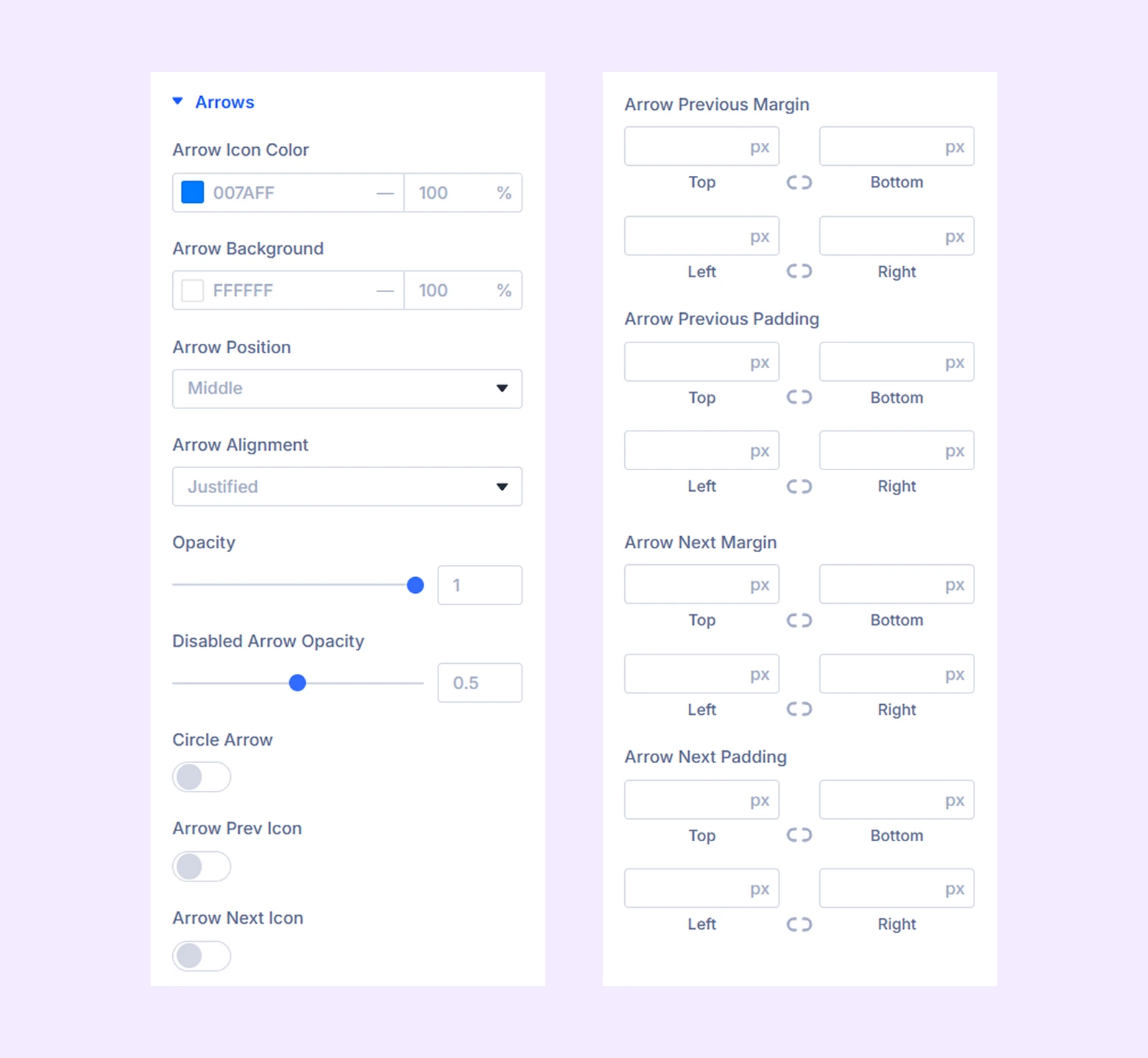
Arrows
- Arrow Icon Color: Pick a color for the arrow navigation icons.
- Arrow Background: Pick a background color for the arrow navigation icons.
- Arrow Position: Change the vertical position of the arrow buttons relative to the post sliders.
- Arrow Alignment: Change the horizontal position of the arrow buttons. ]
- Opacity: Adjust the transparency of the arrow buttons.
- Disabled Arrow Opacity: Adjust the transparency of the arrow buttons.
Note: The navigation arrows will be disabled when you reach the end of the carousel if the loop effect is not active.
- Circle Arrow: Enable to make the arrow buttons circular.
- Spacing: Add custom margin and padding to the arrow buttons.
- Arrow Prev Icon: Toggle on to use a custom icon for the previous button.
- Arrow Next Icon: Toggle on to use a custom icon for the next button.
There you will also find padding and margin settings for arrow previous and arrow next.
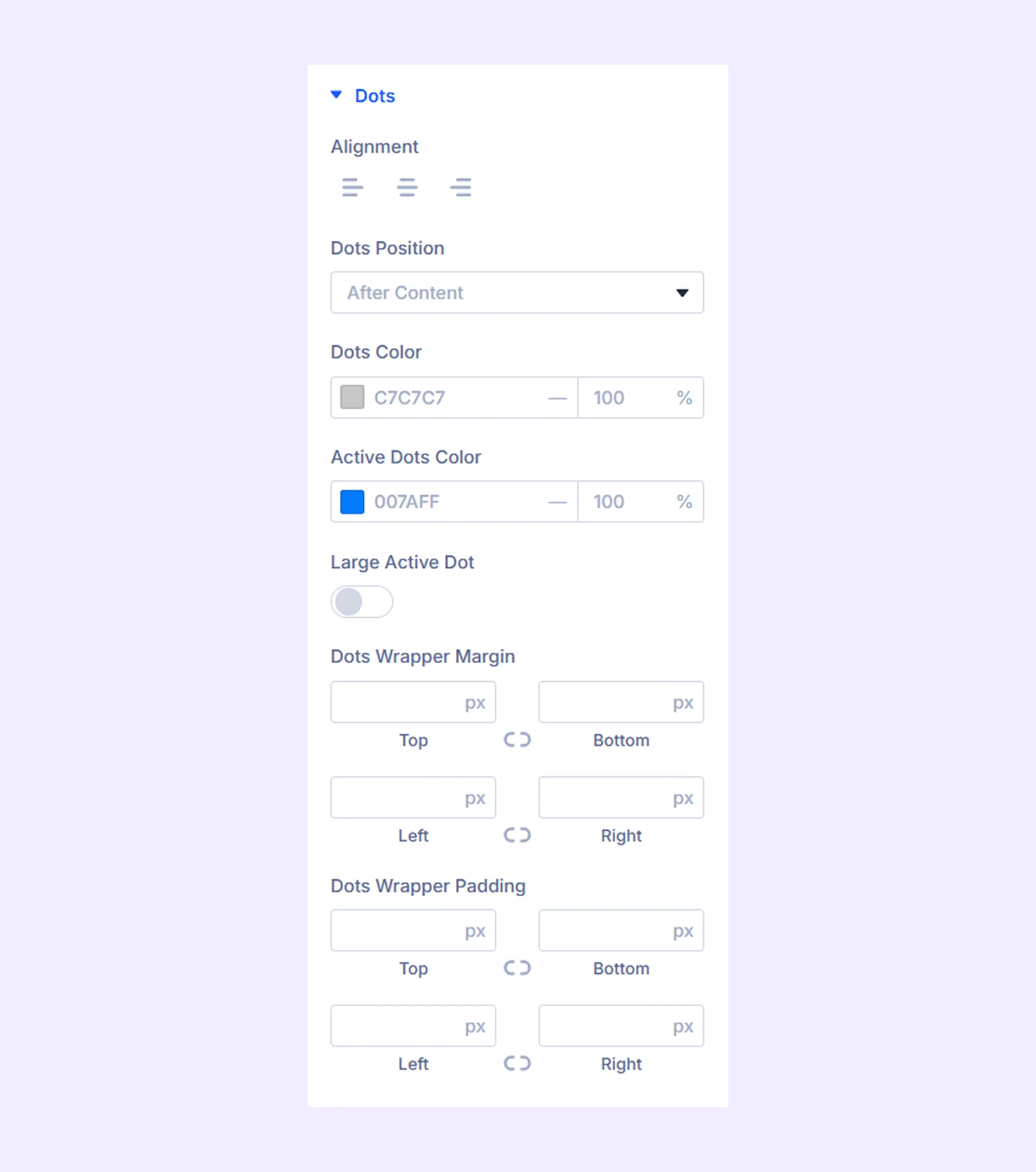
Dots
- Alignment: Change the horizontal position of the dots relative to the post sliders.
- Dots Position: Choose if you want to place the dots before or after the carousel.
- Large Active Dot: Make the active dot larger than the rest.
- Dots Color: Pick a color for the dots.
- Active Dots Color: Pick a separate color for the active dot.
- Spacing: Add custom margin and padding to the dots.
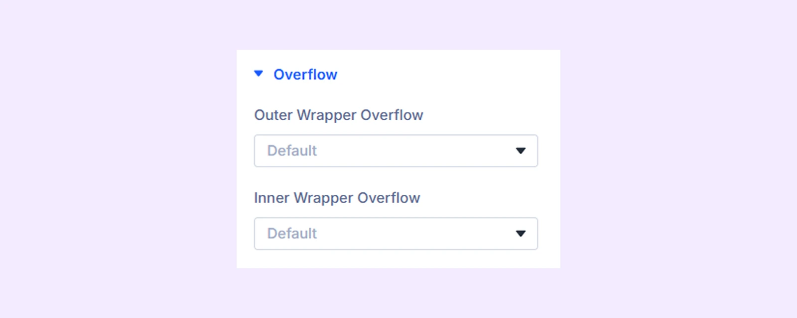
Overflow
- Outer Wrapper Overflow: Control how content within the outer container is handled when it exceeds its boundaries.
- Inner Wrapper Overflow: Control how content within the inner container is handled when it exceeds its boundaries.
Sizing: Adjust the width, height, and alignment of the module.
Spacing: Add custom margin and padding to the module’s container.
Animation: Apply reveal animation effects and customize delay, duration, repeat settings, and animation type.
Advanced Tab
This tab provides additional settings for advanced users who want greater control over the module with custom code, conditions, and more.
Post Element Settings
From this settings tab, you can customize each post element separately. Any customization you make here will override the settings you make in the “Post Carousel Settings.”
Content Tab
Element
Type: Choose the type of the post element. There are 12 different post elements to choose from. However, you can use custom post elements, by using an ACF (Advanced Custom Field) plugin.
If you choose “Post Image”
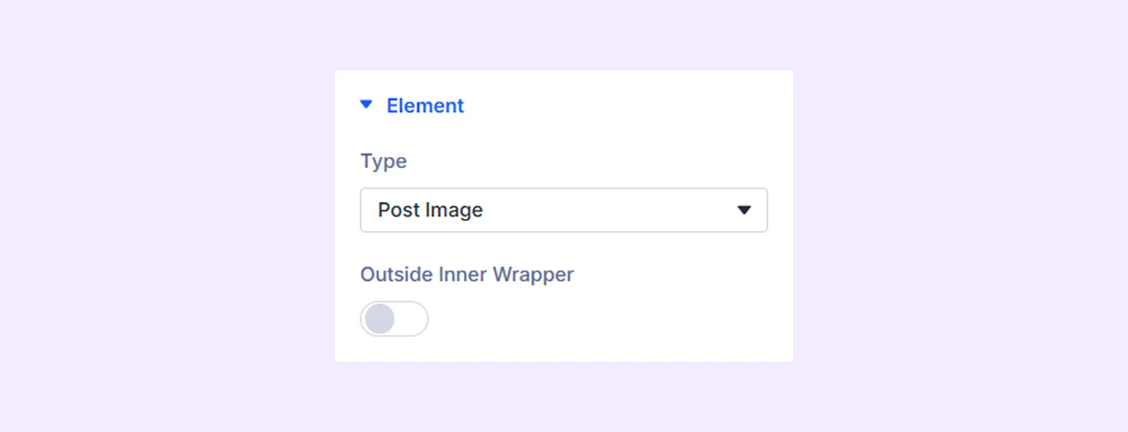
- Outside Inner Wrapper: Enable the featured image of the post to be placed outside the inner wrapper but inside the outer wrapper.
If you choose “Post Title”
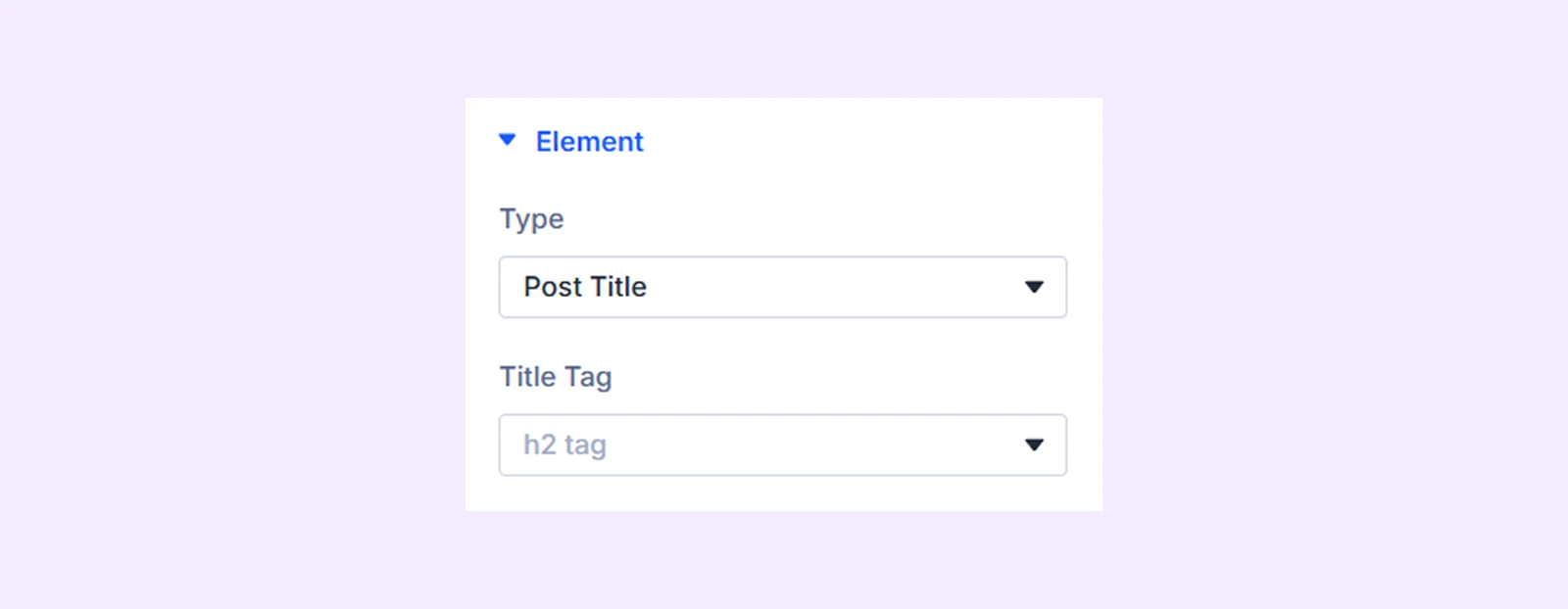
- Title Tag: Choose the HTML tag for the post title.
If you choose the “Post Content”
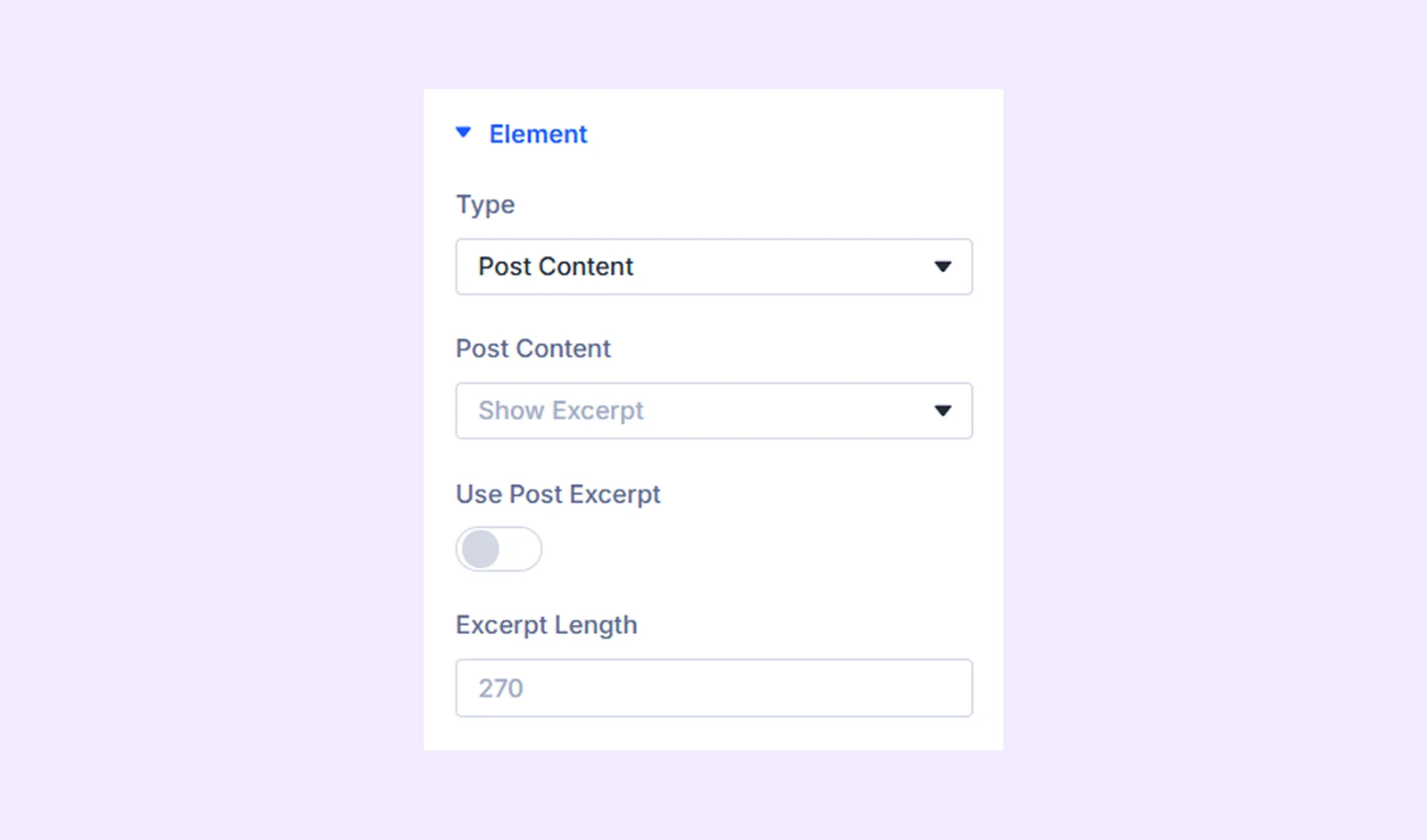
- Post Content: Choose whether to display the full post content or just the excerpt.
- Use Post Excerpt: Toggle this option on to display the manually submitted post excerpt.
- Excerpt Length: Define the number of characters to display for the excerpt. If no manual excerpt is provided, the system will automatically generate one from the post content, and this setting will control its length.
If you choose the “Read More Button”
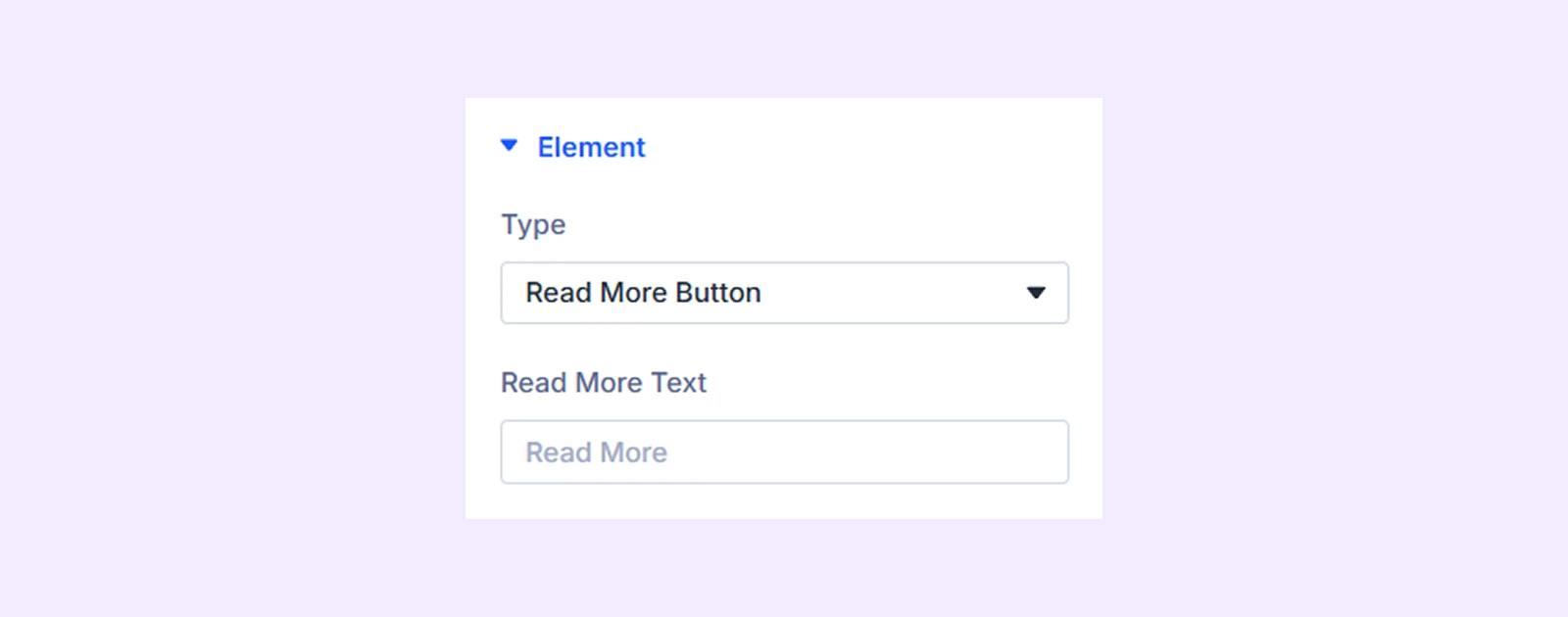
- Read More Text: Type in the text of the “Read More” button.
If you choose “Post Author”
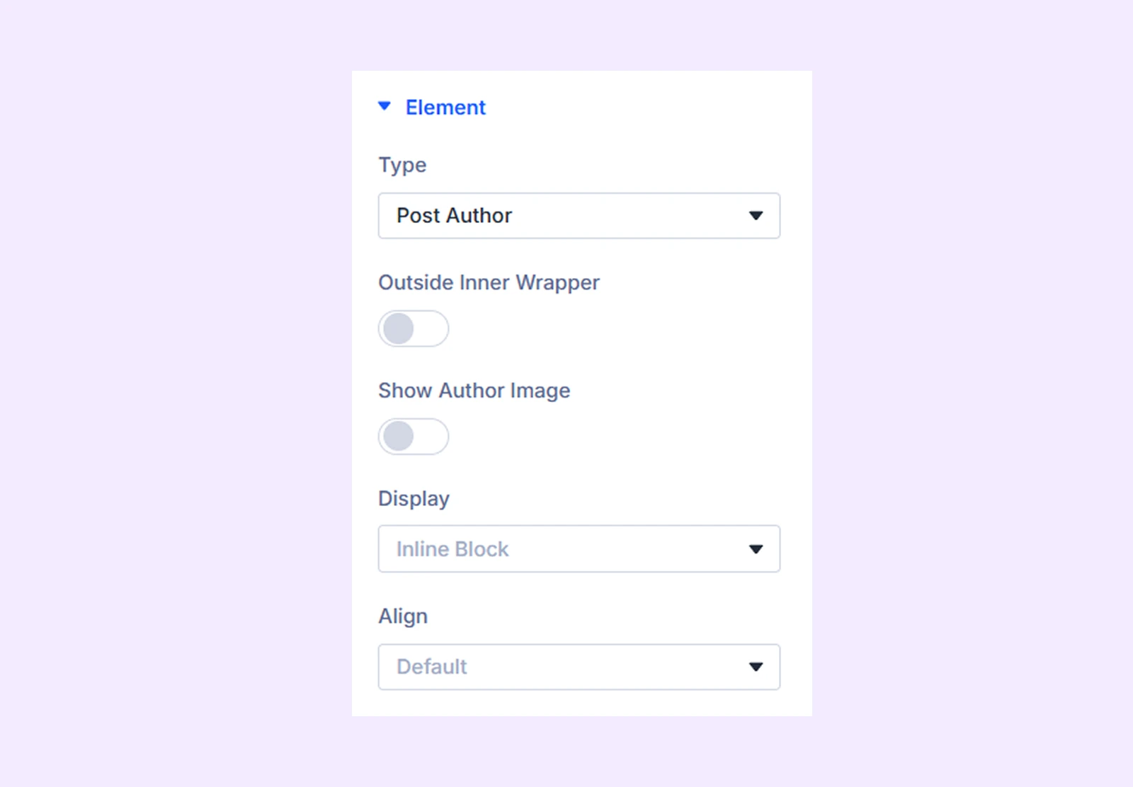
- Outside Inner Wrapper: Enable the author’s name to be placed outside the inner wrapper but inside the outer wrapper.
- Show Author Image: Enable to display author image along with the name.
- Author Image Size: Adjust the size of the author image.
- Hide Author Text: Enable to hide the author’s name and only display the image.
- Display: Select how to display the post element: inline (on the same line), inline block (next to each other with potential line breaks), or block (on separate lines).
- Align: Choose the horizontal placement of the author’s name. Not available when “Block” is selected as the display option.
If you choose “Publish Date”
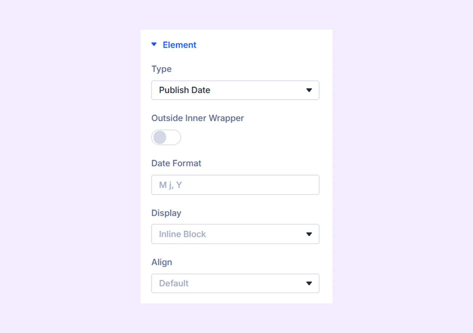
- Outside Inner Wrapper: Enable to place the post publish date outside the inner wrapper but inside the outer wrapper.
- Date Format: Define the date format. Use any combination from here.
- Display: Select how to display the post element: inline (on the same line), inline block (next to each other with potential line breaks), or block (on separate lines).
- Align: Choose the horizontal placement of the date. Not available when “Block” is selected as the display option.
If you choose “Post Categories” or “Post Tags”
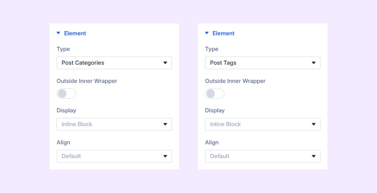
- Outside Inner Wrapper: Enable to place the post categories or post tags outside the inner wrapper but inside the outer wrapper.
- Display: Select how to display the post element: inline (on the same line), inline block (next to each other with potential line breaks), or block (on separate lines).
- Align: Choose the horizontal placement of the post categories or post tags. Not available when “Block” is selected as the display option.
If you choose “Post Comments”
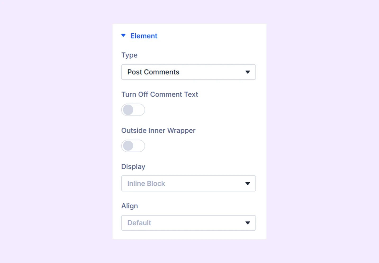
- Turn Off Comment Text: Enable to hide the text of the comments.
- Outside Inner Wrapper: Enable the post comments to be placed outside the inner wrapper but inside the outer wrapper.
- Display: Select how to display the post element: inline (on the same line), inline block (next to each other with potential line breaks), or block (on separate lines).
- Align: Choose the horizontal placement of the post comments. Not available when “Block” is selected as the display option.
If you choose “Custom Text”
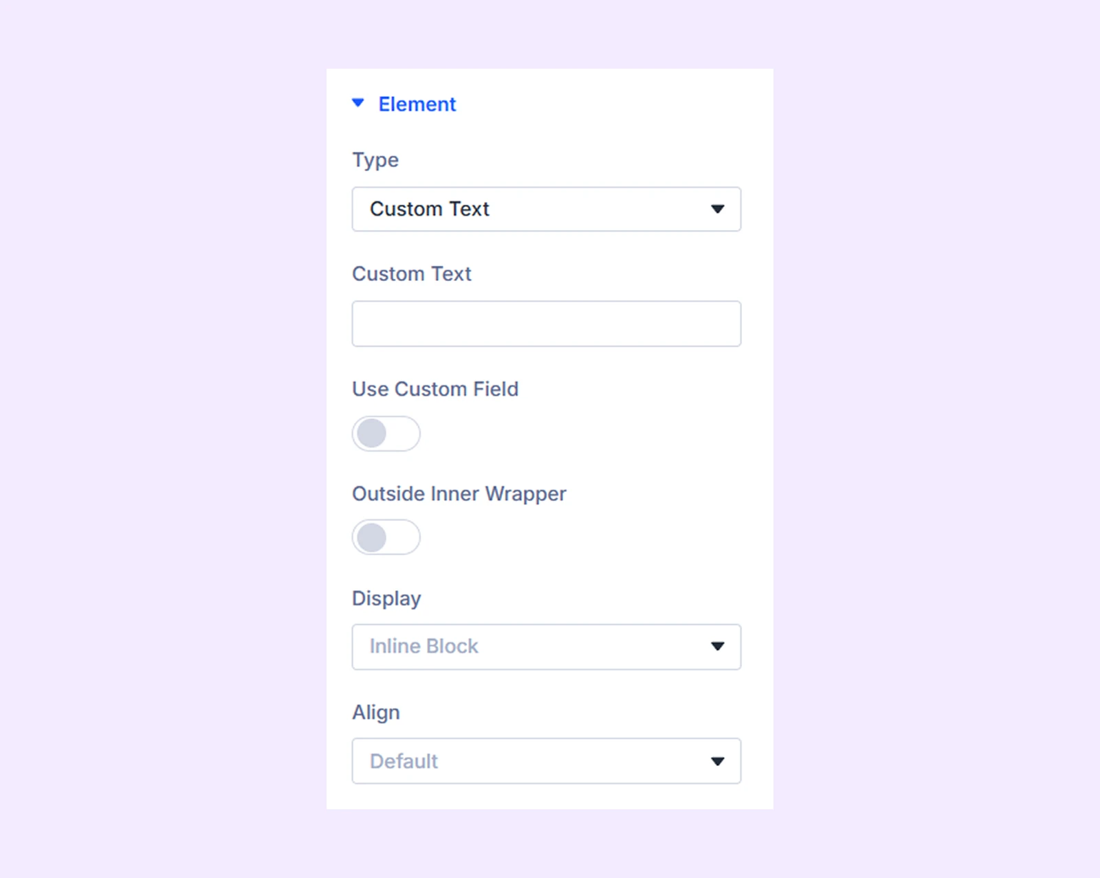
- Outside Inner Wrapper: Enable to place the custom text outside the inner wrapper but inside the outer wrapper.
- Custom Text: Input the custom text you want to display.
- Display: Select how to display the post element: inline (on the same line), inline block (next to each other with potential line breaks), or block (on separate lines).
- Align: Choose the horizontal placement of the custom text. Not available when “Block” is selected as the display option.
If you choose “Reading Time”
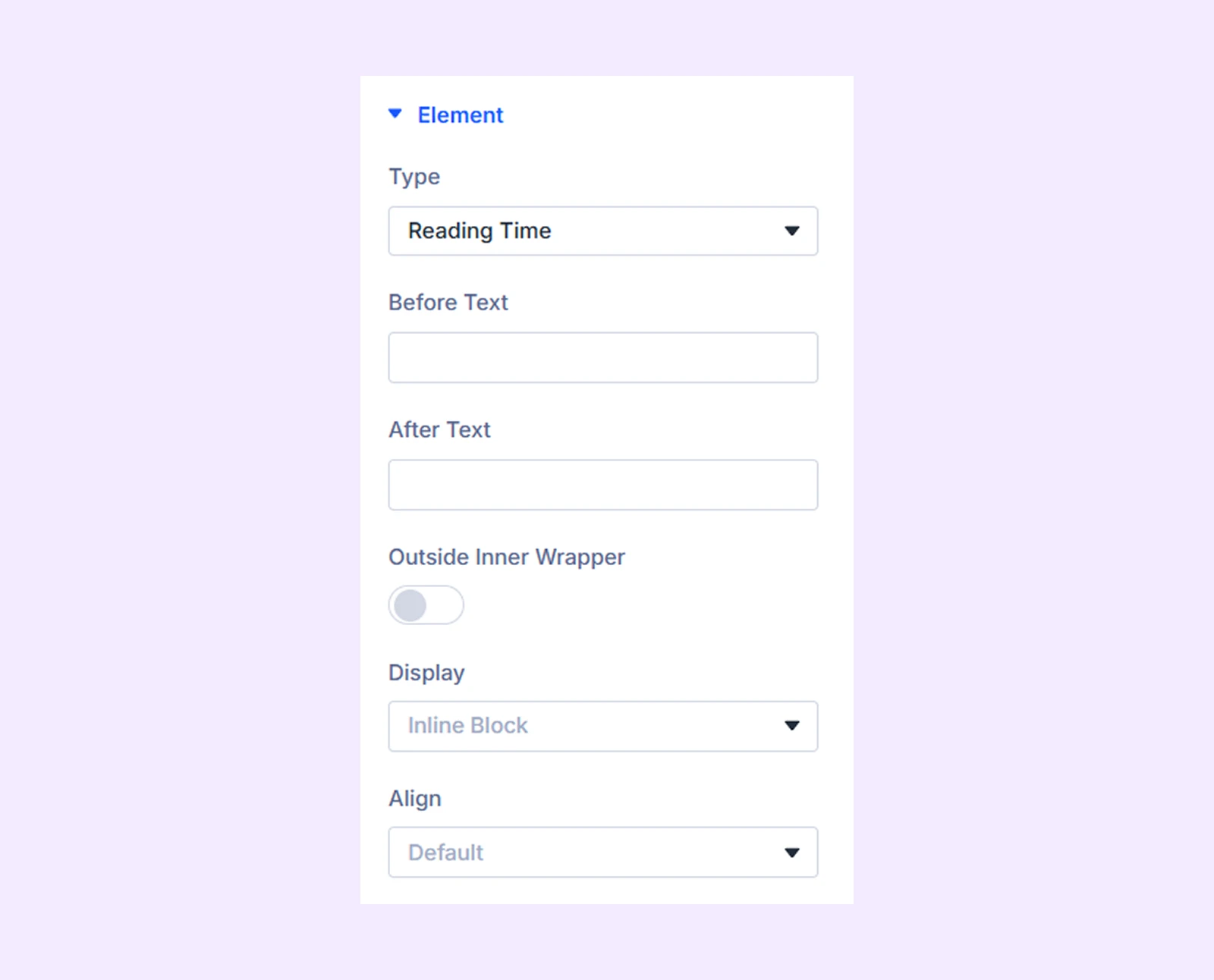
- Before text: Add text that will appear before the reading time value.
- After Text: Add text that will appear after the reading time value.
- Outside Inner Wrapper: Enable this option to place the reading time element outside the inner wrapper but still inside the outer wrapper of the carousel item.
- Display: Choose how the reading time element is displayed: inline (on the same line), inline-block (next to other elements), or block (on a separate line).
- Align: Set the horizontal alignment of the reading time element within its container. Not available if “Block” display is selected.
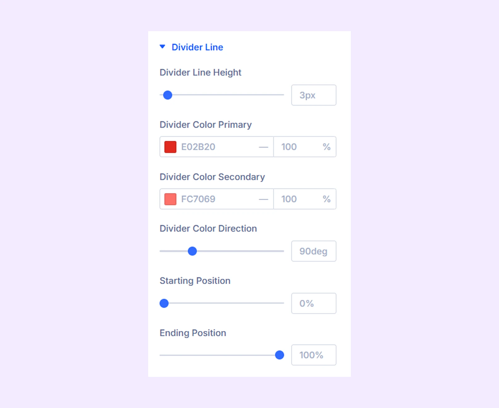
If you choose “Divider” it will add a divider line in

If you choose “ACF Fields”
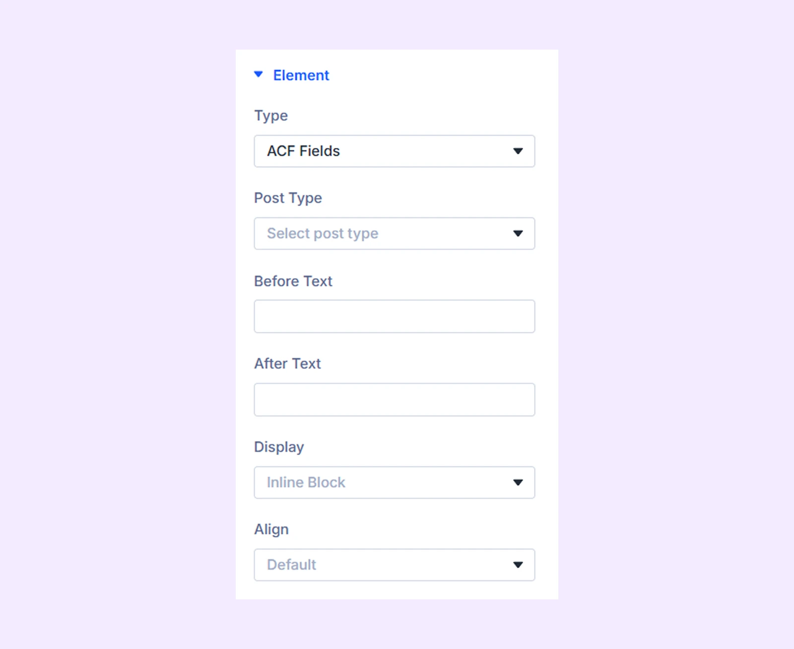
- Post Type: Choose the type of post you want to display in the ACF fields. You have three options: Posts, Projects, and Products.
- Select ACF Field: Select the ACF field value you want to display.
- Before Text: Add text that will be displayed before the ACF field value.
- After Text: Add text that will be displayed after the ACF field value.
- Display: Select how to display the post element: inline (on the same line), inline block (next to each other with potential line breaks), or block (on separate lines).
- Align: Choose the horizontal placement of the ACF field value. Not available when “Block” is selected as the display option.
Note: This section will not be visible unless you have an ACF plugin installed and activated.
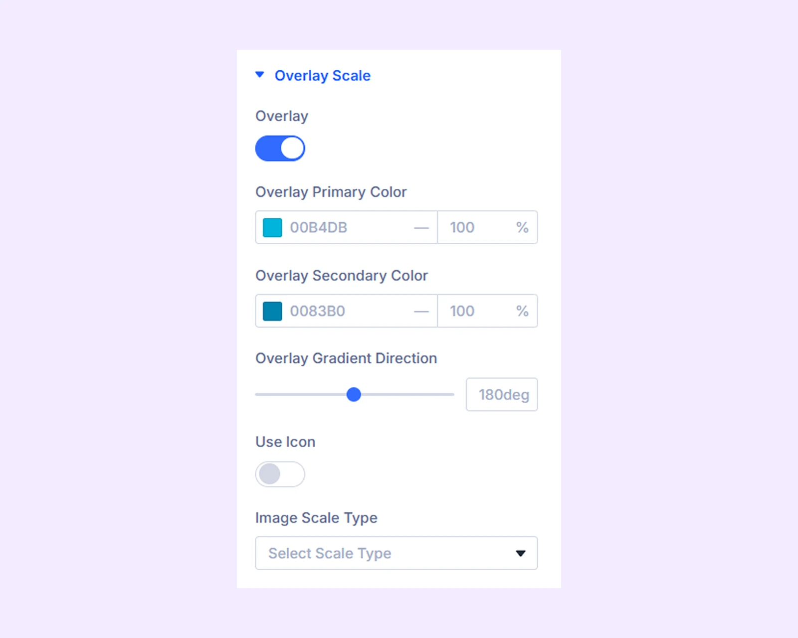
Overlay and Scale
If you choose “Post Image” as the “Type”, this additional section will show up.
- Overlay: Enable to add a gradient over the post image on hover.
- Overlay Primary Color: Choose the primary color for the overlay gradient.
- Overlay Secondary Color: Choose the secondary color for the overlay gradient.
- Overlay Gradient Direction: Adjust the overlay gradient direction.
- Use Icon: Enable to use an icon on the overlay gradient.
- Icon Color: Choose a color for the overlay icon.
- Icon Size: Adjust the size of the overlay icon.
- Icon Reveal Type: Choose the reveal animation for the overlay icon.
- Image Scale Type: Choose how the post image will animate on hover.
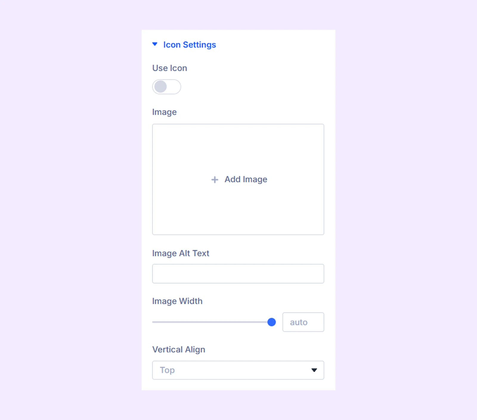
Icon Settings.
If you choose the “Read More Button”, “Post Author”, “Publish Date”, “Post Categories”, “Post Tags”, and “Post Comment” as the “Type”, this additional section will show up.
- Use Icon: Enable to use an icon for the selected post element.
- Icon Color: Choose a color for the icon.
- Icon Size: Adjust the size of the icon.
- Enable Vertical Align Center: Enable to place the icon both vertically and horizontally in the center of its container.
- Image: Upload an image to use instead of the icon.
- Image Alt Text: Submit an alt text for the image.
- Image Width: Specify the width of the image.
- Vertical Align: Change the vertical placement of the post element relative to the image.
Divider Line
- Divider Line Height: Adjust the height of the divider line.
- Divider Color Primary: Choose the primary color for the divider gradient.
- Overlay Color Secondary: Choose the secondary color for the divider gradient.
- Divider Color Direction: Adjust the divider gradient direction.
- Starting Position: Adjust the starting position of the divider gradient.
- Ending Position: Adjust the ending position of the divider gradient.
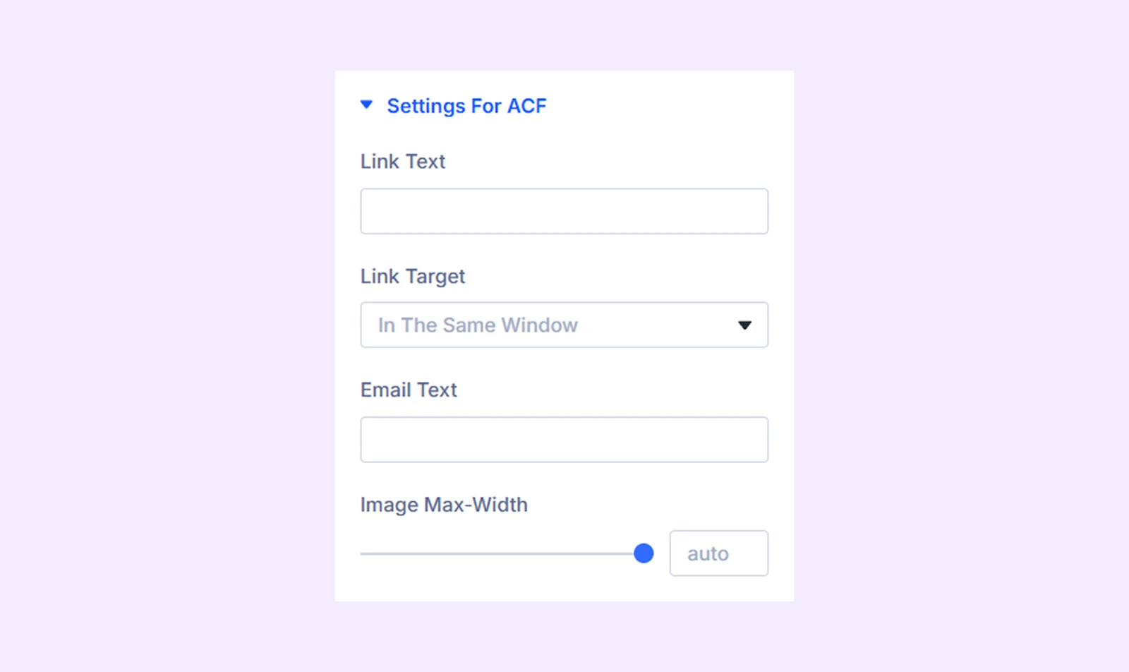
Settings For ACF
If you choose “ACF Fields” as the “Type”, this addition section will show up.
- Link Text: Input the text that will mask the URL in the custom URL field.
- Link Target: Decide if you want the URL to open in a new or the same tab.
- Email Text: Input the text that will mask the email address in the custom email field.
- Image Max Width: Set a maximum width limit for the image in the custom image field.
Background: Set a background for the individual post element.
Element Label: Rename the post element to organize it more easily within the Post Carousel module.
Design Tab
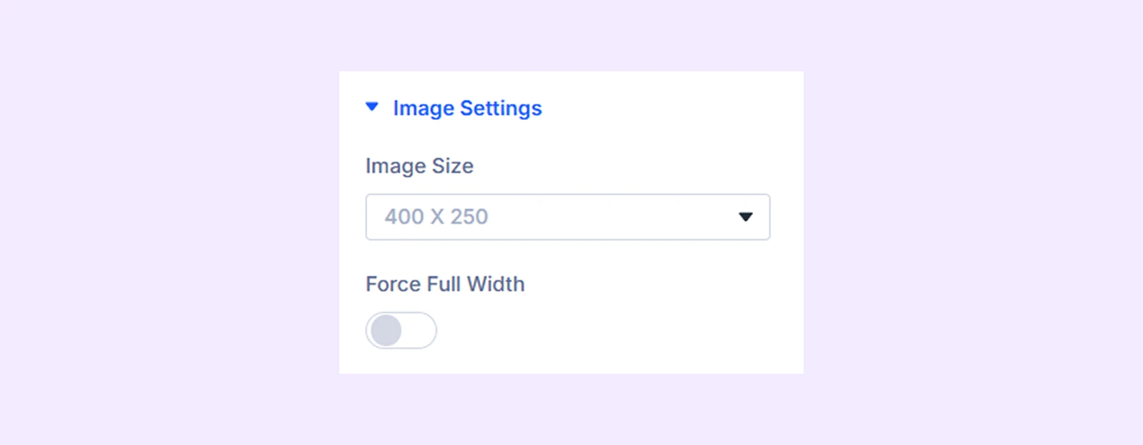
Image Settings
If you choose “Post Image” as the “Type”, this addition section will show up.
- Image Size: Select the desired post image size: original, large (1080×675), or small (400×250).
- Force Full Width: Toggle on to make the post images full width.
Text: Options to change the alignment of the text in the post element and add a shadow effect to it.
Text Styles: Typography options for the text in the post element.
Spacing: Add custom margins and padding to the post element.
Before After Text: If you use an ACF plugin to add custom field elements to your posts, you can add text before and after the value of that custom field element. In this section, you can style the typography of the before and after text.
Sizing: Adjust the width, height, and alignment of the post element.
Border: Border customization options for the post element. You have the option to style each border individually or all the borders together.
Box Shadow: Apply a shadow effect to the post element.
Filters: Add color filters to the post element.
Transform: Change the scale, placement, size, angle, etc. of the post element.
Advanced Tab
This tab provides additional settings for the individual post element.
Need Help?
If you have any questions or need assistance, contact our support team: [email protected]