
DiviFlash Interactive Circle module (introduced in DiviFlash 5.1.0) lets you display content in a circular layout.
Important Note: Interactive Circle module is built for Divi 5 only. Also, it will be disabled by default and to use it, you must enable it manually. Refer to our guide for step-by-step instructions.
Let’s see the settings in brief and how to make better use of it —
Content Tab
This tab contains all essential settings to create and manage your Interactive Circle layout.
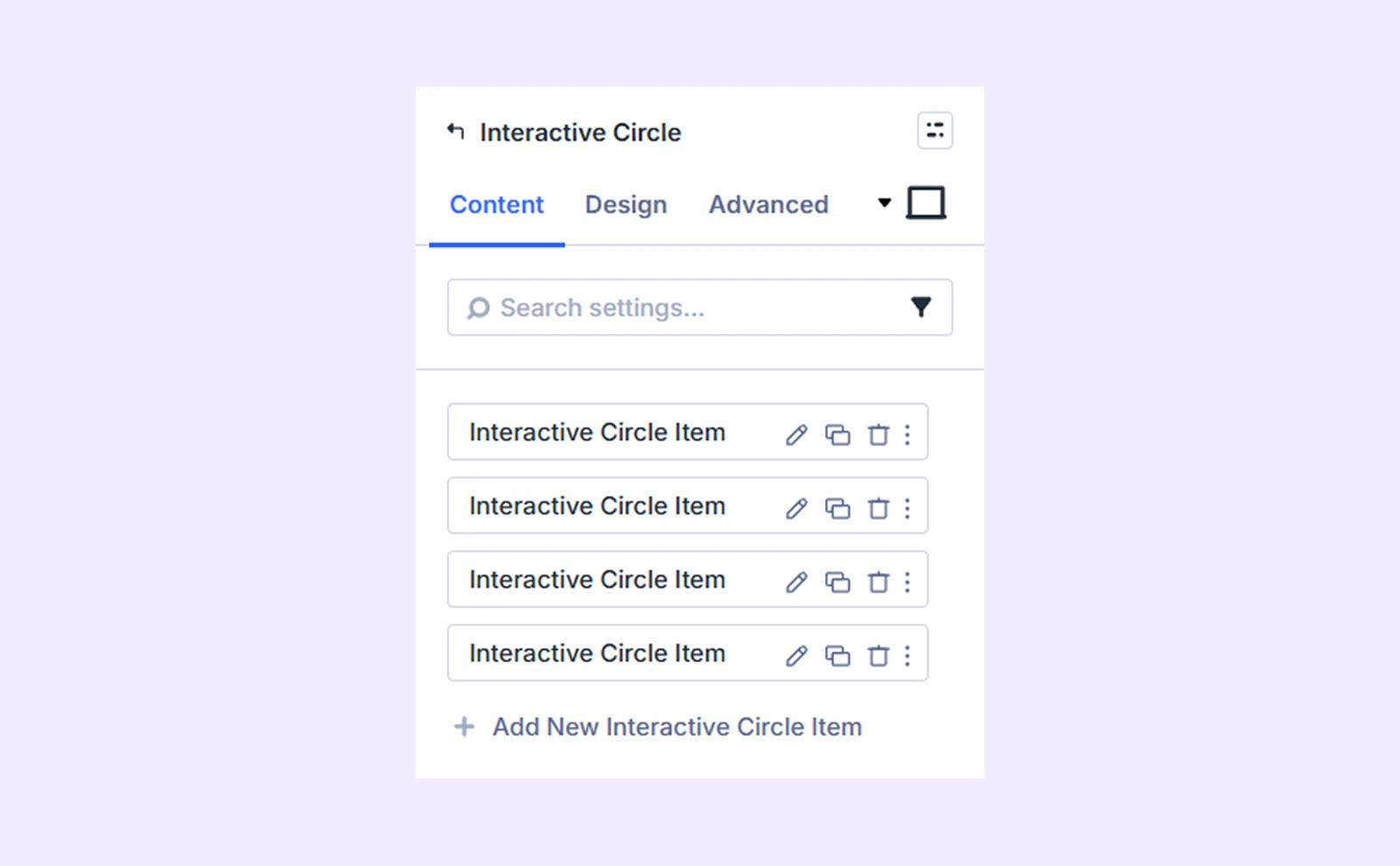
Add New Circle Info Item
Click “+ Add New Circle Info Item” to create individual items inside the circle. Each item can include its own content, icon/image, and styling. By default, you will see four circle items that you can edit or delete. Click here to learn more about item wise customization.
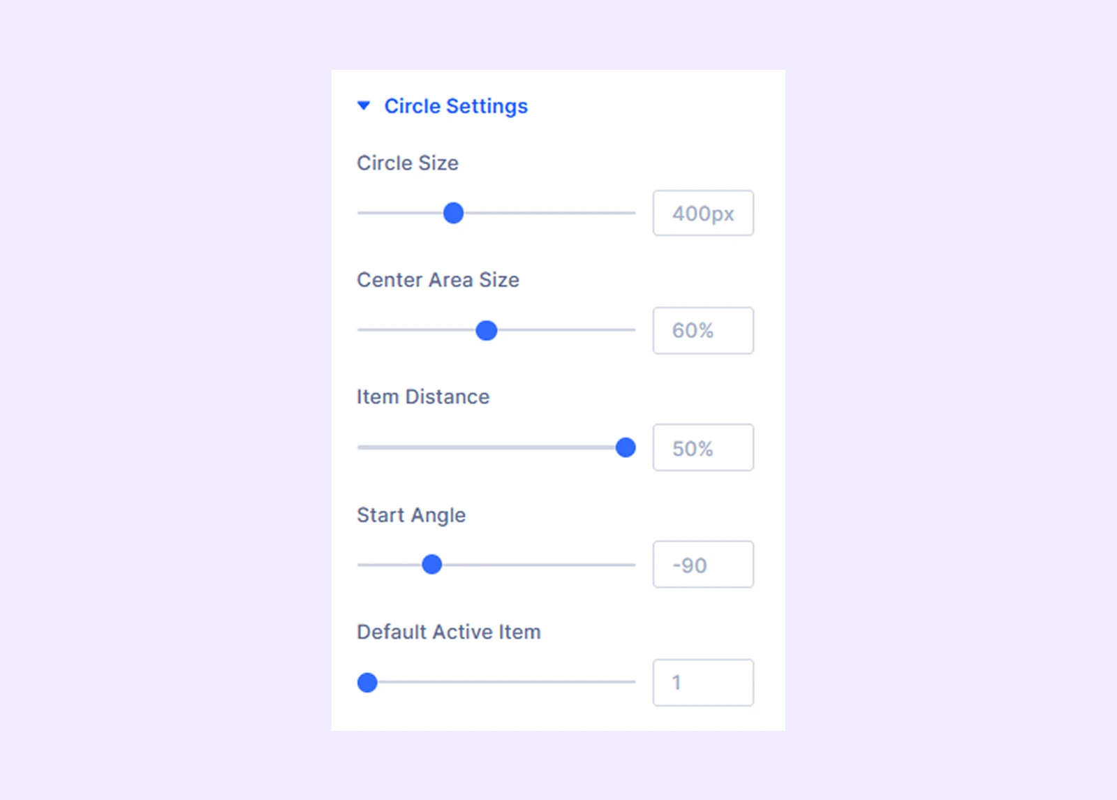
Circle Settings
- Circle Size: Set the overall size of the circle.
- Center Area Size: Adjust the middle/center content area size.
- Item Distance: Set space between center and items.
- Start Angle: Choose where the first item starts.
- Default Active Item: Set which item is active when the page loads.
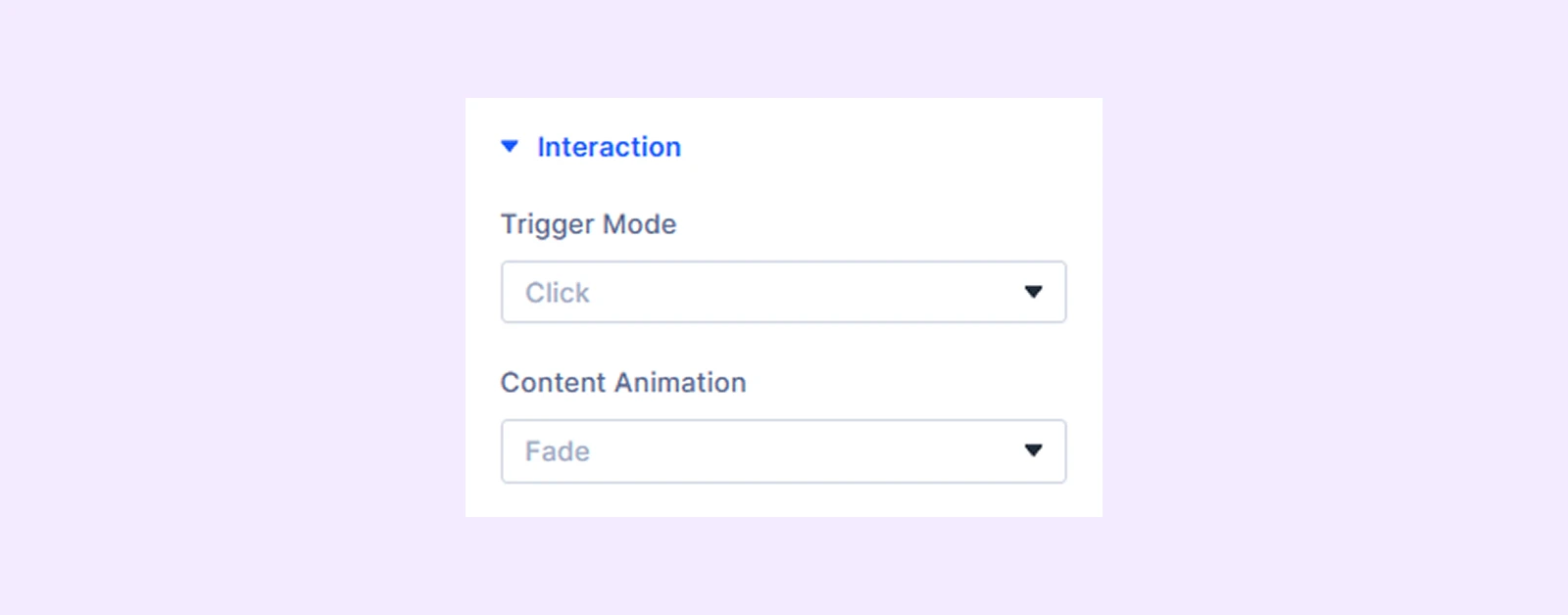
Interaction
- Trigger Mode: Choose interaction type (click or hover)
- Content Animation: Choose animation when content changes.
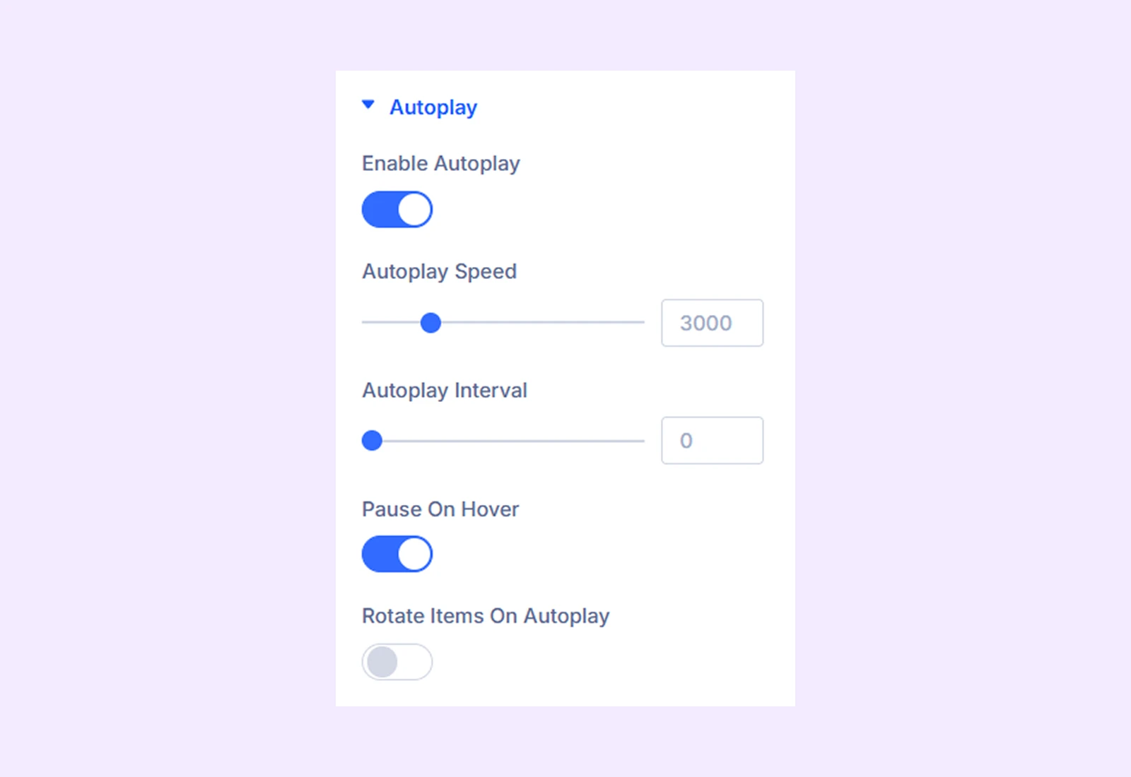
Autoplay
- Enable Autoplay: Turn autoplay on or off
- Autoplay speed: Controls the transition speed between items.
- Autoplay Interval: Sets the delay between each transition.
- Pause On Hover: Stop autoplay when user hovers.
- Rotation Items On Autoplay: Enables circular rotation during autoplay.
- Rotation Direction: Choose from 2 different options, clockwise or center-clockwise
- Rotation Speed: Set how fast items rotate
Link: Use this default Divi setting to add a link to the entire module.
Background: Add a background color, gradient, image, video, pattern, or mask to the module.
Element Label: Rename the module to organize it more easily in the Divi Builder. (Only you can see this label.)
Design Tab
Customize the appearance of the Interactive Circle Module with advanced styling options.
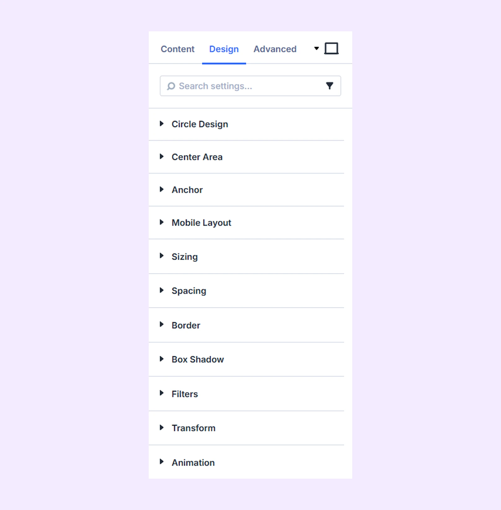
Circle Design: Add background, set border style for the circle layout.
Center Area: Typography options for title and body text, customize background, border, and spacing for the central section.
Anchor
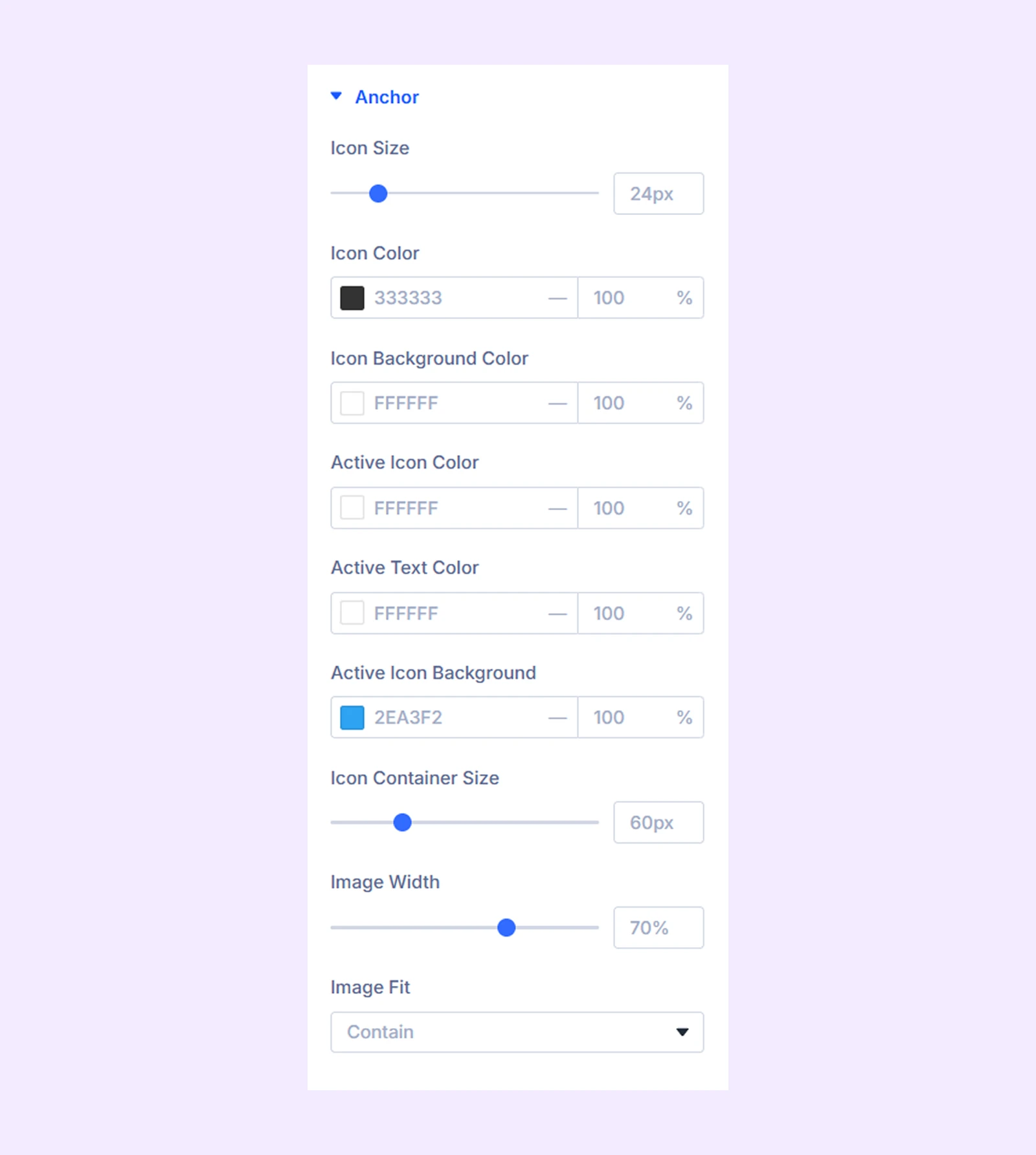
- Icon Size: Adjust icon size
- Icon color: Set default icon color
- Icon Background Color: Define icon background
- Active Icon Color: Set color for active item
- Active Icon Background: Background for active state
- Icon Container SIze: Adjust the container size
- Image width: Control image size
- Image Fit: Define how the image fits within its container
You will also find border-related settings for icons and images and typography options for anchor item text.
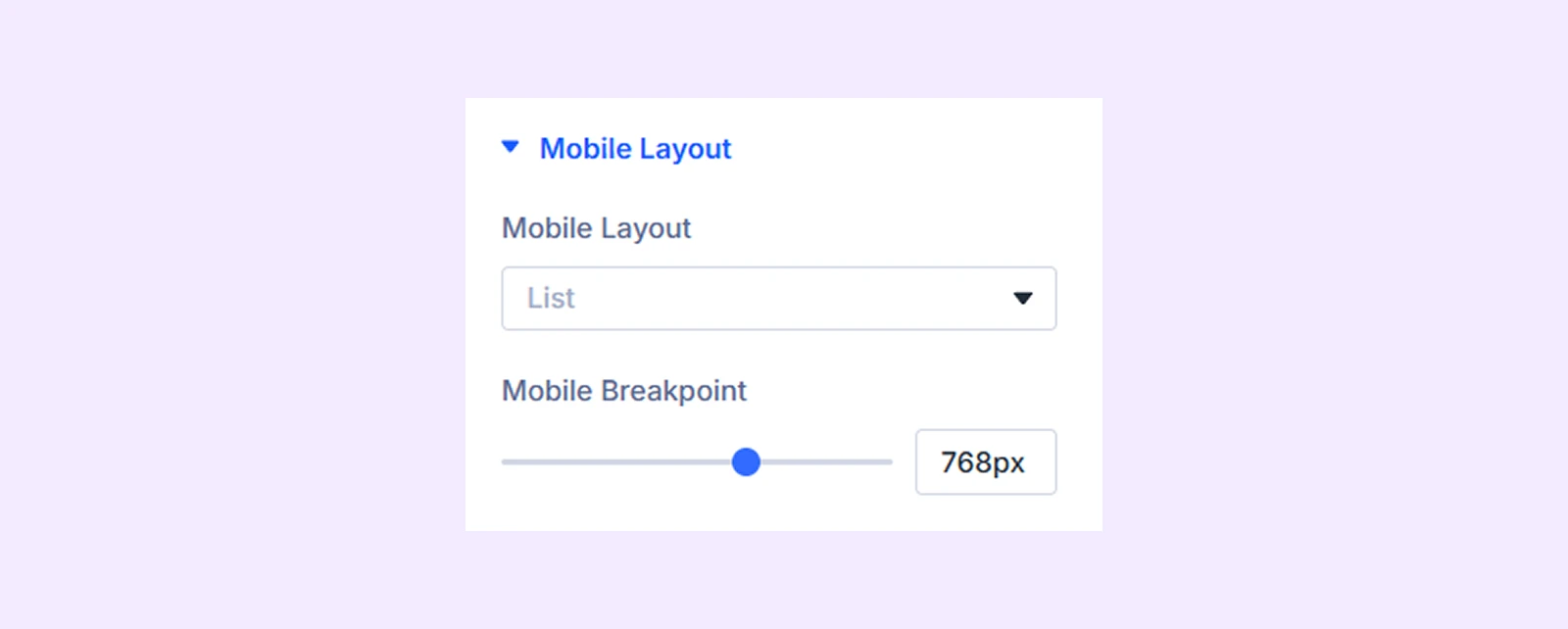
Mobile Layout
- Mobile Layout: Switch between circle or list view.
- Mobile Breakpoint: Set screen size for mobile layout.
Sizing: Adjust the width, height, and alignment of the module.
Spacing: Add custom margin and padding to the module’s container.
Border: Customize the border style, width, and color. And style each border separately or apply the same style to all sides.
Box Shadow: Add shadow effects to the module.
Filters: Apply color filters to enhance the appearance.
Transform: Scale, rotate, move, or skew the module.
Animation: Apply reveal animation effects and customize delay, duration, repeat settings, and animation type.
Advanced Tab
This tab provides additional settings for advanced users who want more control over the module with custom code, conditions, and more.
Circle Info Item Settings
From here, you can add and customize each circle item individually. Any changes made here will override the global settings of the Interactive Circle module.
Content Tab
Content: Add title and description for the item.
Anchor
From here you can choose what type of element you want to show.
If you choose “Icon”
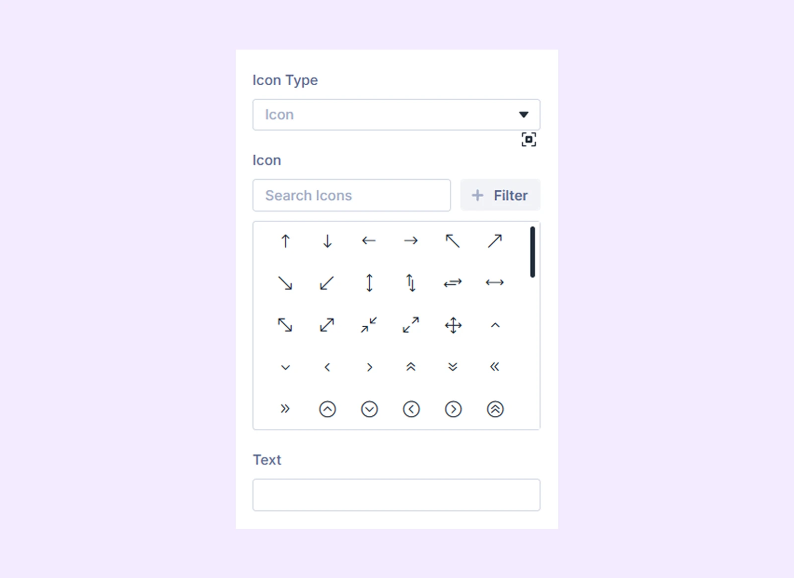
- Icon: Choose the icon you want to display
- Text: Option to add text that will
If you choose “Image”
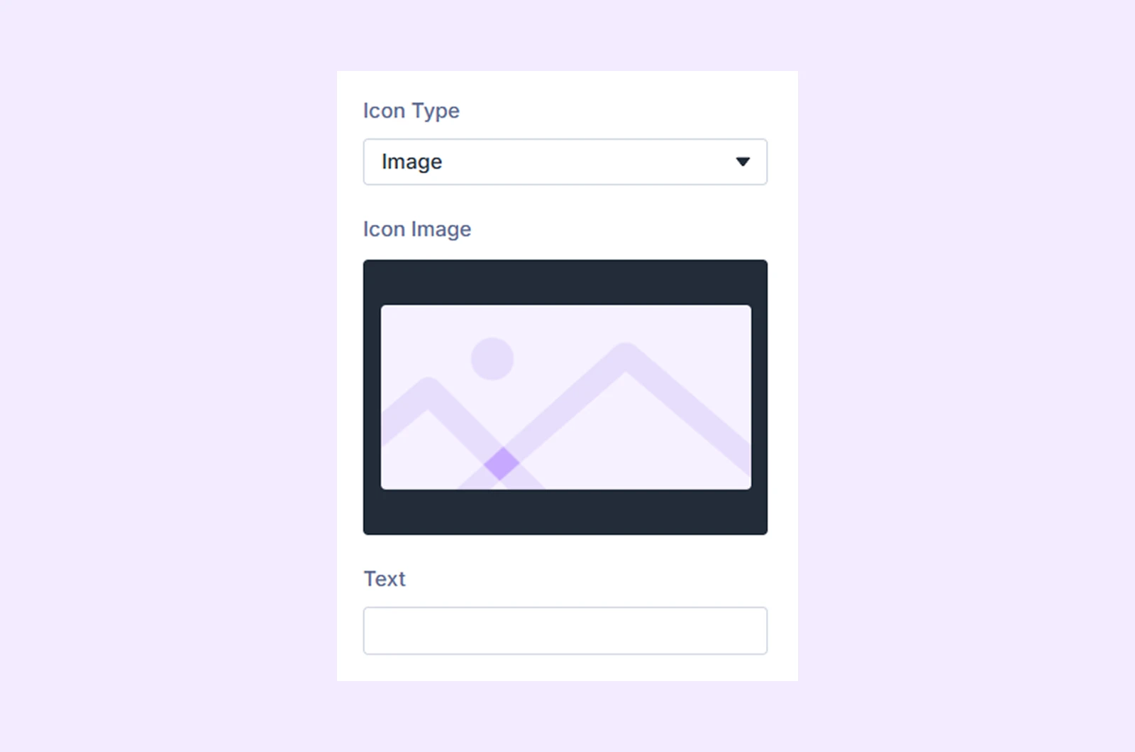
- Icon Image: Choose the image you want to display
- Text: Option to add text that will
You can also choose none to show nothing in the
Element
- Add Element: Add any Divi module, row, or saved layout inside an item.
- Apply Structure Template: A default Divi feature that lets you apply a ready-made layout quickly.
Meta
Element Label: Rename the item for easier identification in the builder (visible only to you).
Design Tab
- Center Area Background: Set background for this item’s center area.
- Icon Override: Customize icon styles for this specific item.
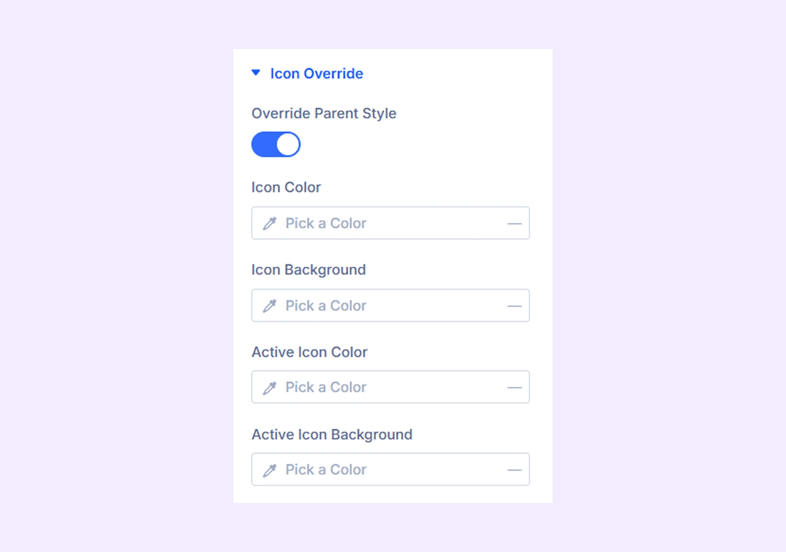
- Override Parent Style: Enable to use custom icon styles for this item.
- Icon Color: Set the icon color.
- Icon Background: Set the icon background color.
- Active Icon Color: Set the icon color for this item state.
- Active Icon Background: Set the icon background color for this item state.
- Title & Description: Customize typography and styling for title text and description text
There you will also find settings like border, box shadow and transforms. Some of them are also available at the module’s parent level.
Advanced Tab
Includes options for custom CSS, visibility rules, and conditional display settings for each item.
Need Help?
If you have any questions or need assistance, contact our support team: [email protected]