
The Timeline Tabs module, introduced in DiviFlash 5.3.0, lets you organize content into interactive timeline-based tabs.
Important Note: Timeline Tabs module is built for Divi 5 only. Also, it will be disabled by default and to use it, you must enable it manually. Refer to our guide for step-by-step instructions.
Let’s see the settings in brief and how to make better use of it —
Content Tab
The Content tab contains the essential settings for adding timeline items and controlling the behavior of the timeline tabs.
Add New Timeline Tab Item
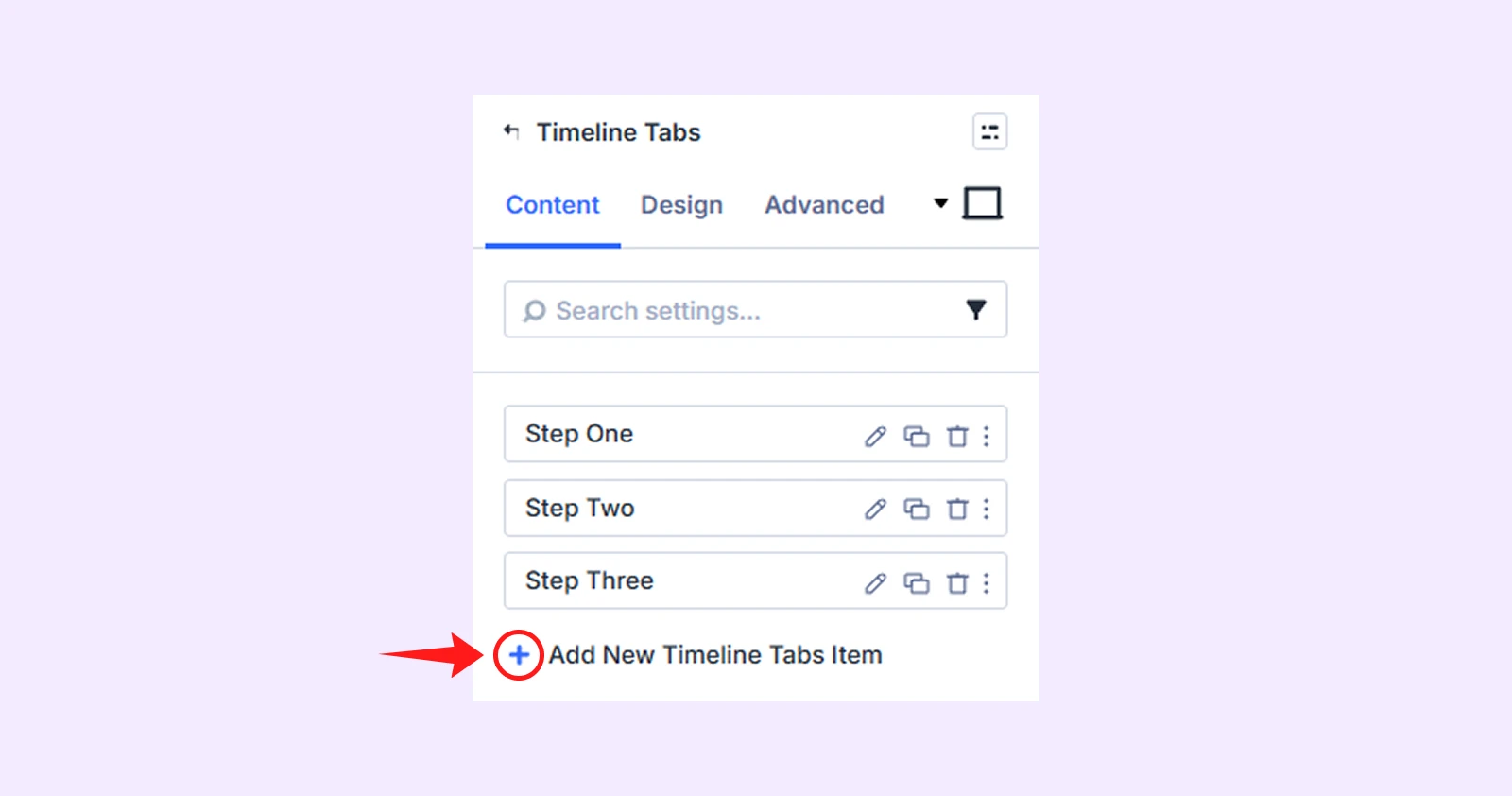
By default, the module includes three timeline tab items that you can edit, or delete. Click Add New Timeline Tab Item to add another item. Each tab item has separate settings. And to learn more, see the Timeline Tabs Child Item Settings section below.
Tabs Settings
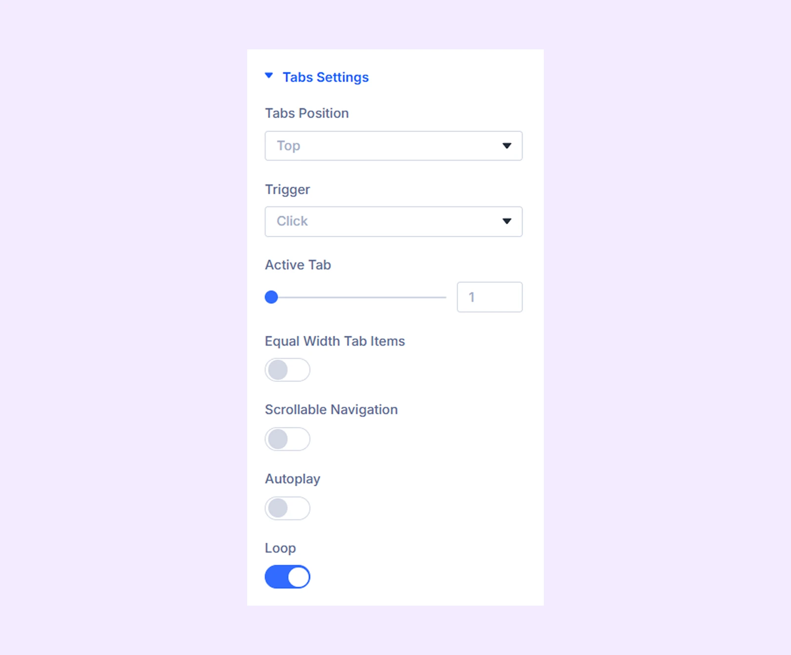
- Tabs Position: Choose whether the tabs appear at the top or bottom.
- Trigger: Select how users activate a tab (Hover or Click).
- Active Tab: Choose which tab is open when the page first loads.
- Equal Width Tab Items: Make all tab items the same width.
- Scrollable Navigation: Allow visitors to scroll through the tab navigation when all items cannot fit within the available space.
- Autoplay: Automatically switch between timeline tabs.
- Autoplay Speed (ms): Set the delay between each automatic tab change.
- Pause on Hover: Pause autoplay when visitors hover over the module.
- Loop: Return to the first tab after the last tab.
Navigation
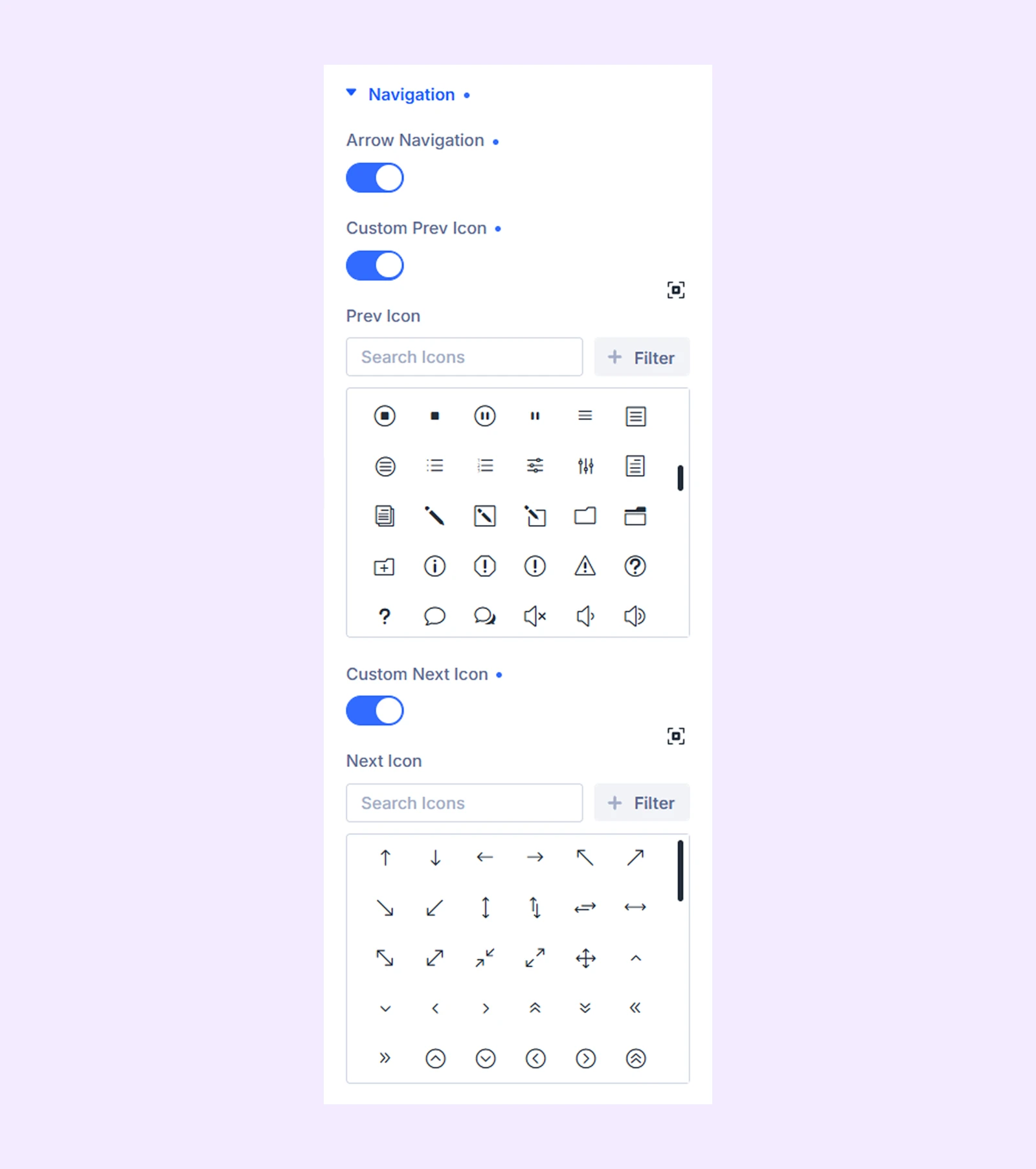
- Arrow Navigation: Show or hide the previous and next navigation arrows.
- Custom Prev Icon: Enable a custom icon for the previous arrow.
- Prev Icon: Select the icon for the previous button.
- Custom Next Icon: Enable a custom icon for the next arrow.
- Next Icon: Select the icon used for the next arrow.
Marker
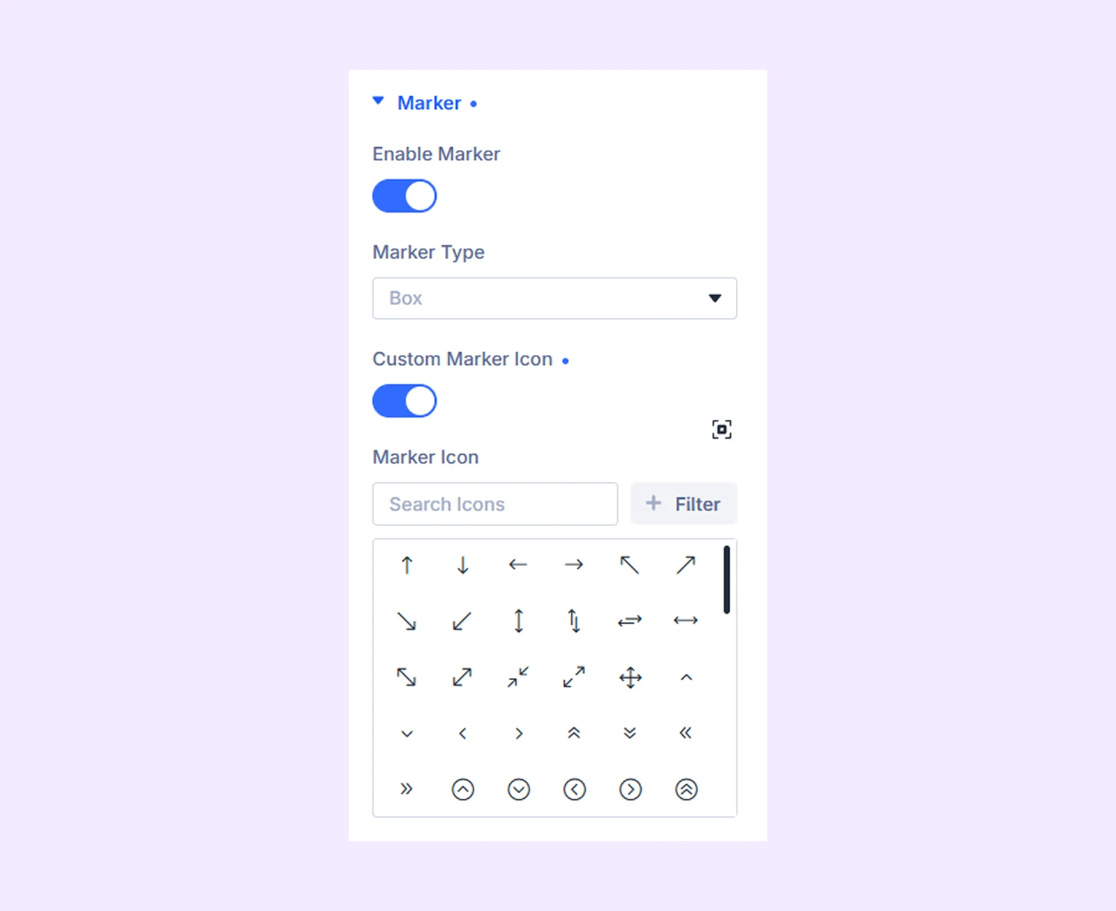
- Enable Marker: Show or hide markers for the timeline items.
- Marker Type: Choose between Box or Line markers.
- Custom Marker Icon: Enable a custom icon for the markers.
- Marker Icon: Select the icon displayed inside each marker.
Line Settings
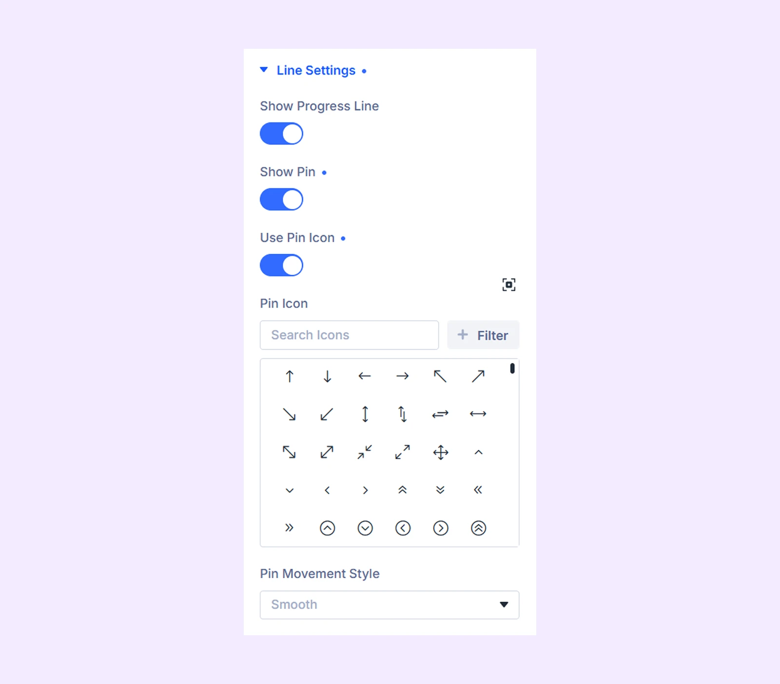
- Show Progress Line: Display a progress line that fills as visitors move through timeline items.
- Show Pin: Add a movable pin that follows the active timeline item.
- Use Pin Icon: Display an icon inside the pin.
- Pin Icon: Choose the icon displayed inside the pin.
- Pin Movement Style: Choose how the pin moves when the active tab changes.
Background: Add a background color, gradient, image, video, pattern, or mask to the module.
Element Label: Rename the module for easier identification inside the Divi Builder. (Visible only to you.)
Design Tab
The Design tab allows you to customize the timeline layout, tab items, markers, navigation arrows, typography, and other visual elements.
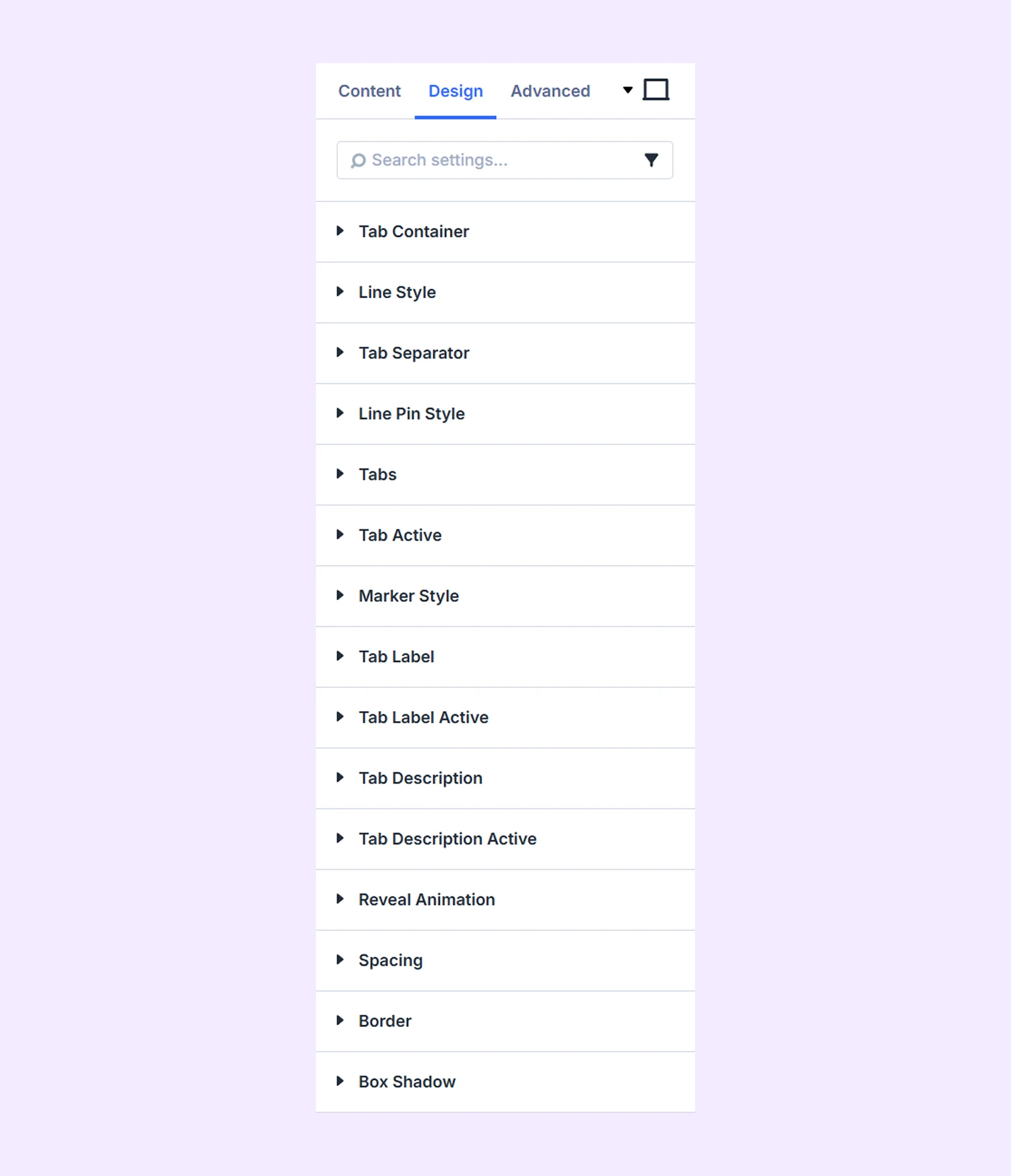
Tab Container: Customize the main timeline container using options like: background, border, spacing and box shadow.
Line Style
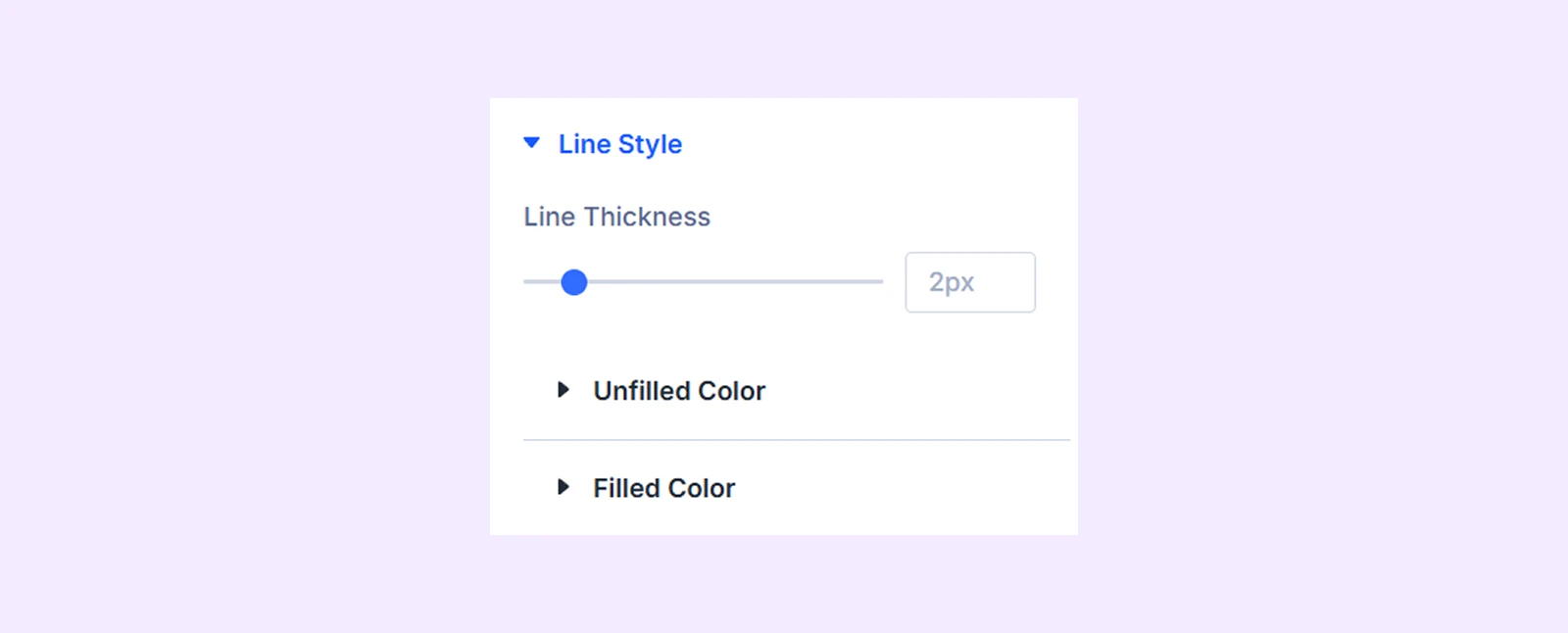
- Line Thickness: Adjust the width of the line.
- Unfilled Color: Set the color of the inactive portion.
- Filled Color: Set the color of the active portion.
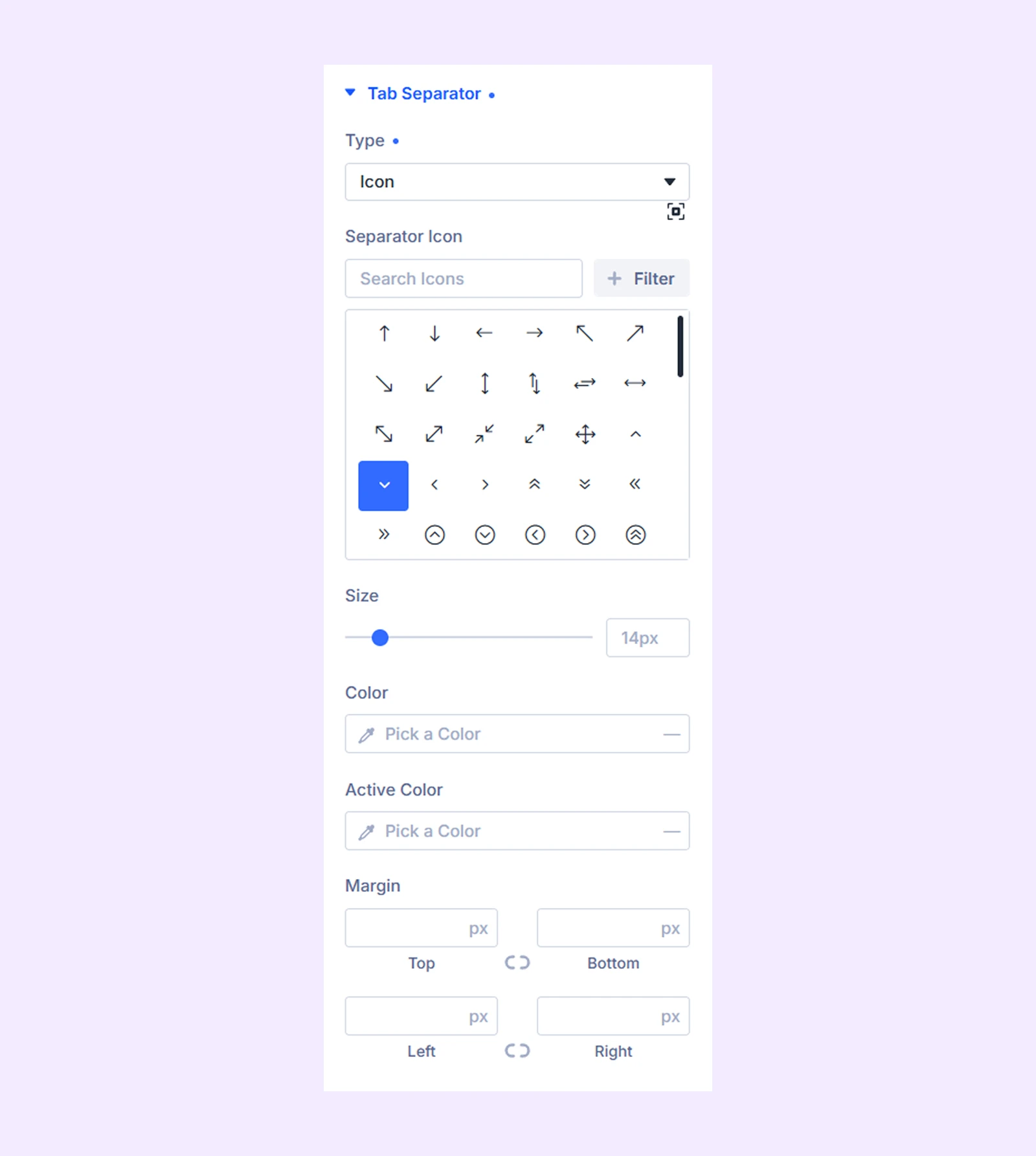
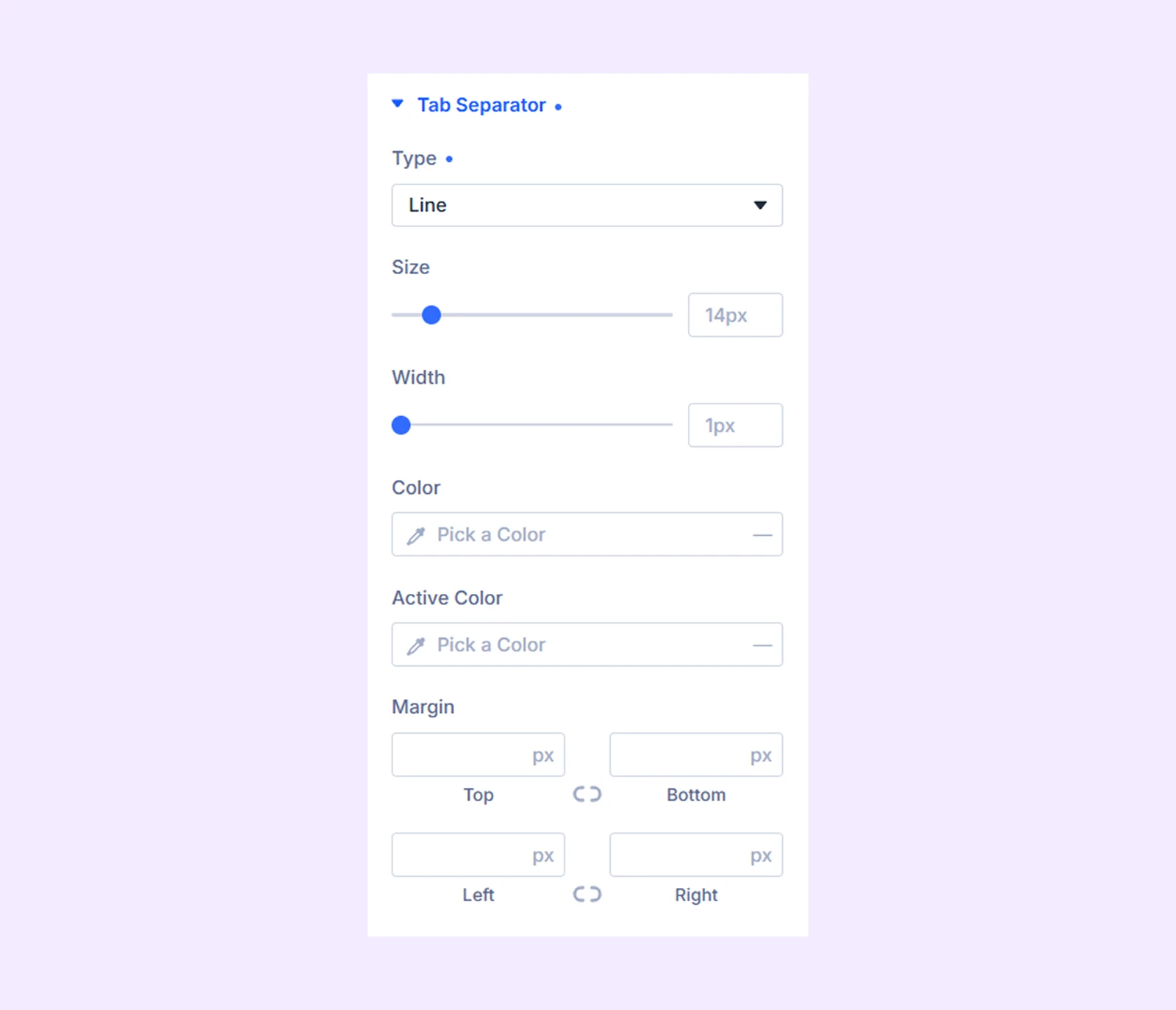
Tab Separator
- Type: Choose Icon, Line, or None.
- If you choose Icon: You can use a custom icon for separator, adjust its size, active and inactive color, as well as spacing.
- If you choose Line: You can adjust line size, width, active and inactive color, and spacing.
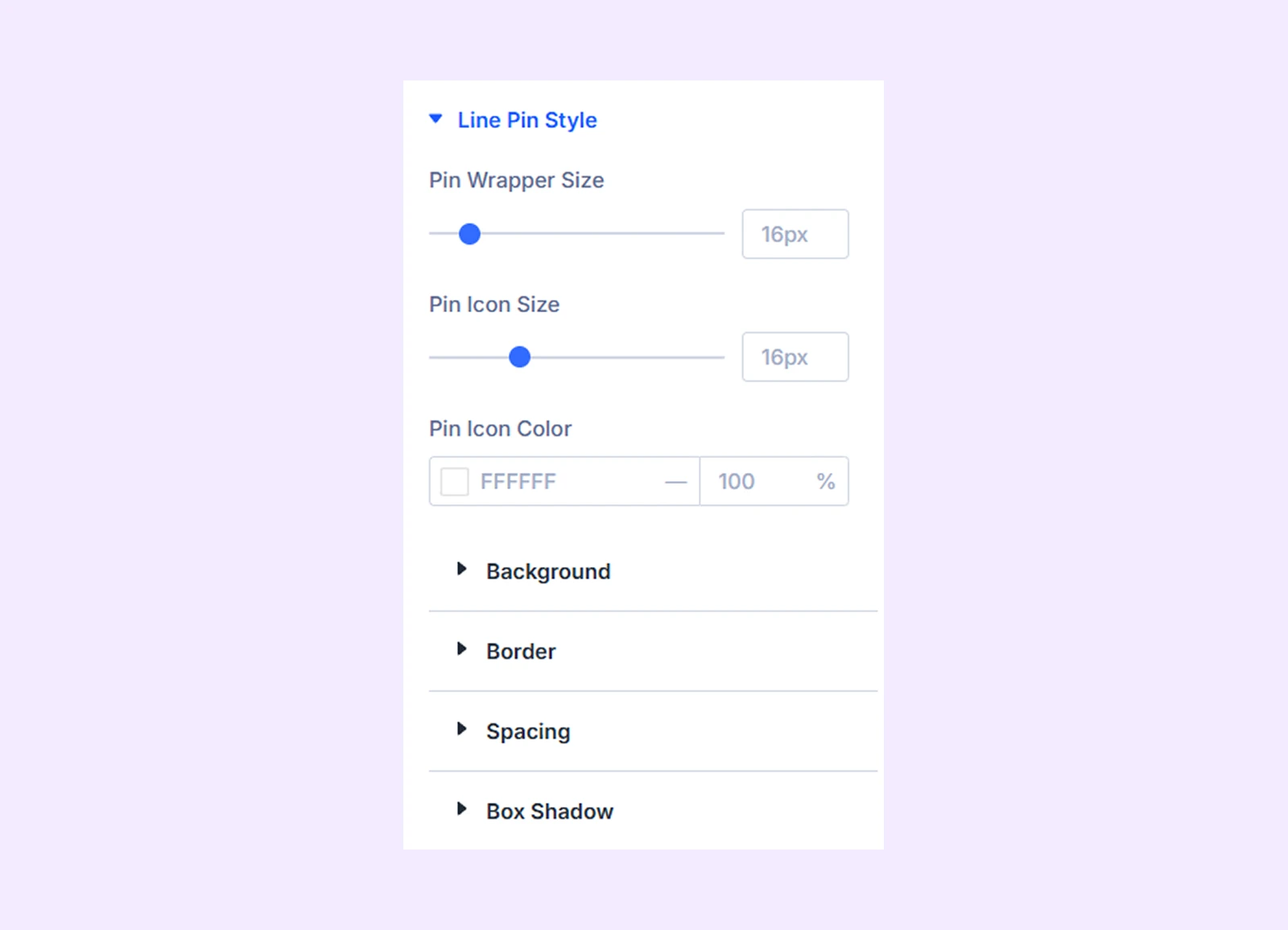
Line Pin Style
These settings appear only when Show Pin is enabled.
- Pin Wrapper Size: Adjust the overall size of the pin container.
- Pin Icon Size: Change the size of the icon inside the pin.
- Pin Icon Color: Choose the color of the pin icon.
There you will also find settings options like background, border, spacing and box shadow.
Tabs
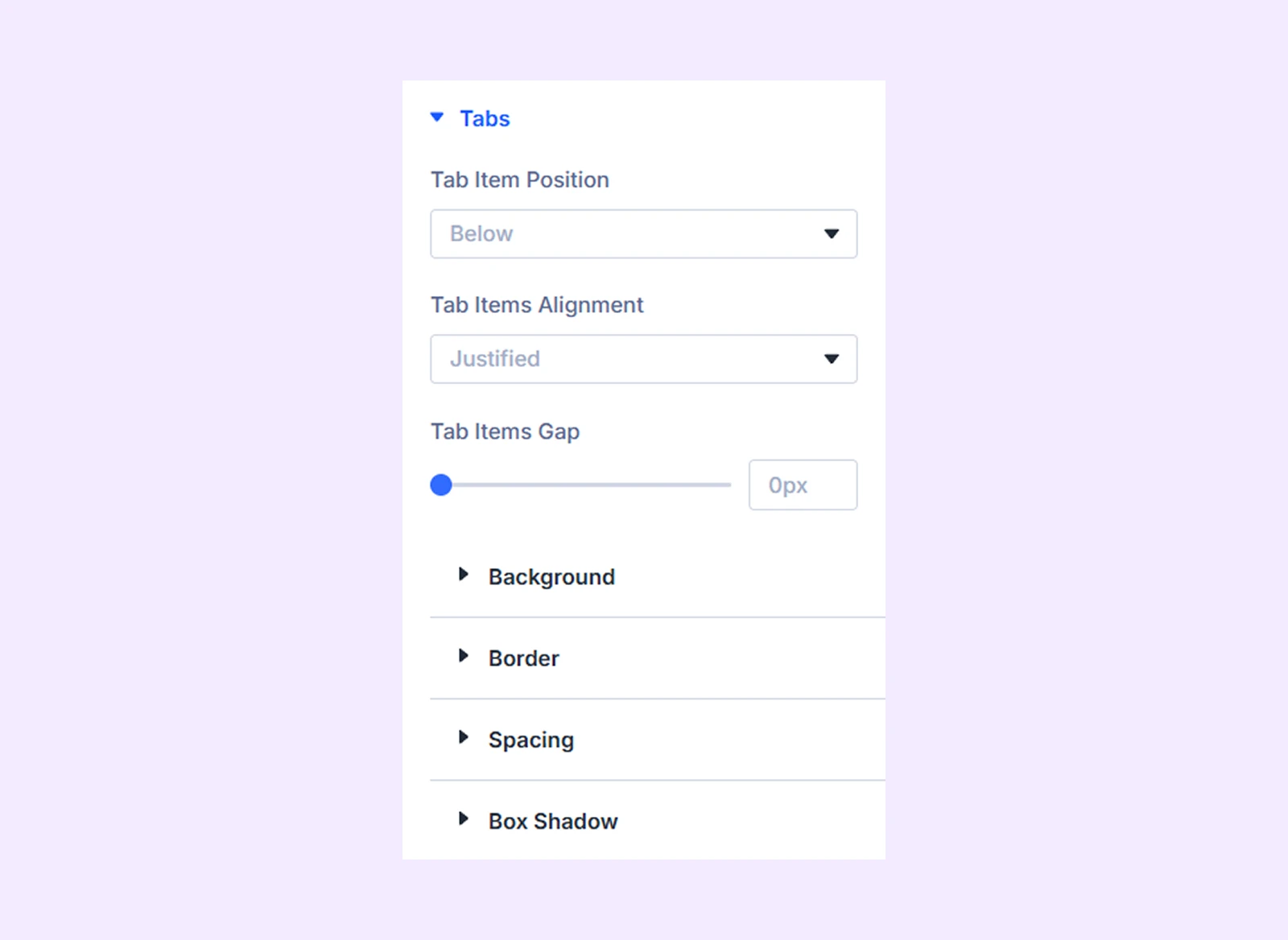
- Tab Item Position: Place tab items above or below the timeline.
- Tab Items Alignment: Align items to the left, center, right, or justify them across the container.
- Tab Items Gap: Set the spacing between tab items.
There you will also find customization options like background, border, spacing and box shadow.
Tab Active: Customize the appearance of the currently active tab using background, border, spacing and box shadow settings.
Marker Style
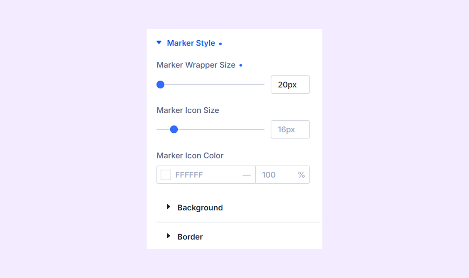
- Marker Wrapper Size: Adjust the size of the marker container.
- Marker Icon Size: Change the size of the marker icon. (Available when you choose Box as a marker type)
- Marker Icon Color: Choose the color of the marker icon. (Available when you choose Box as a marker type)
- Marker Thickness: Control the thickness of line-style markers. (Available when you choose “Line” as a marker type.)
There you will also find settings options like background and color.
Marker Style Active
This section is available only when Enable Marker is enabled and Show Pin (from Line Settings) is disabled.
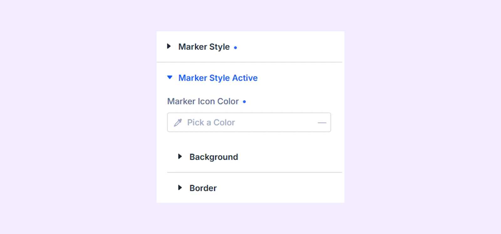
- Marker Icon Color: Customize the marker icon color.
There you will also find background and border customization options.
Tab Label: Customize the appearance and typography of tab titles.
Tab Label Active: Style the title of the currently active tab.
Tab Description: Customize the appearance and typography of tab descriptions.
Tab Description Active: Style the description of the currently active tab.
Navigation Arrows
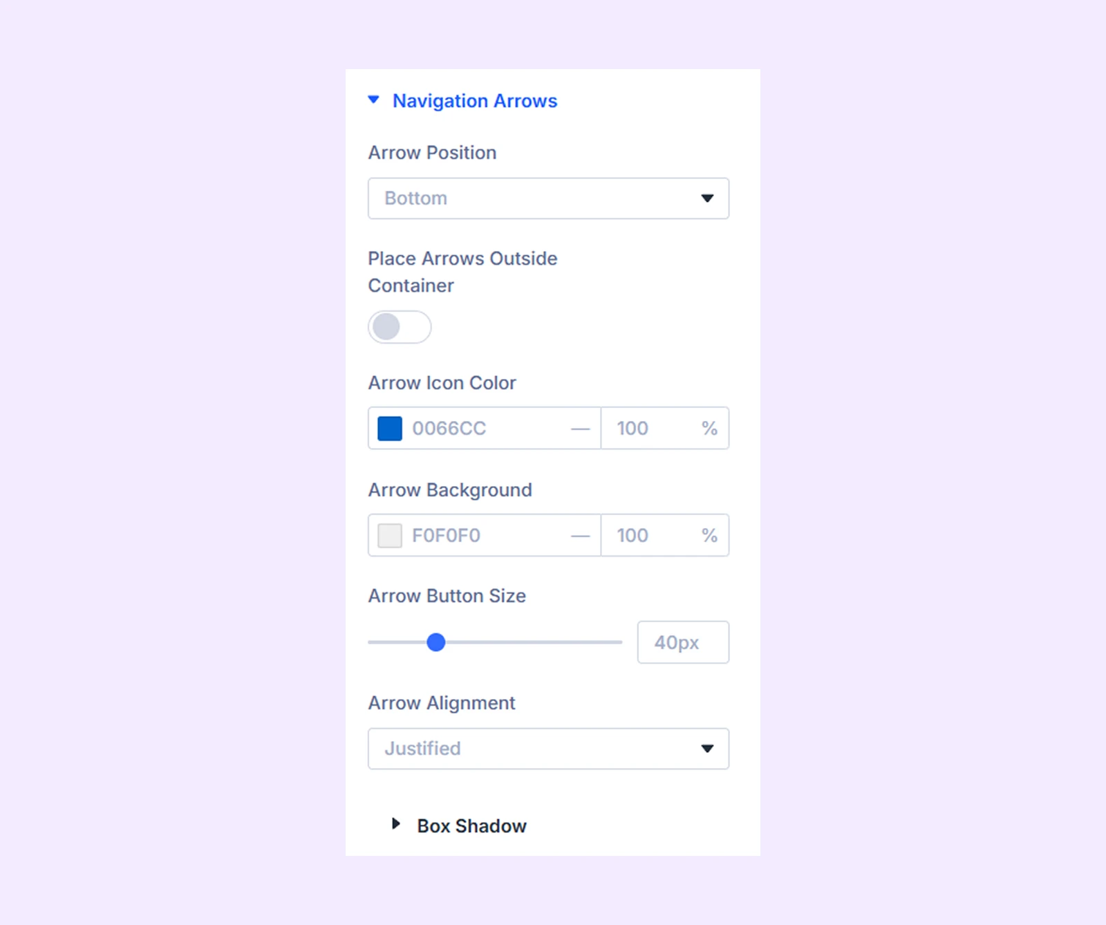
- Arrow Position: Place arrows at the Top, Middle, or Bottom.
- Place Arrows Outside Container: Move the arrows outside the module container.
- Arrow Icon Color: Set the color of the arrow icons.
- Arrow Background: Add a background to the arrow buttons.
- Arrow Button Size: Adjust the size of the navigation buttons.
- Arrow Alignment: Align arrows to the Left, Center, Right, or Justified.
- Disabled Arrow Opacity: Adjust how faded the disabled navigation arrows appear when Loop is disabled. (It’s available when loop is disabled from Tabs Settings.)
Previous Arrow

- Prev Icon Size: Adjust the size of the previous arrow icon.
- Spacing: Adjust the spacing around the previous arrow button.
Next Arrow
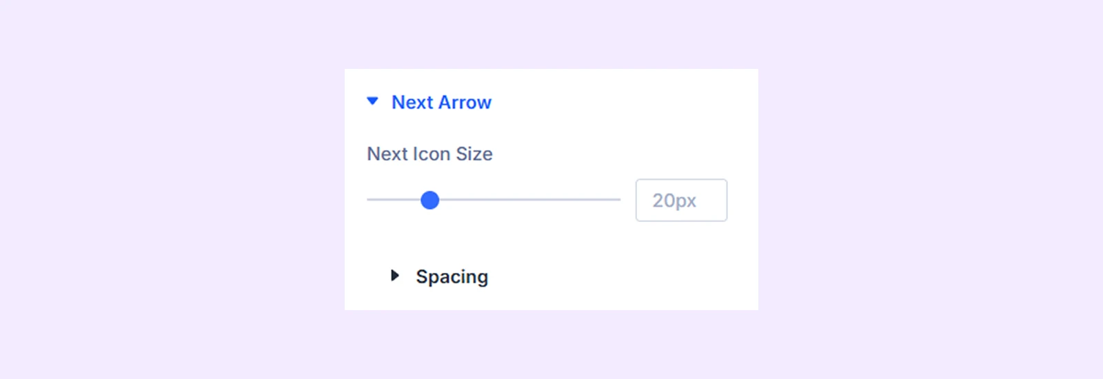
- Prev Icon Size: Adjust the size of the previous arrow icon.
- Spacing: Adjust the spacing around the icon.
Reveal Animation: Apply an entrance animation when timeline content becomes visible.
Spacing: Add custom margin and padding around the module.
Border: Customize the border style, width, color, and corner radius.
Box Shadow: Add a shadow around the module.
Advanced Tab
The Advanced tab provides the standard Divi settings for custom CSS, visibility conditions, transitions, attributes, positioning, and other advanced controls.
Timeline Tabs Child Item Settings
Each timeline tab item includes its own Content, Design, and Advanced tabs. With these, you can customize each item individually.
Content Tab
This tab contains settings for adding and configuring an individual timeline item.
Tab
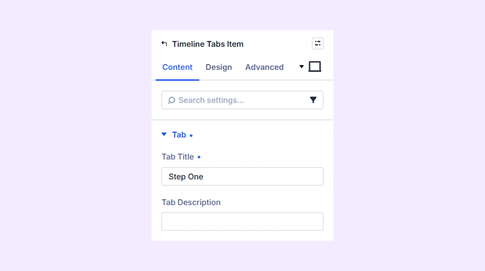
- Tab Title: Enter the timeline item's title.
- Tab Description: Add a short description.
Tab Icon Settings
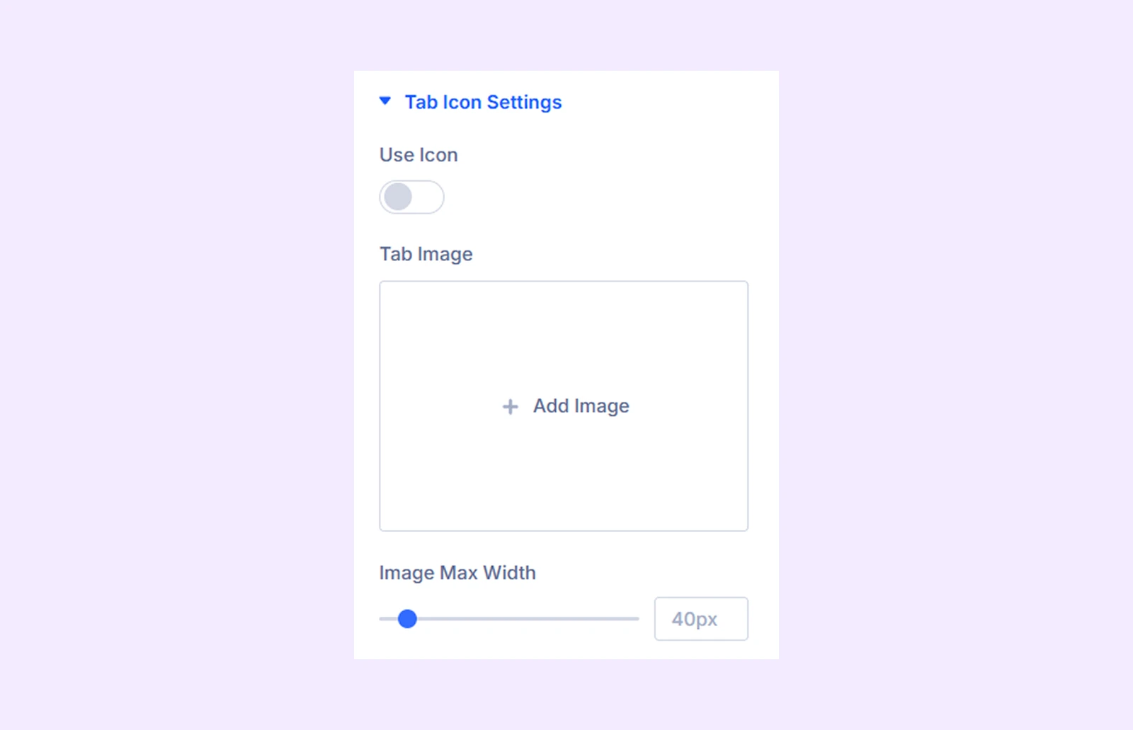
- Use Icon: Enable an icon for the tab item.
- Icon: Select an icon.
- Icon Color: Choose the icon color.
- Icon Size: Adjust the icon size.
- Tab Image: Upload or select an image for the tab.
- Image Max Width: Control the maximum width of the tab image.
Elements

- Add Element: Add new content elements to the tab.
- Apply Structure Template: Apply a predefined layout structure.
Background: Add a background to the child item.
Loop: Display repeating database content based on the query settings.
Element Label: Rename the item for easier identification inside the Divi Builder.
Design Tab
Use these settings to customize the appearance of an individual timeline item.
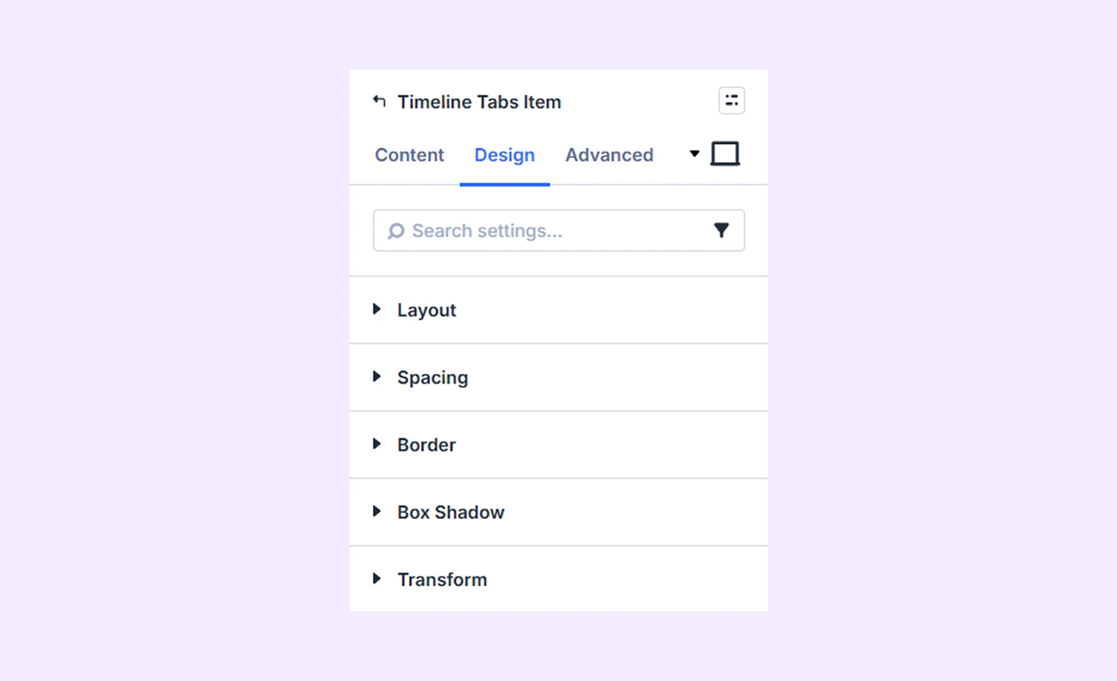
Layout: Control how the child item content is arranged.
Spacing: Add margin and padding around the item.
Border: Customize its border and corner radius.
Box Shadow: Add a shadow effect.
Transform: Scale, rotate, move, or skew the item.
Advanced Tab
Use the Advanced tab to add custom CSS, display conditions, transitions, attributes, visibility settings, and other advanced controls to the individual tab item.
Need Help?
If you have any questions or need assistance, contact our support team: [email protected]