
The Background Switcher module, introduced in DiviFlash 5.3.0, lets you create interactive sections where each item has its own content and background.
Important Note: Background Switcher module is built for Divi 5 only. Also, it will be disabled by default and to use it, you must enable it manually. Refer to our guide for step-by-step instructions.
Let’s see the settings in brief and how to make better use of it —
Content Tab
The Content tab contains the essential settings for adding switcher items and controlling how the background switcher behaves.
Add New Background Switcher Item
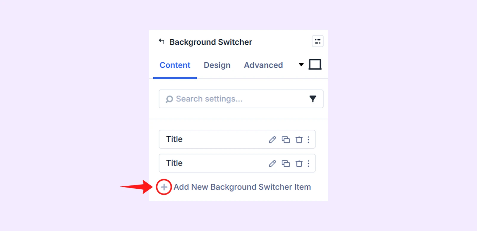
By default, the module includes two background switcher items that you can edit or delete. Click Add New Background Switcher Item to create a new item. Each item has its own settings. To learn more, see the Background Switcher Child Item Settings section below.
Content
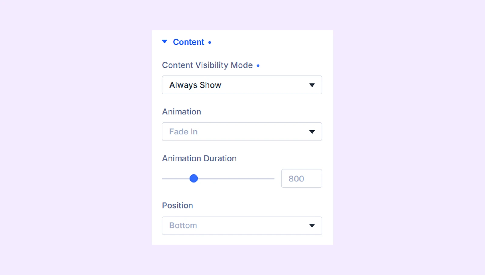
- Content Visibility Mode: Choose how content is displayed. You can use the default behavior, always show content, or display content on hover.
- Transition Duration: Control the transition speed when switching between items.
- Animation: Choose an animation effect for content appearance. (Available with always show and show on hover)
- Animation Duration: Set the speed of the selected animation effect.
- Position: Adjust the placement of the content within the switcher.
Default Active Item

- Enable Default Active Item: Enable a predefined active item when the module first loads.
- Initially Active Item: Choose which item should be active by default.
Autoplay
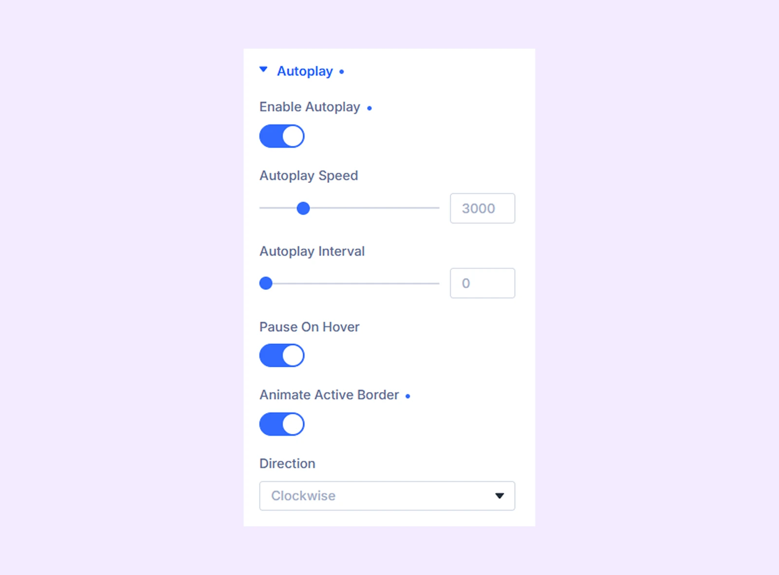
- Enable Autoplay: Automatically switch between items.
- Autoplay Speed: Control how long each item remains active.
- Autoplay Interval: Set the delay between item transitions.
- Pause On Hover: Pause autoplay when visitors hover over the module.
- Animate Active Border: Display an animated progress indicator on the active item.
- Direction: Choose the animation direction of the active border indicator. (Available only when Animate Active Border is enabled.)
Link: Add a custom link to the switcher item.
Background: Configure the item's background settings.
Order: Adjust the item order and arrangement.
Meta: Rename the item for easier identification inside the Divi Builder. (Visible only to you.)
Design Tab
The Design tab allows you to customize the layout, switcher items, content area, images, typography, and other visual elements.
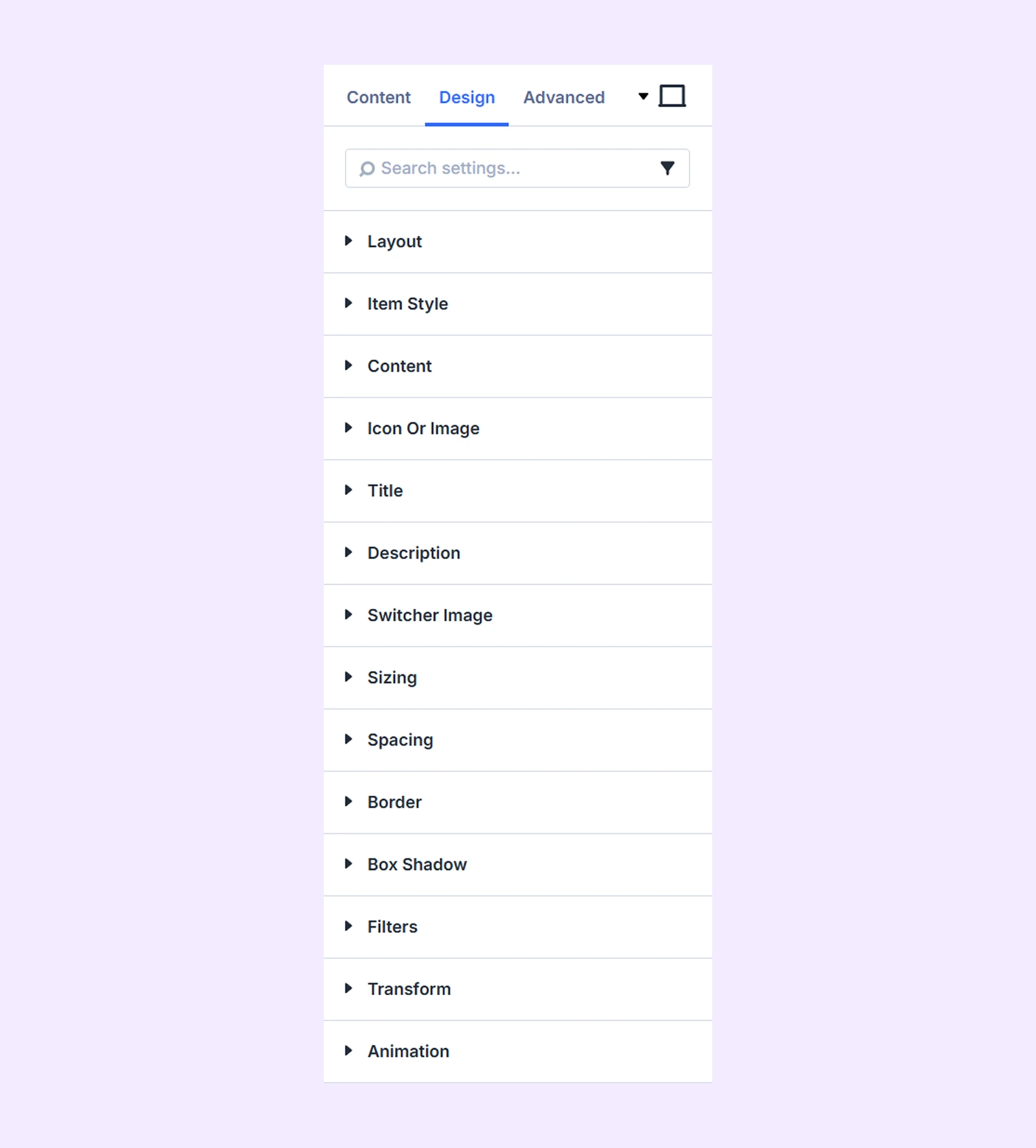
Layout
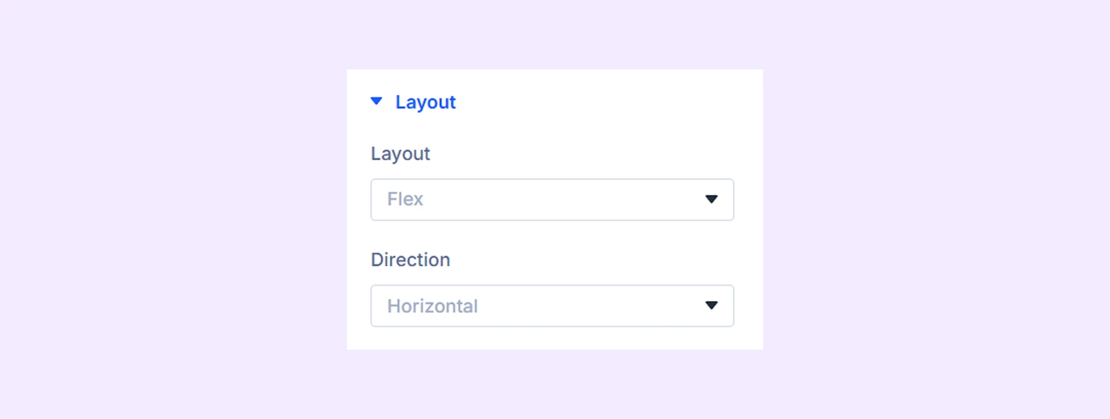
- Layout: Choose between Flex and Grid layouts.
- Direction: Arrange items vertically or horizontally. (Available only with the Flex layout.)
- Columns: Set the number of columns to display. (Available only with the Grid layout.)
Item Style
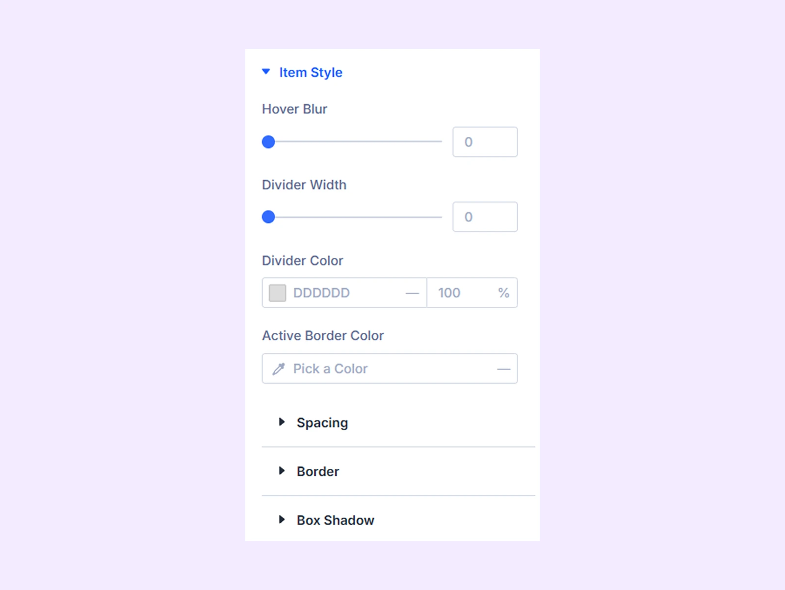
- Hover Blur: Apply a blur effect when hovering over items.
- Divider Width: Adjust the thickness of dividers between items.
- Divider Color: Set the divider color.
- Active Border Color: Choose the border color for the active item.
There you will also find customization options like spacing, border, and box shadow.
Content: Customize the appearance of the content area displayed for each switcher item using options like background, border, spacing, and box shadow.
Icon Or Image
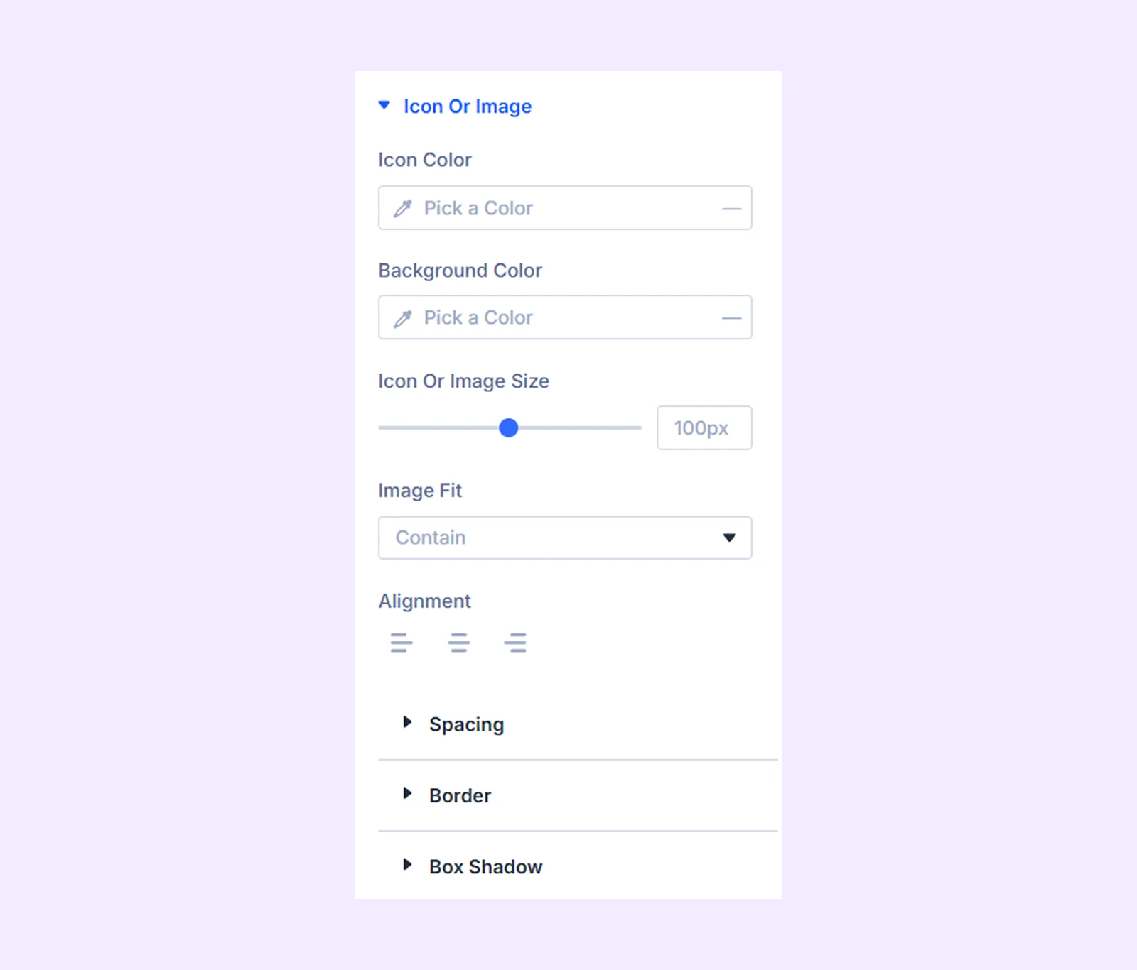
- Icon Color: Set the icon color.
- Background Color: Apply a background color behind the icon or image.
- Icon or Image Size: Adjust the size of the icon or image.
- Image Fit: Control how images fit within their container.
- Alignment: Set the alignment of the icon or image.
There you will also find settings options like spacing, border, and box shadow.
Title: Customize the typography and styling of item titles.
Description: Customize the typography and styling of item descriptions.
Switcher Image
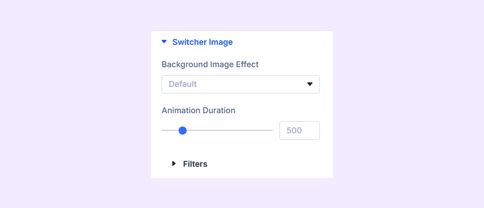
- Background Image Effect: Apply visual effects to background images.
- Animation Duration: Control the speed of image animations.
- Animation Intensity: Control the strength of the animation effect applied to the background image. (Available with zoom in and zoom out effect.)
- Filter: Apply image filters.
Sizing: Adjust image dimensions and sizing behavior.
Spacing: Configure margin and padding.
Border: Customize border style, width, color, and corner radius.
Box Shadow: Add shadow effects.
Filters: Apply additional visual filters.
Transform: Scale, rotate, move, or skew images.
Animation: Apply entrance and interaction animations.
Advanced Tab
The Advanced tab provides the standard Divi settings for custom CSS, visibility conditions, transitions, attributes, positioning, and other advanced controls.
Background Switcher Child Item Settings
Each Background Switcher item includes its own Content, Design, and Advanced tabs. With these settings, you can customize every item individually.
Content Tab
This tab contains settings for adding and configuring an individual switcher item.
Content
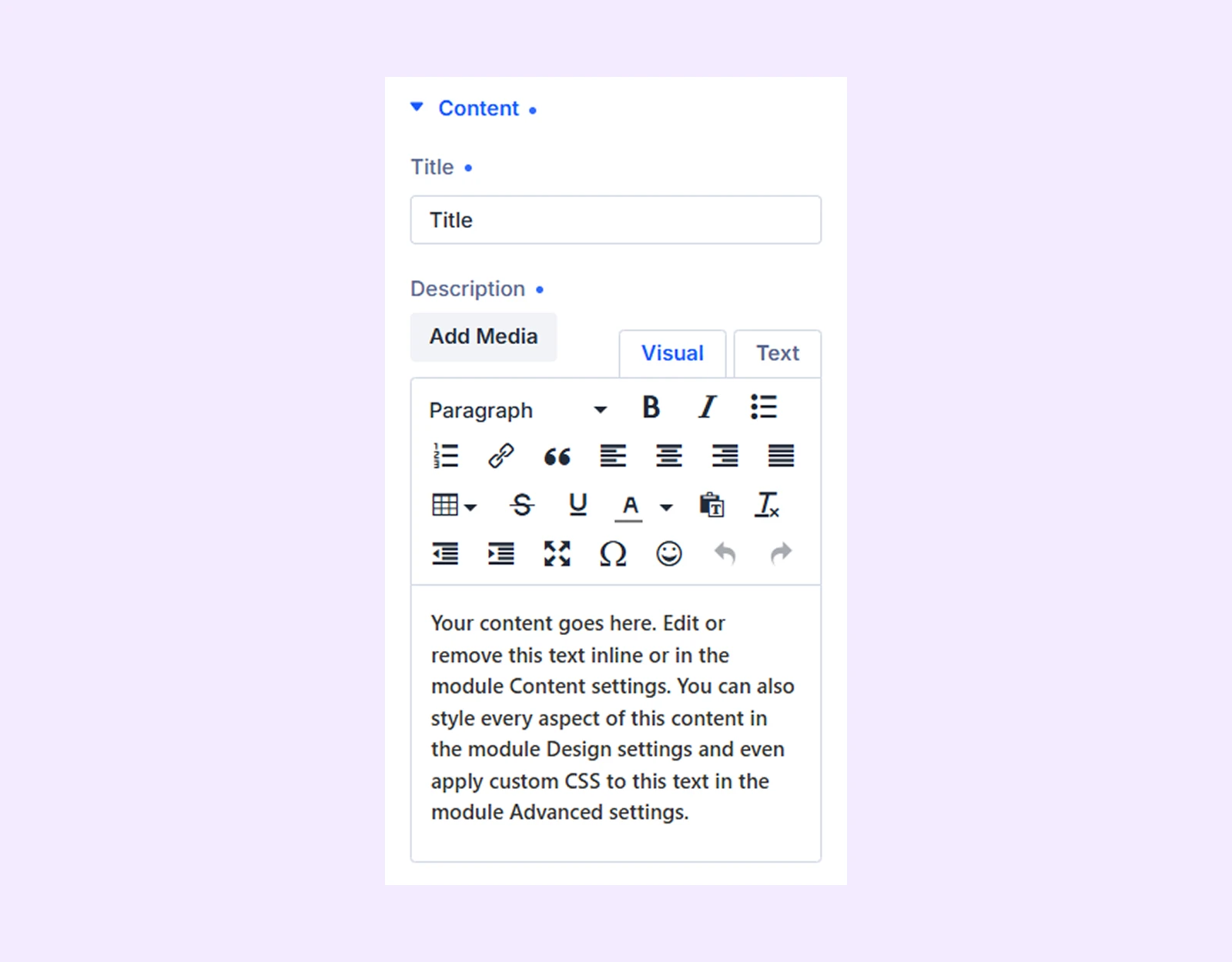
- Title: Enter the item title.
- Description: Add descriptive text for the item.
Icon Or Image
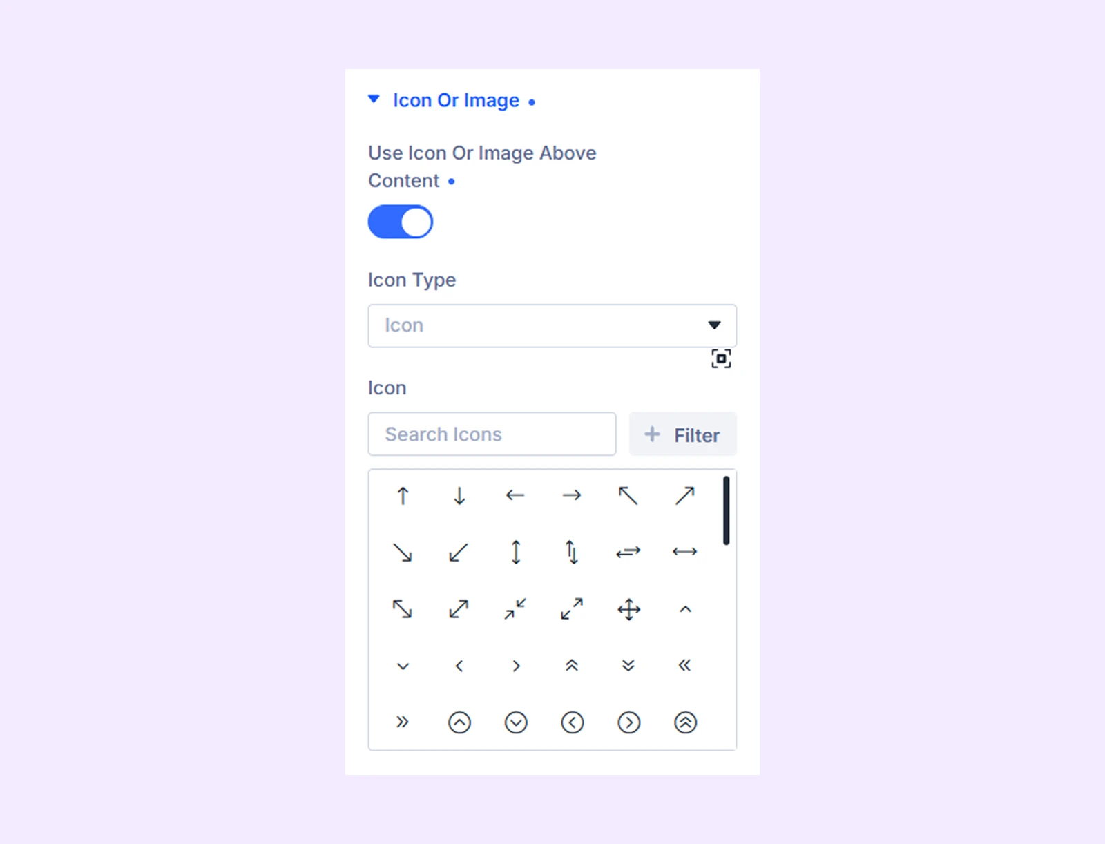
- Use Icon or Image Above Content: Display an icon or image above the item's content.
- Icon Type: Choose whether to use an icon or an image.
- Icon: Select an icon for the item. (Available when Icon is selected as the Icon Type.)
- Image: Upload or choose an image for the item. (Available when Image is selected as the Icon Type.)
Elements: Control which elements are displayed within the item.
Link: Add a custom link to the item.
Background: Configure item-specific background settings.
Loop: Enable or configure loop-related functionality where applicable.
Meta: Configure additional metadata settings for the item.
Design Tab
Use these settings to customize the appearance of an individual switcher item.
Item Style
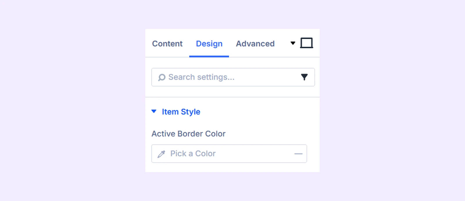
- Active Border Color: Choose the color of the border displayed around the active switcher item.
Content: Customize the appearance of the item's content container.
Icon Or Image
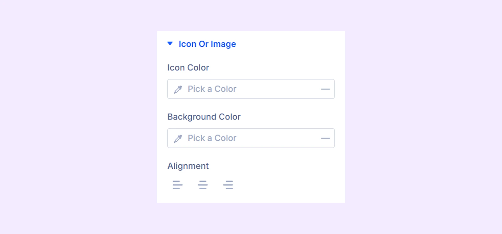
- Icon Color: Set the icon color.
- Background Color: Apply a background color behind the icon or image.
- Alignment: Adjust the alignment of the icon or image.
There you will also find settings options like spacing, border, and box shadow.
Title: Customize the typography, color, and spacing of the item title.
Description: Customize the typography, color, and spacing of the item description.
Overlay Background: Apply an overlay background above the item's background image to improve readability and visual appearance.
There you will also find customization options like spacing, border, box shadow, filters, transform, and animation.
Advanced Tab
Use the Advanced tab to add custom CSS, display conditions, transitions, attributes, visibility settings, and other advanced controls to the individual switcher item.
Need Help?
If you have any questions or need assistance, contact our support team: [email protected]