
The Cookie Banner module lets you create and customize a cookie consent banner in the Divi Visual Builder.
Important Note: The Cookie Banner module is only available in the cookie banner layout, not on regular Divi pages/posts. To access it, enable the Cookie Consent extension, then navigate to General tab and click on Banner Design.
Let’s see the settings in brief and how to make better use of it —
Content Tab
The Content tab controls the banner content, buttons, behavior, preferences panel, reopen button, and builder preview.
Banner Content
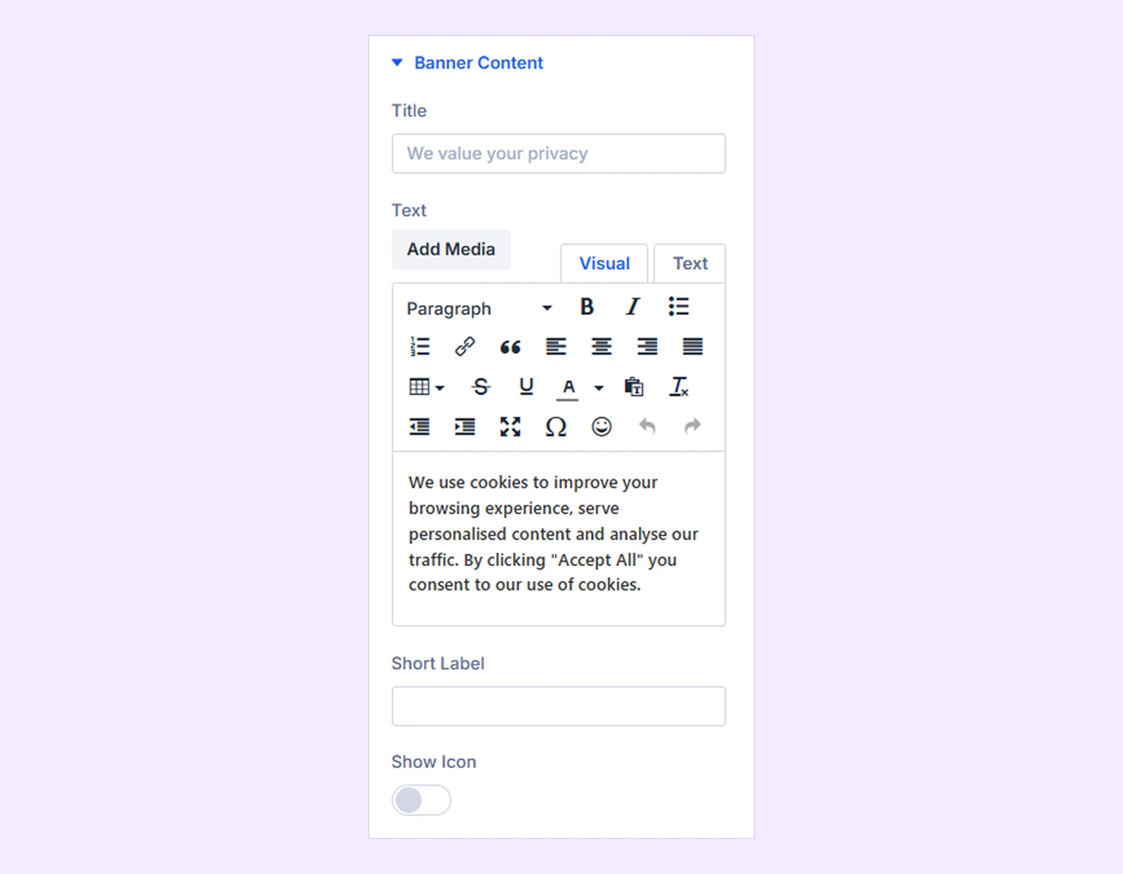
- Title: Set the main heading of the cookie banner. Leave it empty to hide the title.
- Text: Add your cookie consent message and links to your privacy or cookie policy.
- Short Label: Add optional text above the banner title.
- Show Icon: Show or hide an icon above the title.
- Icon: Choose the icon to display on the banner.
Buttons
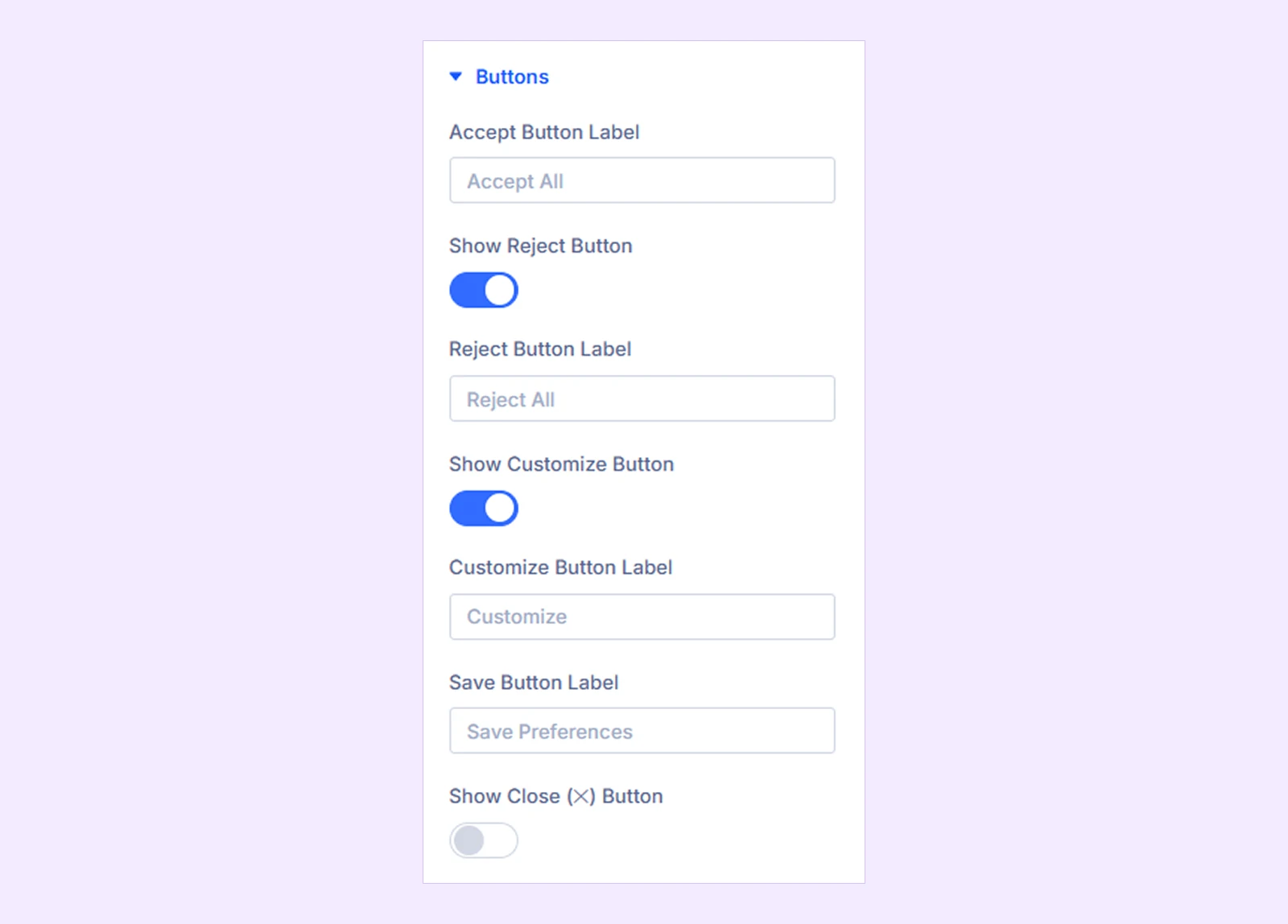
- Accept Button Label: Set the Accept All button text. Leave it empty to hide the button.
- Show Reject Button: Show or hide the button that rejects non-essential cookies.
- Reject Button Label: Set the Reject button text.
- Show Customize Button: Let visitors choose which cookie categories to allow.
- Customize Button Label: Set the Customize button text.
- Save Button Label: Set the button text for saving selected cookie preferences.
- Show Close (✕) Button: Show or hide the banner's close button.
- Close Icon: Choose the icon for the close button.
- Close Button Action: Choose what happens when visitors close the banner:
- Accept all cookies
- Reject non-essential
- Just hide (ask again next visit)
Layout & Behavior
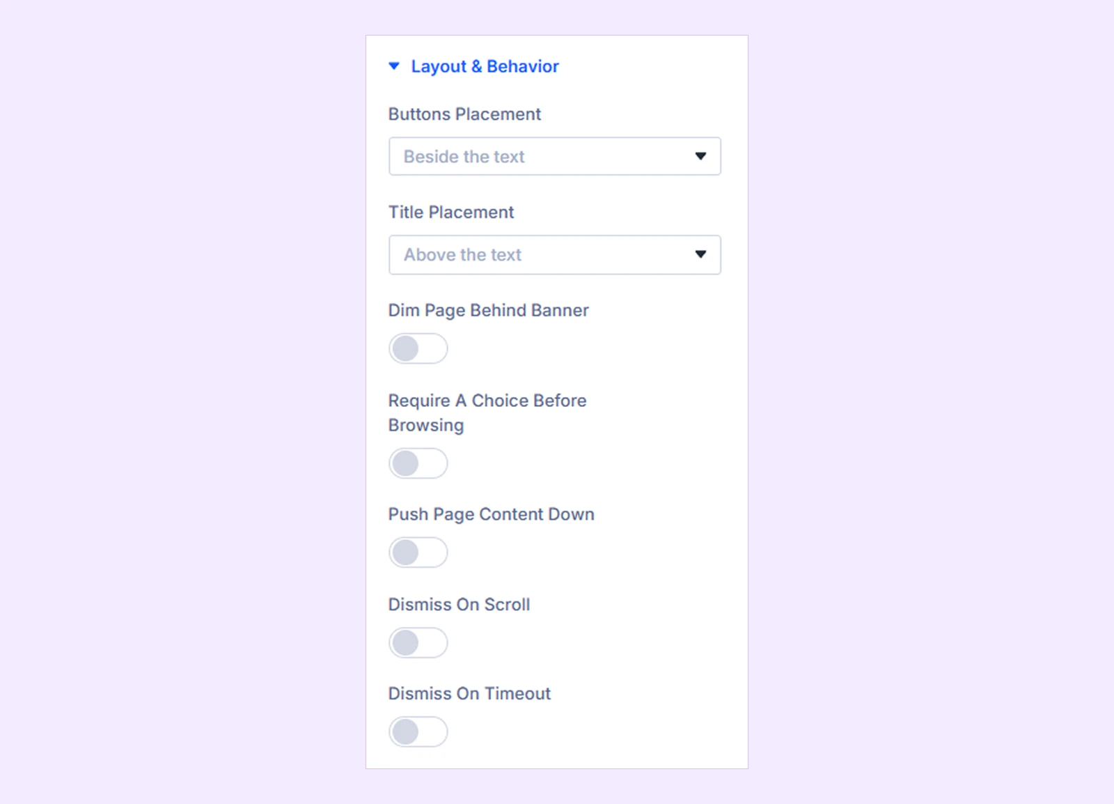
- Buttons Placement: Place the consent buttons beside or below the banner text.
- Title Placement: Display the title above the text or on the same line.
- Dim Page Behind Banner: Add a dark overlay behind the banner to draw attention to it.
- Dim Color: Set the overlay color.
- Require a Choice Before Browsing: Prevent visitors from scrolling or interacting with the page until they make a cookie choice.
- Push Page Content Down: Move the page content to prevent the banner from covering it.
- Dismiss on Scroll: Automatically close the banner when visitors scroll a specified distance.
- Scroll Distance: Set how far visitors must scroll before the banner closes.
- Dismiss on Timeout: Automatically close the banner after a specified time.
- Timeout: Set how long the banner stays open before closing automatically.
- On Dismiss: Choose what happens when the banner closes through scrolling or timeout:
- Accept all cookies
- Reject non-essential
- Just hide (ask again next visit)
Note: Scroll or timeout can close the banner without visitors actively choosing Accept or Save Preferences. Do not treat this as explicit consent when your site requires visitors to actively opt in.
Panel
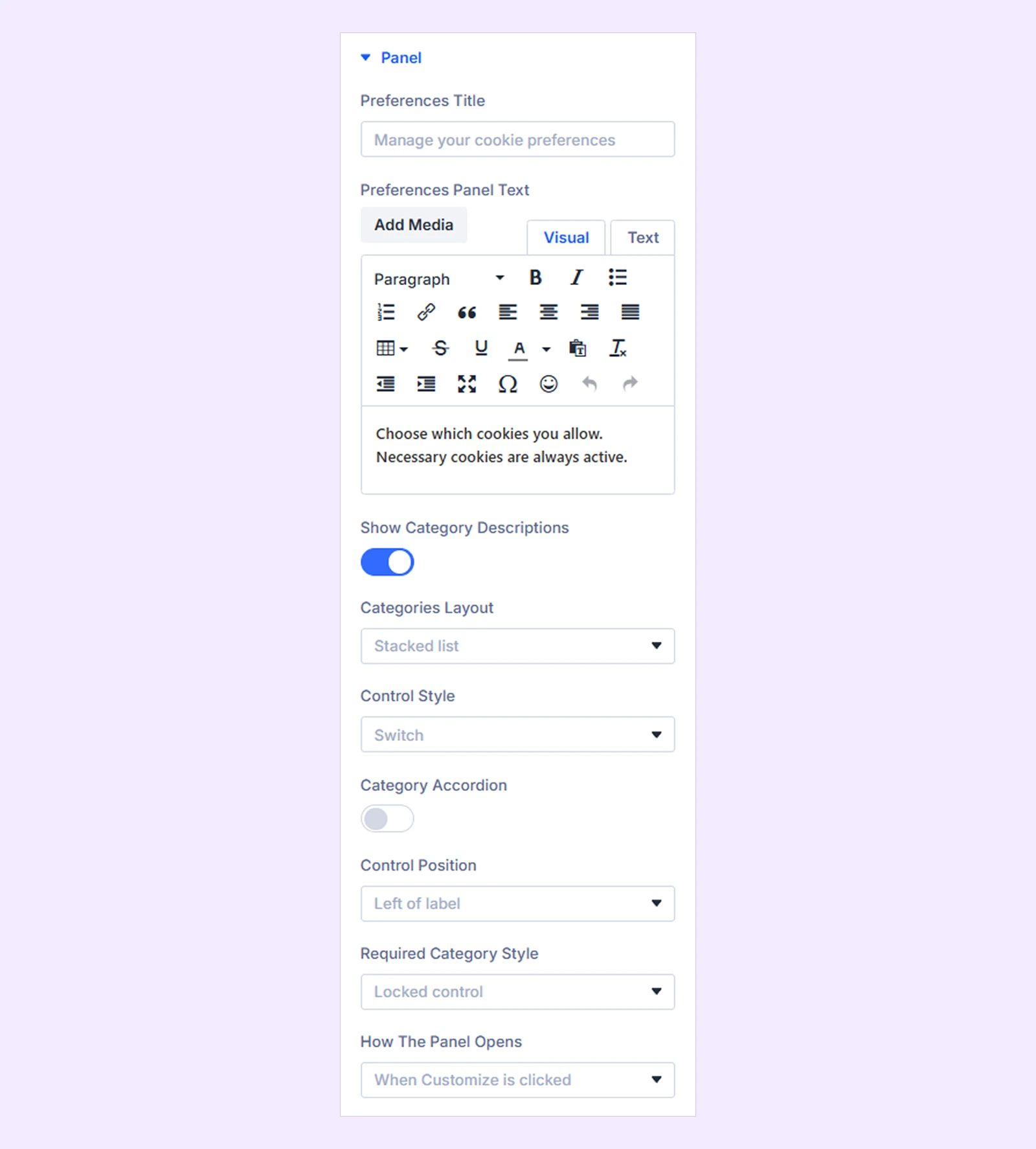
These settings control how visitors view and manage individual cookie categories in the preferences panel.
- Preferences Title: Set the heading of the preferences panel.
- Preferences Panel Text: Add introductory text explaining the available cookie choices.
- Show Category Descriptions: Show or hide descriptions of individual cookie categories.
- Categories Layout: Display cookie categories as a Stacked list or Inline row.
- Control Style: Choose Switch or Checkbox controls for selecting categories.
- Category Accordion: Display category descriptions inside expandable sections. Available when Show Category Descriptions is enabled.
- Control Position: Place the switch or checkbox before or after the category label.
- Required Category Style: Display the Necessary category as a Locked control or Text pill.
- Pill Text: Set the text shown inside the pill.
- How the Panel Opens: Choose whether the panel opens when visitors click Customize or stays open by default.
Note: The preferences panel appears on the live banner only when Show Customize Button is enabled. If you select Always open, keep Show Customize Button enabled.
Reopen Button
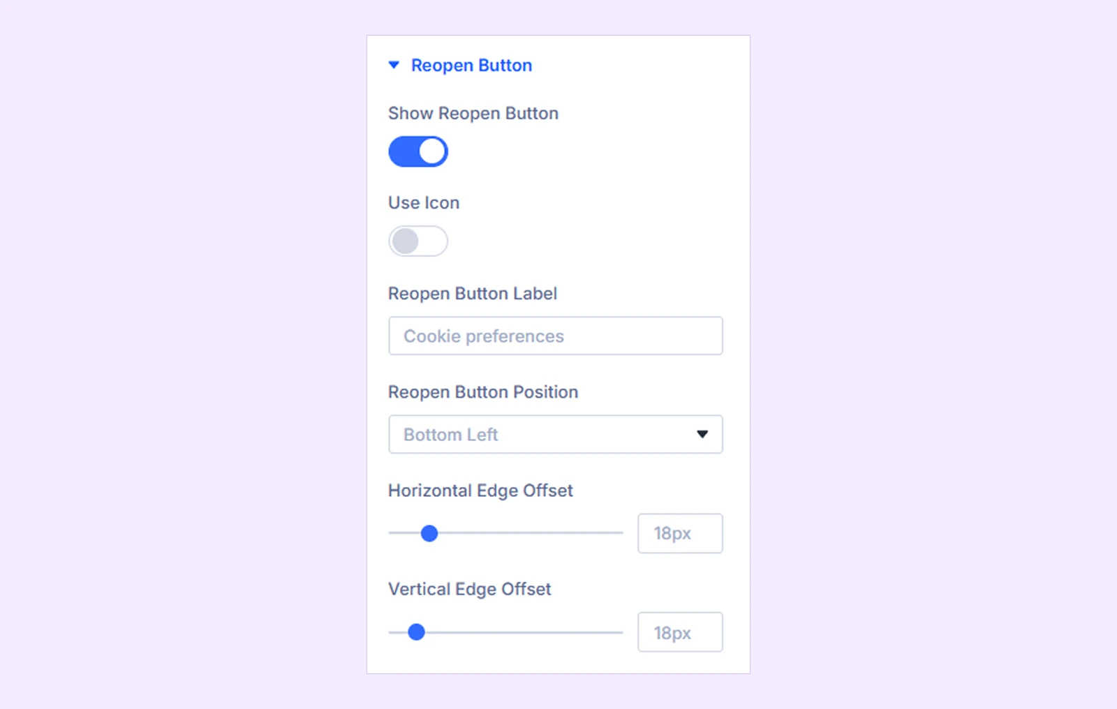
Use these settings to control the button visitors can use to reopen their cookie preferences.
- Show Reopen Button: Show or hide the reopen button.
- Use Icon: Add an icon to the button.
- Icon: Choose the icon.
- Icon Size: Adjust the icon size.
- Icon Color: Set the icon color and hover color.
- Reopen Button Label: Set the button text.
- Reopen Button Position: Place the button at the Bottom Left, Bottom Right, Top Left, or Top Right.
- Horizontal Edge Offset: Adjust the button’s distance from the left or right edge.
- Vertical Edge Offset: Adjust the button’s distance from the top or bottom edge.
Note: You can also use your own Cookie Settings link or button instead of the built-in Reopen Button. See Open Cookie Preferences From a Custom Link or Button guide for the setup.
Builder Preview

- Preview Preferences Panel: Keep the preferences panel open while designing it.
- Preview Reopen Button: Show the reopen button while designing it.
Design Tab
The Design tab lets you customize the appearance and layout of the banner, preferences panel, buttons, and other elements.
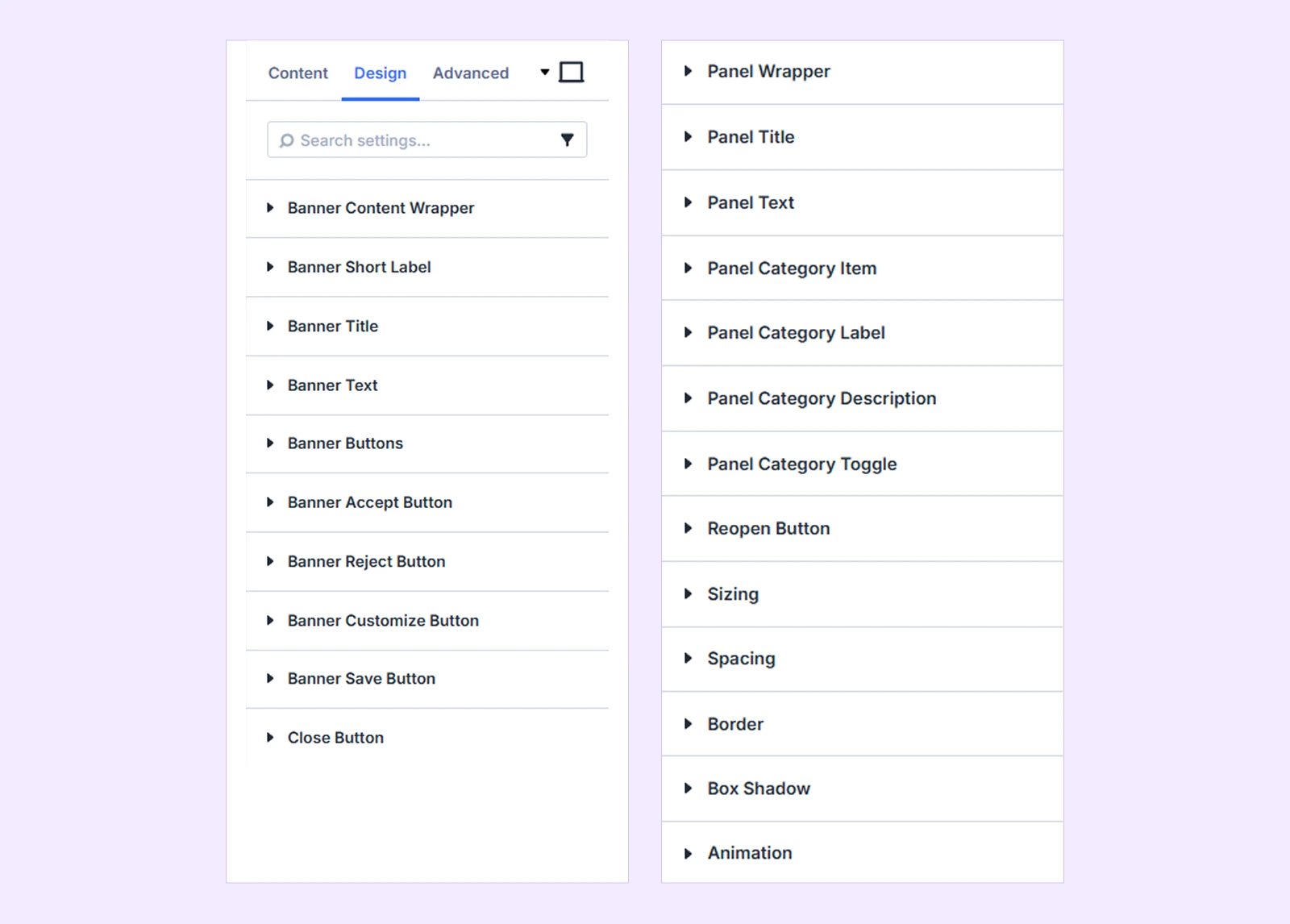
Banner Content Wrapper: Customize the background, border, and spacing of the banner content area.
Banner Icon
- Icon Size: Adjust the size of the banner icon.
- Icon Color: Set the icon color.
- Bubble Size: Adjust the size of the area behind the icon.
You can also customize its background, border, and spacing.
Banner Short Label: Customize the typography of the short label.
Banner Title: Customize the title typography and choose its heading level.
Banner Text: Customize the typography of the main banner text.
Banner Buttons
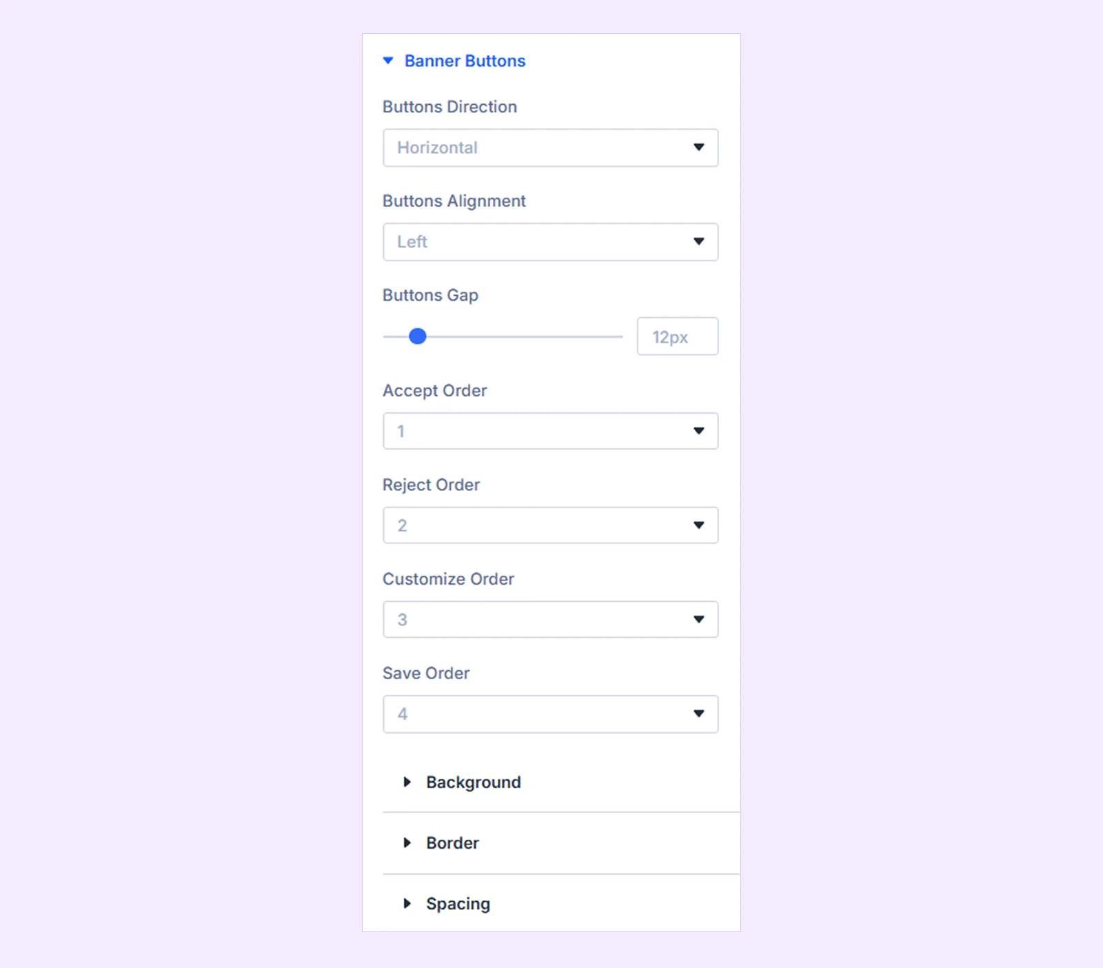
Use these settings to control the layout and order of the banner buttons.
- Buttons Direction: Arrange the buttons horizontally or vertically.
- Buttons Alignment: Align the buttons to the Left, Center, Right, Spread out, or Full width.
- Buttons Gap: Adjust the space between the buttons.
- Accept Order: Set the display order of the Accept button.
- Reject Order: Set the display order of the Reject button.
- Customize Order: Set the display order of the Customize button.
- Save Order: Set the display order of the Save button.
You can also customize the button wrapper’s background, border, and spacing.
Banner Accept Button: Customize the Accept button’s typography, background, border, spacing, and box shadow.
Banner Reject Button: Customize the Reject button’s typography, background, border, spacing, and box shadow.
Banner Customize Button: Customize the Customize button’s typography, background, border, spacing, and box shadow.
Banner Save Button: Customize the Save button’s typography, background, border, spacing, and box shadow.
Close Button
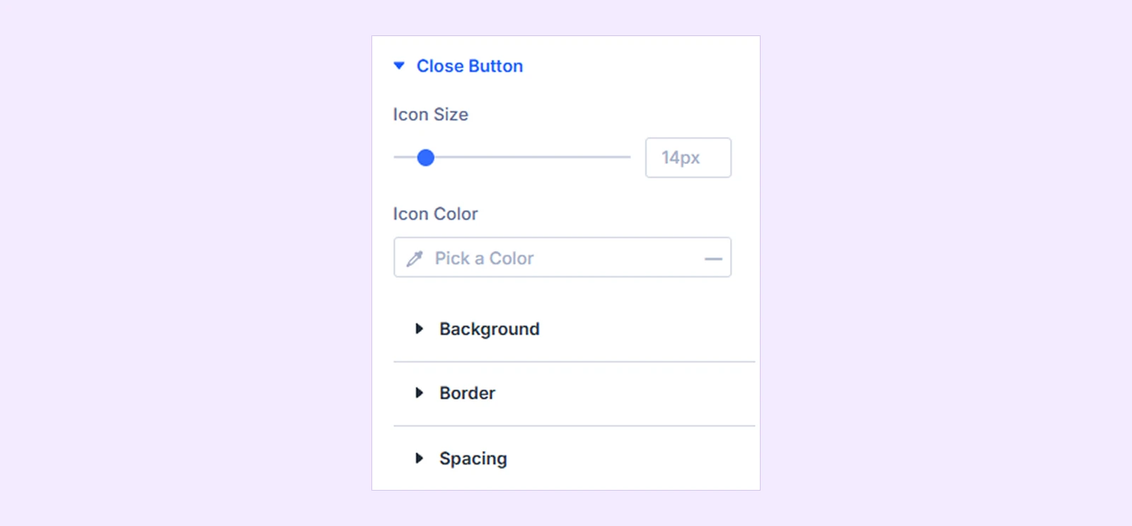
- Icon Size: Adjust the size of the close icon.
- Icon Color: Set the close icon color and hover color.
You can also customize its background, border, and spacing.
Panel Wrapper: Customize the background, border, sizing, and spacing of the preferences panel.
Panel Title: Customize the preferences panel title typography.
Panel Text: Customize the preferences panel text typography.
Panel Category Item
- Item Gap: Adjust the space between category items.
You can also customize each category item’s background, border, and spacing.
Panel Category Label: Customize the category label typography.
Panel Category Description: Customize the category description typography.
Panel Category Toggle
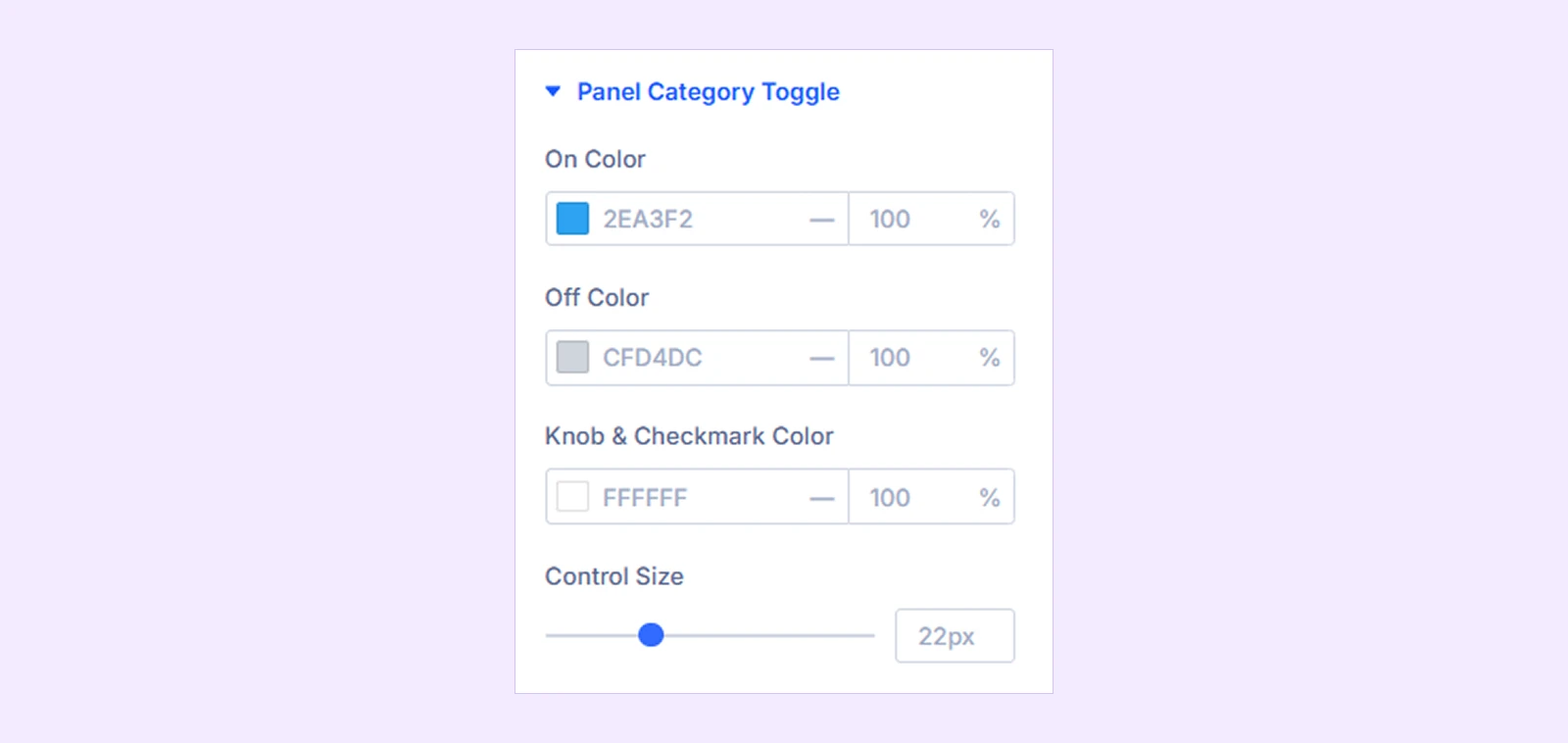
- On Color: Set the color of an enabled control.
- Off Color: Set the color of a disabled control.
- Knob & Checkmark Color: Set the color of the switch knob or checkbox checkmark.
- Control Size: Adjust the size of the switch or checkbox.
Panel Required Pill: Customize the typography of the pill used for the required category.
Reopen Button: Customize the reopen button typography.
You will also find standard Divi settings such as Background, Sizing, Spacing, Border, Box Shadow, and Animation.
Advanced Tab
The Advanced tab gives you additional control over the module with settings such as Custom CSS, Position, Visibility, Conditions, and more.
Need Help?
If you have any questions or need assistance, contact our support team: [email protected]