DiviFlash Hover Box module lets you create interactive content boxes that reveal additional information when users hover over them.
Let’s see the settings in brief and how to make better use of it —
Content Tab
This tab contains the settings for configuring the content and hover behavior of the hover box.
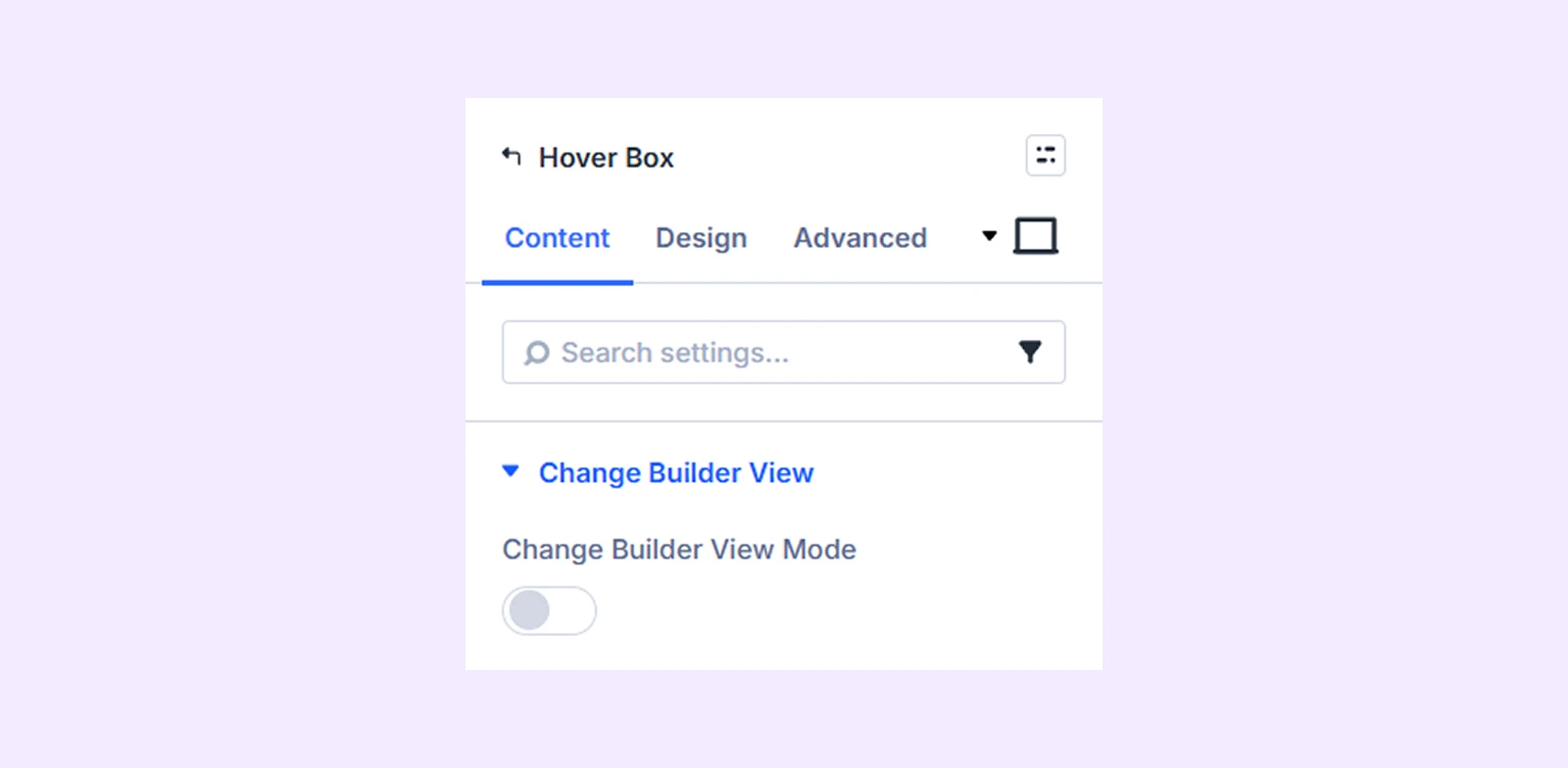
Change Builder View
Change Builder View Mode: Use this option to switch between the normal view and the hover view of the hover box while editing. This lets you see and edit how the box looks in both states.
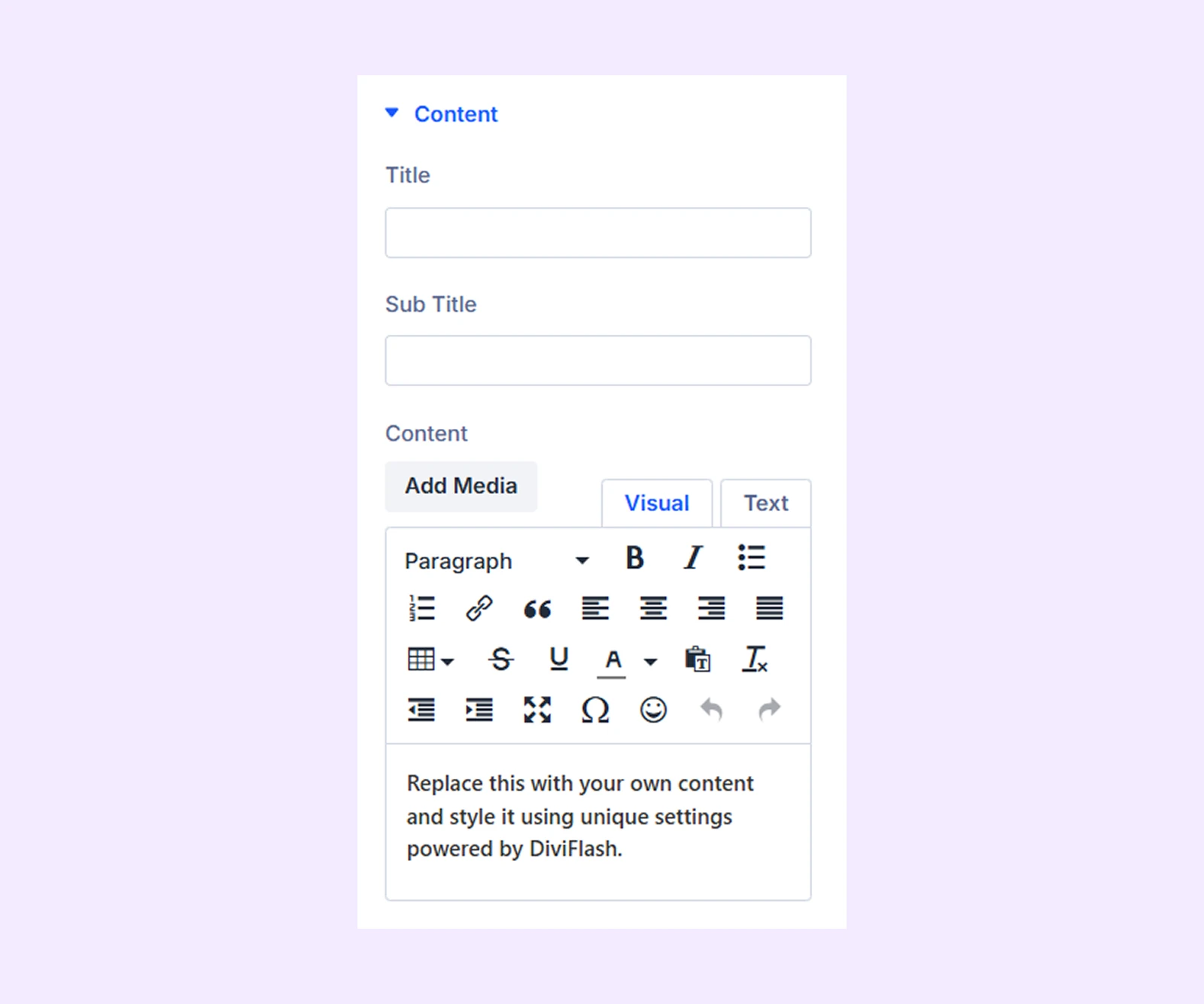
Content
- Title: Enter the title for the hover box.
- Sub Title: Enter a subtitle for the hover box content.
- Content: Enter the main text or description displayed in the hover box.
Button: Enter the button text, URL, and link target for the default version of the hover box.
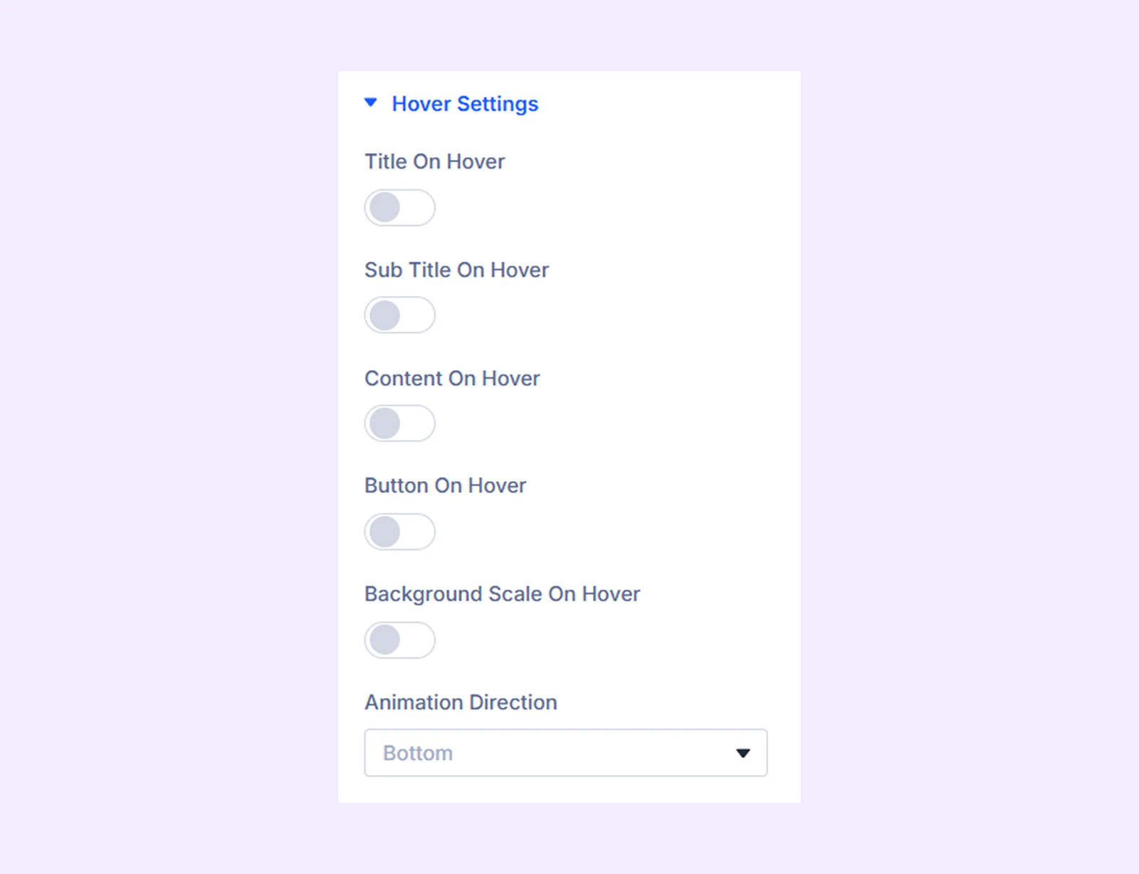
Hover Settings
- Title on Hover: Enable this option to show the title only in the hover version.
- Subtitle on Hover: Enable this option to show the subtitle only in the hover version.
- Content on Hover: Enable this option to show the content only in the hover version.
- Button on Hover: Enable this option to show the button only in the hover version.
- Background Scale on Hover: Enable this option to slightly zoom the background image on hover.
- Animation Direction: Choose the direction from which the hover animation appears.
Link: Use this default Divi setting to add a link to the entire module.
Background: Add a background color, image, or gradient to the hover box background.
Element Label: Rename the module to organize it more easily in the Divi Builder. (Only you can see this label.)
Design Tab
Use this tab to customize the visual appearance of the hover box.
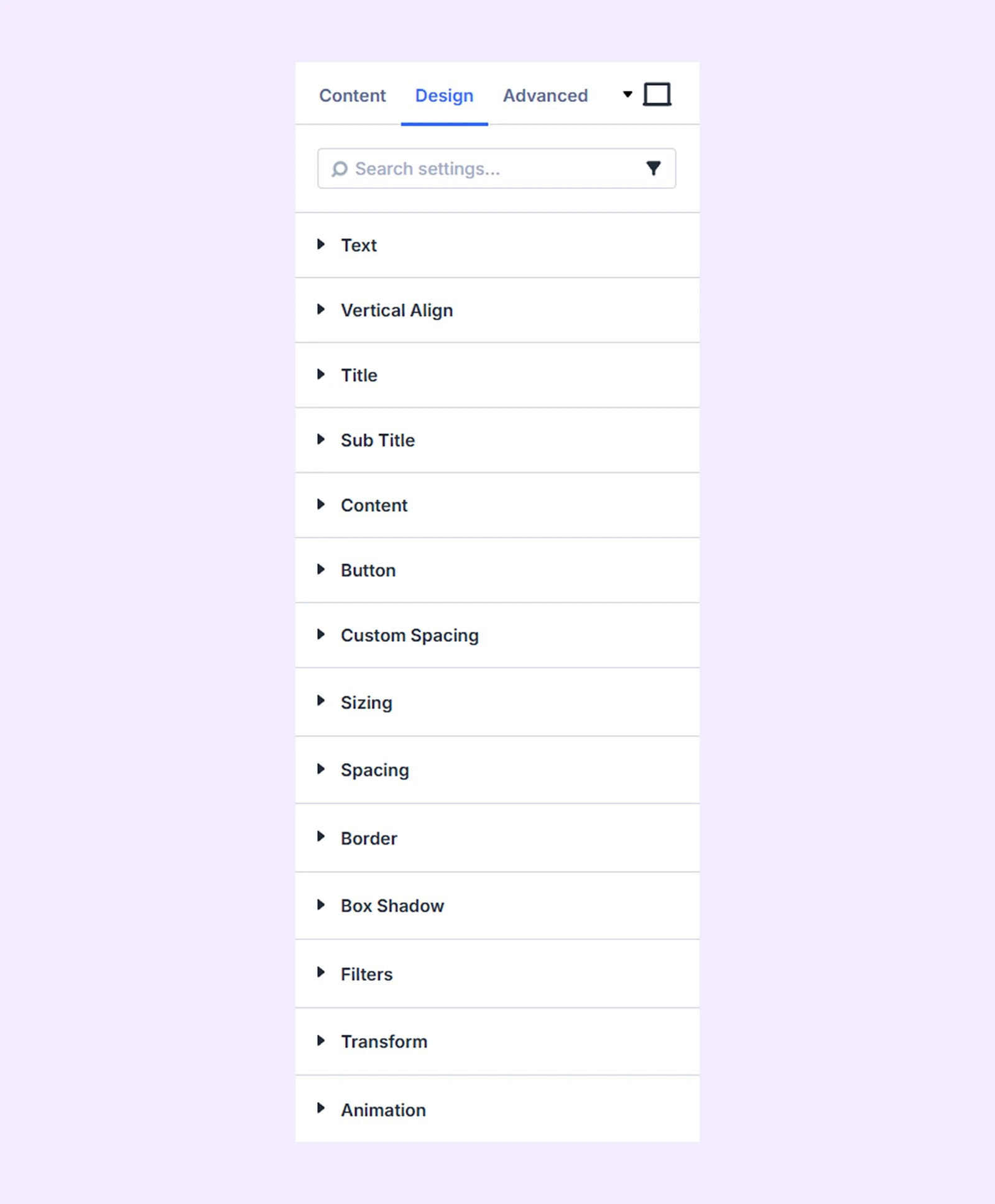
Text: Customize the alignment and shadow settings of the hover box text.
Vertical Align: Adjust the vertical position of the content relative to the background. (This works when the module height is fixed and larger than the content.)
Title: Customize the typography settings of the title text.
Subtitle: Customize the typography settings of the subtitle text.
Content: Customize the typography settings of the content text.
Button: Customize the alignment, background, typography, and border settings of the button.
Custom Spacing: Adjust the margin and padding of individual hover box elements.
Sizing: Adjust the width, height, and alignment of the module.
Spacing: Add custom margin and padding to the module’s container.
Border: Customize the border style, width, and color. And style each border separately or apply the same style to all sides.
Box Shadow: Add shadow effects to the module.
Filters: Apply color filters to enhance the appearance.
Transform: Scale, rotate, move, or skew the module.
Animation: Apply reveal animation effects and customize delay, duration, repeat settings, and animation type.
Advanced Tab
This tab provides additional settings for advanced users who want greater control over the module with custom code, conditions, and more.
Need Help?
If you have any questions or need assistance, contact our support team: [email protected]