
The DiviFlash Filterable CPT module lets you display any type of posts with advanced filtering options.
Let’s see the settings in brief and how to make better use of it —
Content Tab
This tab contains the essential settings to add and configure CPT items.
Add New Item
Click the + Add New Item button to create a new CPT element. This will open the CPT Element Settings, where you can add and customize each element individually. To learn more, click here.
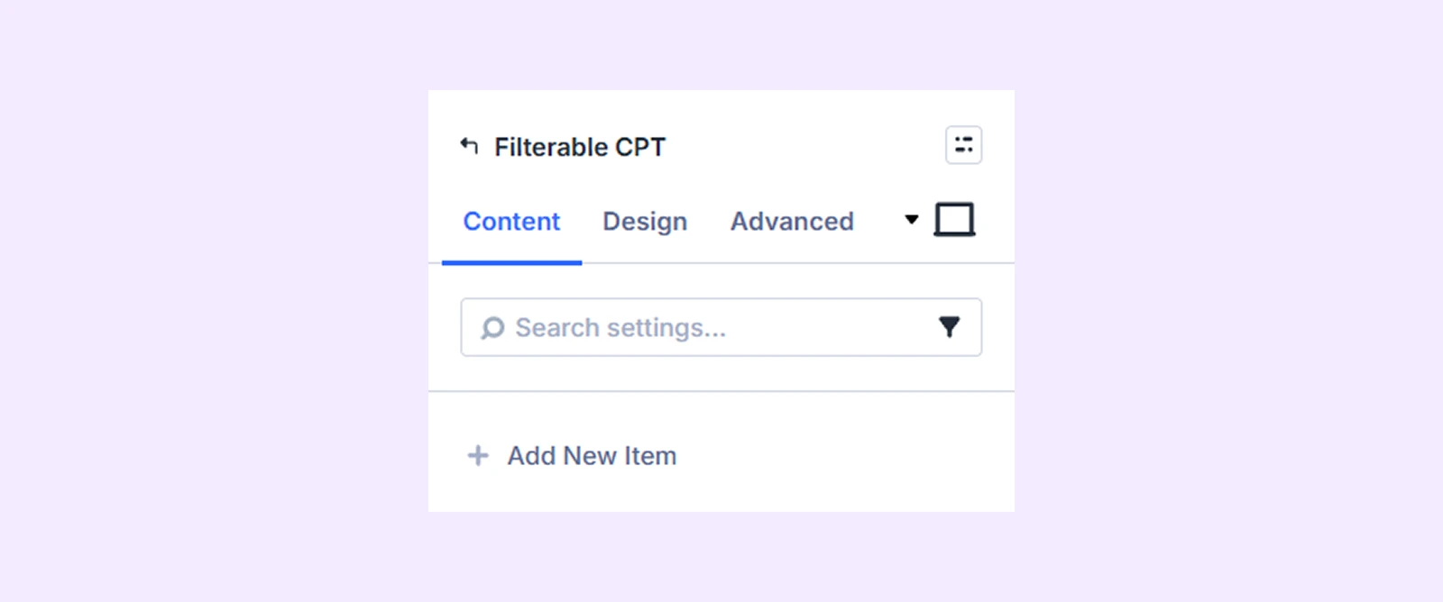
Note: You can change the ordering of the post elements by dragging the post element bars.
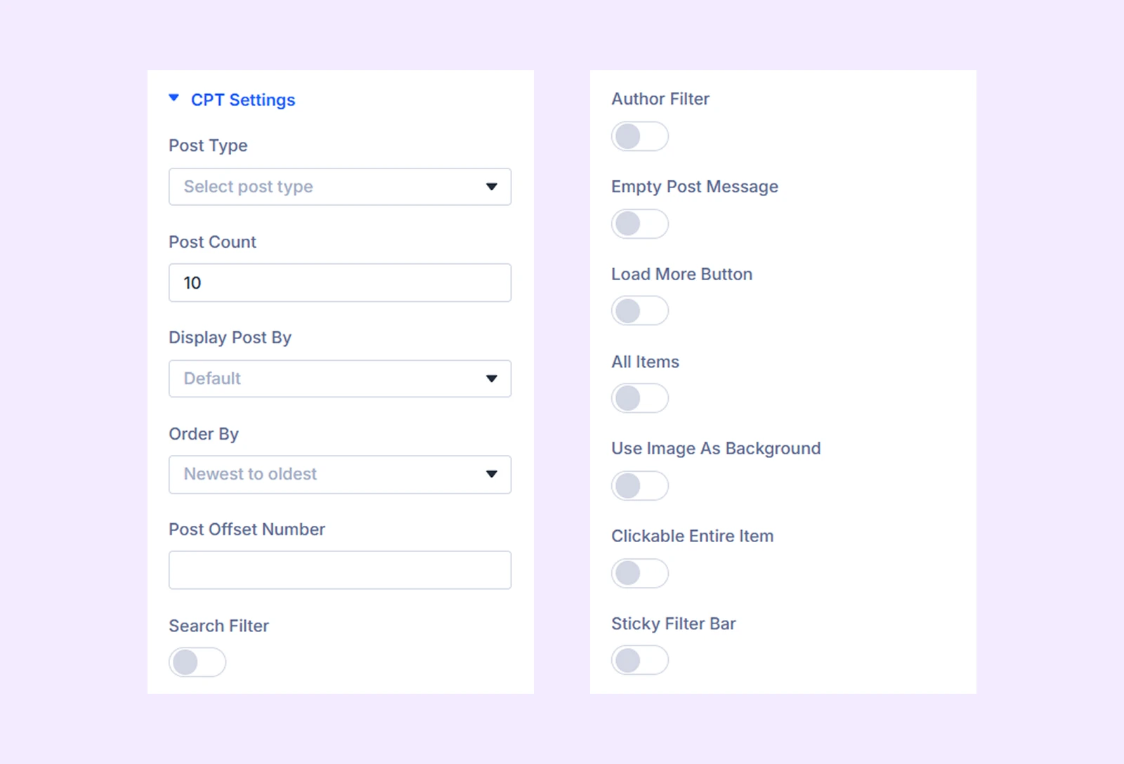
CPT Settings
- Posts For Current Page: Enable this option to display posts related to the current page. (This setting is available only when using the module inside the Divi Theme Builder.)
- Post Type: Select the type of content you want to display in the grid, such as posts, projects, or products.
- Post Count: Define how many posts you want to display in the grid.
- Display Post By: Choose how posts should be displayed, including Default, By Taxonomy, or Multiple Filter options.
- Select Taxonomy: Select the taxonomy of your post types. The options you get will vary based on what you choose as the post type. (Only available when you choose By Taxonomy from the display post by setting.)
- Select Terms: Select specific terms (like categories) to use as filters in the grid.
- Select Taxonomy According to Post Type: Choose if you want to create the filter based on categories, tags, or both. Only available if you choose “Multiple Filter” as “Display Post By, and when you choose Posts from Post Type.
- Multi Filter Type: Select whether the filters should use AND logic or OR logic. Only works if you choose both tags and categories for the filter. Only available if you choose “Multiple Filter” as “Display Post By.”
- Select Taxonomy: Select the taxonomy of your post types. The options you get will vary based on what you choose as the post type. (Only available when you choose By Taxonomy from the display post by setting.)
- Order by: Set how posts are ordered, such as by date, title, or other criteria.
- Posts Offset Number: Choose some posts to be excluded from the display, starting from the latest ones.
- Multiple Filter Dropdown Placeholder Text: Add a prefix to the dropdown filters. Only available if you choose “Multiple Filter” as “Display Post By.”
- Search Filter: Enable to add a search field to the filterable CPT.
- Search Button Text: Input the text for the search button.
- Search Placeholder Text: Input the placeholder text for the search field.
- Author Filter: Enable filtering posts by author.
- Empty Post Message: Enable to display a message in case there are no posts that match the filter
- Custom Empty Post Message: Submit the empty post message you want to display.
- Load More Button: Enable to add a load more button to the filterable CPT grid.
- Load More Text: Define the text displayed on the Load More button.
- All Items: Enable an option to show all items without filtering.
- All Item Button Text: Set the label for the “All” filter button.
- Use Image as Background: Use the featured images of the posts as the background of the other post elements.
- Background Image Scale on Hover: Enable this option to make the background image zoom in when you hover over it.
- Clickable Entire Item: Enable to make all the custom posts in the grid linked to the original post.
- Sticky Filter Bar: Enable a sticky filter bar that remains visible while scrolling.
- Turn Off Sticky On: Choose specific devices (desktop, tablet, mobile) where the sticky filter should be disabled.
- Sticky Offset: Adjust the top spacing of the sticky filter bar to control its position while scrolling.
Multi Filter (ACF)
If you choose “Multiple Filter” as “Display Post By” and have an ACF plugin installed, this additional section will appear.

- ACF Filter: Toggle on to enable the use of custom field type as the multi filter.
- Select ACF Field: Choose the custom field you want to use for the multi filter.
Multi Filter Field Type
If you choose “Multiple Filter” as “Display Post By” this additional section will appear.
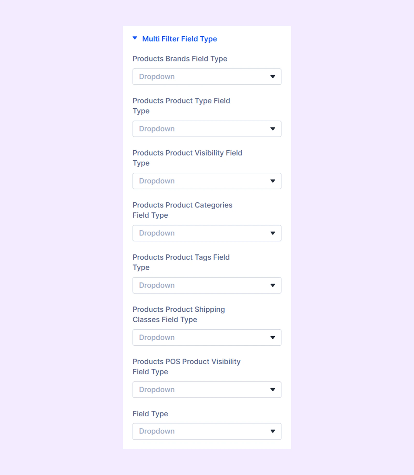
- Project Categories Field Type: Select whether the category filter should be a dropdown menu or a checkbox list.
- Project Tags Field Type: Select whether the tags filter should be a dropdown menu or a checkbox list.
- Project Format Field Type:
Item Outer Wrapper Background: Add a background color, gradient, or image to the outer wrapper of the filterable CPT grid.
Item Inner Wrapper Background: Add a background color, gradient, or image to the inner wrapper of the filterable CPT grid.
Search Wrapper Background: Add a background color, gradient, or image to the wrapper of the search field. This section only appears if you enable “Search Filter.”
Link: Add a custom URL to the module and choose whether it opens in the same window or a new tab.
Background: Add a background color, gradient, image, video, pattern, or mask to the module.
Element Label: Rename the module to organize it more easily in the Divi Builder. (Only you can see this label.)
Design Tab
Use this tab to style and customize the appearance of the Filterable CPT module.
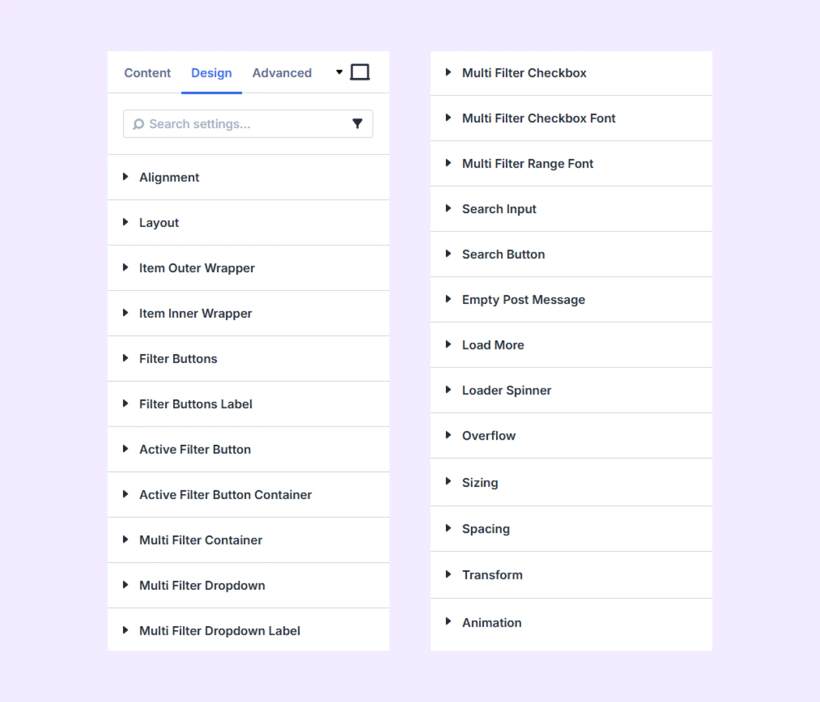
Alignment: Change the placement of all the post elements relative to the filterable CPT grid containers.
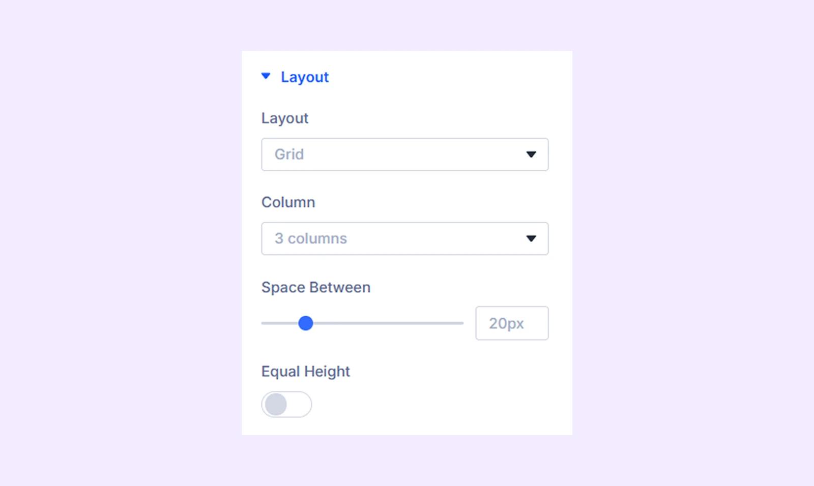
Layout
- Layout: Choose between a traditional grid layout or a modern masonry layout.
- Column: Select the number of columns to display in the filterable CPT grid.
- Space Between: Adjust the space between the post types.
- Equal Height: Enable to make all the CPT grids the same height.
Item Outer Wrapper: Border customization options for the outer wrapper of the filterable CPT grid.
Item Inner Wrapper: Border customization options for the inner wrapper of the filterable CPT grid.
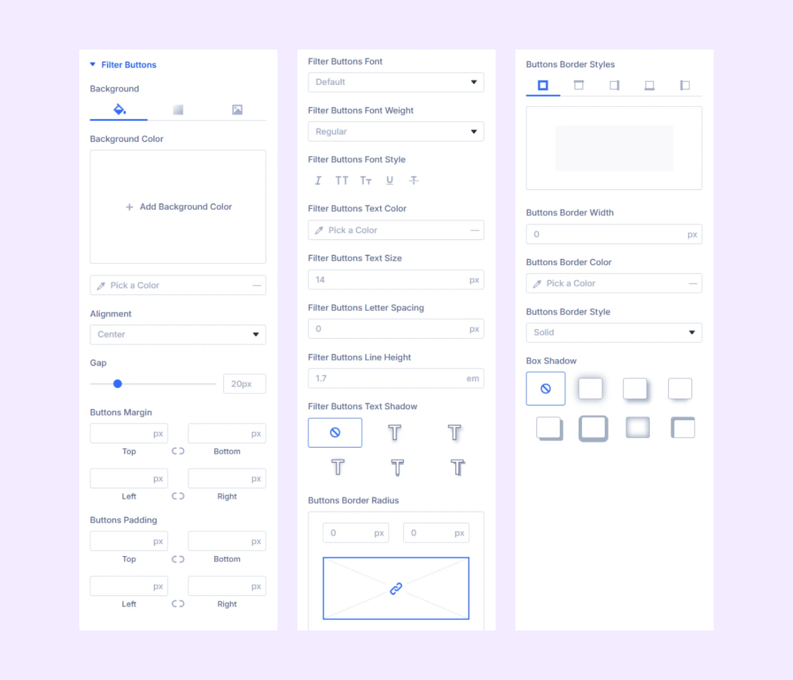
Filter Buttons
- Background: Add a background color, gradient, or image to filter buttons.
- Alignment: Change the horizontal placement of the filter buttons relative to the CPT grid.
- Gap: Adjust the gap between the filter buttons.
The rest of the options are for the spacing, typography and border customization of the filter buttons.
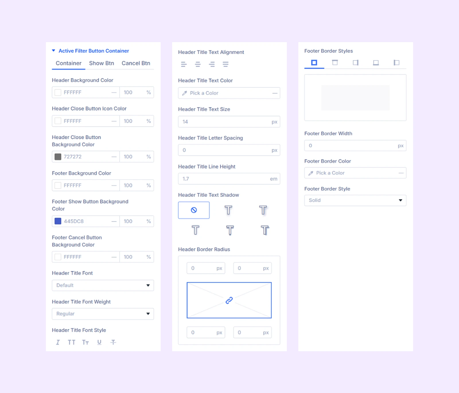
Active Filter Button: Background, typography, and border customization options for buttons that show the active filter data.
Active Filter Button Container
- Container: Color, typography and border options for the header and footer of the active filter button.
- Show Button: Typography and border options for the show button.
- Cancel Button: Typography and border options for the cancel button.
Multi Filter Container
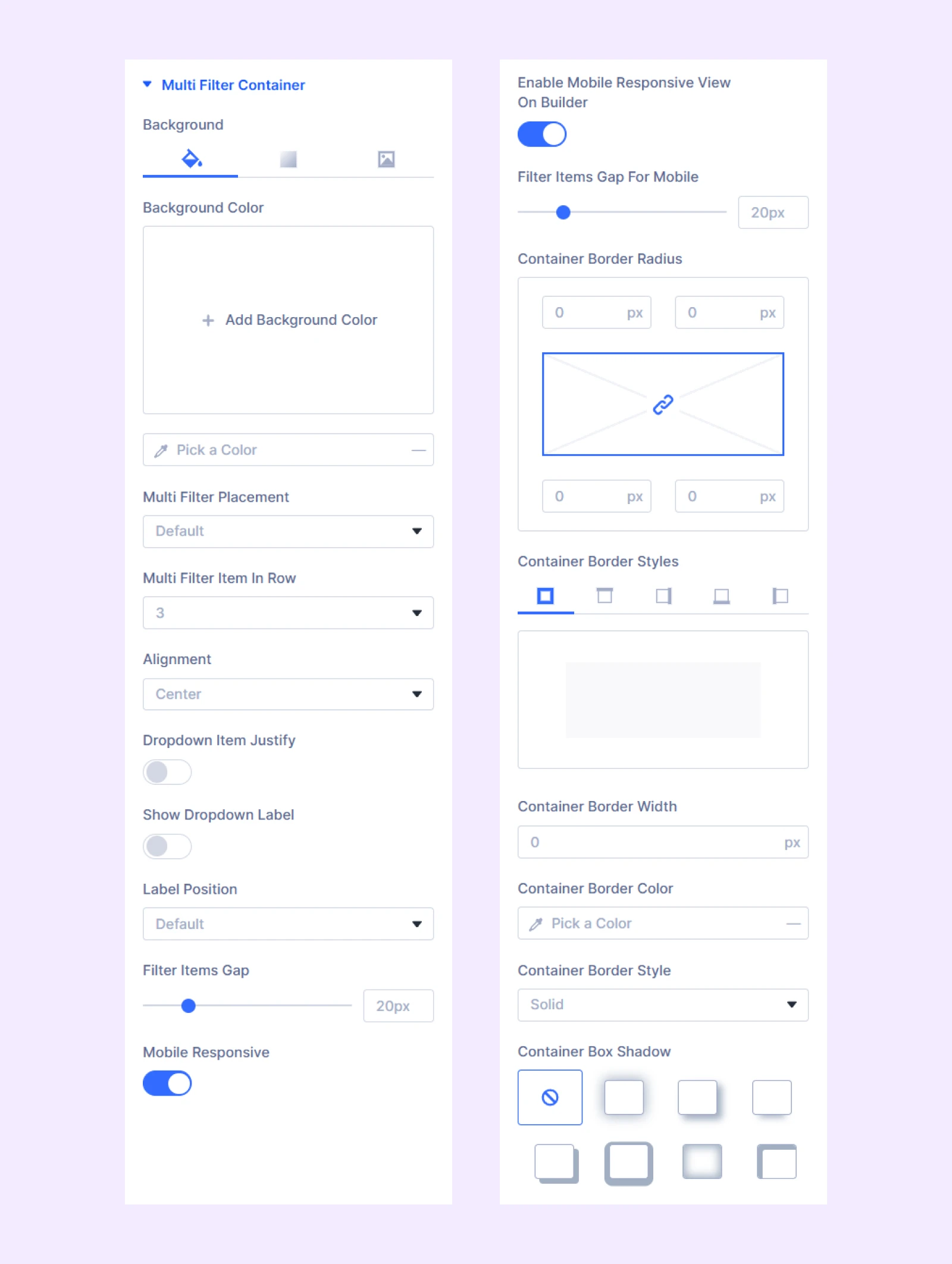
- Background: Add a background color, gradient, or image to the multi filter container.
- Multi Filter Placement: Choose if you want to place the multi filter container to the left, right, or center.
- Multi Filter Container Width: Adjust the width of the multi filter container. Only available if you place the multi filter container on the left or right.
- Vertical Alignment: Change the vertical position of the multi filter container relative to the filterable CPT grid. Only available if you place the multi filter container on the left or right.
- Multi Filter Item in Row: Choose how many filter items you want to display in each row.
- Alignment: Choose the horizontal placement of the multi filter container.
- Dropdown Item Justify: Control the alignment of dropdown items within the container.
- Show Dropdown Label: Enable to add a label to the dropdown labels.
- Label Prefix: Input a prefix text to the dropdown labels.
- Use Single Label: Enable to use one label for both dropdowns.
- Single Label Text: Input the label you want to use for both of the dropdowns.
- Label Position: Choose the position of the dropdown labels.
- Filter Items Gap: Adjust the gap between the filter items.
- Mobile Responsive: Enable to display a mobile version of the multi filter.
- Enable Mobile Responsive View on Builder: Enable this option to display a mobile version of the multi filter with header, footer, and show and cancel buttons.
- Filter Items Gap for Mobile: Adjust the gap between the filter items but only for mobile devices.
The rest of the options are for customizing the border of the multi filter container.
Multi Filter Dropdown
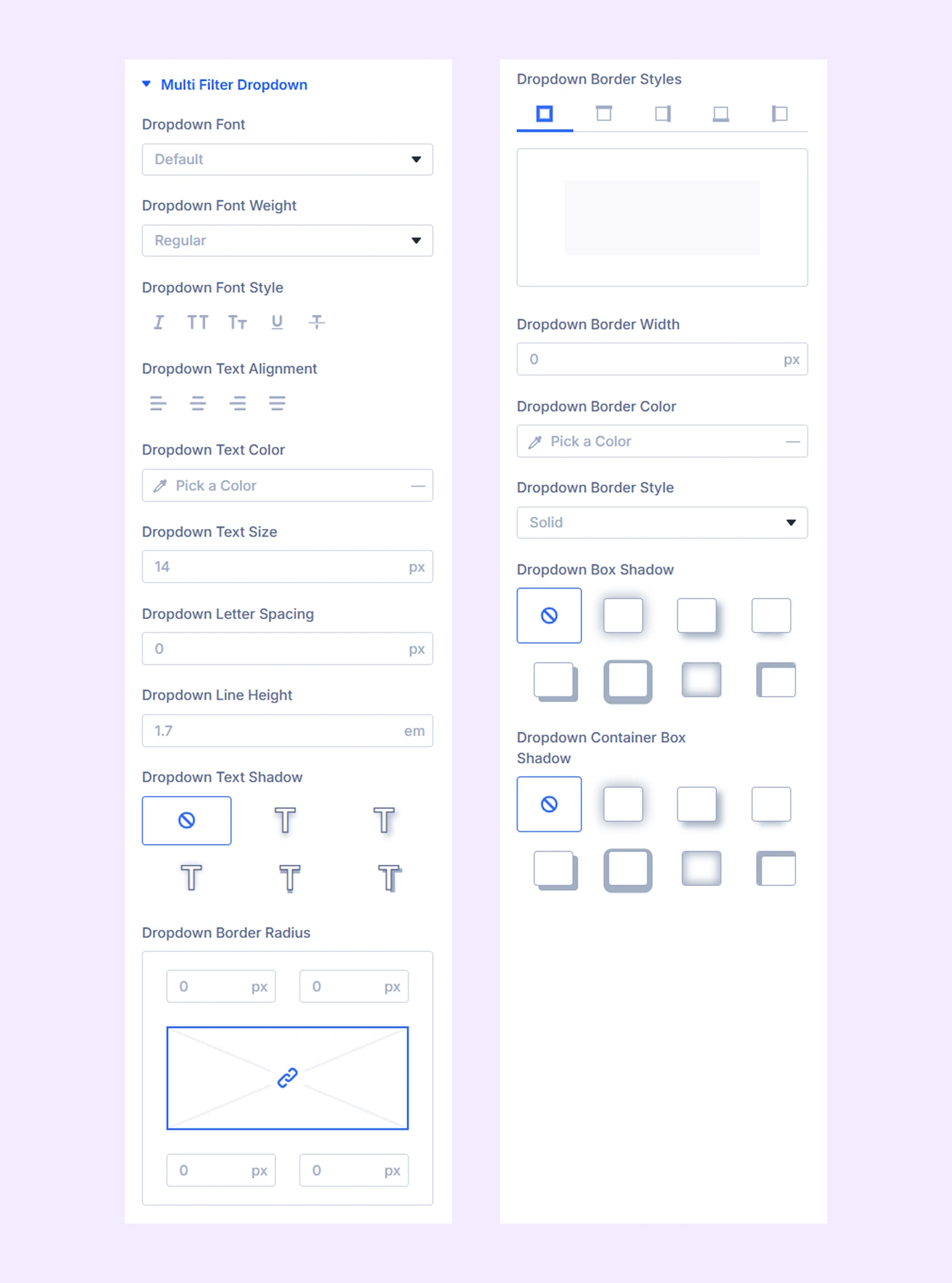
- Background: Add a background color, gradient, or an image to the dropdown.
- Autocomplete Min Height: Set a minimum height limit for the dropdown autocomplete.
The rest of the options are for customizing the typography and the border of the dropdown and its container.
Multi Filter Dropdown Label
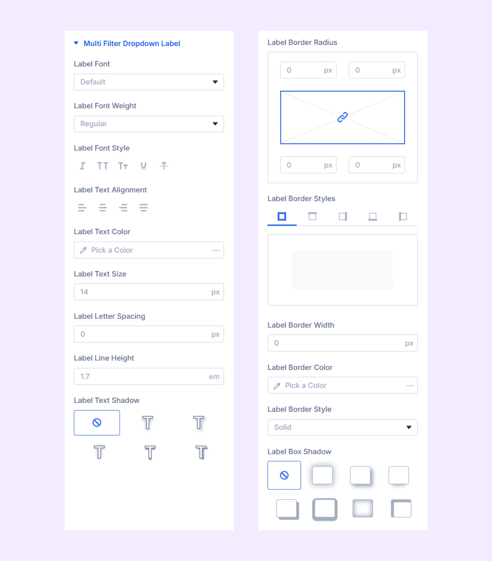
- Label Min Width: Set a minimum width limit for the dropdown label.
The rest of the options are for customizing the typography and the border of the dropdown label and its container.
Multi Filter Checkbox
Choose “Checkbox” from the “Multi Filter Field Type” to apply the styling options available here.
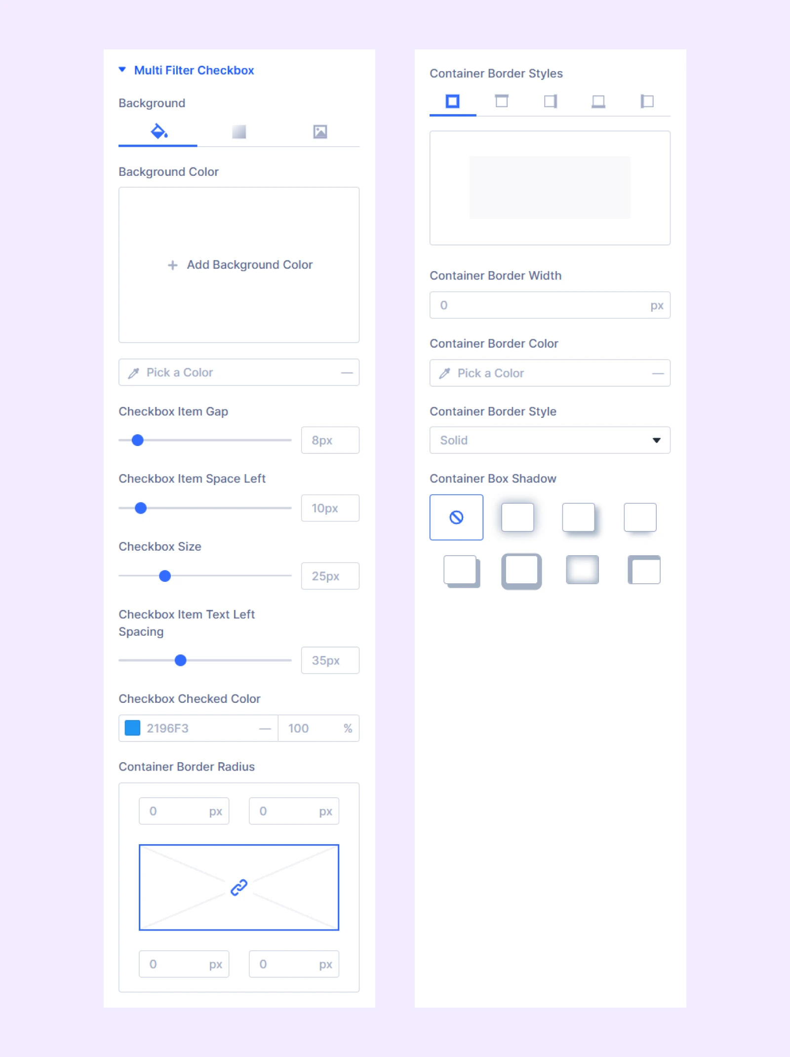
- Background: Add a background color, gradient, or an image to the checkbox background.
- Checkbox Item Gap: Adjust the gap between the checkbox items.
- Checkbox Item Space Left: Adjust the amount of space to leave from the left border to the checkboxes.
- Checkbox Size: Adjust the size of the checkboxes.
- Checkbox Item Text Left Spacing: Adjust the gap between the checkboxes and it text.
- Checkbox Item Checked Color: Specify the color of the checkboxes in their checked state.
The rest of the options are for customizing the border of the checkboxes.
Multi Filter Checkbox Font: Typography options for the label and checkbox text.
Multi Filter Range
If you use range as the custom field type through an ACF plugin, you can customize the colors of the range from this section.
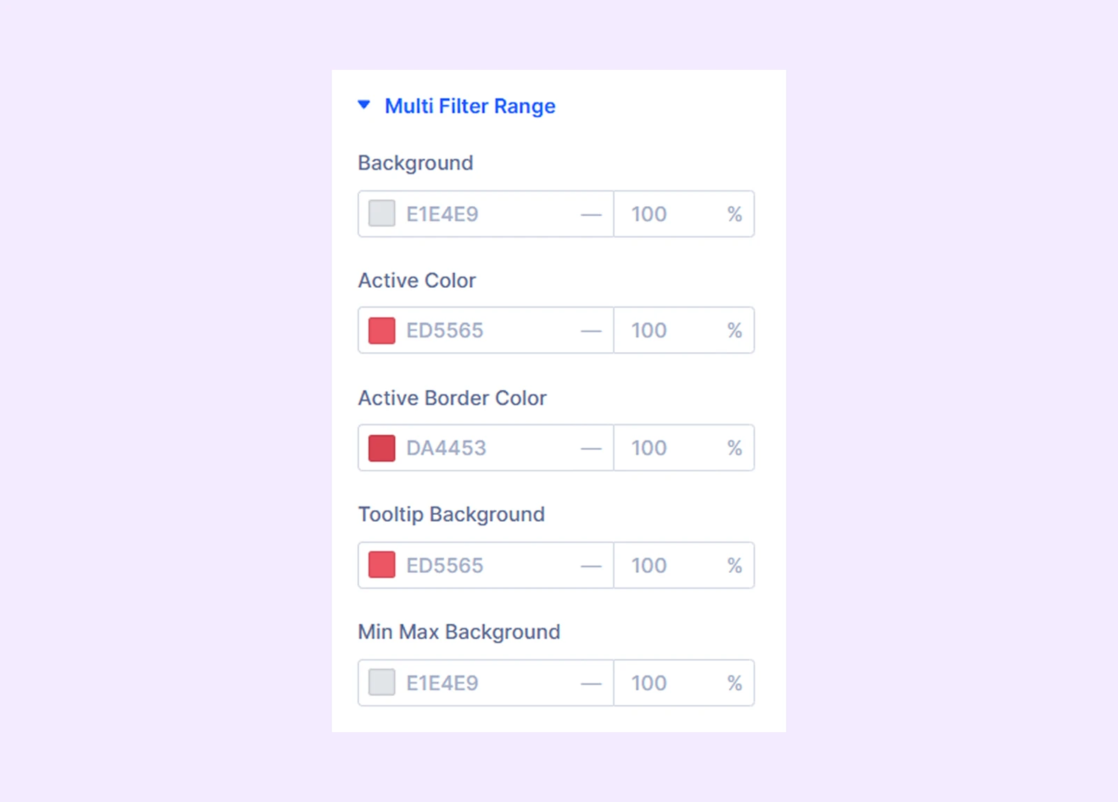
Multi Filter Range Font: If you use range as the custom field type through an ACF plugin, you can customize the typography of the range field from this section.
Search Input
- Input Background: Change the search input background color or add a color gradient or an image.
- Search Input Width: Adjust the width of the search input field.
- Search Alignment: Change the horizontal placement of the search input field.
Customize the typography and border of the search input field.
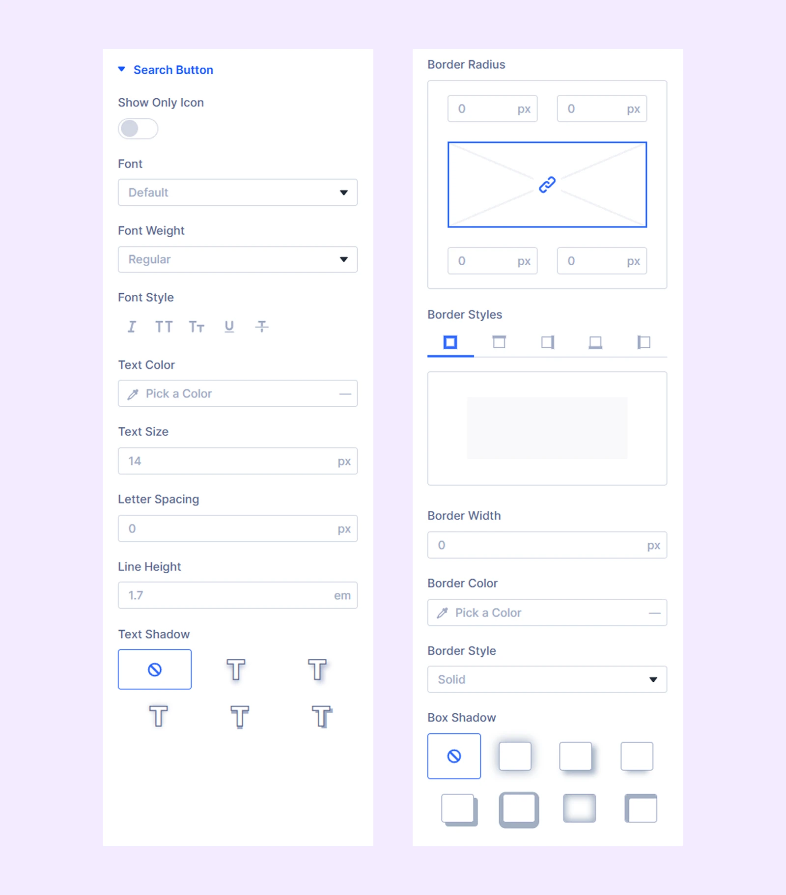
Search Button
- Background: Change the background color of the search button or add a color gradient or an image.
- Use Icon: Enable this option to use an icon beside the button text.
- Icon Size: Adjust the size of the search button icon.
- Icon Color: Change the color of the search icon.
- Icon Placement: Decide if the icon will be on the right side of the search bar button text or on the left side.
- Show Only Icon: Enable this option to use only the icon instead of the search button text.
The rest of the options are for the typography of the search button text and its border.
Empty Post Message: Typography options for
Load More
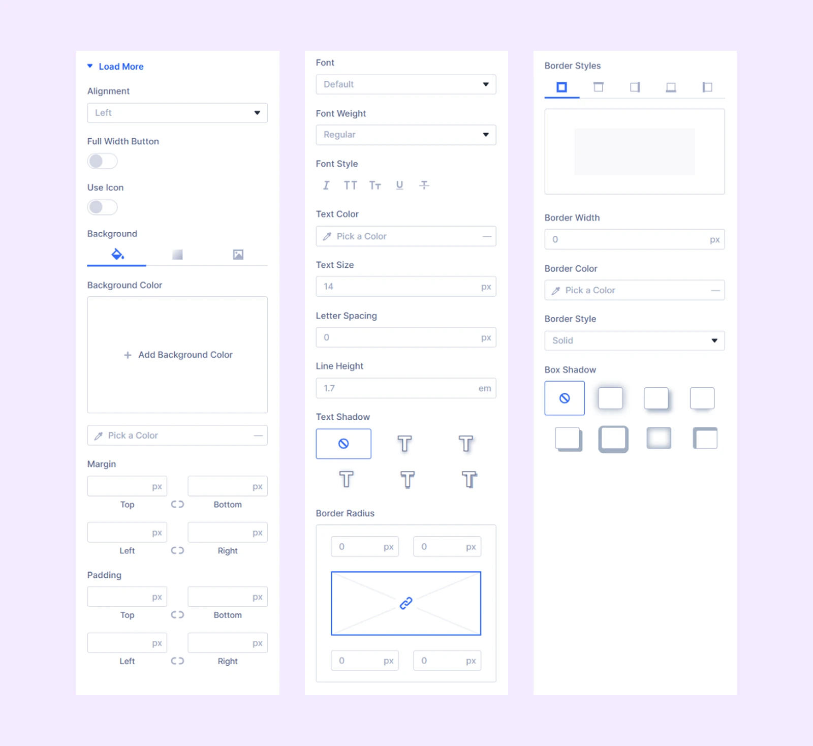
- Alignment: Change the horizontal placement of the load more more button respective to the filterable CPT grid.
- Full Width Button: Expand the 'Load More' button to fill the entire width of the filterable CPT grid's container.
- Use Icon: Enable this option to use an icon in the load more button.
- Icon Position: Decide if the icon will be placed on the left or right side of the button text.
The rest of the options are for background, spacing, typography, and border of the load more button.
Loader Spinner
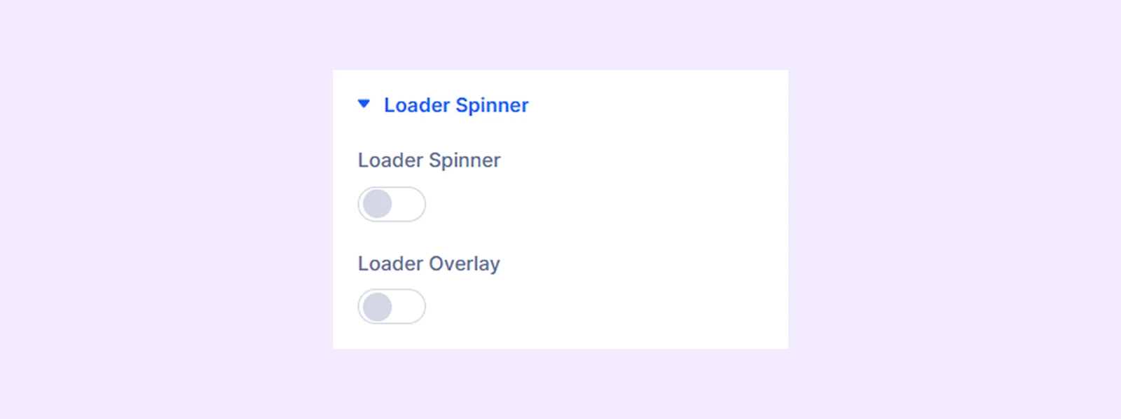
- Loader Spinner: Toggle this option on to use a loader spinner while the filterable CPT grids are loading.
- Type: Choose from 16 different preset loaders.
- Spinner Color: Change the color of the preset loader.
- Secondary Color: Add a secondary color to the loader.
- Spinner Size: Adjust the size of the loader.
- Alignment: Change the horizontal placement of the loader.
- Spinner Distance From Top: Adjust the distance between the loader and the top of the filterable CPT grid.
- Margin: Add a custom margin to the loader spinner from the filterable CPT grid.
- Loader Overlay: Enable to add a background color or gradient to the loader spinner.
Overflow
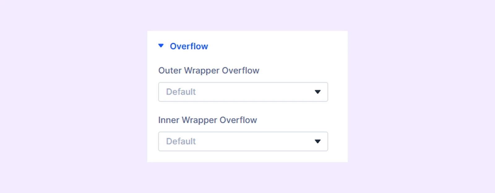
- Outer Wrapper Overflow: Control how content within the outer container is handled when it exceeds its boundaries.
- Inner Wrapper Overflow: Control how content within the inner container is handled when it exceeds its boundaries.
Sizing: Adjust the width, height, and alignment of the module.
Spacing: Adjust the margins and padding of the module container.
Transform: Adjust the scale, position, rotation, and size of the module.
Animation: Add reveal animation effects and control the animation style, delay, duration, and more.
Advanced Tab
This tab provides additional settings for advanced users who want greater control over the module with custom code, conditions, and more.
CPT Element Settings
From this settings tab, you can customize each custom post element separately. Any customization you make here will override the settings you make in the “CPT Grid Settings.”
Content Tab
Element
Type: Choose the type of the post element. There are 11 different post elements to choose from. However, you can use custom post elements, by using an ACF (Advanced Custom Field) plugin.
If you choose “Image”
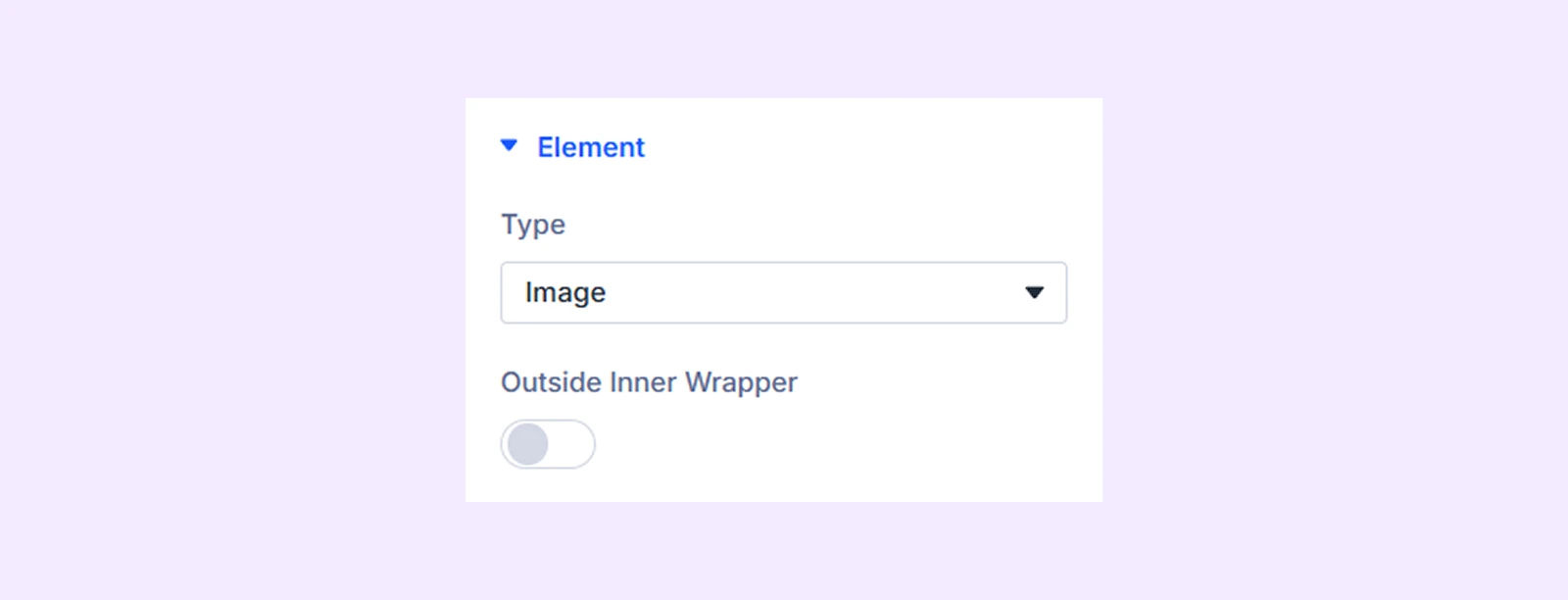
- Outside Inner Wrapper: Enable the featured image of the post to be placed outside the inner wrapper but inside the outer wrapper.
If you choose “Title”
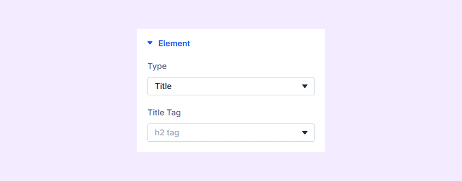
- Title Tag: Choose the HTML tag for the post title.
If you choose “Content”
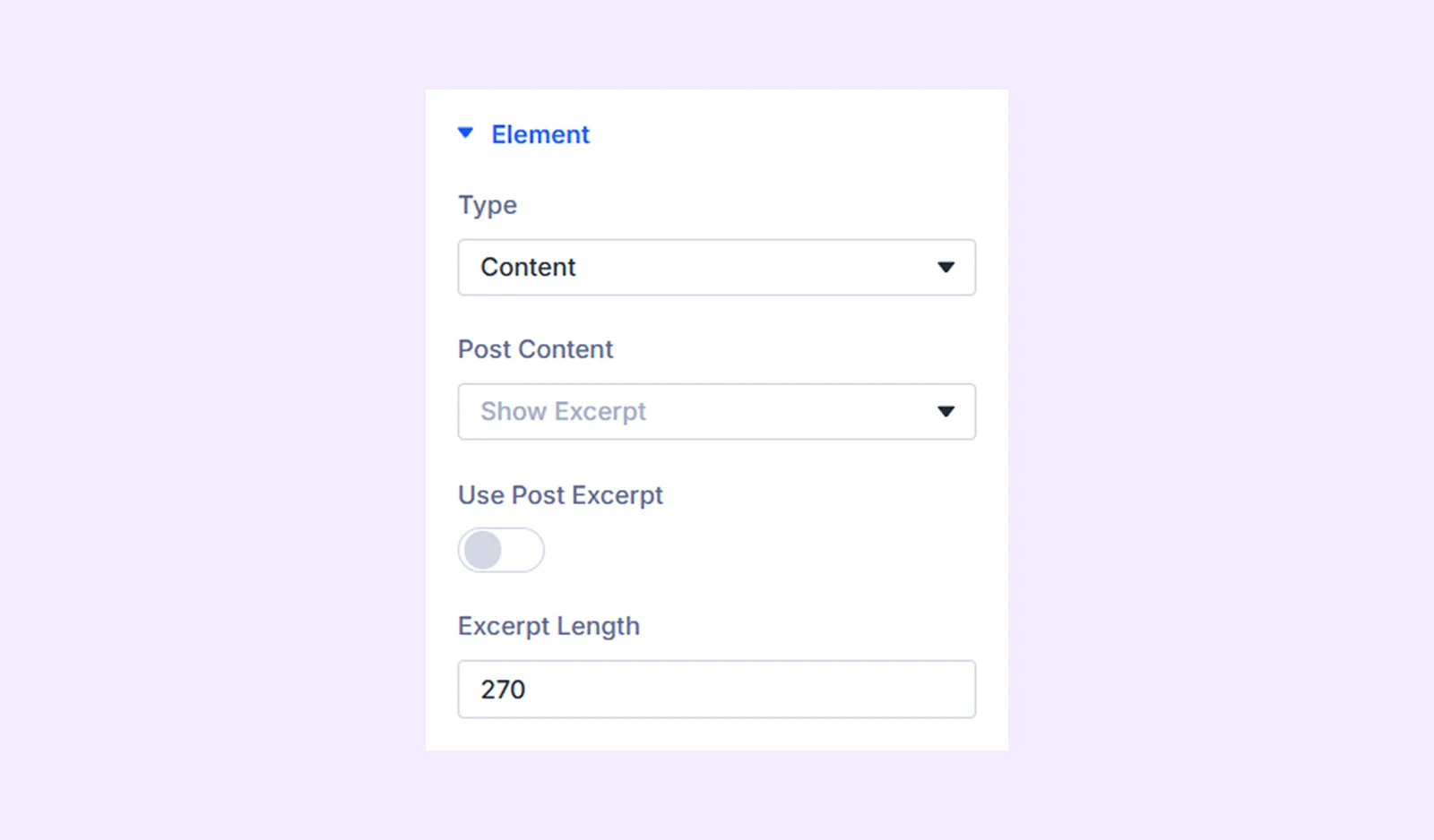
- Post Content: Choose to show either the content of the posts or just the post excerpt.
- Use Post Excerpt: Toggle this option to display the post excerpt that was manually submitted.
- Excerpt Length: Define the character length of the post excerpt.
Note: if the posts have no excerpt, Divi will automatically take the first few sentences to generate an excerpt from the post’s content. The Excerpt Length option allows you to control the length of this auto-generated excerpt. However, if the posts have manually submitted excerpts, the value in excerpt length will not apply.
If you choose the “Read More Button”
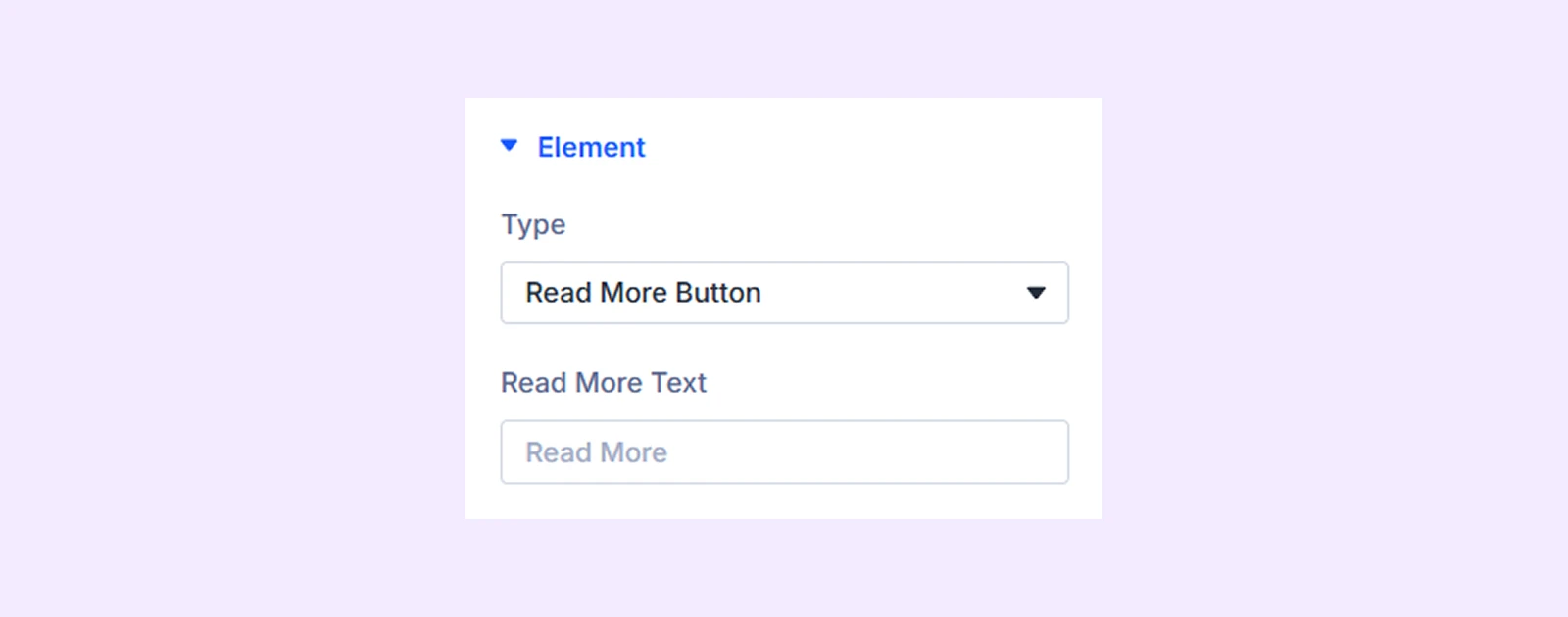
- Read More Text: Type in the text of the “Read More” button.
If you choose “Author”
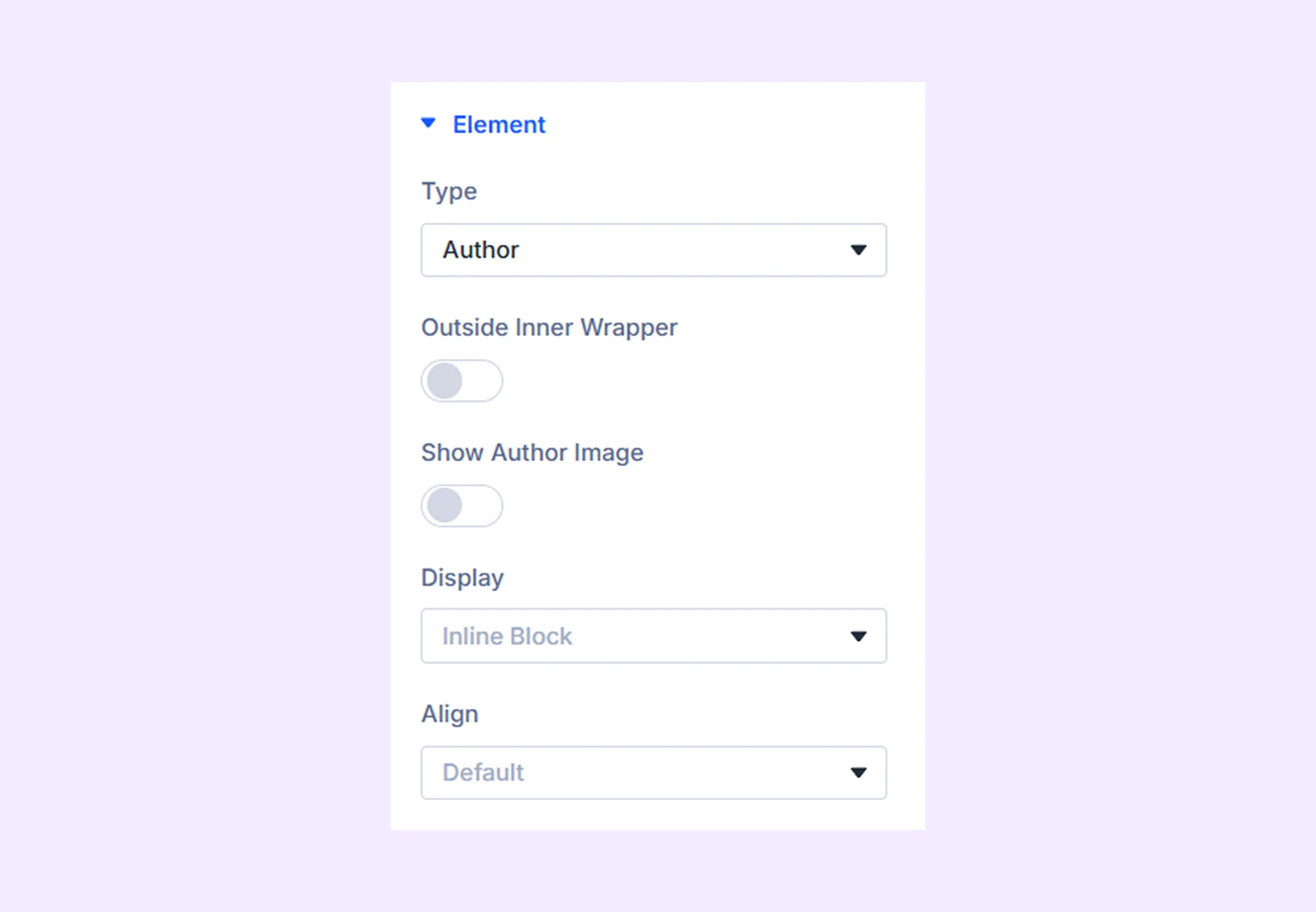
- Outside Inner Wrapper: Enable the author’s name to be placed outside the inner wrapper but inside the outer wrapper.
- Show Author Image: Enable to display author image along with the name.
- Author Image Size: Adjust the size of the author image.
- Hide Author Text: Enable to hide the author’s name and only display the image.
- Display: Select how to display the custom post element: inline (on the same line), inline block (next to each other with potential line breaks), or block (on separate lines).
- Align: Choose the horizontal placement of the author's name. Not available when “Block” is selected as the display option.
If you choose “Publish Date”
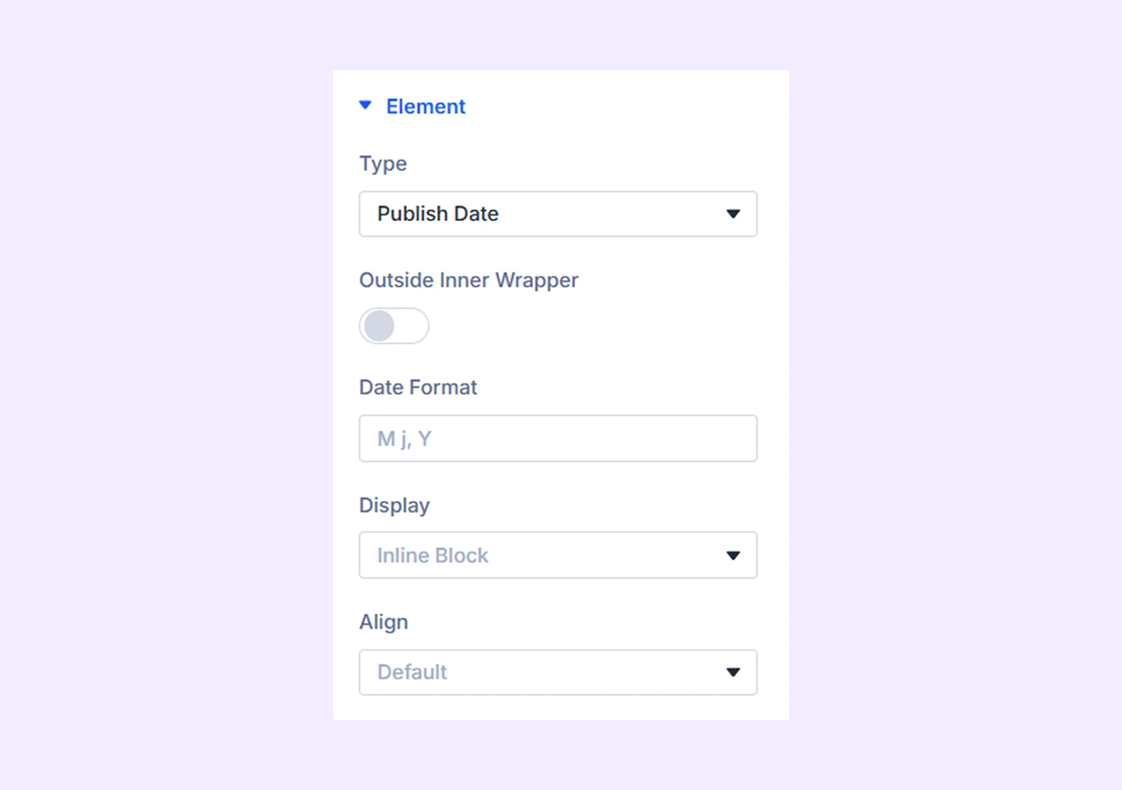
- Outside Inner Wrapper: Enable to place the post publish date outside the inner wrapper but inside the outer wrapper.
- Date Format: Define the date format. Use any combination from here.
- Display: Select how to display the post element: inline (on the same line), inline block (next to each other with potential line breaks), or block (on separate lines).
- Align: Choose the horizontal placement of the date. Not available when “Block” is selected as the display option.
If you choose “Taxonomy”
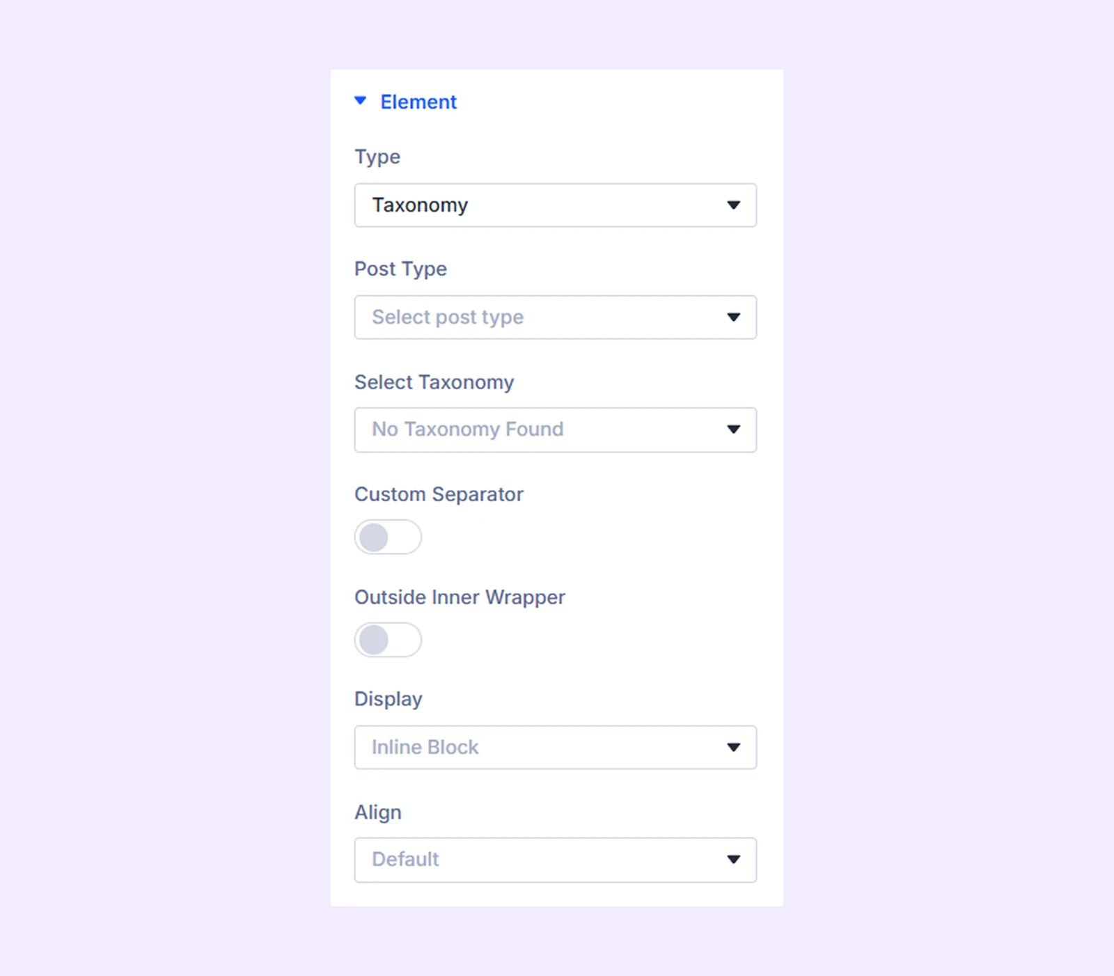
- Post Type: Choose the type of posts to display taxonomy. You have three options: Posts, Projects, and Products.
- Select Taxonomy: Choose the type of taxonomy you want to display. The options will vary depending on the post type you choose.
- Custom Separator: Enable to use a custom separator for the taxonomy.
- Separator Text: Insert the custom separator symbol.
- Before Text: Input the text you want to display before the separator.
- After Text: Input the text you want to display after the separator.
- Outside Inner Wrapper: Enable to place the post categories or post tags outside the inner wrapper but inside the outer wrapper.
- Display: Select how to display the post element: inline (on the same line), inline block (next to each other with potential line breaks), or block (on separate lines).
- Align: Choose the horizontal placement of the taxonomy. Not available when “Block” is selected as the display option.
If you choose “Custom Text”
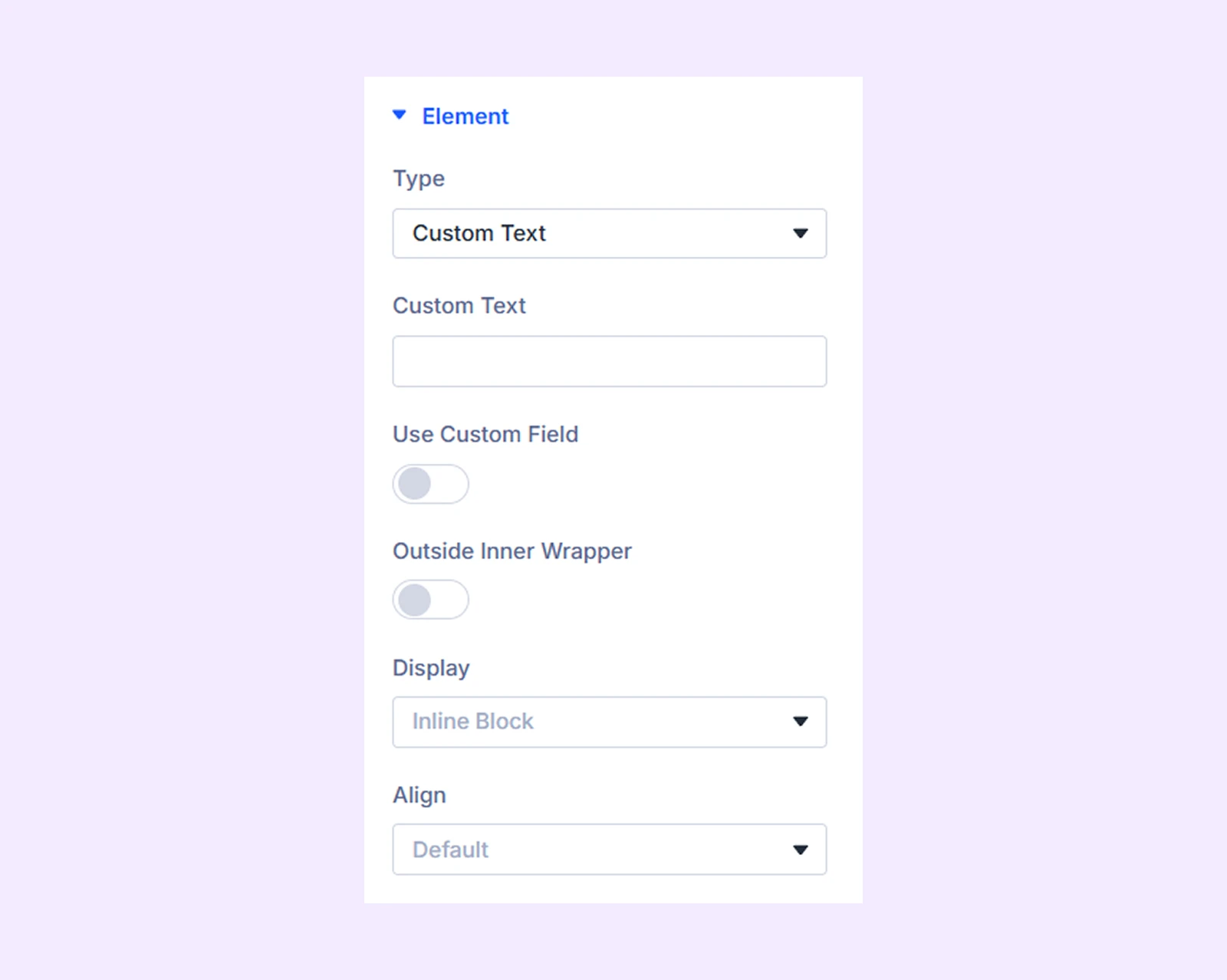
- Custom Text: Input the custom text you want to display.
- Outside Inner Wrapper: Enable to place the custom text outside the inner wrapper but inside the outer wrapper.
- Display: Select how to display the post element: inline (on the same line), inline block (next to each other with potential line breaks), or block (on separate lines).
- Align: Choose the horizontal placement of the custom text. Not available when “Block” is selected as the display option.
If you choose “Reading Time”
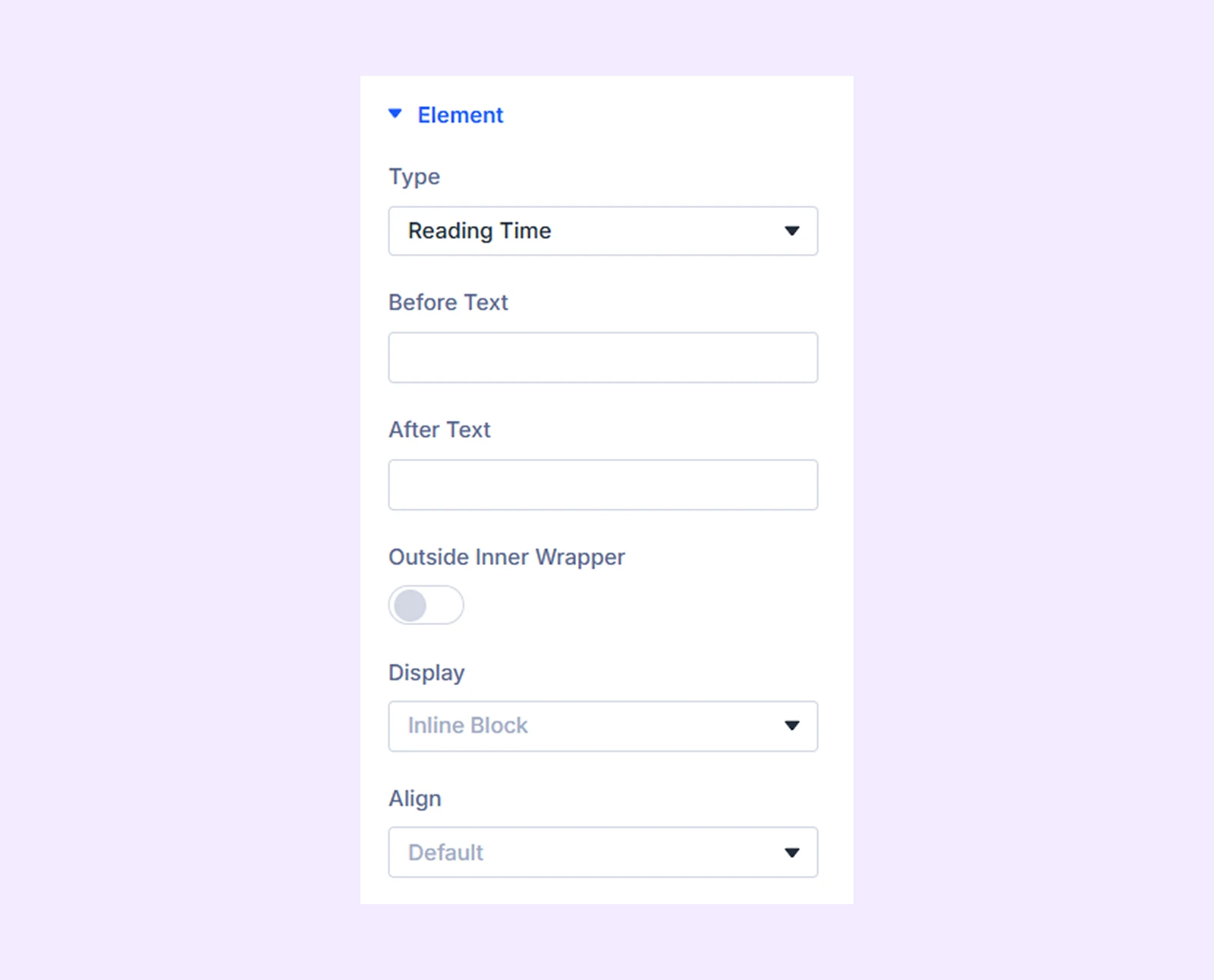
- Before Text: Add prefix.
- After Text: Add suffix.
- Display: Select how to display the post element: inline (on the same line), inline block (next to each other with potential line breaks), or block (on separate lines).
- Align: Choose the horizontal placement of the icon. Not available when “Block” is selected as the display option.
If you choose “Icon”
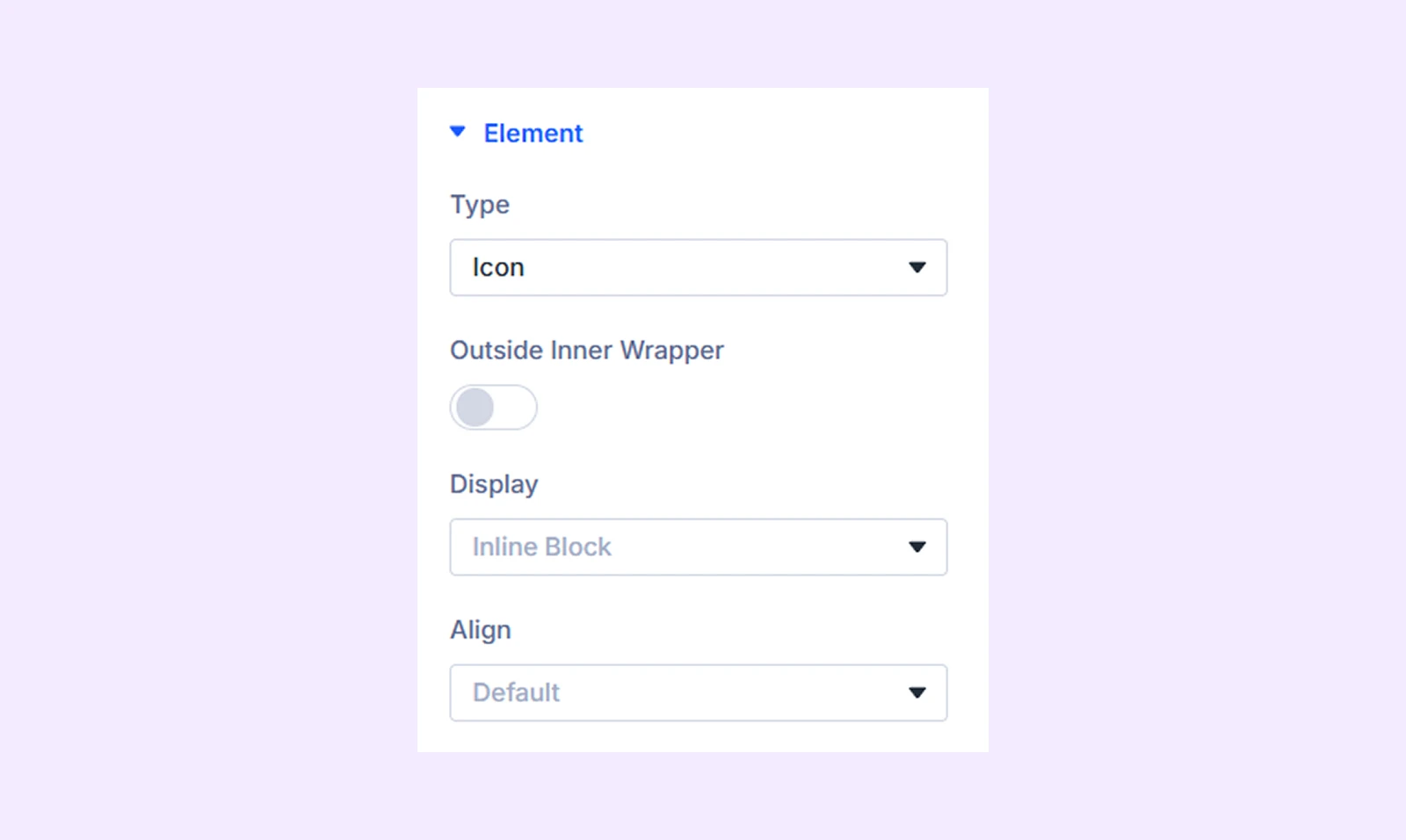
- Outside Inner Wrapper: Enable to place the icon outside the inner wrapper but inside the outer wrapper.
- Display: Select how to display the post element: inline (on the same line), inline block (next to each other with potential line breaks), or block (on separate lines).
- Align: Choose the horizontal placement of the icon. Not available when “Block” is selected as the display option.
If you choose “Divider” then it will add a divider line between custom post elements to separate content visually.

If you choose “ACF Fields”
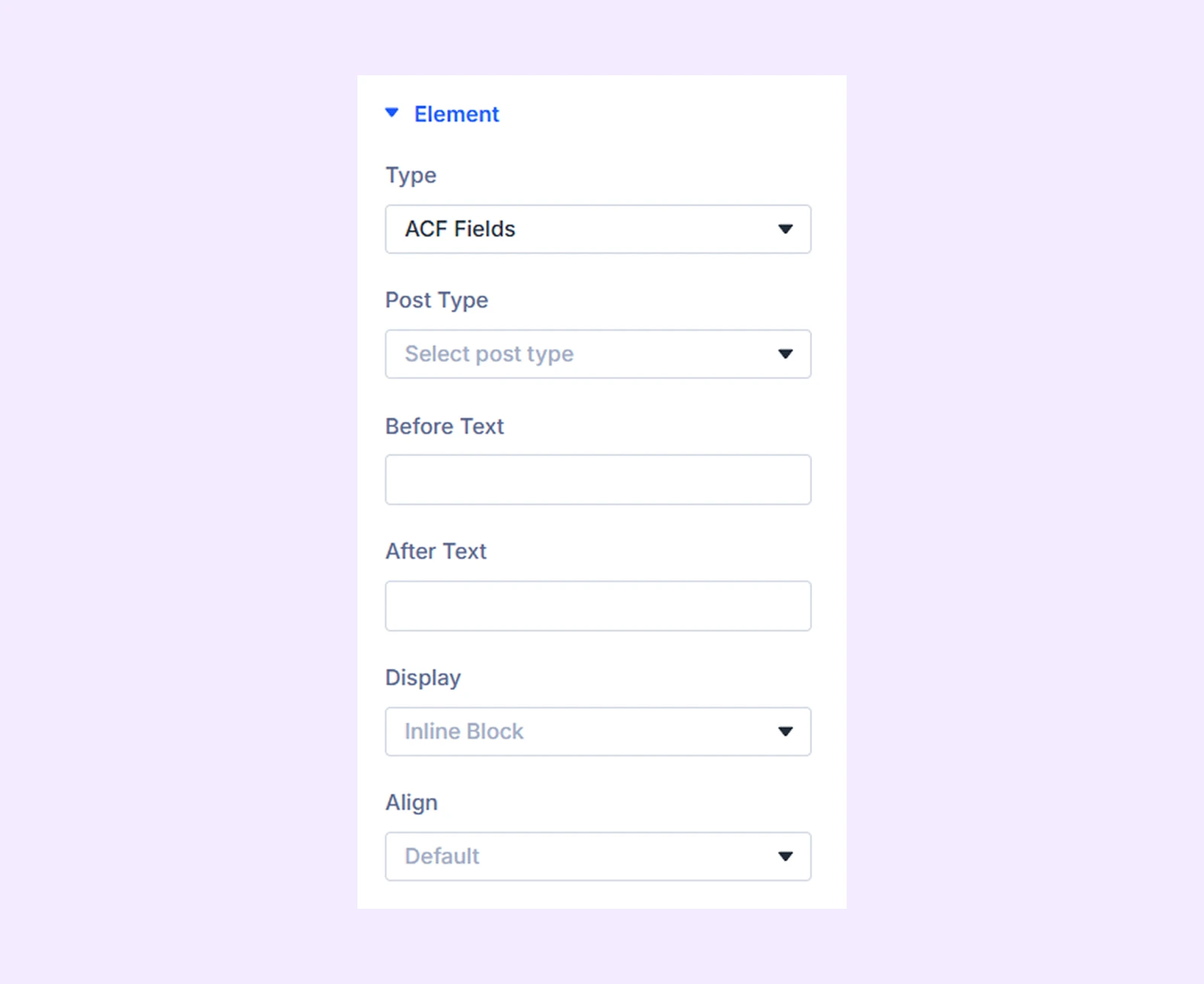
- Post Type: Choose the type of post you want to display in the ACF field. You have three options: Posts, Projects, and Products.
- Select ACF Field: Select the ACF field value you want to display.
- Before Text: Add text that will be displayed before the ACF field value.
- After Text: Add text that will be displayed after the ACF field value.
- Display: Select how to display the post element: inline (on the same line), inline block (next to each other with potential line breaks), or block (on separate lines).
- Align: Choose the horizontal placement of the ACF field value. Not available when “Block” is selected as the display option.
Overlay and Scale
If you choose “Image” as the “Type”, this additional section will show up.
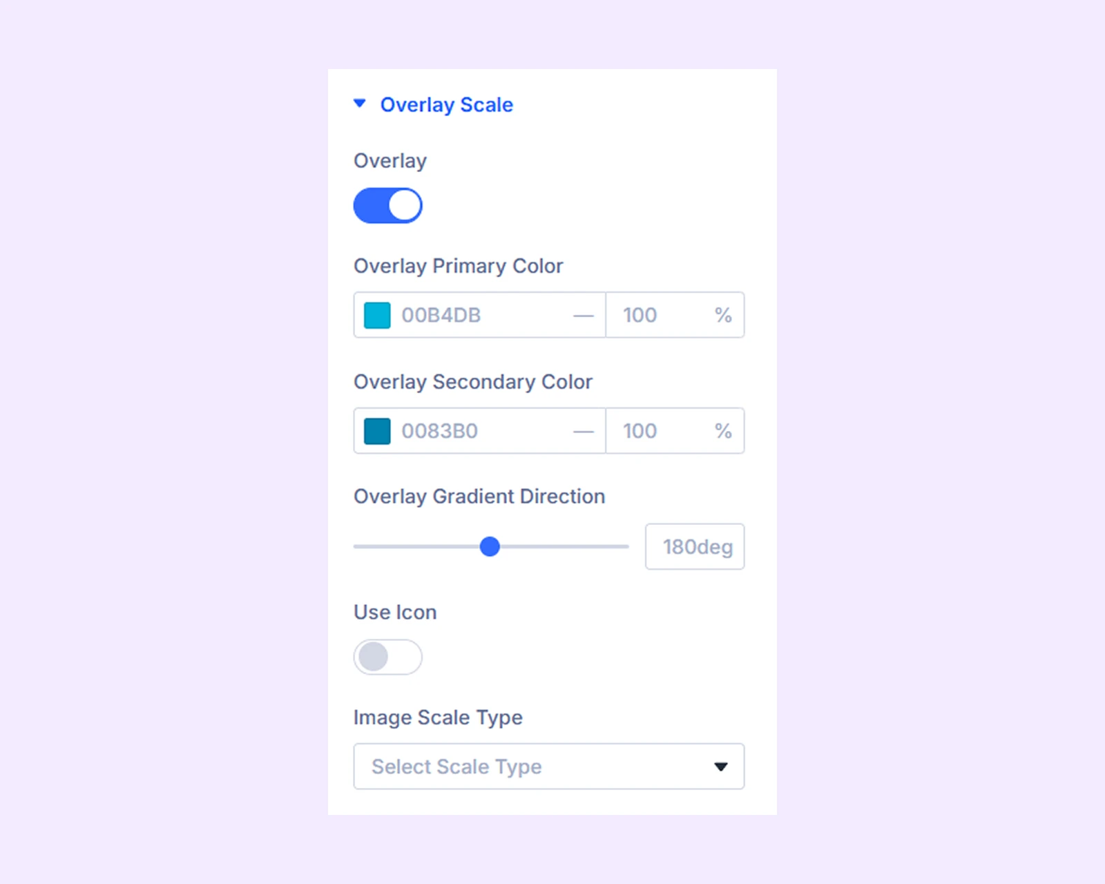
- Overlay: Enable to add a gradient over the image on hover.
- Overlay Primary Color: Choose the primary color for the overlay gradient.
- Overlay Secondary Color: Choose the secondary color for the overlay gradient.
- Overlay Gradient Direction: Adjust the overlay gradient direction.
- Use Icon: Enable to use an icon on the overlay gradient.
- Icon Color: Choose a color for the overlay icon.
- Icon Size: Adjust the size of the overlay icon.
- Icon Reveal Type: Choose the reveal animation for the overlay icon.
- Image Scale Type: Choose how the image will animate on hover.
Icon Settings
If you choose the “Read More Button”, “Author”, “Publish Date”, “Taxonomy”, “Icon”, and “ACF Fields” as the “Type”, this additional section will show up.
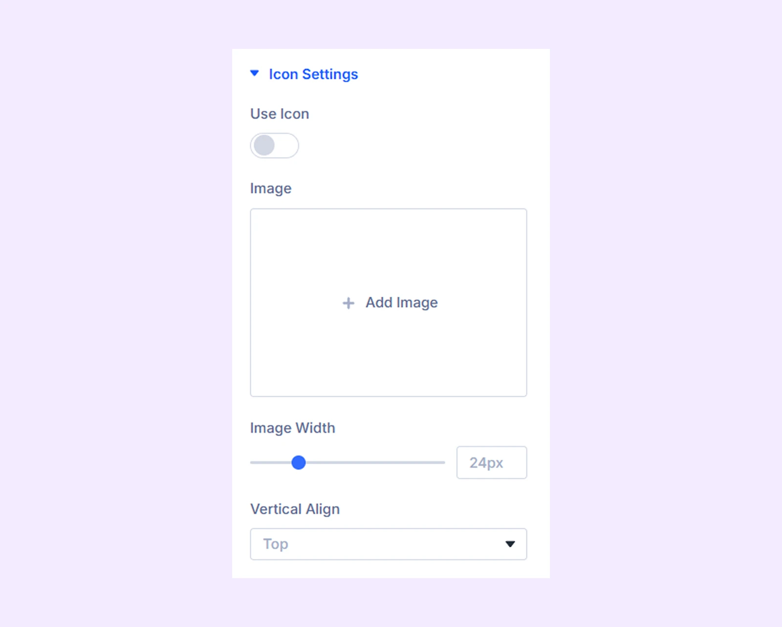
- Use Icon: Enable to use an icon for the selected post element.
- Icon Color: Choose a color for the icon.
- Icon Size: Adjust the size of the icon.
- Image: Upload an image to use instead of the icon.
- Image Width: Specify the width of the image.
- Vertical Align: Change the vertical placement of the post element relative to the image.
Settings For ACF
If you choose “ACF Fields” as the “Type”, this additional section will show up.
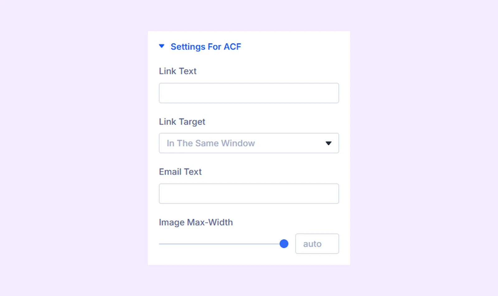
- Link Text: Input the text that will mask the URL in the custom URL field.
- Link Target: Decide if you want the URL to open in a new or the same tab.
- Email Text: Input the text that will mask the email address in the custom email field.
- Image Max Width: Set a maximum width limit for the image in the custom image field.
Divider Line
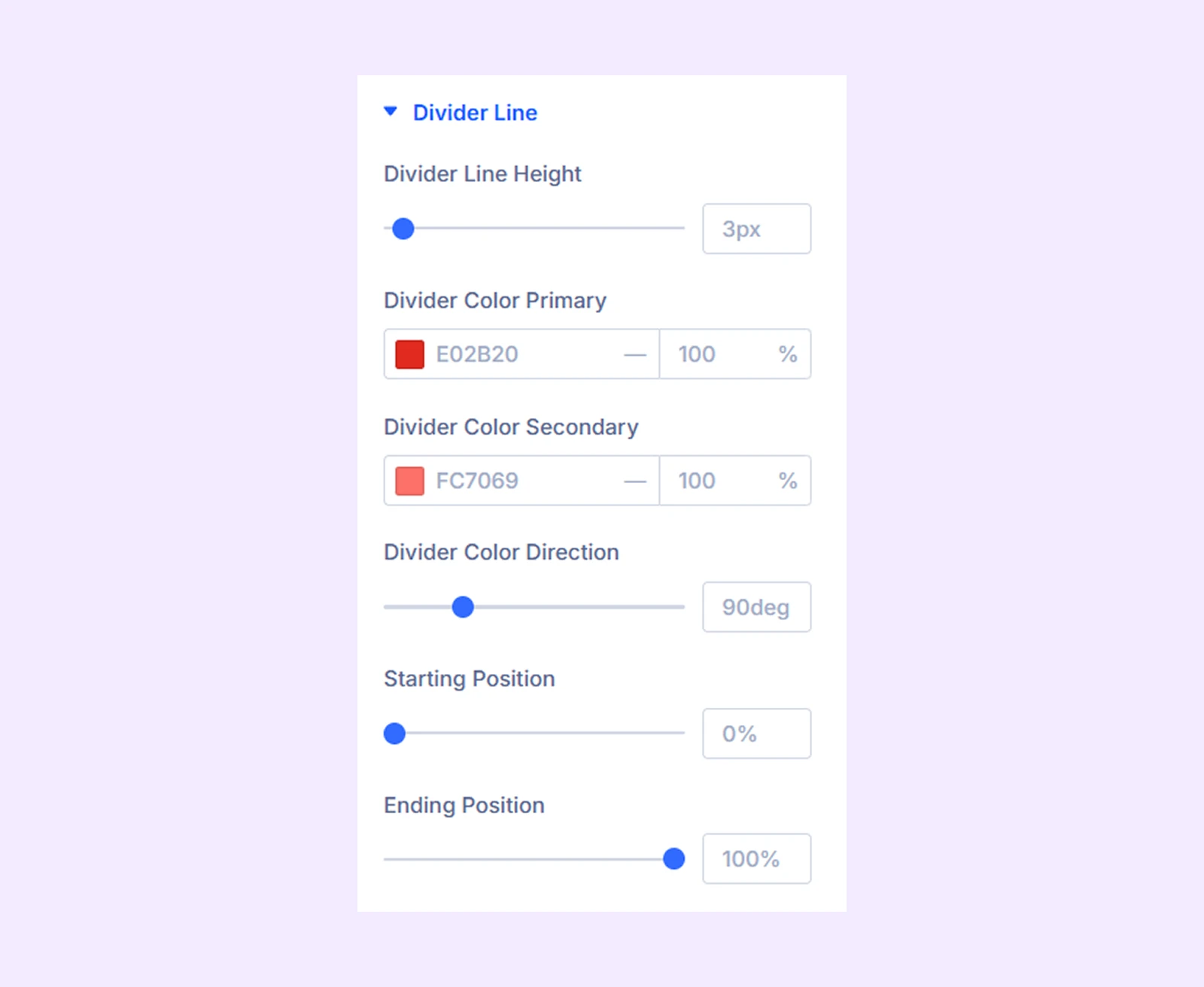
- Divider Line Height: Adjust the height of the divider line.
- Divider Color Primary: Choose the primary color for the divider gradient.
- Overlay Color Secondary: Choose the secondary color for the divider gradient.
- Divider Color Direction: Adjust the divider gradient direction.
- Starting Position: Adjust the starting position of the divider gradient.
- Ending Position: Adjust the ending position of the divider gradient.
Link: Add a link to the custom post element.
Background: Add background to the element.
Element Label: Rename the element for easier identification (visible only to you).
Design Tab
Alignment: Change the horizontal placement of all the text-based custom post elements relative to the CPT grid containers.
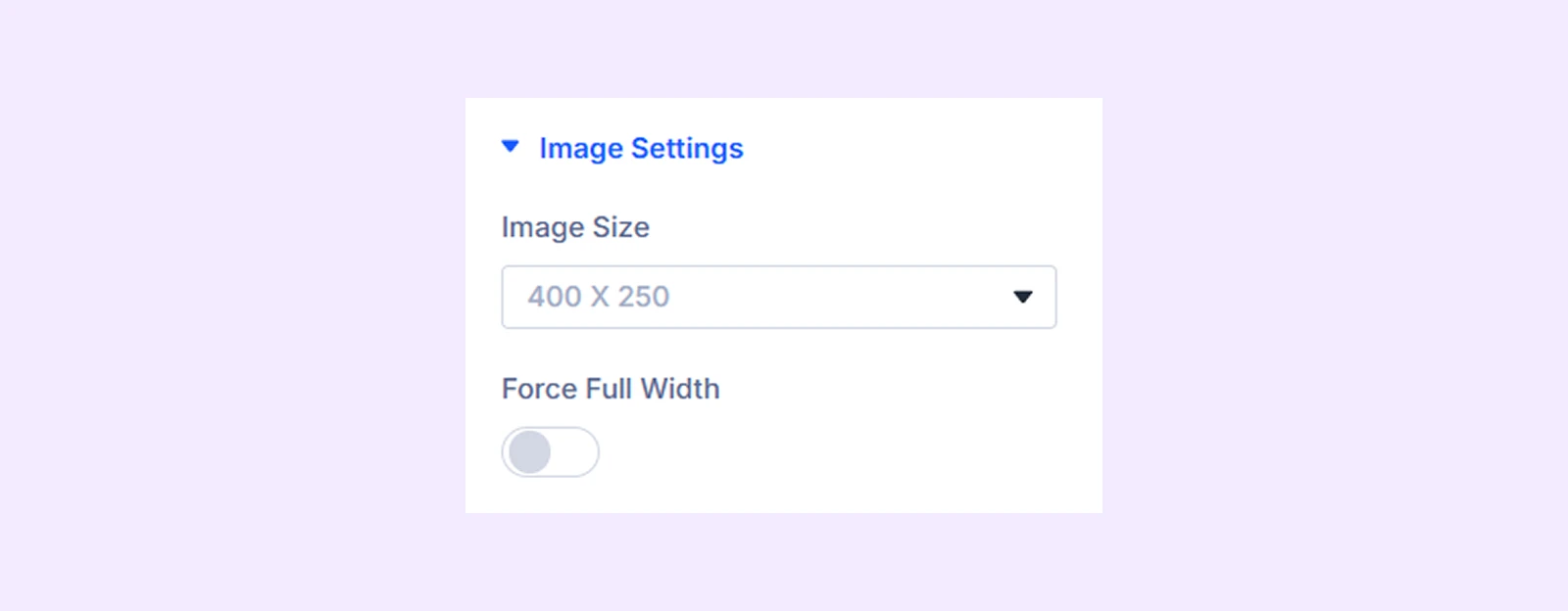
Image Settings
If you choose “Image” as the “Type”, this additional section will show up.
- Image Size: Select the desired image size: original, 1080x675, 350x450, 400x250, 400x400, or 300x300.
- Force Full Width: Toggle on to make the post images full width.
Body Text: Typography options for the text-based content of the custom post elements.
Before After Text: Typography options for the taxonomy, before and after text of the ACF field, and the meta.
Spacing: Add custom margins and padding to the custom post element.
Sizing: Adjust the width, height, and alignment of the custom post element.
Border: Border customization options for the custom post element. You have the option to style each border individually or all the borders together.
Box Shadow: Apply a shadow effect to the custom post element.
Filters: Add color filters to the custom post element.
Transform: Change the scale, placement, size, angle, etc. of the custom post element.
Advanced Tab
This tab provides additional settings for advanced users to control each element individually.
Need Help?
If you have any questions or need assistance, contact our support team: [email protected]