
Remote Controller module lets you control supported DiviFlash and Divi modules on the same page using separate navigation controls such as arrows, dots, tabs, dropdowns, counters, links, or Play/Pause, depending on what the target module supports.
Important Note:
- The Remote Controller is available in DiviFlash 5.5.0 or later and works with Divi 5 only.
- Add a unique CSS ID to the supported target module, then enter the same ID in Connect To Remote ID.
- The Remote Controller module is disabled by default. Follow this step-by-step guide to enable it.
Let’s see the settings in brief and how to make better use of it.
Content Tab
The Content tab lets you connect the Remote Controller to a target module, choose a control type, and configure how the selected control works.

Remote Settings
- Connect To Remote ID: Enter the CSS ID of the module you want to control. To add an ID to the module you want to target, follow the instructions:
- Open the target module.
- Go to Advanced > Attributes > ID.
- Enter a unique value, such as product-carousel.
- Enter the same value in the Connect To Remote ID field.
- Control Type: Choose the type of remote control:
- Arrows
- Dots
- Tabs
- Dropdown
- Counter
- Play Pause
- Link
Note: To control multiple supported modules with the same Remote Controller, enter their CSS IDs separated by commas.
Arrows Settings
It’s available when you choose Arrows as a control type.
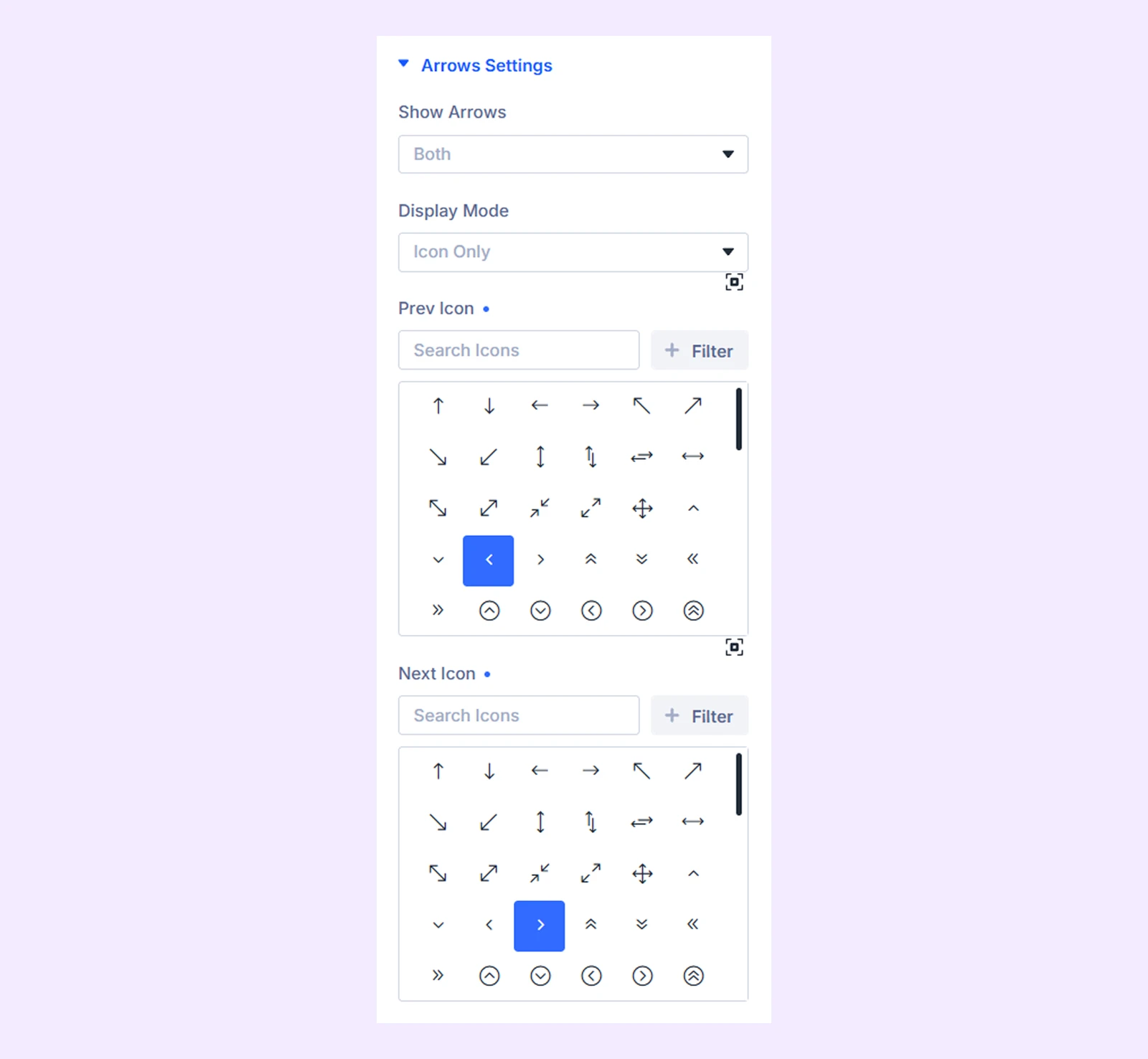
- Show Arrows: Choose whether to display Both, Previous Only, or Next Only arrow.
- Display Mode: Choose whether the arrows display Icon Only, Text Only, or Both.
- Prev Icon: Choose the icon for the previous control.
- Prev Label Text: Enter the text for the previous control.
- Next Icon: Choose the icon for the next control.
- Next Label Text: Enter the text for the next control.
Dots Settings
It’s available when you choose Dots as a control type.

- Click Behavior: Choose between Jump to Slide and Display Only.
- Use Numbers in Dots: Display item numbers inside the dots instead of plain dots.
Tabs
It’s available when you choose Tabs as a control type.

- Activation Trigger: Choose whether tabs activate on Click or Hover.
- Show Content on Active: Show the Item label or description when the tab becomes active.
Use Add New Item to create the individual tabs. See Remote Controller Child Item Settings below for the available Item controls.

Dropdown
It’s available when you choose Dropdown as a control type.
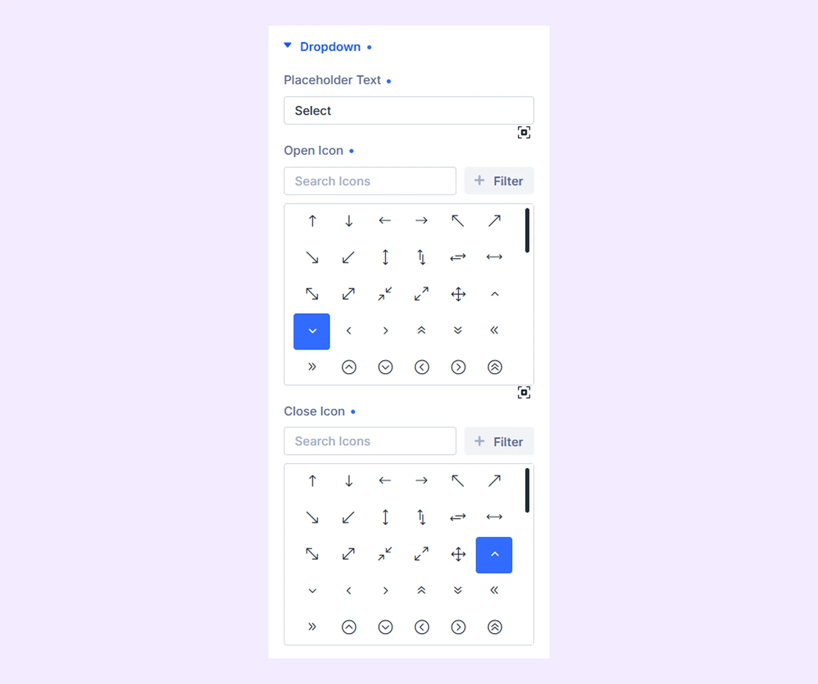
- Placeholder Text: Enter the text displayed on the closed dropdown.
- Open Icon: Choose the icon displayed when the dropdown is closed.
- Close Icon: Choose the icon displayed when the dropdown is open.
Use Add New Item to create the individual dropdown options. See Remote Controller Child Item Settings below for their settings.

Counter
It’s available when you choose Counter as a control type.
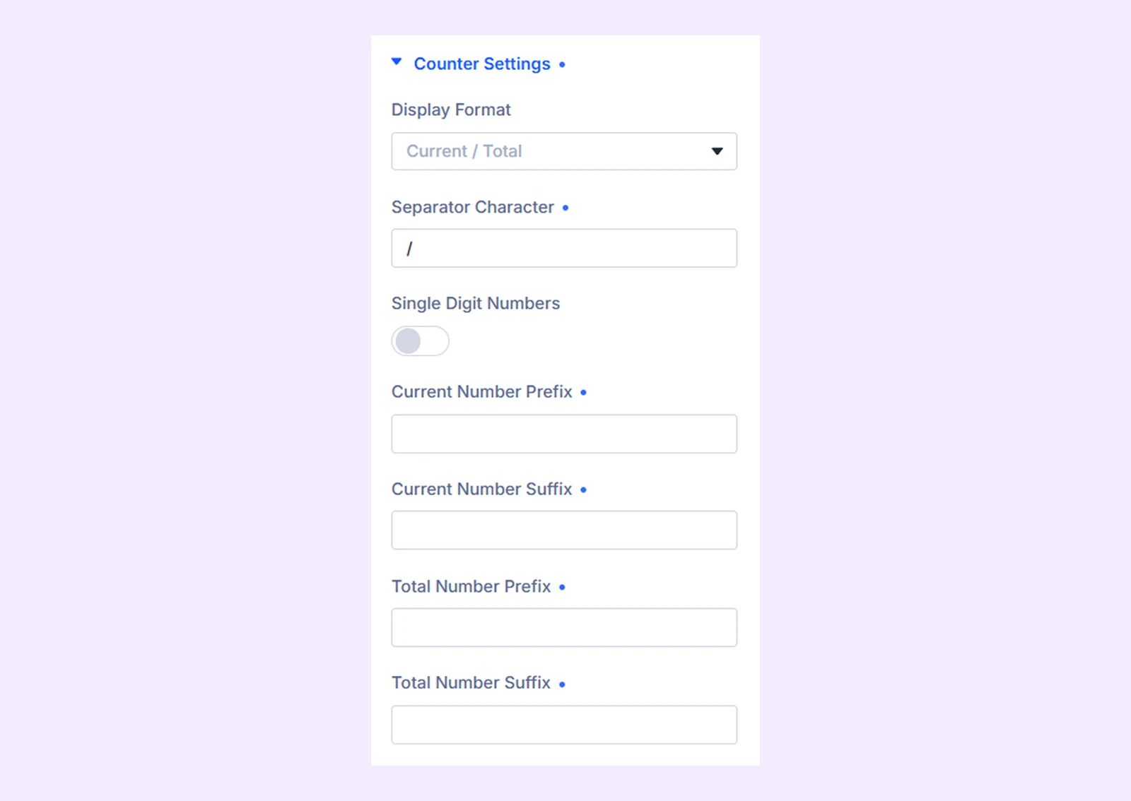
- Display Format: Choose how the counter appears:
- Current / Total
- Current Only
- Total Only
- Custom Pattern
- Separator Character: Enter the character displayed between the current and total values.
- Custom Pattern: Create your own counter format using {current} and {total}. (Available when Custom Pattern is selected.)
- Single Digit Numbers: Add a leading zero to single-digit values, such as 01, 02, and 03.
- Current Number Prefix: Add text before the current number. (Available when the selected format includes Current.)
- Current Number Suffix: Add text after the current number. (Available when the selected format includes Current.)
- Total Number Prefix: Add text before the total number. (Available when the selected format includes Total.)
- Total Number Suffix: Add text after the total number. (Available when the selected format includes Total.)
Play Pause
It’s available when you choose Play Pause as a control type.
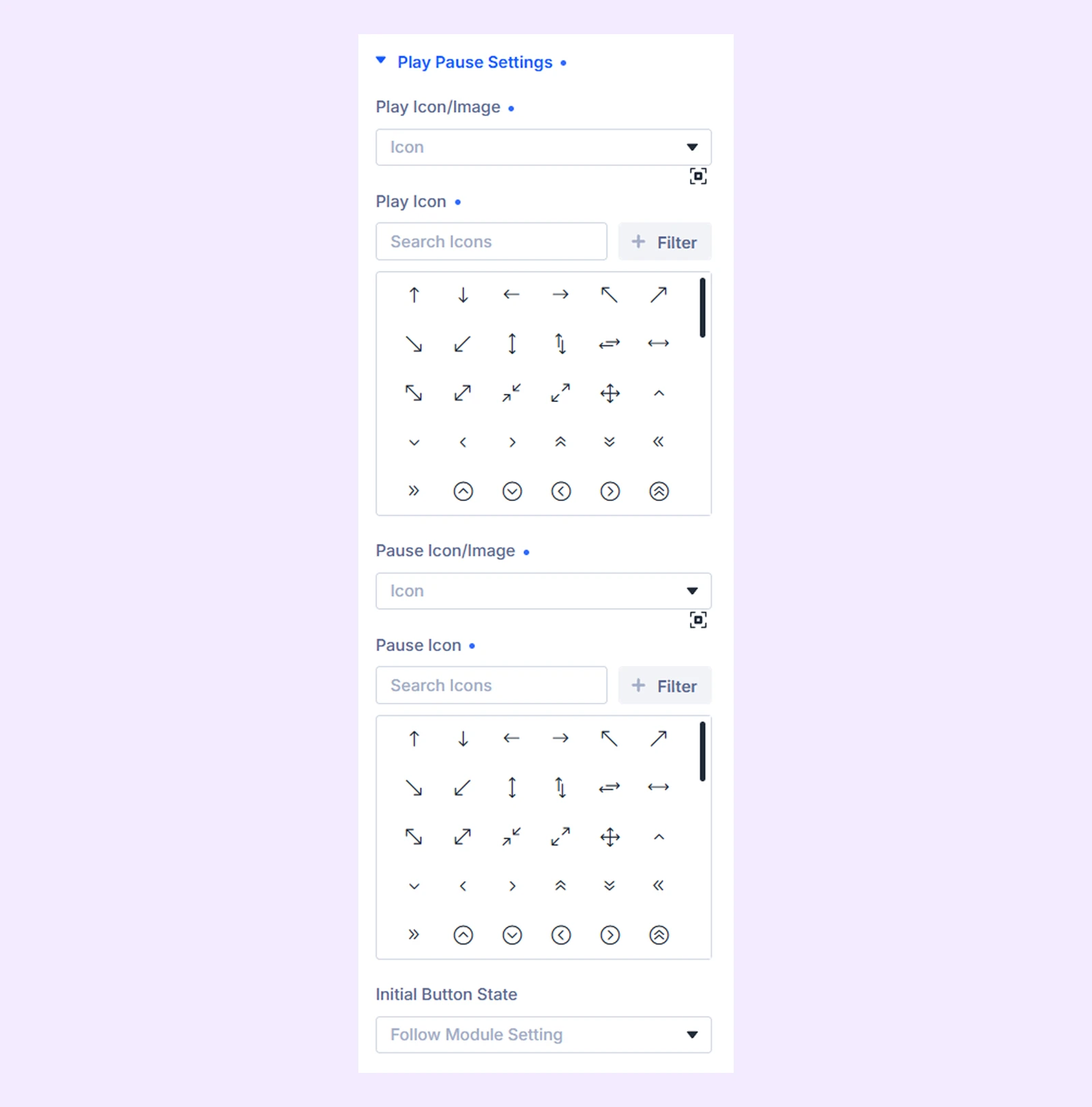
- Play Icon/Image: Choose whether the Play state uses an icon or image.
- Play Icon: Choose the Play icon. (Available when Icon is selected.)
- Play Image: Upload the Play image. (Available when Image is selected.)
- Pause Icon/Image: Choose whether the Pause state uses an icon or image.
- Pause Icon: Choose the Pause icon. (Available when Icon is selected.)
- Pause Image: Upload the Pause image. (Available when Image is selected.)
- Initial Button State: Follow the target module’s autoplay state or initially display the Play or Pause control.
Note: Play/Pause only controls a target module’s existing autoplay. The target module must support autoplay and have it enabled for this control to work.
Link
It’s available when you choose Link as a control type.
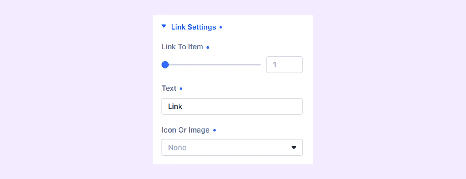
- Link to Item: Choose which item the control should navigate to.
- Text: Enter the text displayed on the link.
- Icon or Image: Choose whether to display an icon, image, or neither.
- Icon: Choose the link icon. (Available when Icon is selected.)
- Image: Upload an image for the link. (Available when Image is selected.)
Hover Animation
Use Hover Animation to add an interaction effect when visitors hover over the controls.
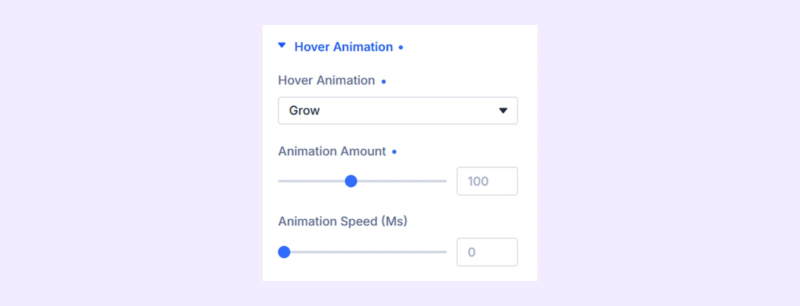
- Hover Animation: Choose an effect such as Grow, Shrink, Pulse, Pop, Rotate, Float, Glow, Ripple, and more.
- Animation Amount: Adjust the strength of the selected effect.
- Animation Speed: Control the animation duration.
- Color: Set the animation color. (Available when Glow or Ripple is selected.)
Design Tab
Use the Design tab to customize the appearance and layout of the selected Remote Controller type.
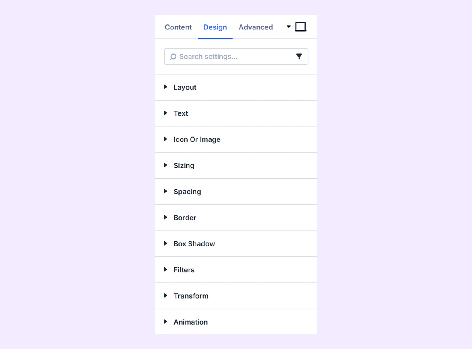
Layout: Control the arrangement of the remote controls, including direction, alignment, spacing, and wrapping.
Arrows
It’s available when you choose Arrows as the control type.
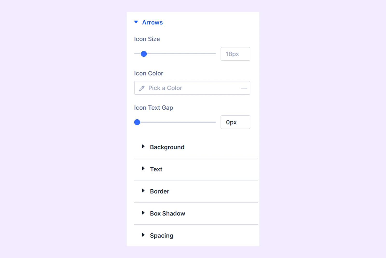
- Icon Size: Adjust the size of the arrow icons.
- Icon Color: Set the arrow icon color.
- Icon Text Gap: Adjust the spacing between the icon and text. (Available when Both is selected as the Display Mode.)
You can also customize the Background, Text, Border, Box Shadow, and Spacing.
Dot
It’s available when you choose Dots as the control type.
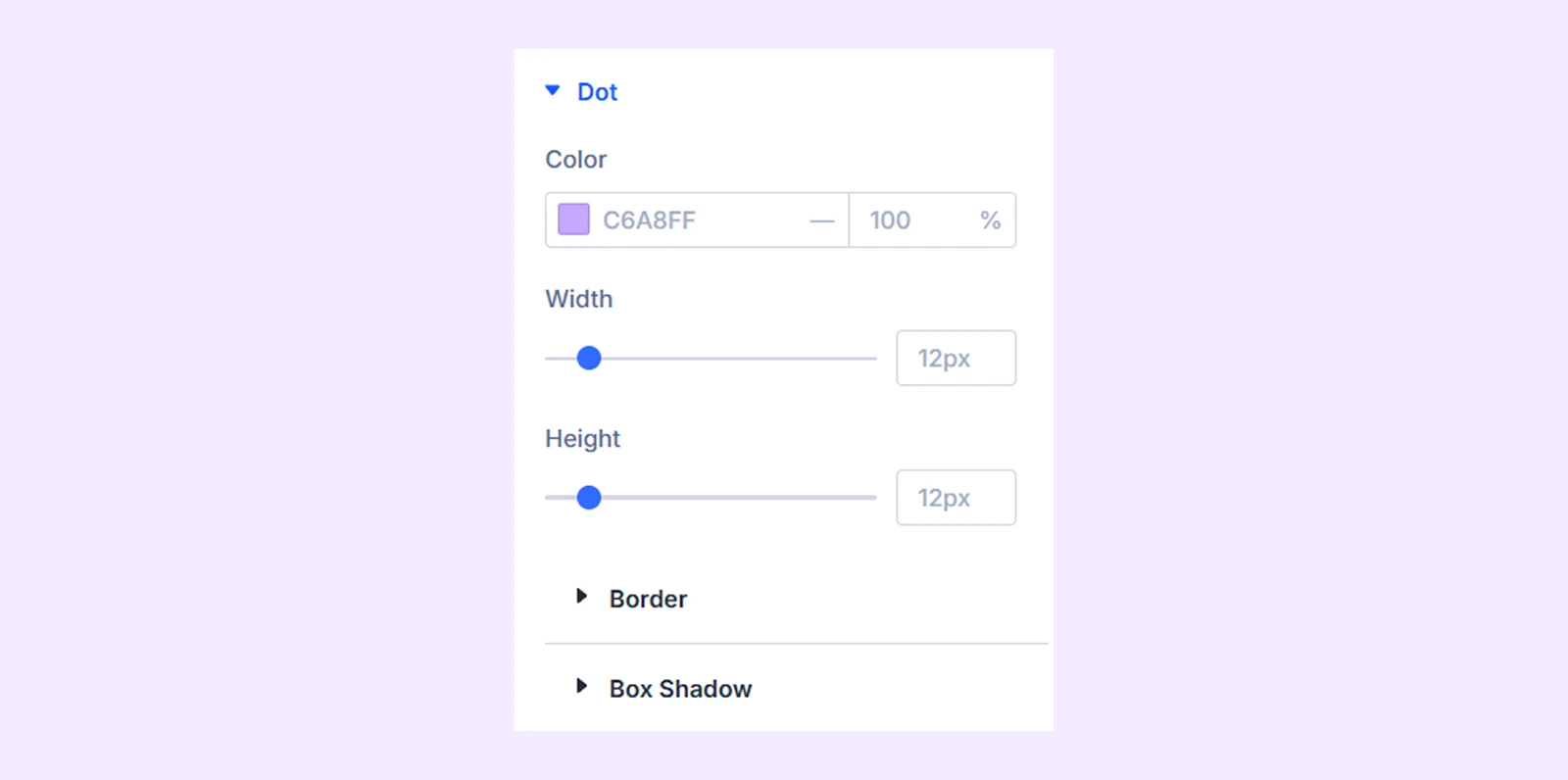
Customize inactive dots using:
- Color: Set the inactive dot color.
- Width: Adjust the dot width.
- Height: Adjust the dot height.
You can also customize the Border, Box Shadow, and Typography. (Typography is available when Use Numbers in Dots is enabled.)
Active Dot: Customize the active dot separately using Color, Width, Height, Border, Box Shadow, and Typography. (It’s available when you choose Dots as the control type. )
Dropdown
It’s available when you choose Dropdown as the control type.
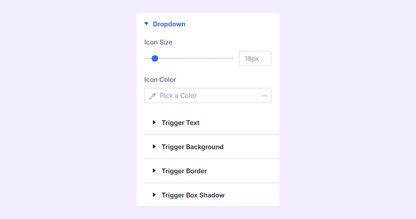
Customize the dropdown trigger using:
- Icon Size: Adjust the dropdown icon size.
- Icon Color: Set the dropdown icon color.
- Trigger Text: Customize the trigger text.
- Trigger Background: Customize the trigger background.
- Trigger Border: Customize the trigger border.
- Trigger Box Shadow: Add a shadow to the trigger.
Dropdown Panel
It’s available when you choose Dropdown as the control type.
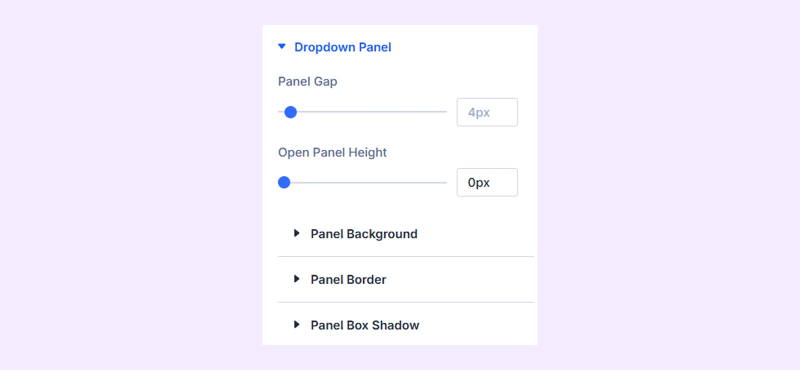
- Panel Gap: Adjust the space between the trigger and dropdown panel.
- Open Panel Height: Set the maximum height of the opened panel.
- Panel Background: Customize the panel background.
- Panel Border: Customize the panel border.
- Panel Box Shadow: Add a shadow around the panel.
Item Text
It’s available when you choose Tabs or Dropdown as the control type.
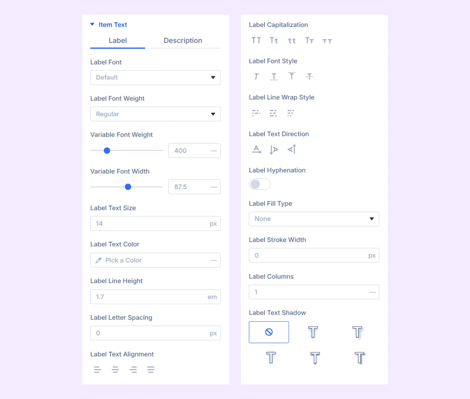
- Label: Customize the Item label typography.
- Description: Customize the Item description typography.
Active Item Text: Customize the label and description separately for the active Item. (It’s available when you choose Tabs or Dropdown as the control type.)
Icon or Image
It’s available when you choose Tabs or Dropdown as the control type.
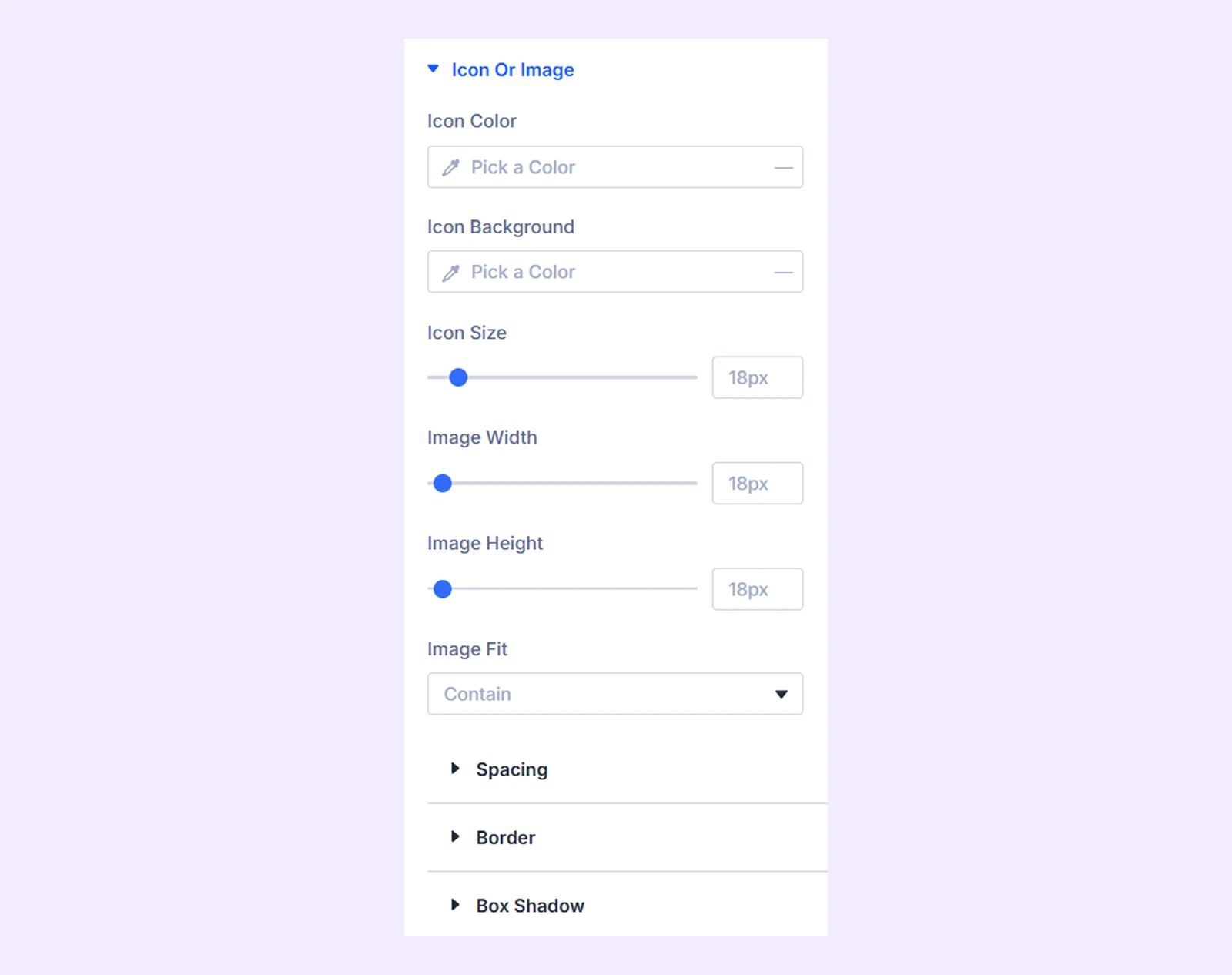
- Icon Color: Set the Item icon color.
- Icon Background: Set the background behind the icon or image.
- Icon Size: Adjust the icon size.
- Image Width: Set the image width.
- Image Height: Set the image height.
- Image Fit: Choose how the image fits within its area.
You can also adjust Spacing, Border, and Box Shadow.
Active Icon or Image: Customize the icon or image separately when its Item becomes active. (It’s available when you choose Tabs or Dropdown as the control type.)
Item Style: Customize the normal Item using Background, Spacing, Border, and Box Shadow. (It’s available when you choose Tabs or Dropdown as the control type.)
Active Item Style: Customize the active Item using Background, Spacing, Border, and Box Shadow. (It’s available when you choose Tabs or Dropdown as the control type.)
Play Pause Style
It’s available when you choose Play Pause as the control type.
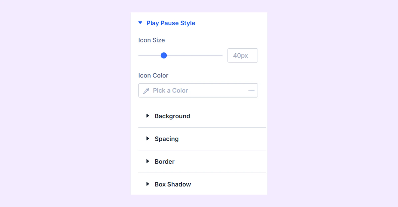
- Icon Size: Adjust the Play/Pause icon size.
- Icon Color: Set the icon color.
You can also customize the Background, Spacing, Border, and Box Shadow.
Counter
It’s available when you choose Counter as the control type.
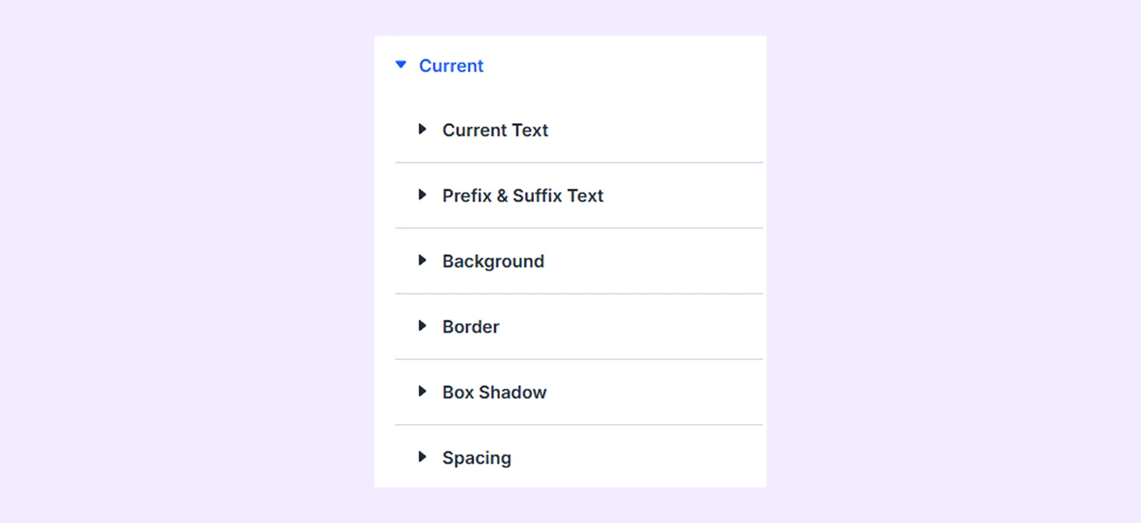
Customize the counter based on the selected Display Format. You can style:
- Current Text: Customize the current number.
- Current Prefix & Suffix: Customize text placed before and after the current number.
- Total Text: Customize the total number.
- Total Prefix & Suffix: Customize text placed before and after the total number.
- Separator Color: Set the separator color.
- Separator Size: Adjust the separator size.
- Typography: Customize the overall counter typography.
You can also customize the Background, Border, Box Shadow, and Spacing around the current and total values.
Text: Customize the title text using typography settings.
Sizing: Adjust the width, height, and alignment of the module.
Spacing: Adjust the margins and padding of the module container.
Border: Customize the border using radius, style, width, and color settings.
Box Shadow: Add shadow effects to the module container.
Filters: Apply color filter effects to the module.
Transform: Adjust the scale, position, rotation, and size of the module.
Animation: Add reveal animation effects and control the animation style, delay, duration, and more.
Advanced Tab
For advanced users seeking deeper control over the module, this tab offers extra configurations including custom CSS, conditions, positioning, attributes, and other Divi settings.
Remote Controller Child Item Settings
The Item child module is available for Tabs or Dropdown control types. Add one Item for each tab or dropdown option you want to display. Each Item has its own Content, Design, and Advanced tabs, allowing you to customize its content and appearance independently.
Content Tab
Use the Content tab to configure the content of an individual Item.
Text
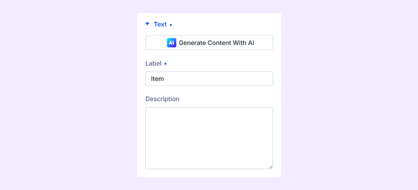
- Label: Enter the main text displayed for the Item.
- Description: Add optional secondary text below the label.
Icon or Image
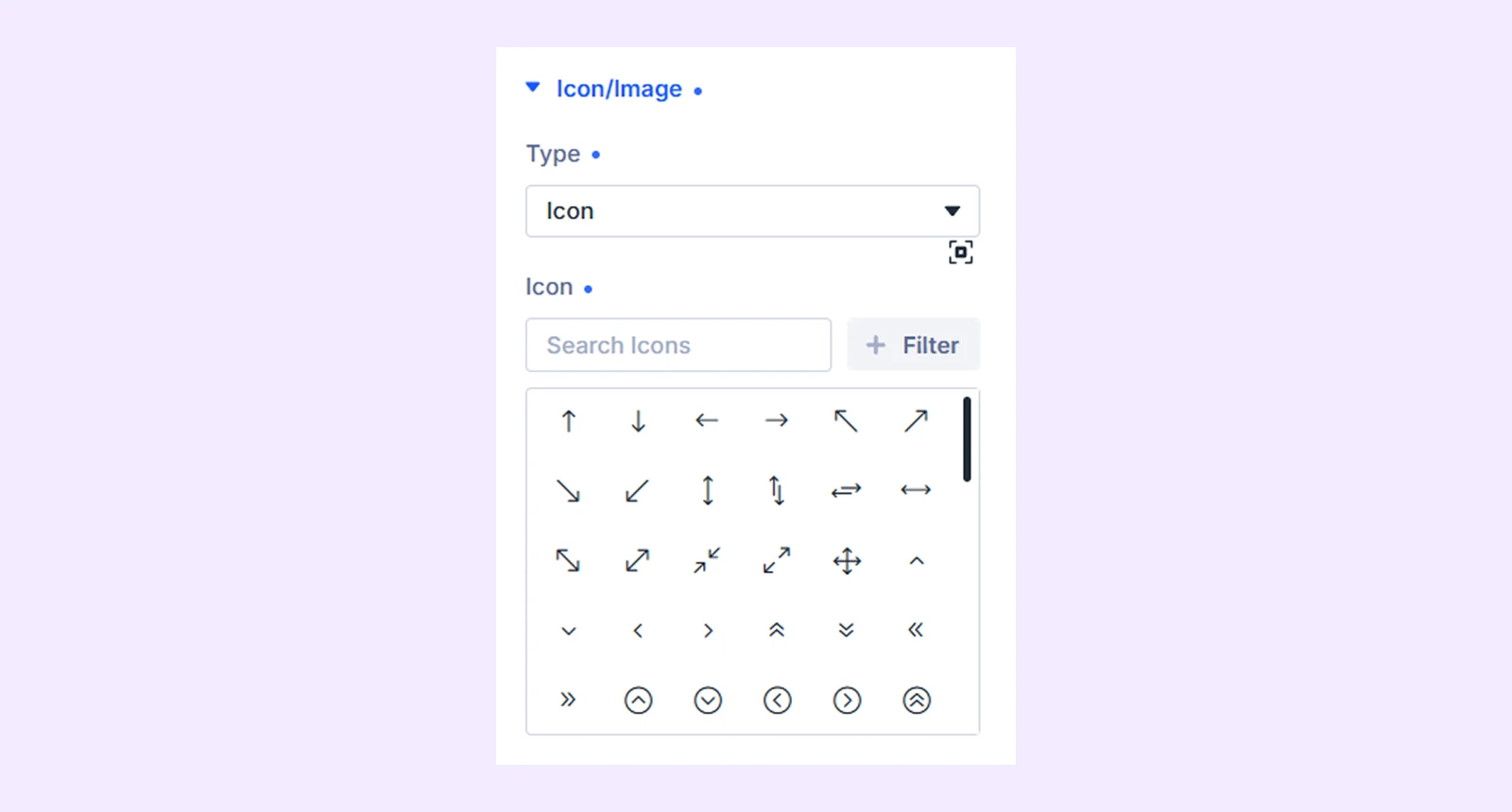
- Type: Choose whether to display None, Icon, or Image.
- Icon: Select an icon for the Item. (Available when Icon is selected.)
- Image: Upload or choose an image for the Item. (Available when Image is selected.)
Elements: Control standard Divi element visibility options where available.
Loop: Display repeating content from queries such as posts, products, terms, or users.
Meta: Rename the Item for easier identification inside the Divi Builder.
Design Tab
Use the Design tab to customize the appearance and layout of an individual Item.
Layout: Adjust the arrangement, alignment, and spacing between the Item text and its icon or image.
Item Text: Customize the typography and appearance of the Item label and description.
Icon or Image
- Icon Color: Set the Item icon color. (Available when Icon is selected.)
- Icon Background: Set the background behind the icon or image.
- Border: Customize the icon or image border.
Active Icon or Image
Customize the icon or image separately when the Item becomes active.
- Icon Color: Set the active icon color. (Available when Icon is selected.)
- Icon Background: Set the active icon or image background.
- Border: Customize the border of the active icon or image.
Item Style: Customize Item’s Background, Border, Spacing and Box Shadow
Active Item Style: Customize the Item when it becomes active using background and border.
Advanced Tab
Use the Advanced tab to access Divi’s standard settings for custom CSS, conditions, visibility, transitions, attributes, positioning, and other advanced controls.
Supported Module lists
The Remote Controller supports the following DiviFlash and native Divi modules.
DiviFlash Modules (Carousels, Sliders, Tabs, Accordions & Switchers)
- Content Carousel
- Testimonial Carousel
- Product Carousel
- Image Carousel
- Instagram Carousel
- CPT Carousel
- Post / Blog Carousel
- Logo Carousel
- Advanced Tab
- Image Accordion
- FAQ
- Interactive Circle
- Timeline Tabs
- Background Switcher
Divi Default Modules (Sliders, Carousels & Portfolio)
- Slider
- Post Slider
- Fullwidth Post Slider
- Video Slider
- Group Carousel
- Fullwidth Portfolio
Note: Not every supported module works with every control type. Play/Pause requires the target module to support autoplay and have autoplay enabled. Advanced Tab, Image Accordion, FAQ, and Divi Video Slider do not support Play/Pause, while some other supported modules provide it conditionally.
Need Help?
If you have any questions or need assistance, contact our support team: [email protected]