
The Smart CPT module for Divi 5 is an advanced display solution built to showcase custom post types, portfolios, and default Divi Projects with precision.
Important Note: Smart CPT is built for Divi 5. Also, posts must have a featured image to appear in the module. Posts without a featured image will be skipped.
Let’s see the settings in brief and how to make better use of it.
Content Tab
The Content Tab allows you to choose your layout structure, define your dynamic post queries, manage card elements, and set up interactive mechanics like filtering and pagination.
Layouts
The Layouts section sets the foundational presentation of your post showcase.
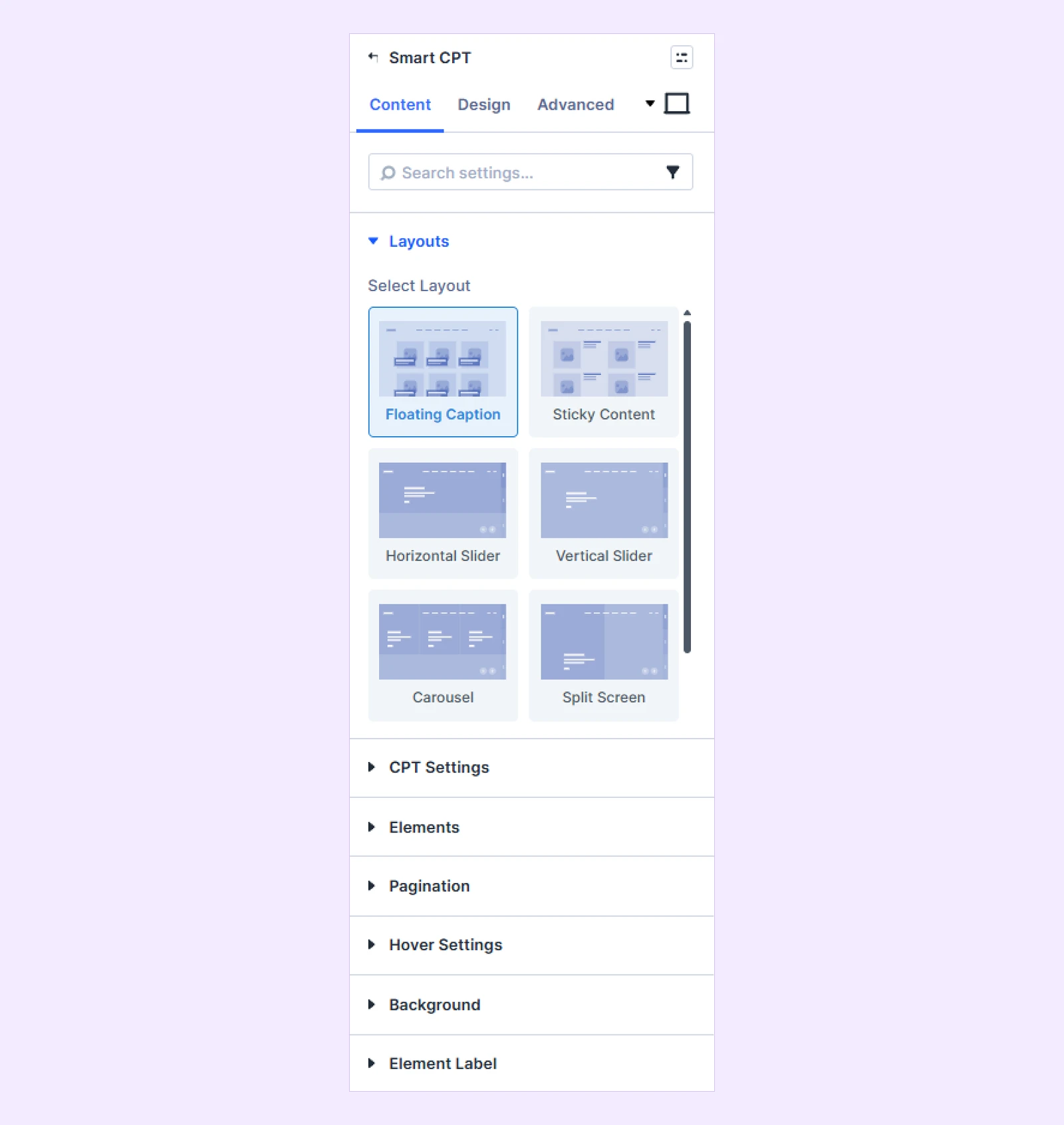
- Select Layout: Choose from 11 pre-built layouts divided into Grids
- Floating Caption
- Sticky Content
- Horizontal Slider
- Vertical Slider
- Carousel
- Split Screen
- Fullscreen
- Scattered Content
- Centered Content
- Interactive Links
- Vertical Interactive Links
CPT Settings
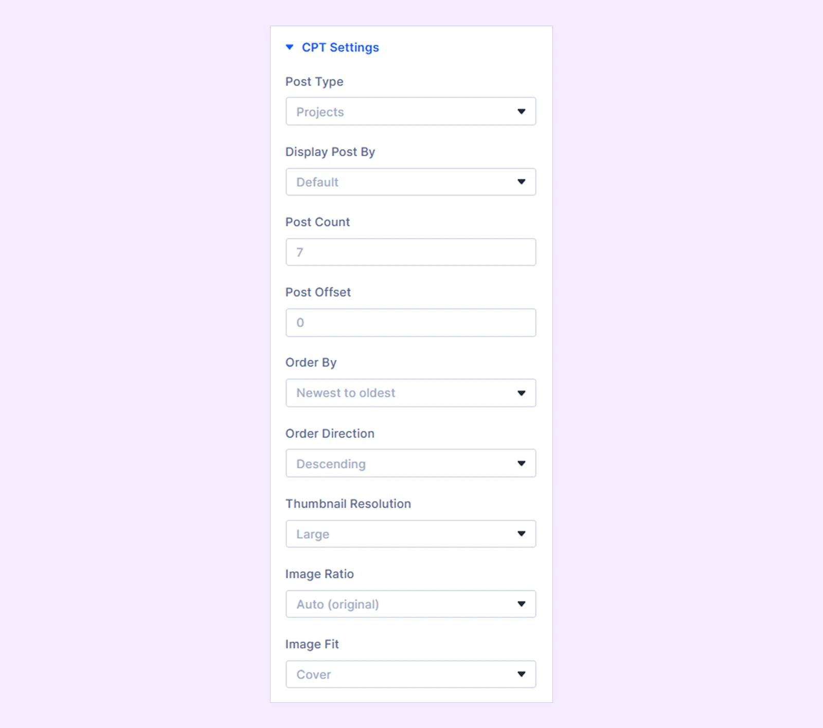
CPT Settings determine which WordPress post types and taxonomies are pulled into the layout.
- Posts For Current Page: Use the current page query to dynamically display relevant posts. Available when the module is used inside the Theme Builder.
- Select the Post Type to View on Builder: Choose which post type is used for the builder preview when Posts For Current Page is enabled.
- Post Type: Choose any registered public post type (Defaults to Projects).
- Display Post By: Toggle between Default (all entries) or By Taxonomy to restrict query output.
- Select Taxonomy: Specify categories or tags to query (this option is only available when display post is selected to Taxonomy
- Post Count : Set how many posts you need to display.
- Post Offset: Define total posts per page (default is 7) and skip a specific number of leading posts.
- Order By: Set the post order by ascending, descending, alphabetic, newest to oldest, oldest to newest, and random.
- Order Direction: Sort content by date, title, menu order, or random configurations in ascending or descending sequence.
- Thumbnail Resolution: Choose the media size used for featured images.
- Image Ratio: Force fixed aspect ratios (Square, 16:9, Portrait)
- Reversed Layout: Toggle to swap the image and text alignment (Only available for Sticky Content layout)
- Image Fit: Set image containment (Cover, Contain, Fill)
Elements
Toggle specific data points and interface controls on or off
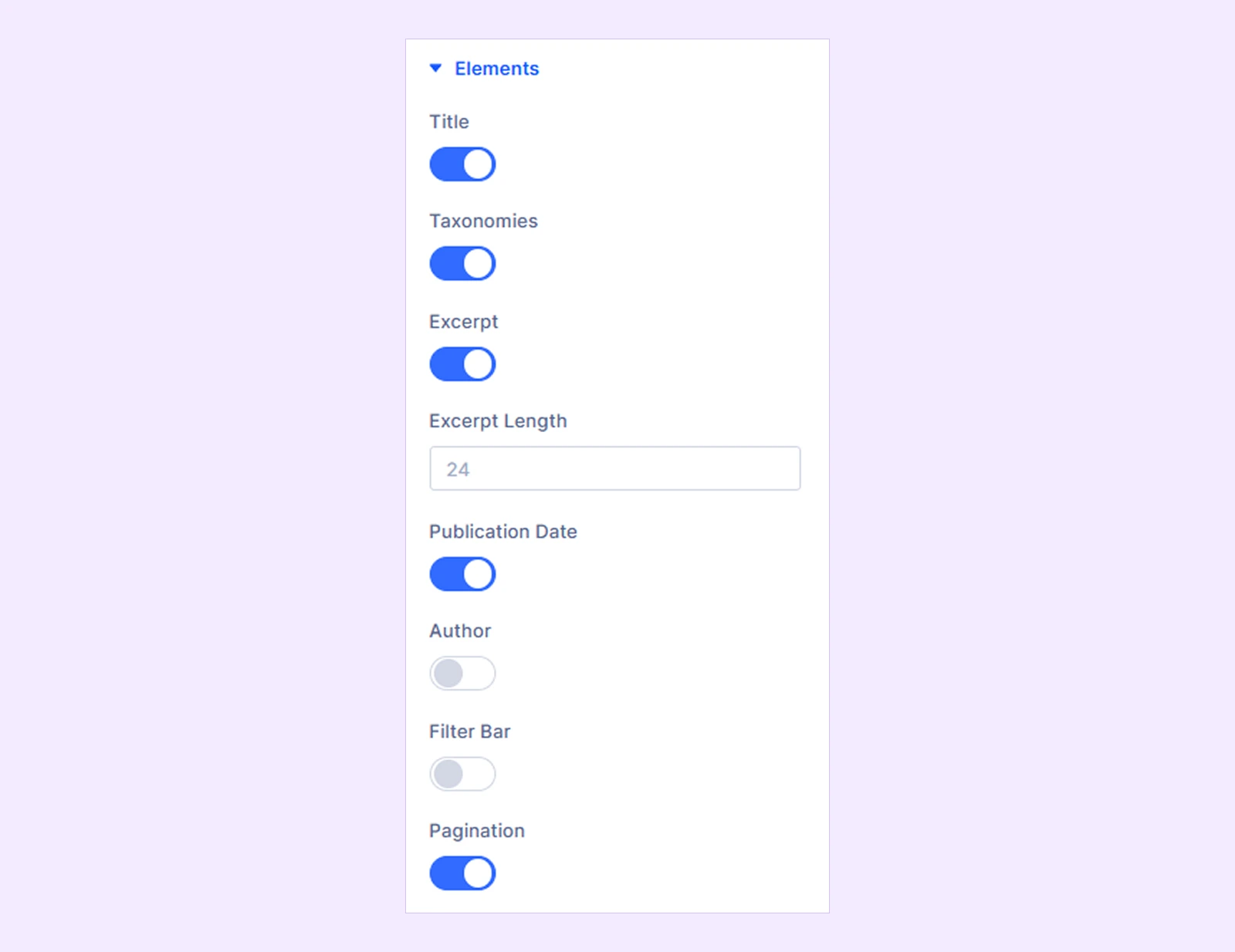
- Title: Toggle to show or hide the title of each item in the layout.
- Taxonomies: Display or hide categories, tags, or custom terms associated with each item.
- Excerpt: Enable or disable a short preview of the item's main content.
- Excerpt Length: Define the maximum character or word count for the excerpt preview (This option is only available when Excerpt toggle is on)
- Publication Date: Show or hide the original published date on each item card.
- Read More: Show or hide the Read More link. Available in these layouts: Carousel, Split Screen, Fullscreen, Scattered Content, and Centered Content.
- Author: Toggle to display or hide the author's name
- Watermark: Enable to display faint background text behind the item (available in these layouts: Carousel, Split Screen, Fullscreen, Scattered Content, and Centered Content)
- Watermark Letter Count: Set the character limit for the watermark text (available only when Watermark is enabled).
- Overlay: Toggle a color or gradient mask over media. (available in these layouts: Carousel, Split Screen, Fullscreen, Scattered Content, and Centered Content.)
- Arrow: Show navigation arrows to slide between items (available in these layouts: Carousel, Split Screen, Fullscreen, Scattered Content, and Centered Content.)
- Filter Bar: Add interactive frontend filtering tabs allowing users to sort posts dynamically by terms.
- Pagination: Enable multi-page navigation controls like page numbers or buttons to browse through large sets of items.
Read More
This option is only available when these layouts are selected: Sticky content, Horizontal Slider, Vertical Slider, Carousel, Split Screen, Full Screen, Scattered Content, Centered Content.
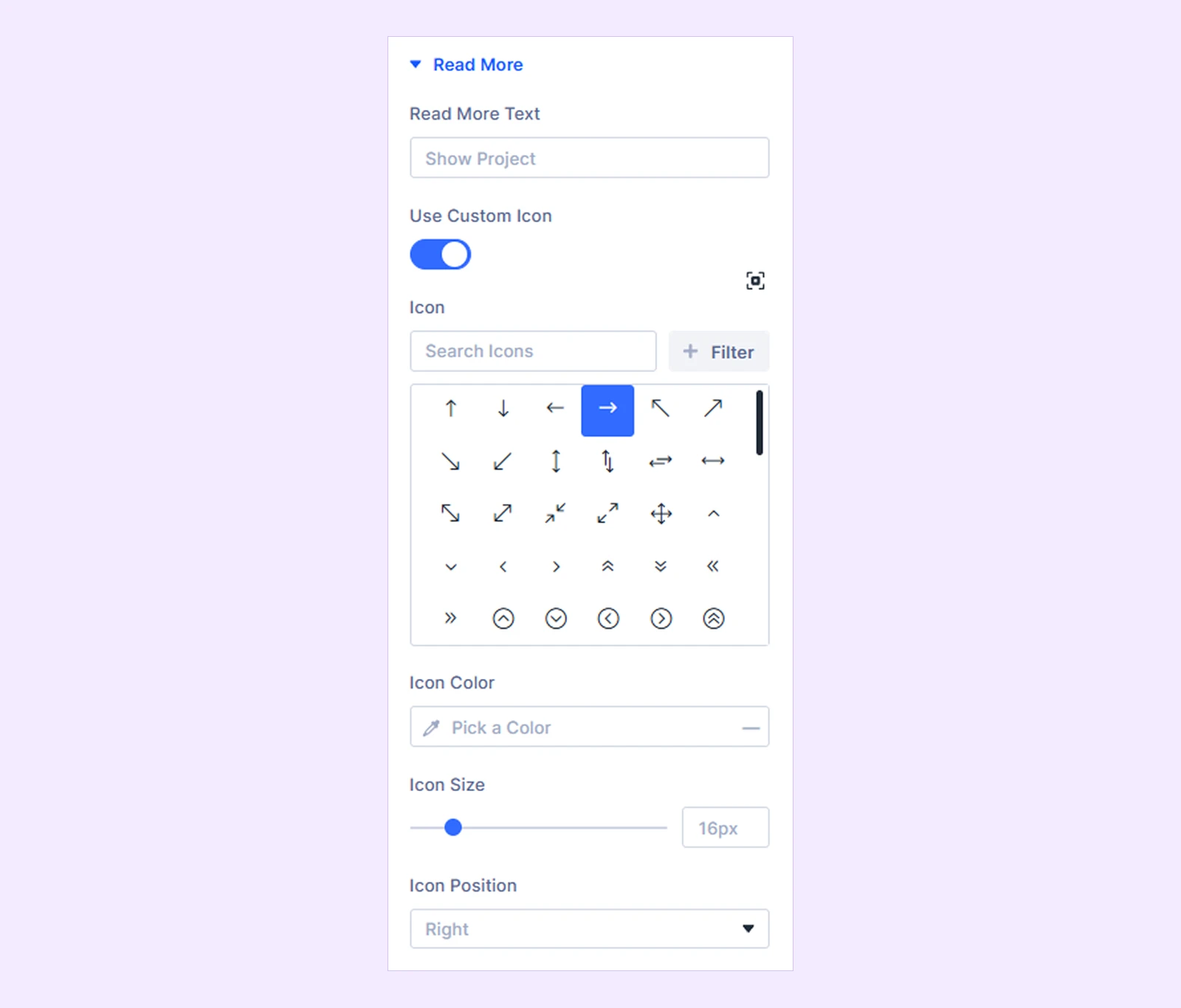
- Read More Text: Customize button label text (defaults to "Show Project")
- Use Custom Icon: Toggles whether to display a custom-designed icon instead of the default element icon.
- Icon: Lets you search for and select the specific icon graphic you want to display.
- Icon Color: Sets the custom color applied directly to the chosen icon.
- Icon Size: Adjusts the dimensions (width and height) of the icon on the page.
- Icon Position: Controls where the icon is placed relative to surrounding text or element content (e.g., Left or Right).
Filter Bar
Configure dynamic AJAX-based taxonomy filtering buttons above grid layouts. This option is only available when Elements > Filter Bar toggle is on, and the Floating Caption, and Sticky Content layout is selected.
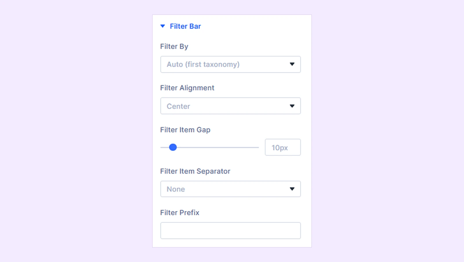
- Filter By: Select which taxonomy terms populate the dynamic filter navigation bar.
- Filter Alignment: Set the horizontal orientation of the filter buttons across the container (Left, Center, Right).
- Filter Item Gap: Define the spacing in pixels between each individual filter button.
- Filter Item Separator: Choose a visual divider to place between filter buttons (None, Pipe, Dot, Slash).
- Filter Prefix: Add custom introductory text or a label that appears directly before the filter buttons.
Pagination
This option is only available when the Interactive Link layout is selected.
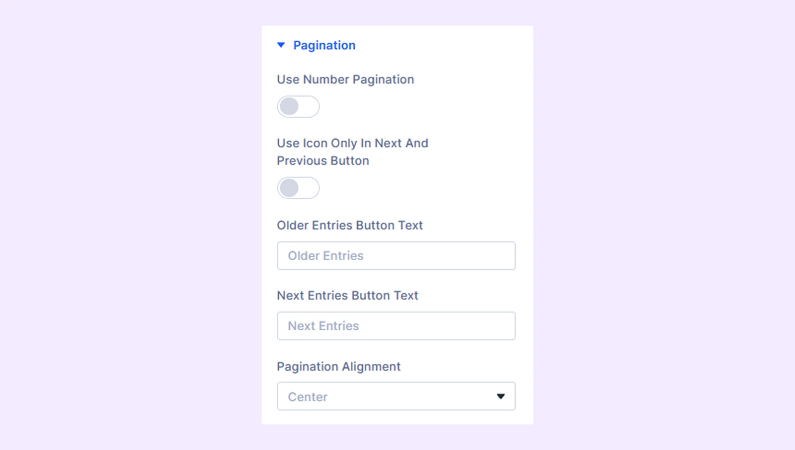
- Put Pagination Inside: Moves navigation links inside the module's primary container rather than below it.
- Use Number Pagination: Toggle switch to display numeric page navigation instead of standard navigation links.
- Pagination Item Gap: Define the spacing in pixels between individual pagination numbers (e.g., 10px) (This option is only available when Use Number Pagination is on).
- Shorthand Pagination: Enable ellipsis formatting to shorten long page ranges for cleaner display (This option is only available when Use Number Pagination is on).
- Use Icon Only In Next And Previous Button: Replace the text labels on the next and previous buttons with navigation icons (This option is only available when Use Number Pagination is on).
- Older Entries Button Text: Customizes the text displayed on the link leading to previous/older posts.
- Next Entries Button Text: Customizes the text displayed on the link leading to newer/subsequent posts.
- Pagination Alignment: Choose the horizontal alignment of the pagination controls within the container (Left, Center, Right).
Hover Settings
Add depth and movement to grid-based card interactions.
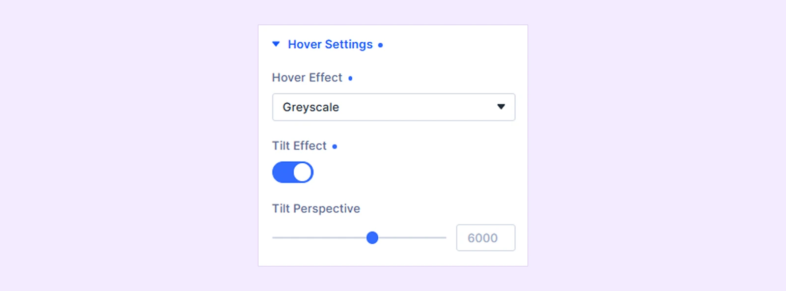
- Hover Effect: Apply visual transformation animations to featured images upon mouse hover (Zoom, Overlay, Greyscale).
- Zoom Scale: Set the magnification percentage for the image hover animation (This option is only available when Hover Effect is set to Zoom).
- Transition Speed: Fine-tune the duration and timing of hover animations in milliseconds.
- Overlay Color: Choose a custom background overlay tint for the hover state (This option is only available when Hover Effect is set to Overlay).
- Tilt Effect: Enable interactive 3D card tilt tracking based on cursor movement.
- Tilt Perspective: Adjust the depth perspective intensity of the 3D tilt interaction (This option is only available when Tilt Effect toggle is on).
Slider
Only available when the carousel and fullscreen layout is selected.
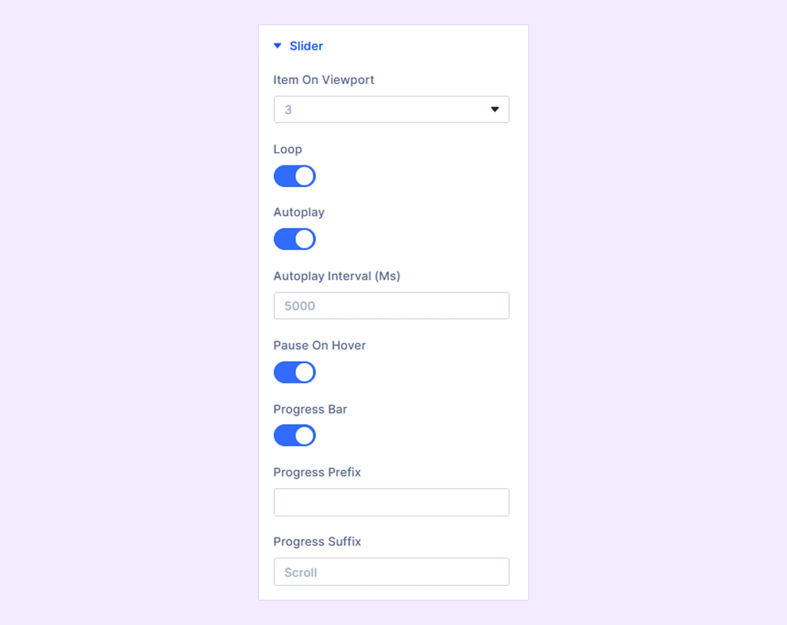
- Item on viewport: Set visible slide counts across Desktop, Tablet, and Mobile views (This option is only available when Carousel layout is selected).
- Loop: Enable this toggle to seamlessly repeat the slides in a continuous infinite loop.
- Autoplay: Turn on this switch to advance through the slides automatically.
- Autoplay Interval (Ms): Set the duration in milliseconds to control how long each slide stays visible before transitioning (set to 5000). Only available when autoplay toggle is on.
- Pause On Hover: Activate this toggle to temporarily stop the automatic slideshow whenever a user hovers over it. Only available when autoplay toggle is on.
- Mouse-Wheel Scrolling: Turn on this switch to let visitors navigate through slides using their mouse scroll wheel. Only available when Fullscreen Layout is selected.
- Drag Scrolling: Enable this option to allow users to click and drag across the slider to move between slides. Only available when Fullscreen Layout is selected.
- Progress Bar: Enable this control to display a visual indicator that tracks slide progression.
- Progress Prefix: Enter custom text to place a label directly in front of the progress indicator.
- Progress Suffix: Add custom text to append a label immediately after the progress indicator (set to Scroll).
Design Tab
The Design Tab provides comprehensive styling for every element, wrapper, and interaction state across the Smart CPT module.
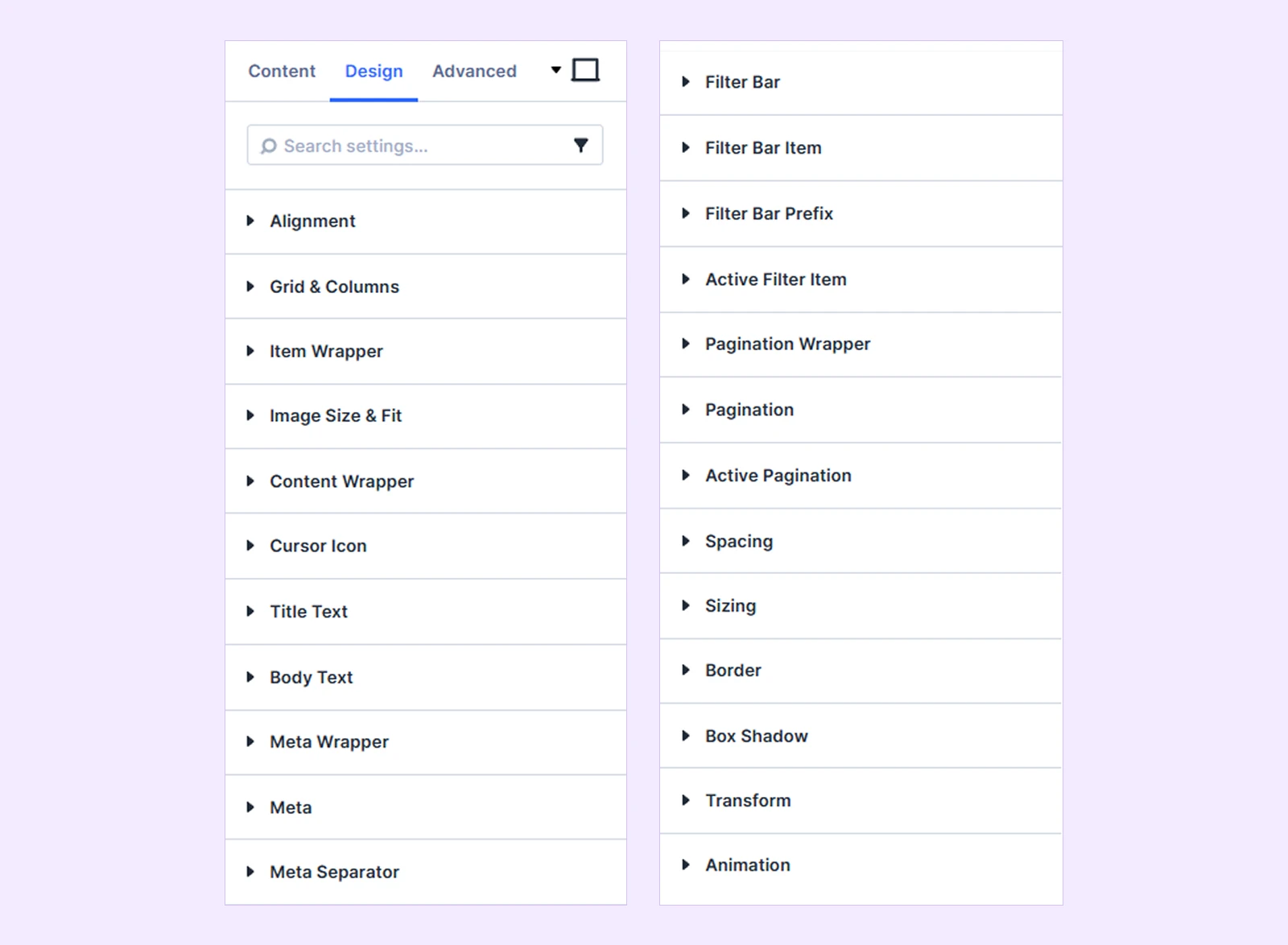
Alignment
- Alignment: Set the placement of elements (Left, Center, Right, Justified). Only available when Floating Caption, and Sticky Content layout is selected.
- Item Alignment: Set the alignment (Left, Center, Right, or Justified) for interactive link items. Available only in Interactive Links and Vertical Interactive Links layouts.

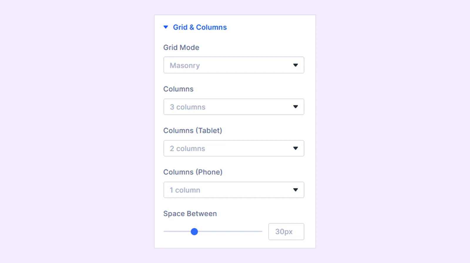
Grid & Columns
Only available when Floating Caption, and Sticky Content layout is selected.
- Grid Mode: Choose the layout structure style for displaying post items (e.g., Masonry, Grid).
- Row Height: Set the target height for each row (available only when Grid Mode is set to Justified).
- Columns: Set the number of columns to display on desktop screens (e.g., 3 columns).
- Columns (Tablet): Select the responsive column count for tablet devices (e.g., 2 columns).
- Columns (Phone): Define the responsive column count for mobile phone screens (e.g., 1 column).
- Space Between: Adjust the horizontal and vertical gap spacing between grid items in pixels (e.g., 30px).
- Equal Height: Match the heights of all cards within the same row (available only when Grid Mode is set to Grid).
Item Wrapper: Customize the container styling for each individual item card. You will also find options like Background, Border, Box Shadow, and Spacing to customize your item cards further.
Image Size & Fit
This design option is only available when Floating Caption layout, or Sticky Content layout is selected.
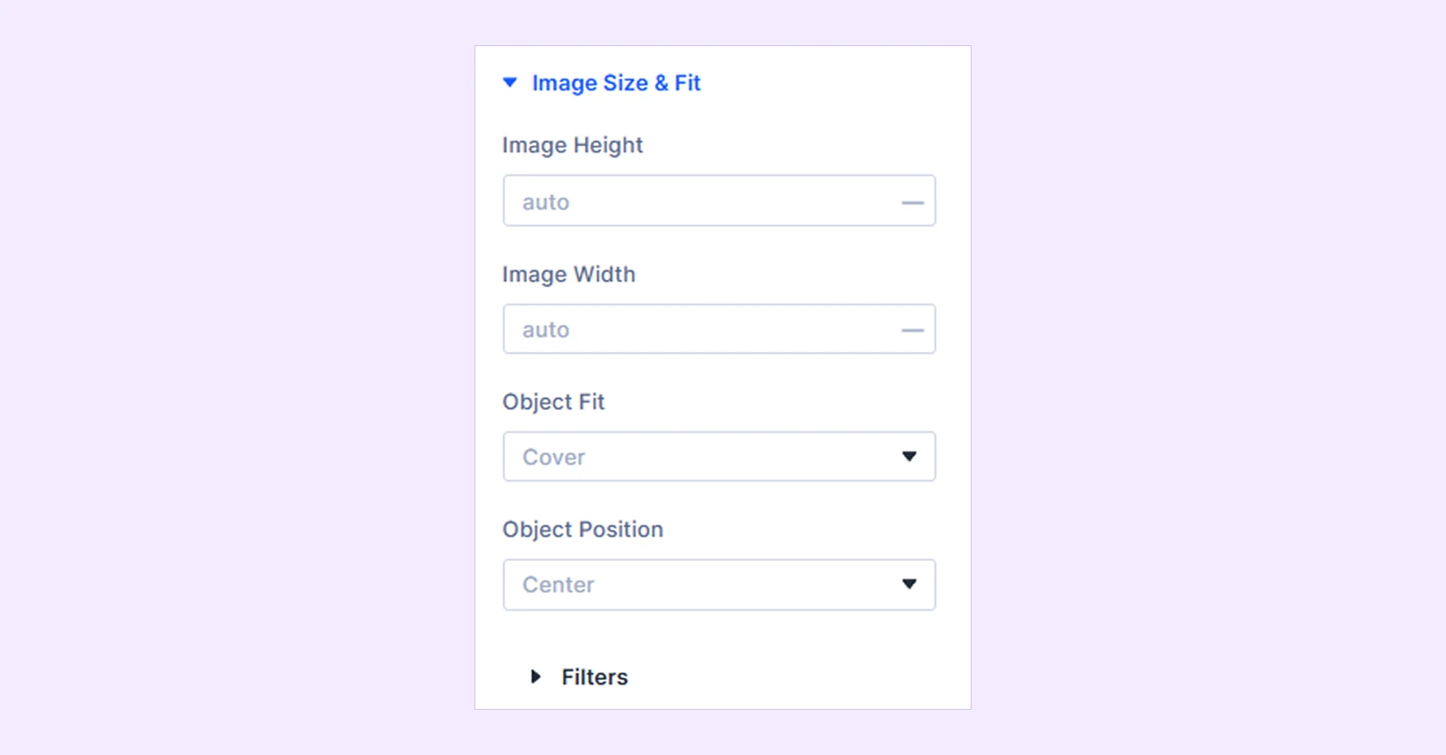
- Image Height: Set a custom height value for the featured image (e.g., auto, px, rem).
- Image Width: Define a custom width for the featured image (e.g., auto, 100%, px).
- Object Fit: Choose how the image scales to fit within its defined boundaries (e.g., Cover, Contain, Fill).
- Object Position: Adjust the focal alignment of the image within its frame (e.g., Center, Top, Bottom).
You will also find options like Filters to customize your images further.
Content Wrapper
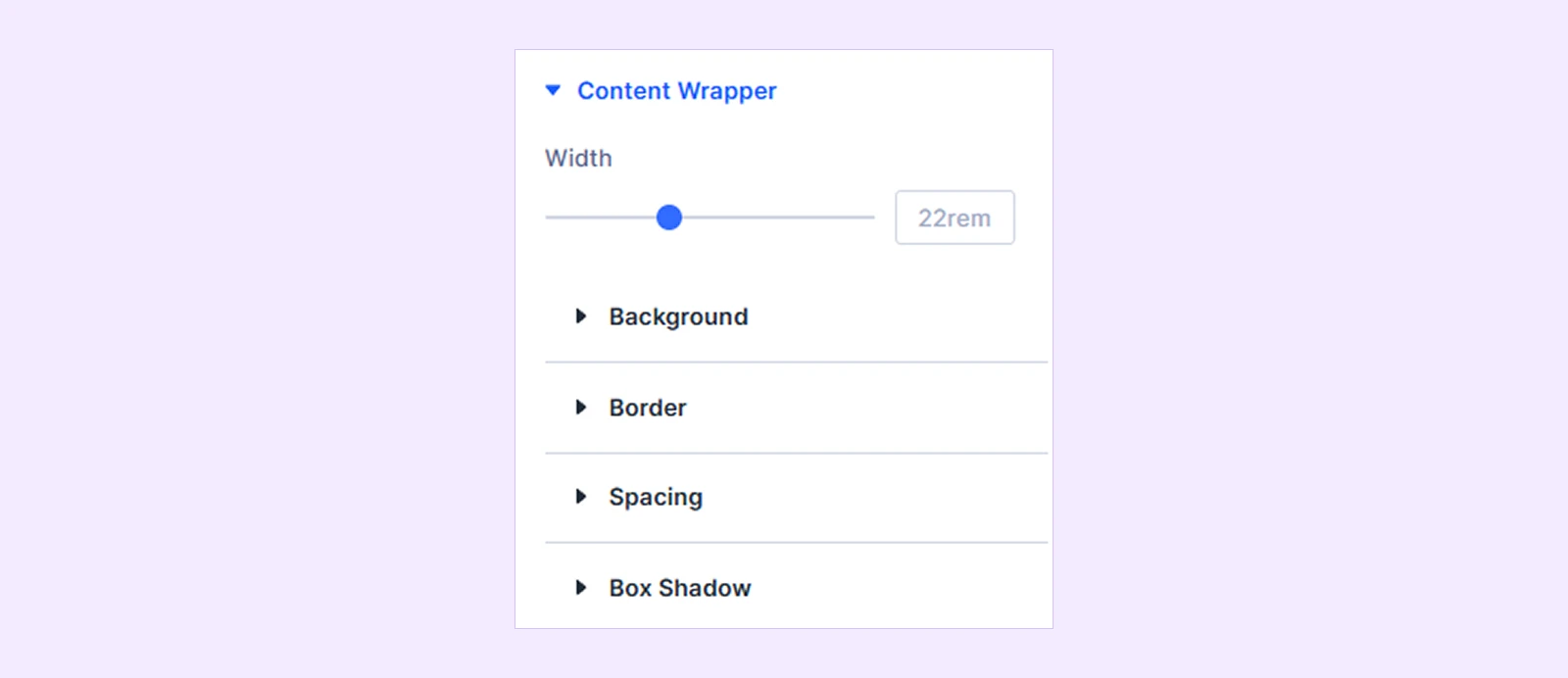
- Width: You can adjust the content wrapper width as you need
You’ll also find background, border, spacing, and box shadow for further customization.
Cursor Icon
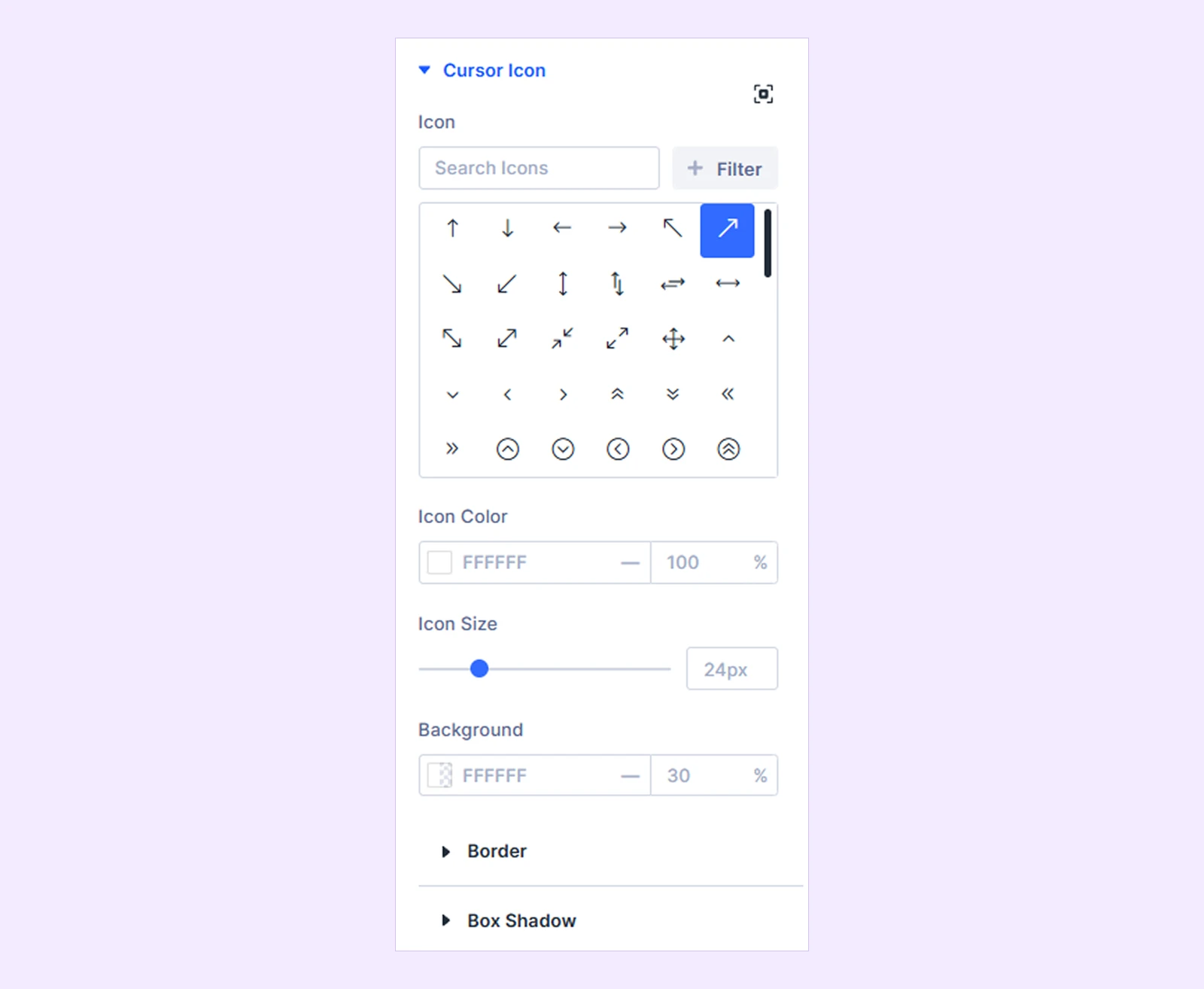
- Icon: Choose a direction or style for your cursor icon from the available options.
- Icon Color: Customize the color and opacity of the cursor icon.
- Icon Size: Adjust the dimensions of the cursor icon to your preferred scale.
- Background: Set a background color and transparency behind the cursor icon.
You'll also find Border and Box Shadow options for further customization.
Image Wrapper: Available when Scattered Content layout, Vertical Interactive Links layout is selected. You’ll find background, border, spacing, and box shadow for further customization.
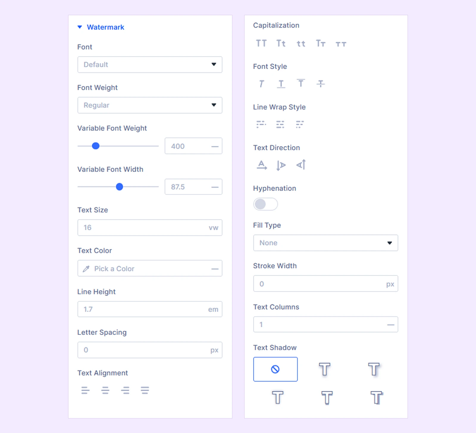
Watermark
Displays a stylized background graphic, text, or category index behind slide content to add visual depth. Available when the Horizontal slider layout, Split screen layout, Full screen layout, Centered Content layout is selected.
Overlay
You can set the overlay color. Available when the Horizontal layout, Vertical layout, Split screen layout, Full screen layout, Centered Content layout is selected.
Alignment: You can set the item alignment whether on: left, right, center, or justified. Available when Interactive Links layout is selected.
Title Text: Style the typography, color, size, and alignment of the title text.
Body Text: Customize the typography, color, size, line height, and alignment of the body text.
Meta Wrapper: Style the overall container surrounding the post metadata items.You will also find options like Background, Border, and Spacing to customize your meta wrapper further.
Meta
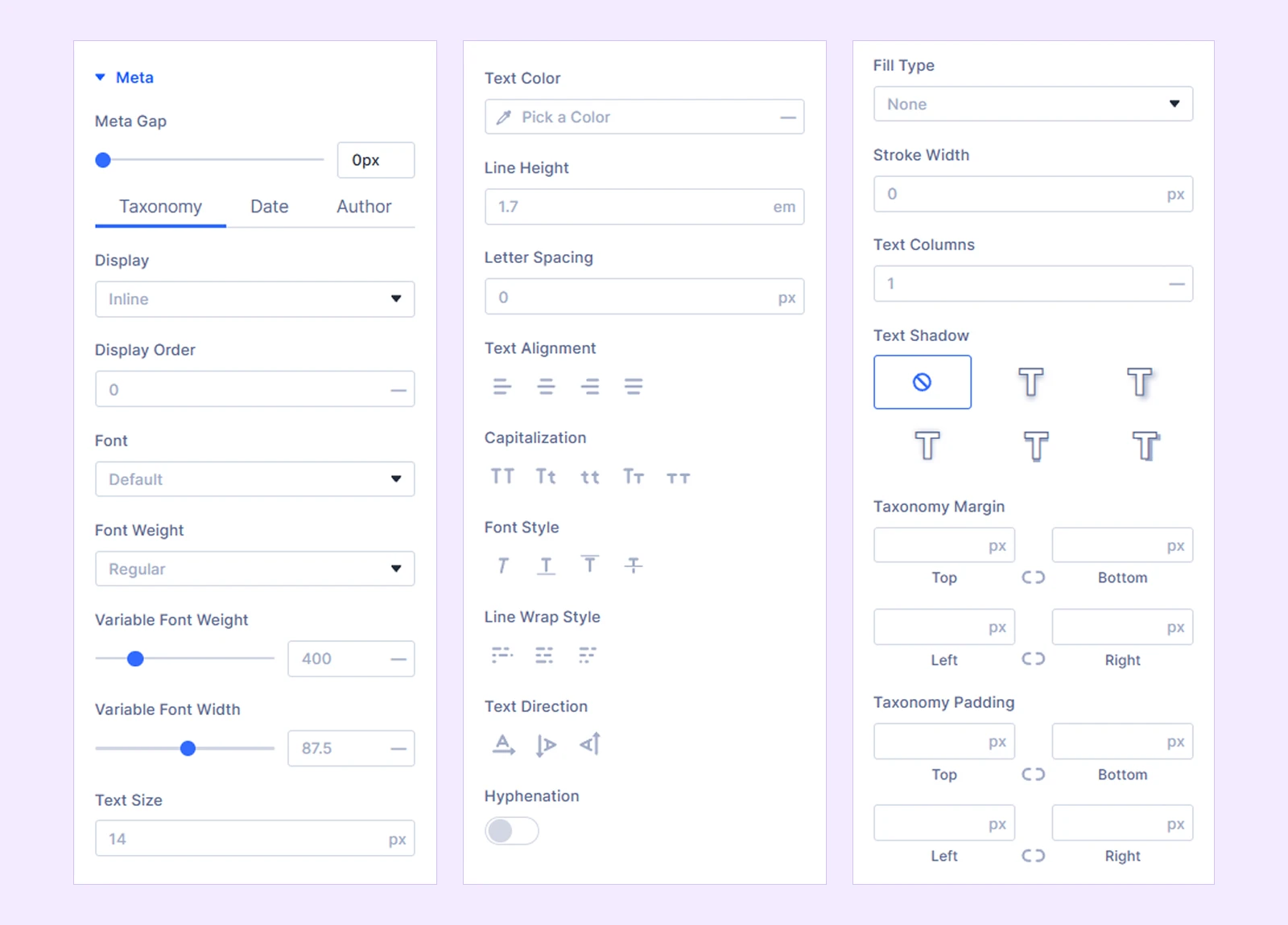
Customize the layout, spacing, and styling of individual metadata components (Taxonomy, Date, Author).
- Meta Gap: Adjust the spacing distance between individual metadata items in pixels (e.g., 10px).
- Taxonomy: Customize the typography, colors, and layout styling specifically for taxonomy terms.
- Date: Configure the typography, text color, and icon settings for the publication date display.
- Author: Adjust the font styles, avatar display, and colors for the post author information.
- Display: Choose how metadata items are arranged relative to each other (Inline, Block).
- Display Order: Control the order in which Taxonomy, Date, and Author metadata appear.
You will also find options like Typography, Color, and Spacing to customize each meta element further.
Meta Separator
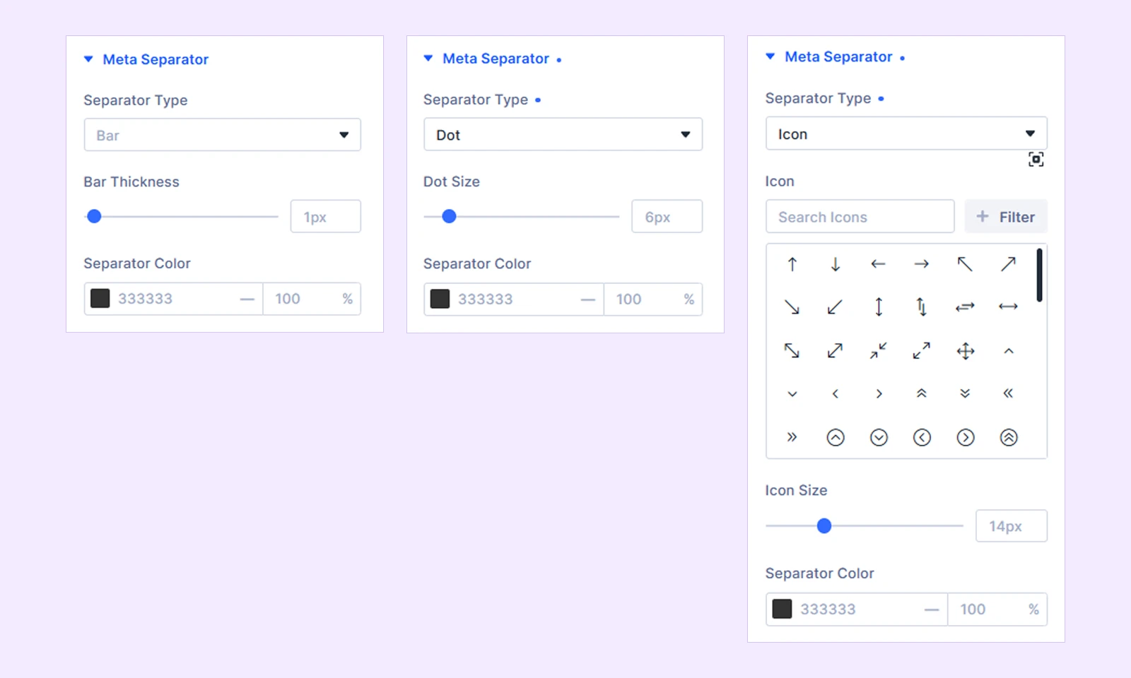
- Separator type: Select the separator type form Bar, Dot, and Icon
- Bar Thickness: Adjusts the width or line weight of the separator line between the metadata elements.
- Dot Size: Controls the overall size and diameter of the separator dot.
- Icon: Opens a grid picker and search bar to select the specific icon symbol you want to display.
- Icon Size: Controls the overall height and width dimensions of the separator icon.
- Separator Color: Controls the exact color and opacity/transparency applied to the separator elements.
Read More: Configure the typography, color, background, and spacing for the post read more button. This option is only available for these layouts: Sticky content, Horizontal vertical slider, Carousel, Split Screen, Full Screen, Scattered Content, and Centered Content,
Filter Bar: Customize the wrapper container. You’ll also find background, border, spacing, and box shadow for further customization.
Filter Bar Item: Style individual inactive filter buttons including their font, text color, background badge, padding, and border.
Filter Bar Prefix: Style the prefix label text appearing before the filter buttons (Adjust typography, color, and margin spacing).
Active Filter Item: Configure the active or highlighted state styling for the currently selected filter button (Set active text color, background color, and border).
Pagination Wrapper: Style the outer container wrapping all pagination elements (Adjust background, border, margin, and padding).
Pagination: Customize the standard typography, text color, background, border, and size of inactive pagination numbers or buttons.
Active Pagination: Set the visual style for the currently active page number (Define active background color, text color, and border styling).
Arrow Wrapper: Customize the container box, position, and background surrounding the navigation arrows (Available when the Horizontal Slider layout, Vertical layout, Carousel layout, Split screen layout, Full screen layout, Scattered Content layout, Centered Content layout is selected).
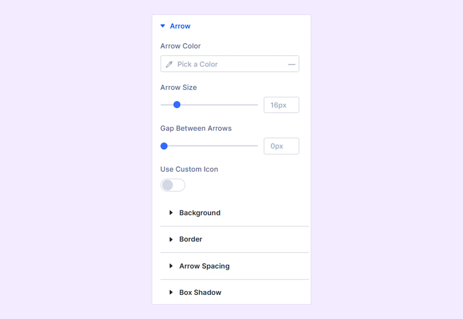
Arrow
Adjust the arrow icons (Available when the Horizontal layout, Vertical layout, Carousel layout, Split screen layout, Full screen layout, Scattered Content layout, Centered Content layout is selected).
- Arrow Color: Customize the navigation arrow color.
- Arrow Size: Adjust the navigation arrow size.
- Gap Between Arrows: Adjust the spacing between the previous and next arrows.
- Use Custom Icon: Enable custom arrow icons.
- Left Arrow Icon: Choose the previous arrow icon.
- Right Arrow Icon: Choose the next arrow icon.
You will also find background, border, arrow spacing, and box shadow for further customization.
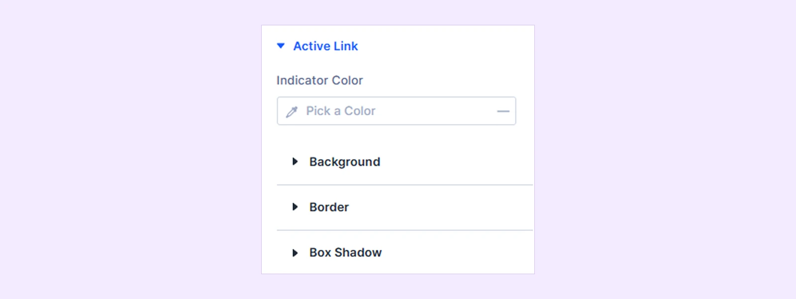
Active Link
- Indicator Color: Customize the animated active indicator color. Available with Vertical Interactive Links.
- Scale: Set the active link scale size. (Available with Interactive Links.)
Style the active or currently hovered item link state (Set color, underline, and typography styling) You’ll also find background, border, and box shadow to customize further.
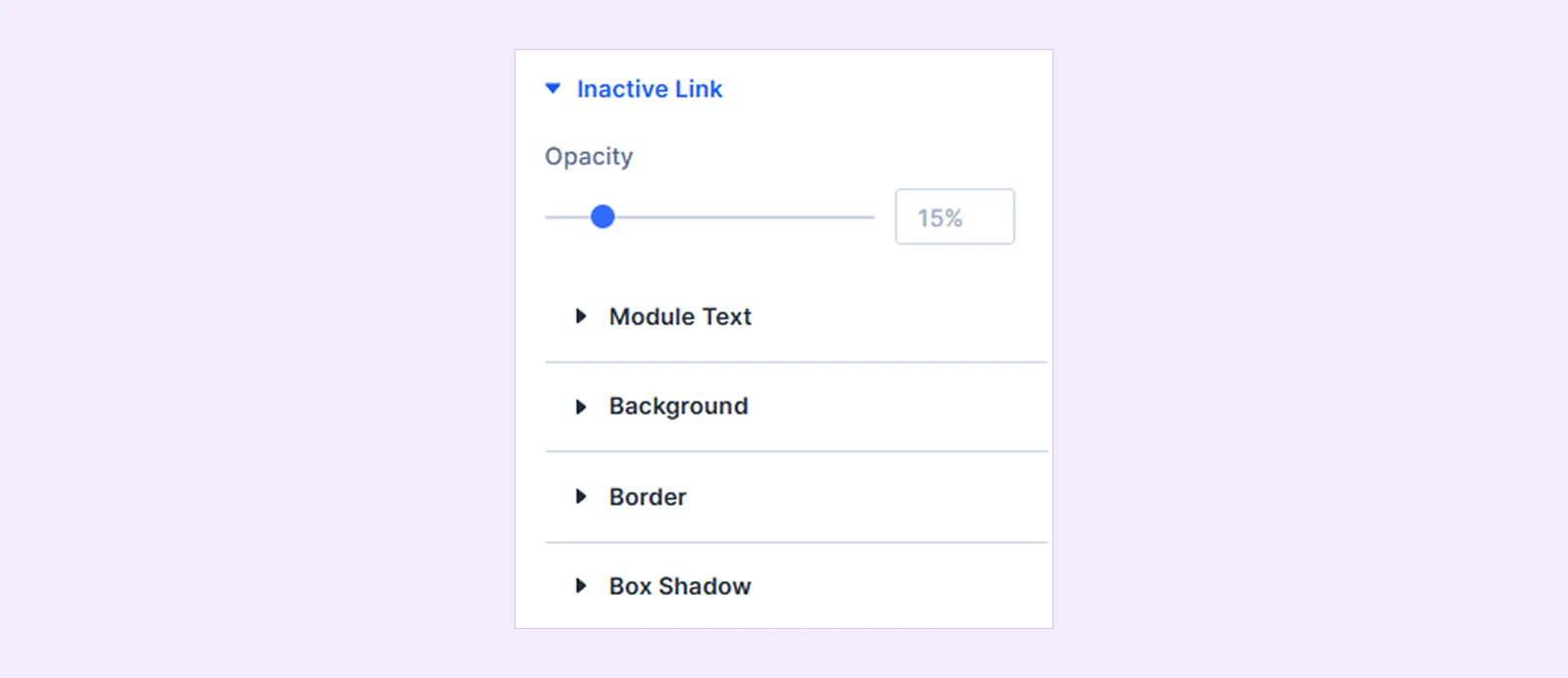
Inactive Link
- Opacity: Set the opacity of the inactive link.
You’ll also find module text, background, border, box shadow for further customization (Available when Interactive Links layout, Vertical Interactive Links layout is selected).
Sizing: Adjust image dimensions and sizing behavior.
Spacing: Configure margin and padding.
Border: Customize border style, width, color, and corner radius.
Box Shadow: Add shadow effects.
Filters: Apply additional visual filters.
Transform: Scale, rotate, move, or skew images.
Animation: Apply entrance and interaction animations.
Advanced Tab
The Advanced tab provides the standard Divi settings for custom CSS, visibility conditions, transitions, attributes, positioning, and other advanced controls.
Need Help?
If you have any questions or need assistance, contact our support team: [email protected]