
The Google Reviews module, introduced in DiviFlash 5.5.0, lets you display a business's Google reviews in different layouts with details.
Important Note:
- Google Reviews module is built for Divi 5 only. Also, it will be disabled by default and to use it, you must enable it manually. Refer to our guide for step-by-step instructions.
- To display real reviews, you need the business Place ID and either a Google Places API key or SerpApi key.
- Reviews are fetched in the background and stored on your site, so make sure WP-Cron is working properly.
Let's see the settings in brief and how to make better use of it.
Content Tab
The Content tab contains the essential settings for connecting the module to Google reviews, choosing which reviews to show, configuring place information, and more.
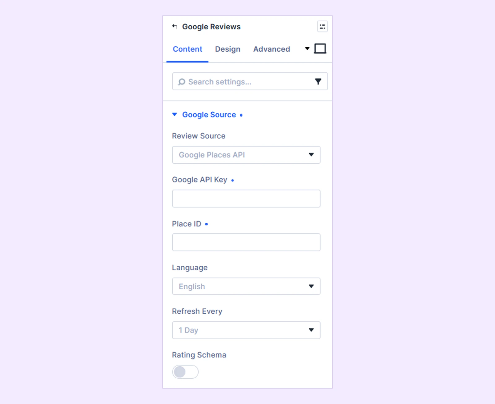
Google Source
- Review Source: Choose where the reviews are fetched from:
- Google Places API
- SerpApi
- Google API Key: Enter your Google Places API key. (Available when Google Places API is selected as the Review Source.)
- SerpApi Key: Enter your SerpApi private key. (Available when SerpApi is selected as the Review Source.)
- Place ID: Enter the Google Place ID of the business whose reviews you want to display.
- Language: Choose the language used for the review data and localized review information.
- Refresh Every: Choose how often the stored reviews are refreshed in the background:
- 6 Hours
- 12 Hours
- 1 Day
- 1 Week
- Rating Schema: Add Organization, AggregateRating, and Review structured data to the page using the synced business and review information.
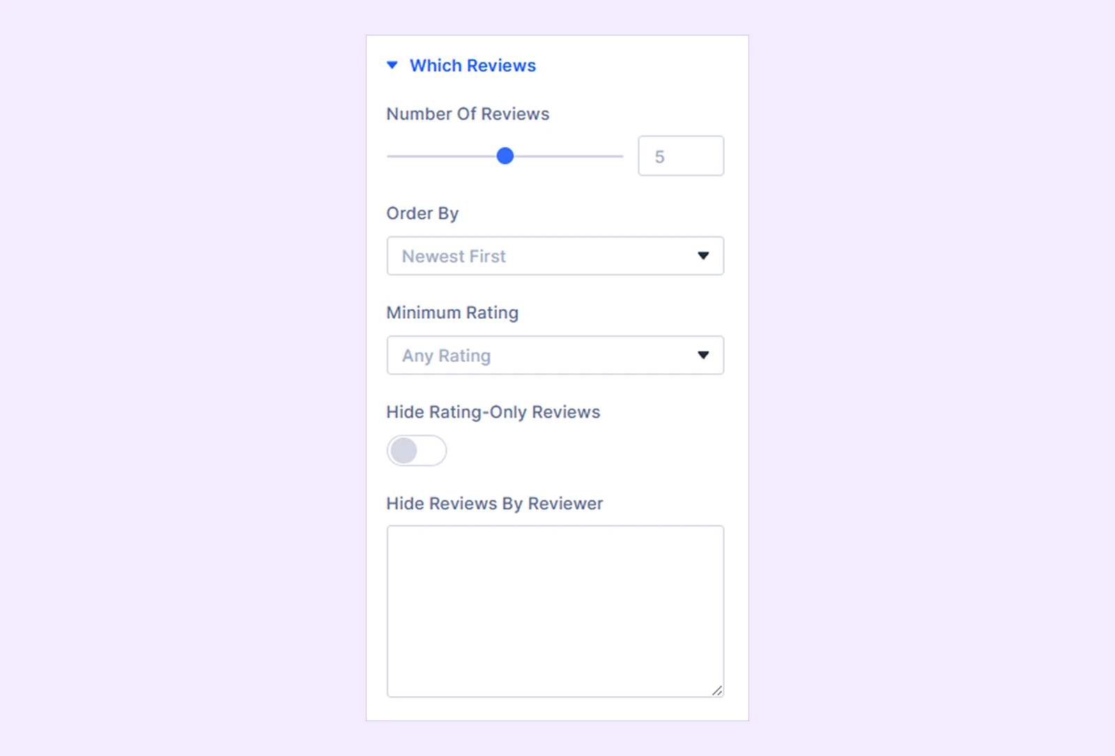
Which Reviews
- Number of Reviews: Set how many reviews to display. Google Places API supports up to 10, while SerpApi supports up to 50. Set it to 0 to show all reviews that have been fetched.
- Order By: Choose how the reviews are ordered:
- Newest First
- Oldest First
- Highest Rated
- Lowest Rated
- Random
- Minimum Rating: Set the minimum star rating a review must have to appear:
- Any Rating
- 2 Stars and Up
- 3 Stars and Up
- 4 Stars and Up
- 5 Stars Only
- Hide Rating-Only Reviews: Hide reviews that contain a star rating but no written review text.
- Hide Reviews By Reviewer: Enter reviewer names you want to exclude. Add one name per line or separate multiple names with commas.
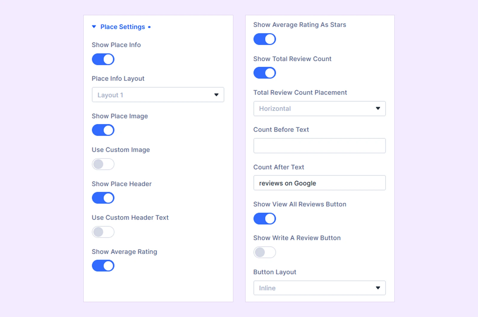
Place Settings
- Show Place Info: Show or hide the complete place information section.
- Place Info Layout: Choose between Layout 1, Layout 2, Layout 3, or Layout 4 to arrange the place image, business information, and buttons in different ways.
- Show Place Image: Show or hide the business image.
- Use Custom Image: Use your own image instead of the image returned for the Google place.
- Place Image: Upload or select a custom place image.
- Show Place Header: Show or hide the business name.
- Use Custom Header Text: Replace the business name with custom text.
- Place Header Text: Enter the custom heading text.
- Show Average Rating: Display the business's average Google rating.
- Show Average Rating as Stars: Display the average rating using stars.
- Show Total Review Count: Display the business's total Google review count.
- Total Review Count Placement: Choose how the review count appears:
- Horizontal
- Vertical
- Count Before Text: Add custom text before the total review count.
- Count After Text: Add custom text after the total review count.
- Total Review Count Placement: Choose how the review count appears:
- Show View All Reviews Button: Display a button that opens the business's reviews on Google.
- Show Write A Review Button: Display a button that opens Google's review form for the business.
- Button Layout: Display the View All Reviews and Write A Review buttons Inline or Block.
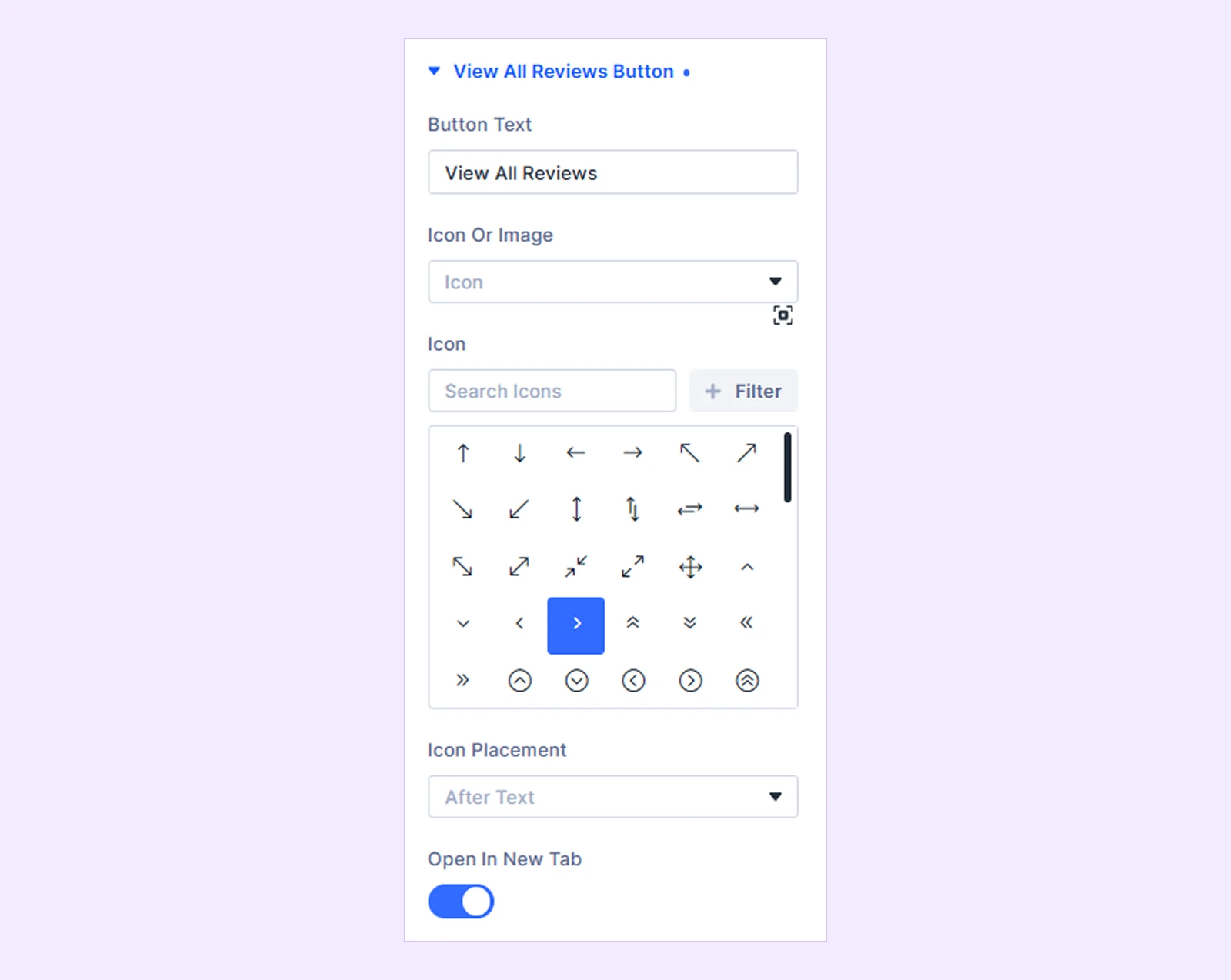
View All Reviews Button
This section is available when Show Place Info from Content → Place Settings and Show View All Reviews Button are enabled in Content → Place Settings.
- Button Text: Enter the text displayed on the button.
- Icon or Image: Choose whether to display None, an Icon, or an Image with the button text.
- Icon: Select the button icon. (Available when Icon is selected.)
- Image: Upload or select an image. (Available when Image is selected.)
- Icon Placement: Place the icon or image before or after the button text.
- Open in New Tab: Open the Google reviews page in a new browser tab.
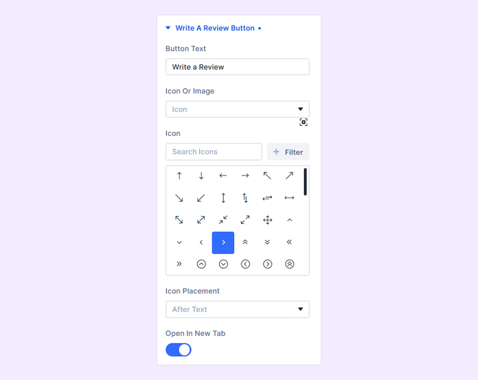
Write A Review Button
This section is available when Show Place Info and Show Write A Review Button are enabled in Content → Place Settings.
- Button Text: Enter the text displayed on the button.
- Icon or Image: Choose whether to display None, an Icon, or an Image with the button text.
- Icon: Select the button icon. (Available when Icon is selected.)
- Image: Upload or select an image. (Available when Image is selected.)
- Icon Placement: Place the icon or image before or after the button text.
- Open in New Tab: Open the Google review form in a new browser tab.
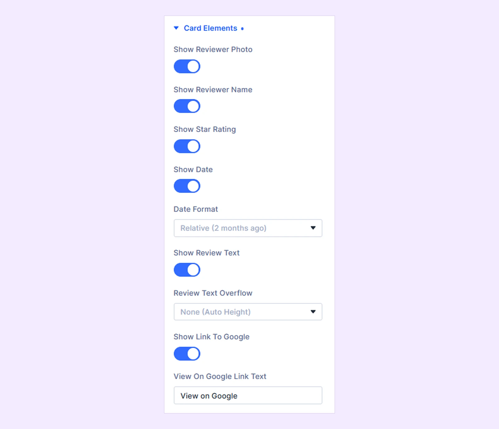
Card Elements
- Show Reviewer Photo: Show or hide the reviewer's profile photo.
- Show Reviewer Name: Show or hide the reviewer's name. If the reviewer photo is hidden, the reviewer name remains visible for Google attribution.
- Show Star Rating: Display the reviewer's star rating.
- Show Date: Display the review date.
- Date Format: Choose how the review date appears:
- Site Default
- Relative
- Custom
- Date Format: Choose how the review date appears:
- Custom Date Format: Enter a PHP date format for the review date. (Available when Custom is selected as the Date Format.)
- Show Review Text: Show or hide the written review.
- Review Text Overflow: Choose how long review text is handled:
- None (Auto Height)
- Scroll
- Truncate (Line Clamp)
- Read More Toggle
- Read More Text: Enter the text used to expand a long review.
- Read Less Text: Enter the text used to collapse an expanded review. (Available with Read More Toggle.)
- Review Text Overflow: Choose how long review text is handled:
- Show Link to Google: Display a link to the review on Google.
- View on Google Link Text: Enter the text displayed for the Google review link.
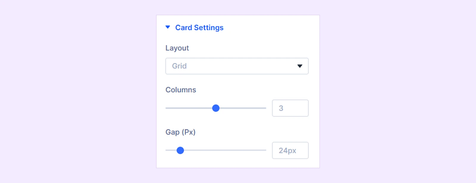
Card Settings
- Layout: Choose how the review cards are displayed:
- Grid
- Masonry
- List
- Carousel
- Columns: Set the number of review columns. This option is hidden for the List layout. With Carousel, it controls how many slides are visible at once.
- Gap (Px): Adjust the spacing between review cards. This option is hidden for the Carousel layout.
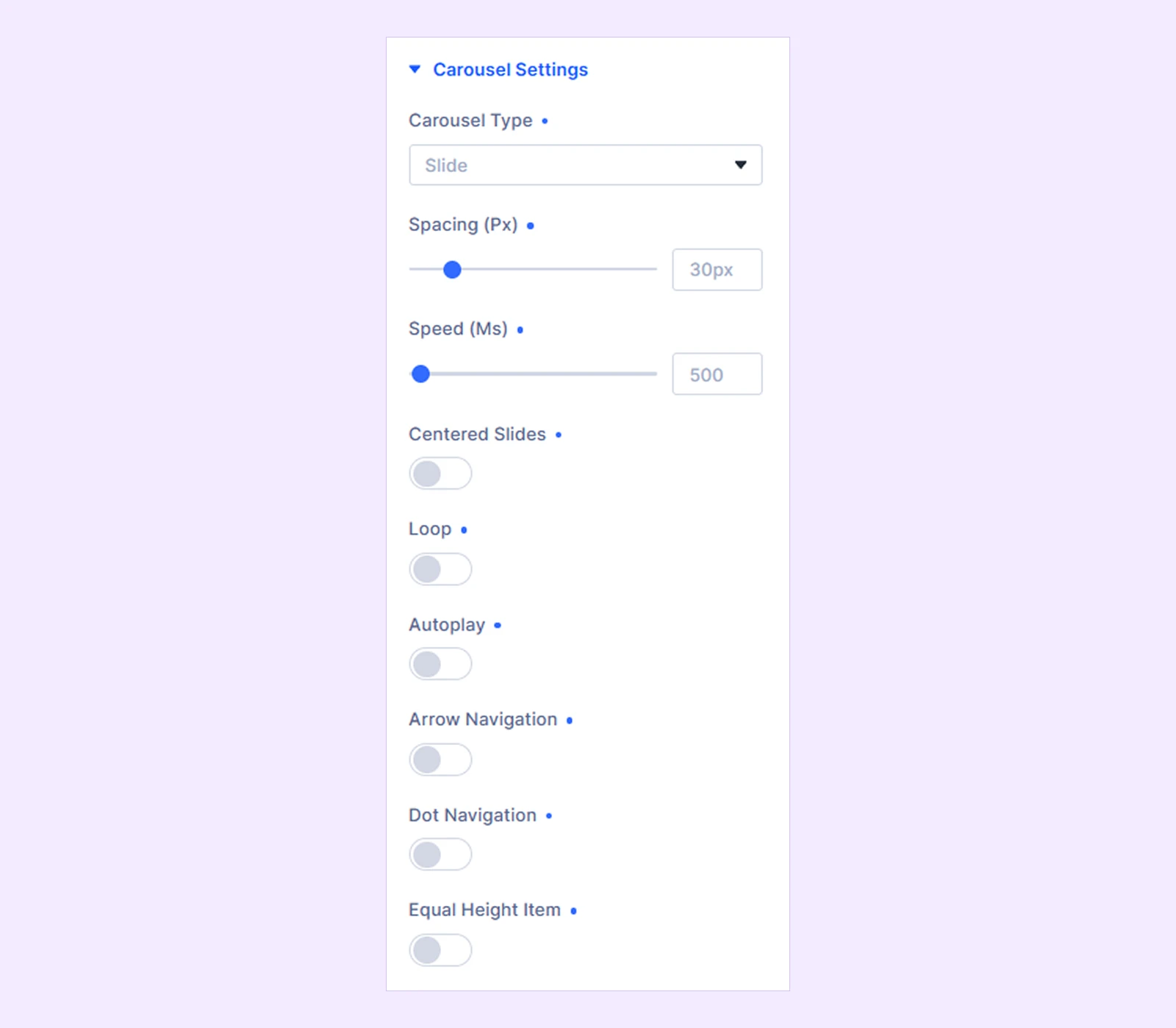
Carousel Settings
These settings are available when Carousel is selected from Content → Card Settings → Layout.
- Carousel Type: Choose between Slide and Coverflow.
- Spacing (px): Adjust the spacing between carousel items.
- Speed (ms): Set the duration of the slide transition.
- Centered Slides: Keep the active slide centered within the carousel.
- Loop: Continuously cycle through the review cards.
- Autoplay: Automatically move through carousel items.
- Autoplay Speed (ms): Set the delay between automatic slide changes.
- Pause On Hover: Pause autoplay when visitors hover over the carousel. (Available when Autoplay is enabled.)
- Arrow Navigation: Display previous and next navigation arrows.
- Dot Navigation: Display dot navigation below the carousel.
- Equal Height Item: Make the visible review cards equal in height.
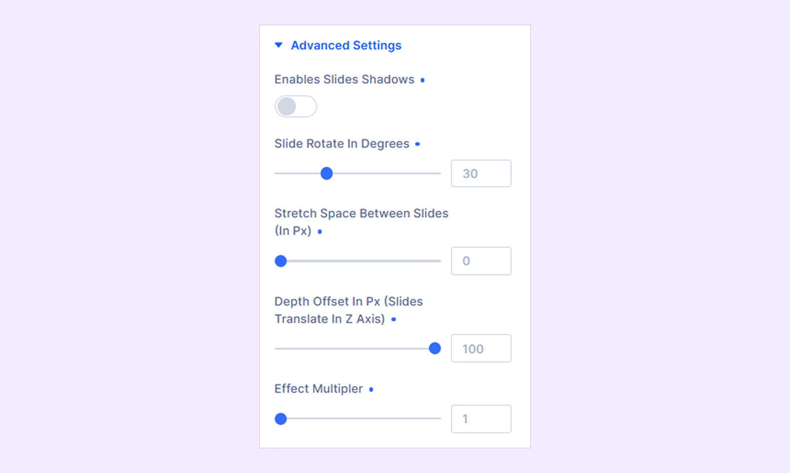
Advanced Settings
The settings are available when Coverflow is selected as the Carousel Type from Content → Carousel Settings.
- Enables slides shadows: Add shadows to the Coverflow slides.
- Shadow color dark: Choose the dark slide shadow color.
- Shadow color light: Choose the light slide shadow color.
- Slide rotate in degrees: Set how much the Coverflow slides rotate.
- Stretch space between slides (in px): Adjust the horizontal spacing between Coverflow slides.
- Depth offset in px (slides translate in Z axis): Control the depth of the Coverflow effect.
- Effect multiplier: Control the overall strength of the Coverflow effect.
Link: Add a URL and configure how it opens.
Background: Add a background color, gradient, image, video, pattern, or mask to the module.
Loop: Configure Divi loop settings where applicable.
Order: Configure display order of the available items.
Meta: Rename the module for easier identification inside the Divi Builder. This label is only visible in the builder.
Design Tab
The Design tab contains the settings for customizing the place information, review cards, reviewer details, ratings, review text, carousel navigation, and other visual elements.
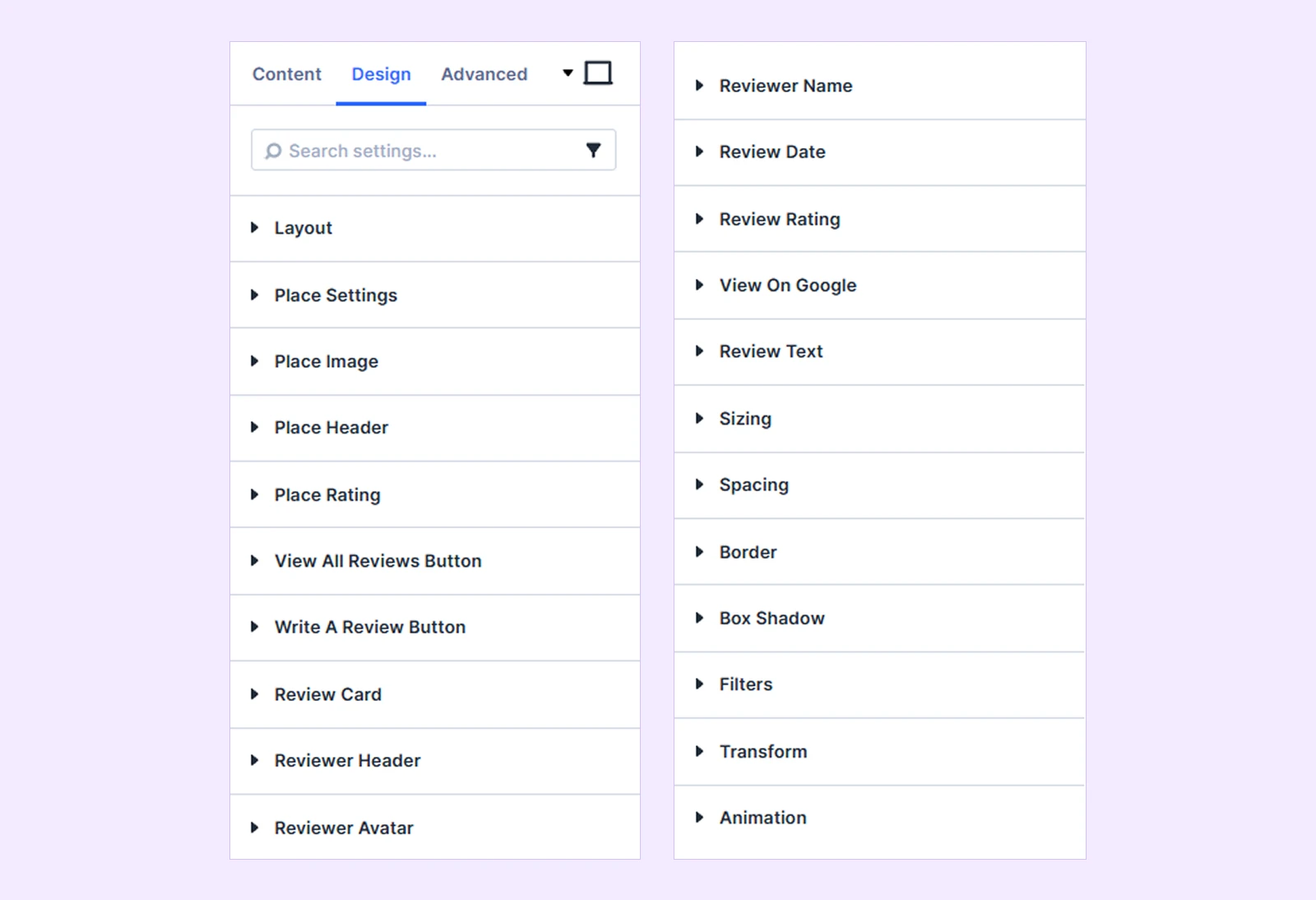
Layout: Use the Layout settings to control the arrangement and spacing of the place information and review cards.
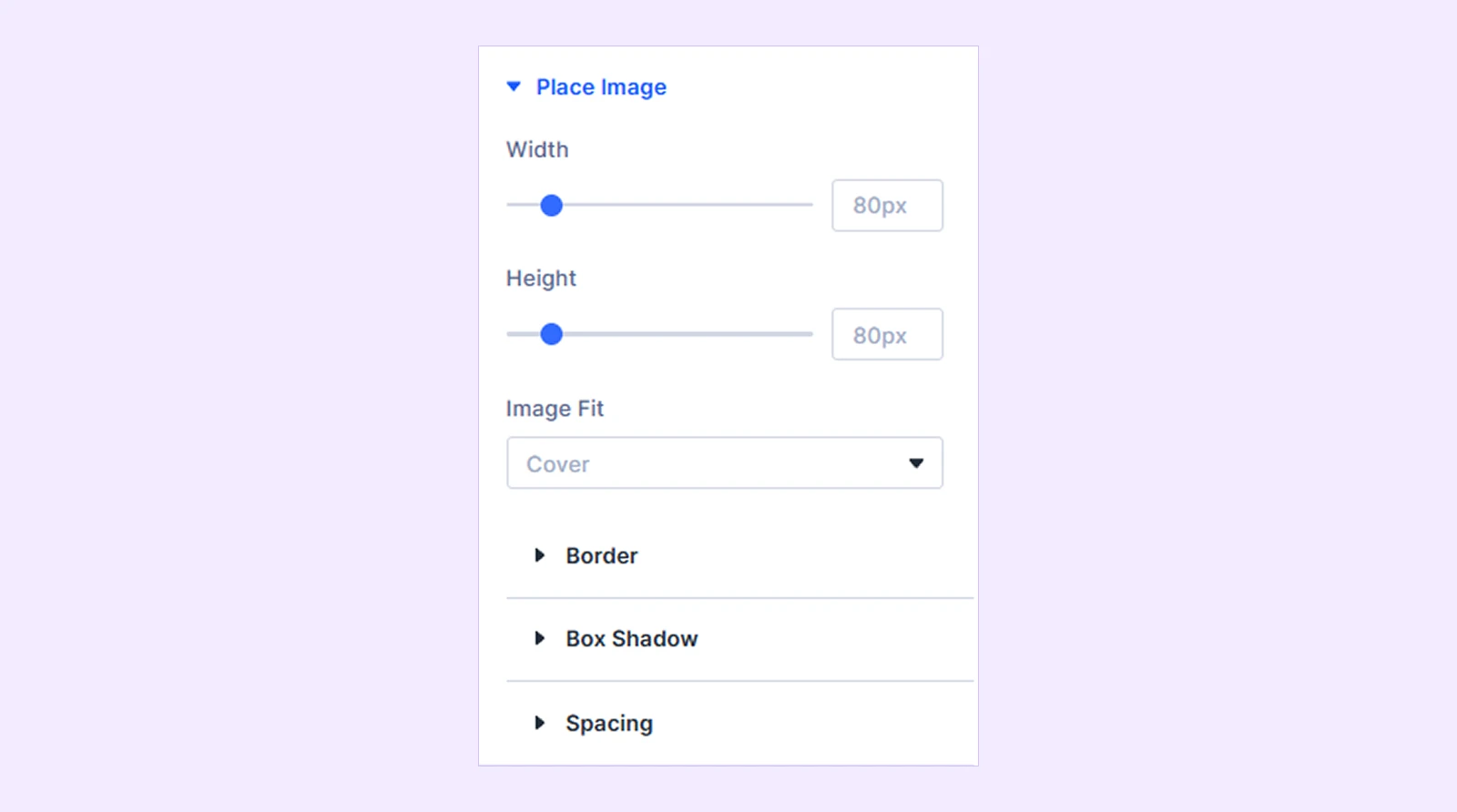
Place Settings
- Container Width: Set the width of the place-information container.
- Horizontal Alignment: Align the place information to the Left, Center, or Right. (Available with Place Info Layout 1 and Layout 2.)
- Vertical Alignment: Align the place information to the Top, Middle, or Bottom. (Available with Place Info Layout 2, Layout 3, and Layout 4.)
You will also find customization options such as background, spacing, border, and box shadow.
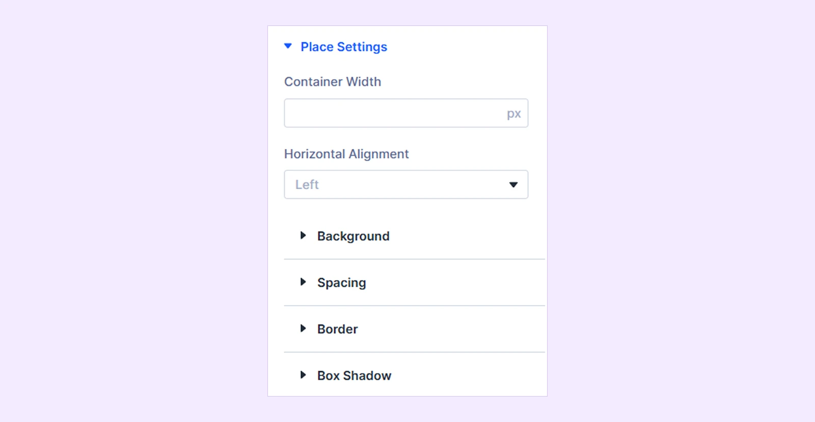
Place Image
- Width: Adjust the width of the place image.
- Height: Adjust the height of the place image.
- Image Fit: Choose how the place image fits inside its area:
- Cover
- Contain
- Fill
You will also find customization options such as border, box shadow, and spacing.
Place Header: Customize place header items with text and spacing customizations.
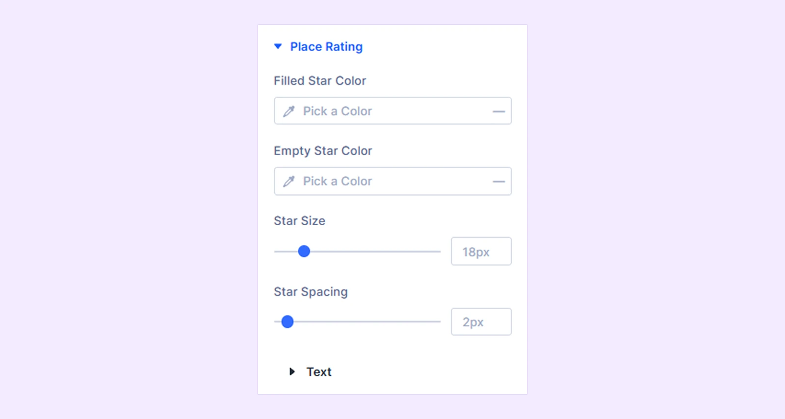
Place Rating
- Filled Star Color: Choose the color of the filled rating stars.
- Empty Star Color: Choose the color of the empty rating stars.
- Star Size: Adjust the size of the stars.
- Star Spacing: Adjust the space between stars.
- Text: Customize the typography of the average rating and review count.
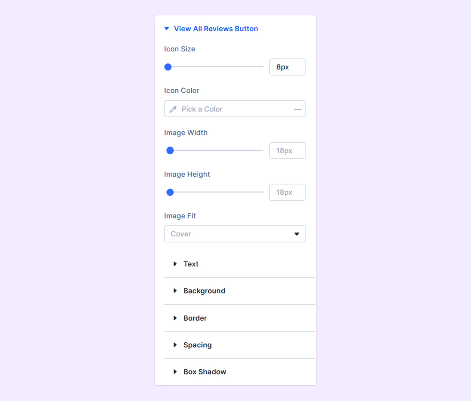
View All Reviews Button
These settings are available when View All Reviews Button is enabled from Content → Place Settings.
- Icon Size: Adjust the button icon size.
- Icon Color: Choose the button icon color.
- Image Width: Adjust the button image width. (Available when Image is selected in Content.)
- Image Height: Adjust the button image height.
- Image Fit: Choose how the button image fits inside its area.
You can also customize the button text, background, border, spacing, and box shadow.
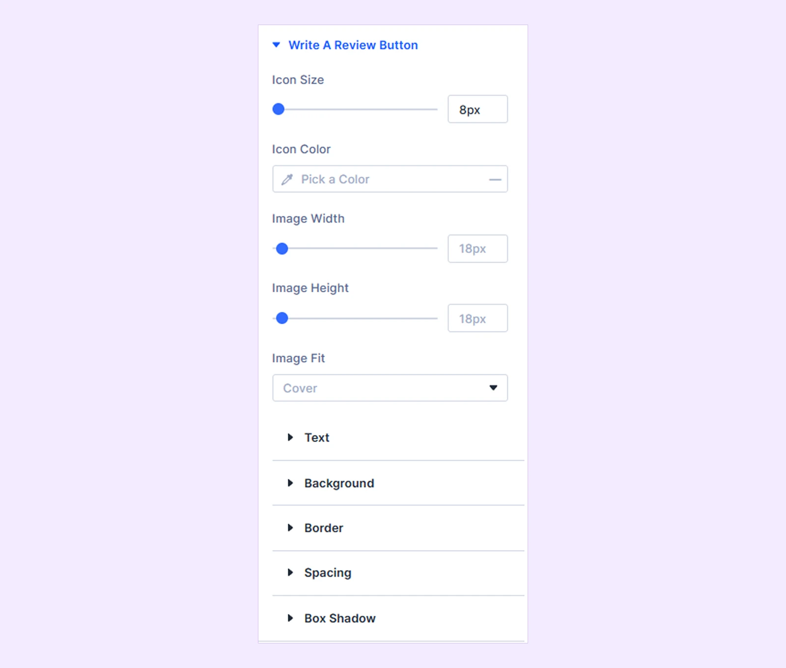
Write A Review Button
These settings are available when Write A Review Button is enabled from Content → Place Settings.
- Icon Size: Adjust the button icon size.
- Icon Color: Choose the button icon color.
- Image Width: Adjust the button image width. (Available when Image is selected in Content.)
- Image Height: Adjust the button image height.
- Image Fit: Choose how the button image fits inside its area.
You can also customize the button text, background, border, spacing, and box shadow.
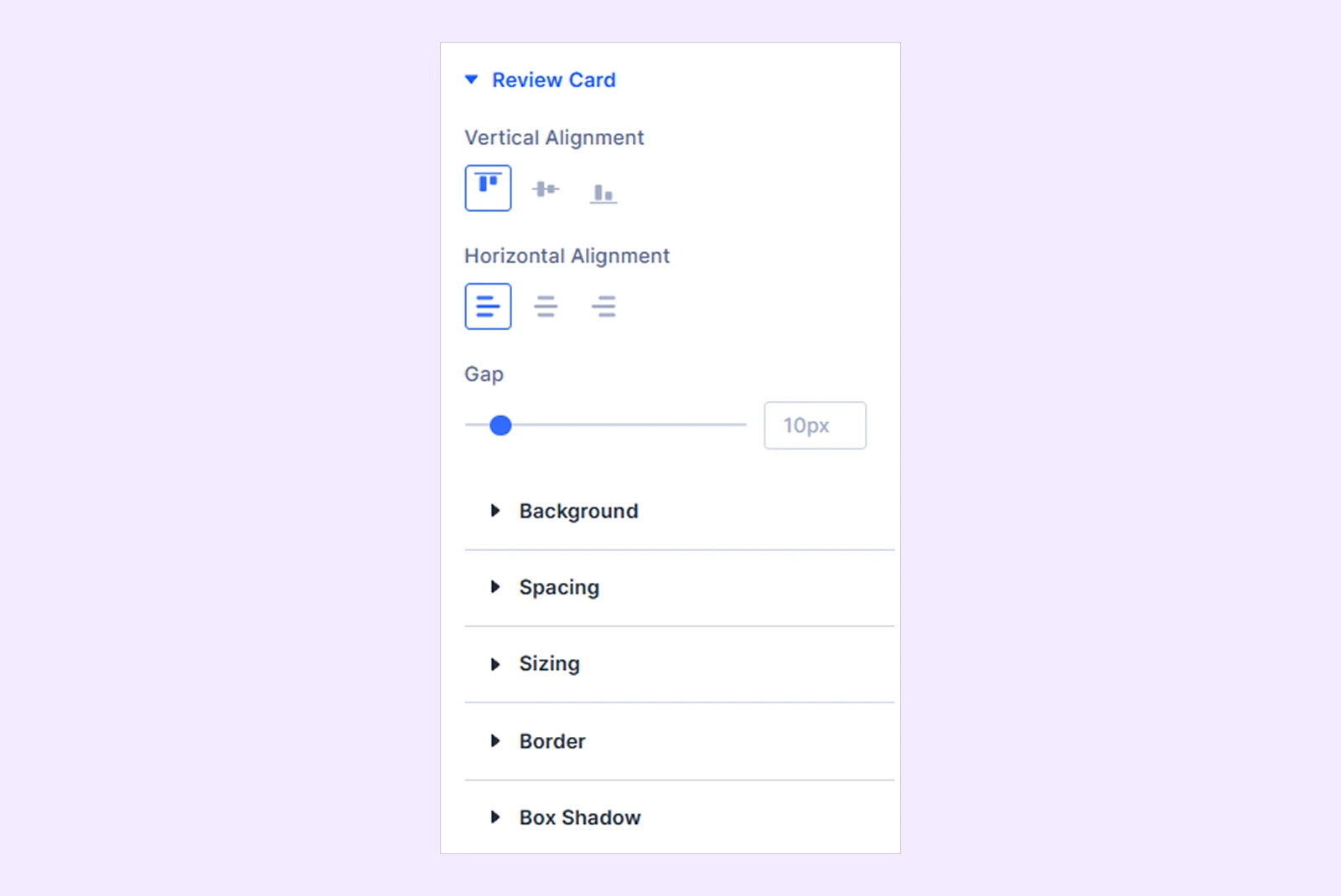
Review Card
- Vertical Alignment: Align the card content to the Top, Center, or Bottom.
- Horizontal Alignment: Align the card content to the Left, Center, or Right.
- Gap: Adjust the spacing between the reviewer header, rating, review text, and Google link.
There you will also find customization options such as background, spacing, sizing, border, and box shadow.
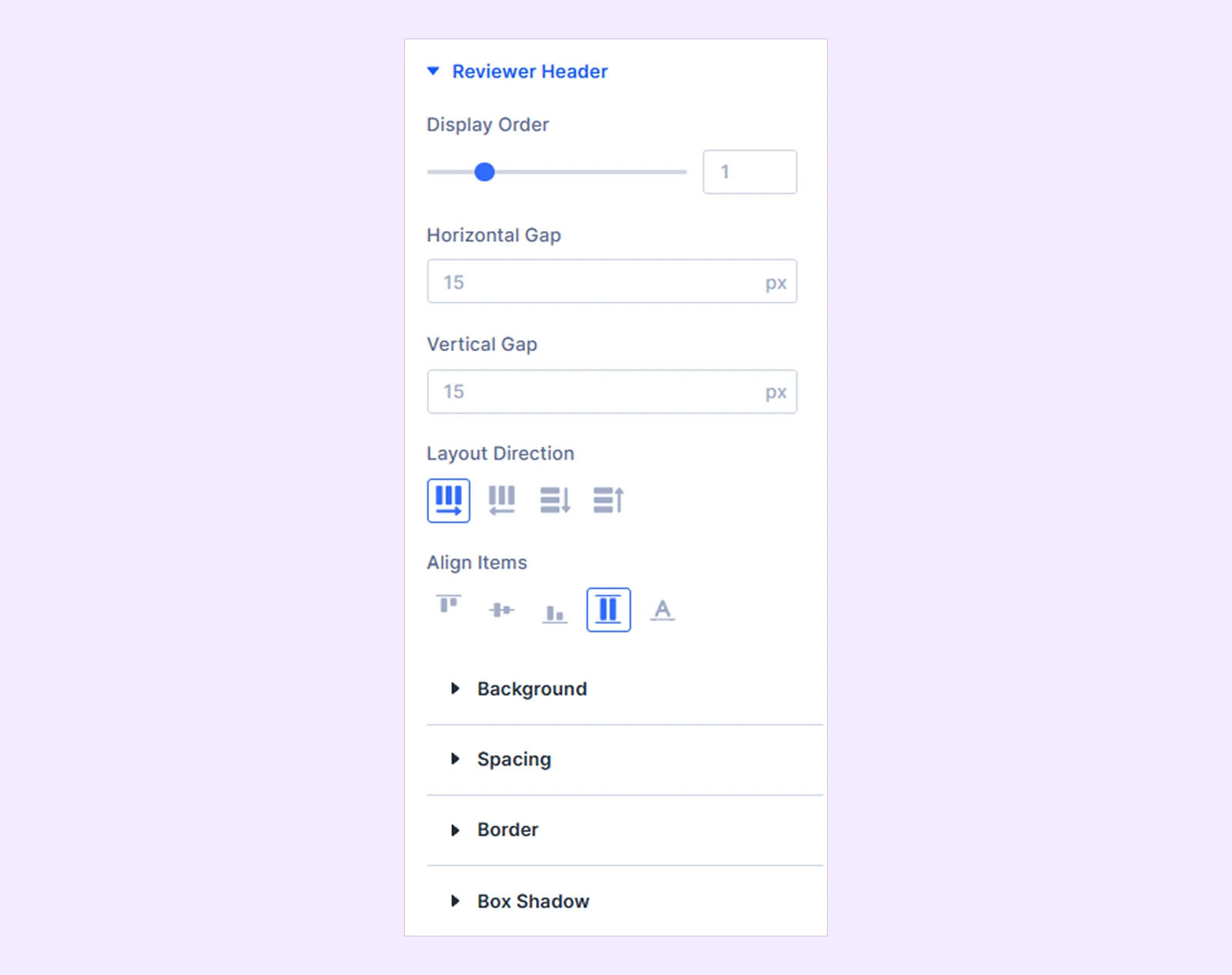
Reviewer Header
- Display Order: Control where the reviewer header appears among the review card elements.
- Horizontal Gap: Adjust gaps between headers horizontally.
- Vertical Gap: Adjust gaps between headers vertically.
- Layout Direction: Adjust headers layout direction from available options.
- Align Items: Adjust alignments between displayed items with the available options.
You will also find customization options such as background, spacing, border, and box shadow.
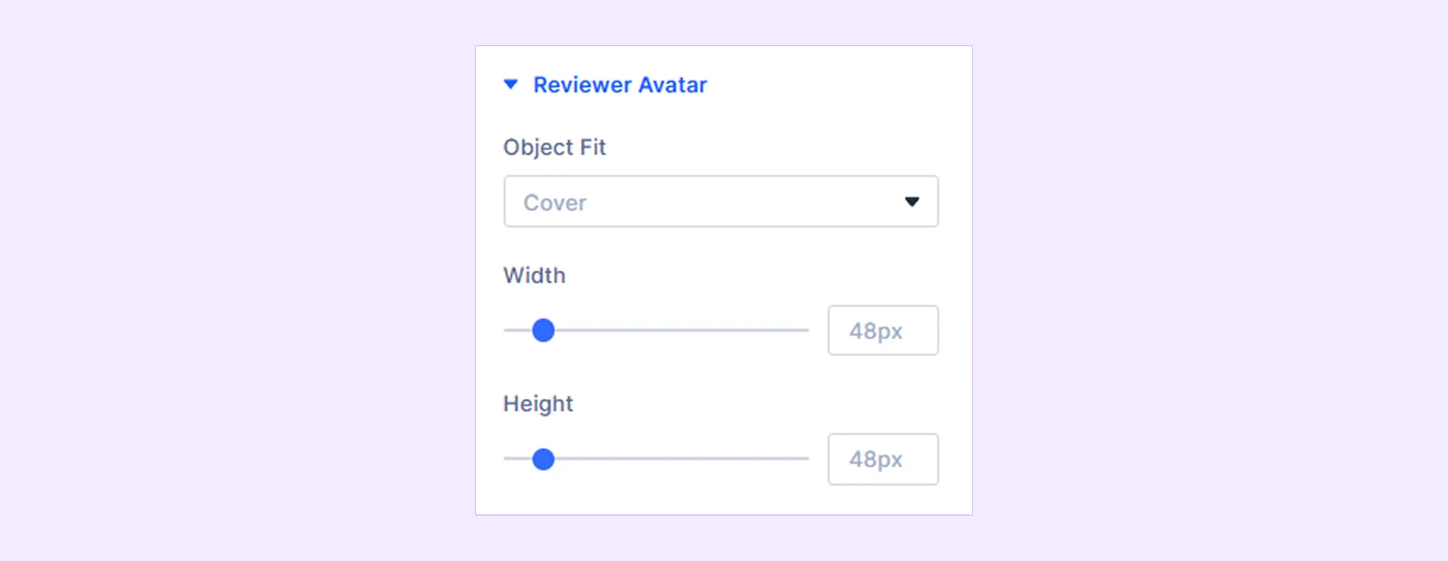
Reviewer Avatar
- Object Fit: Choose how the reviewer image fits inside its area:
- Cover
- Contain
- Fill
- Width: Adjust the reviewer avatar width.
- Height: Adjust the reviewer avatar height.
Reviewer Name: Customize the reviewer name using text and spacing settings.
Review Date: Customize the review date using text and spacing settings.
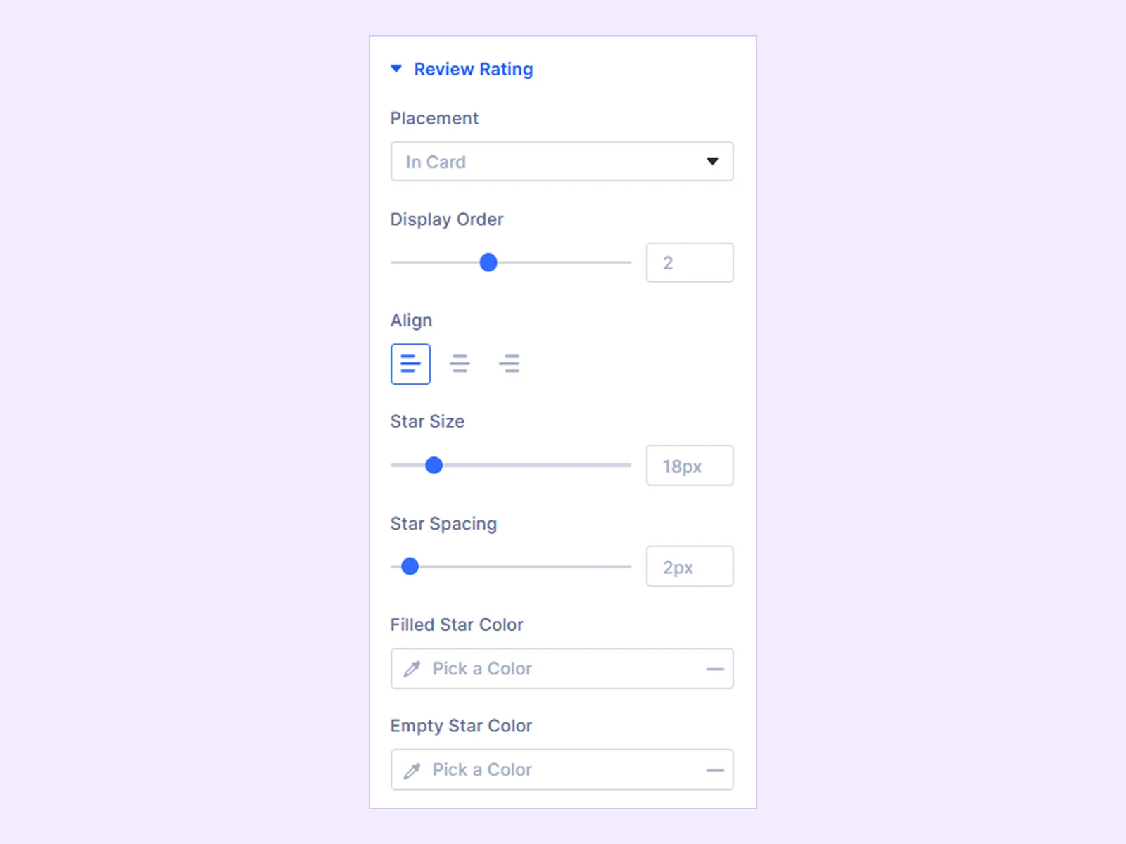
Review Rating
- Placement: Choose where the review rating appears:
- In Card
- In Review Header
- In Review Text
- Display Order: Control the rating's order among the card elements. (Available when Placement is set to In Card.)
- Align: Align the rating to the Left, Center, or Right. (Available when Placement is set to In Card or In Review Text.)
- Vertical Align: Align the rating vertically inside the reviewer header. (Available when Placement is set to In Review Header.)
- Text Position: Place the rating above or below the review text. (Available when Placement is set to In Review Text.)
- Gap from Text: Adjust the spacing between the rating and review text. (Available when Placement is set to In Review Text.)
- Star Size: Adjust the size of the review stars.
- Star Spacing: Adjust the space between stars.
- Filled Star Color: Choose the filled star color.
- Empty Star Color: Choose the empty star color.
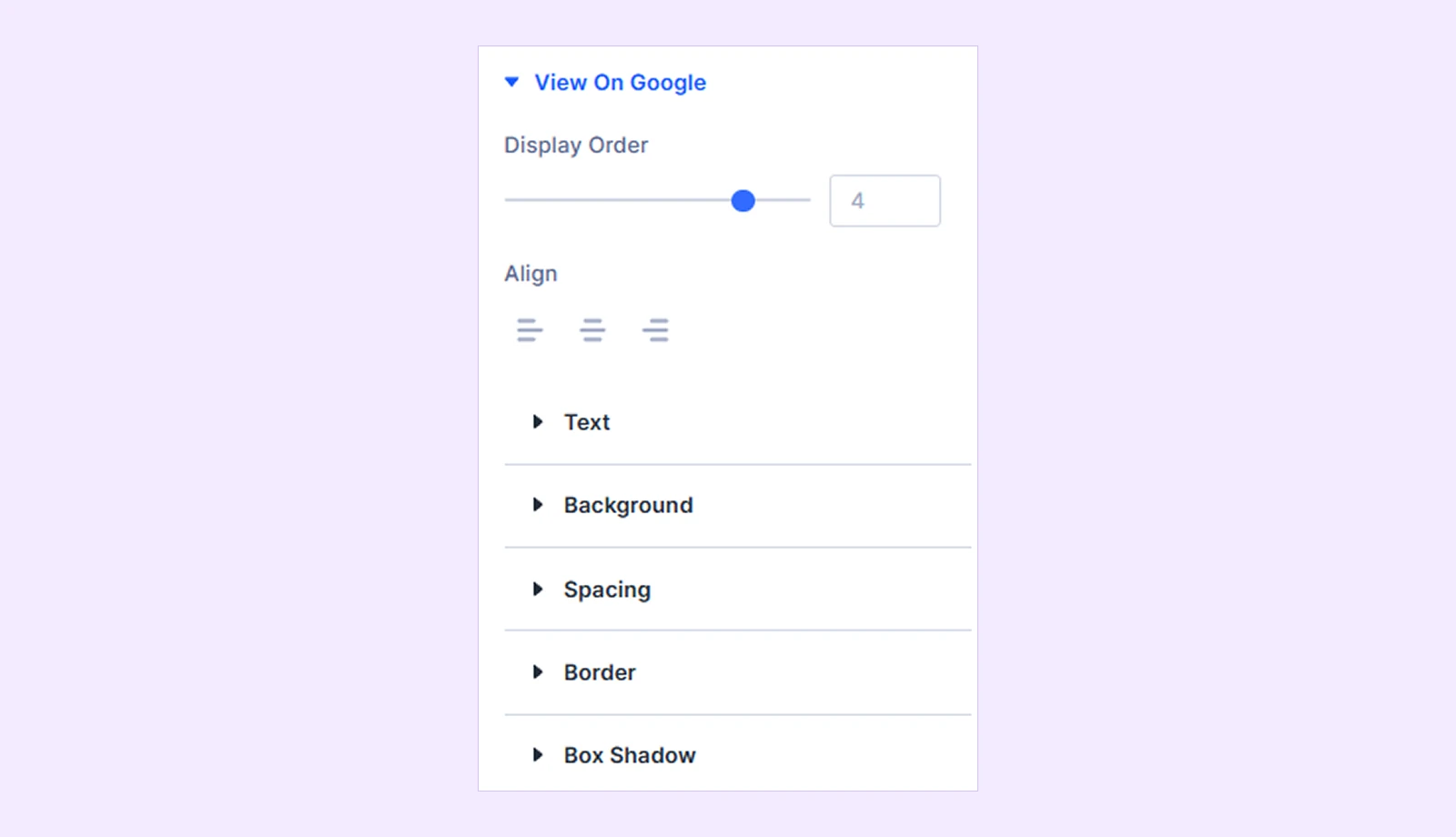
View On Google
- Display Order: Control where the View on Google link appears among the review card elements.
- Align: Align the link to the Left, Center, or Right.
You will also find customization options such as text, background, spacing, border, and box shadow.
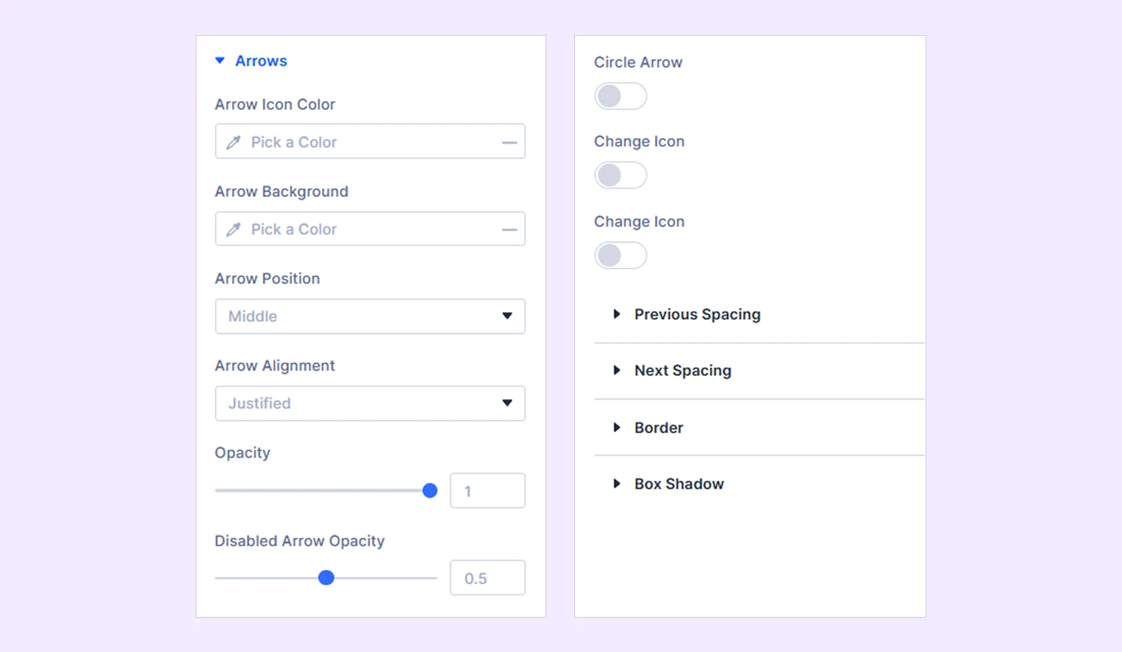
Arrows
These settings are available when Carousel is selected from Content → Card Settings → Layout and Arrow Navigation is enabled in Content → Carousel Settings.
- Arrow Icon Color: Choose the navigation arrow icon color.
- Arrow Background: Choose the arrow button background.
- Arrow Position: Place the arrows at the Top, Middle, or Bottom.
- Arrow Alignment: Align the arrows to the Left, Center, Right, or Justified.
- Opacity: Adjust the arrow opacity.
- Disabled Arrow Opacity: Adjust the opacity of an unavailable arrow when Loop is disabled.
- Circle Arrow: Display the navigation arrows as circular buttons.
- Change Icon: Enable a custom icon for the previous arrow.
- Icon: Select the previous arrow icon.
- Icon Size: Adjust the previous arrow icon size.
- Previous Spacing: Adjust the spacing around the previous arrow.
- Next Spacing: Adjust the spacing around the next arrow.
You will also find customization options such as border and box shadow.
Dots
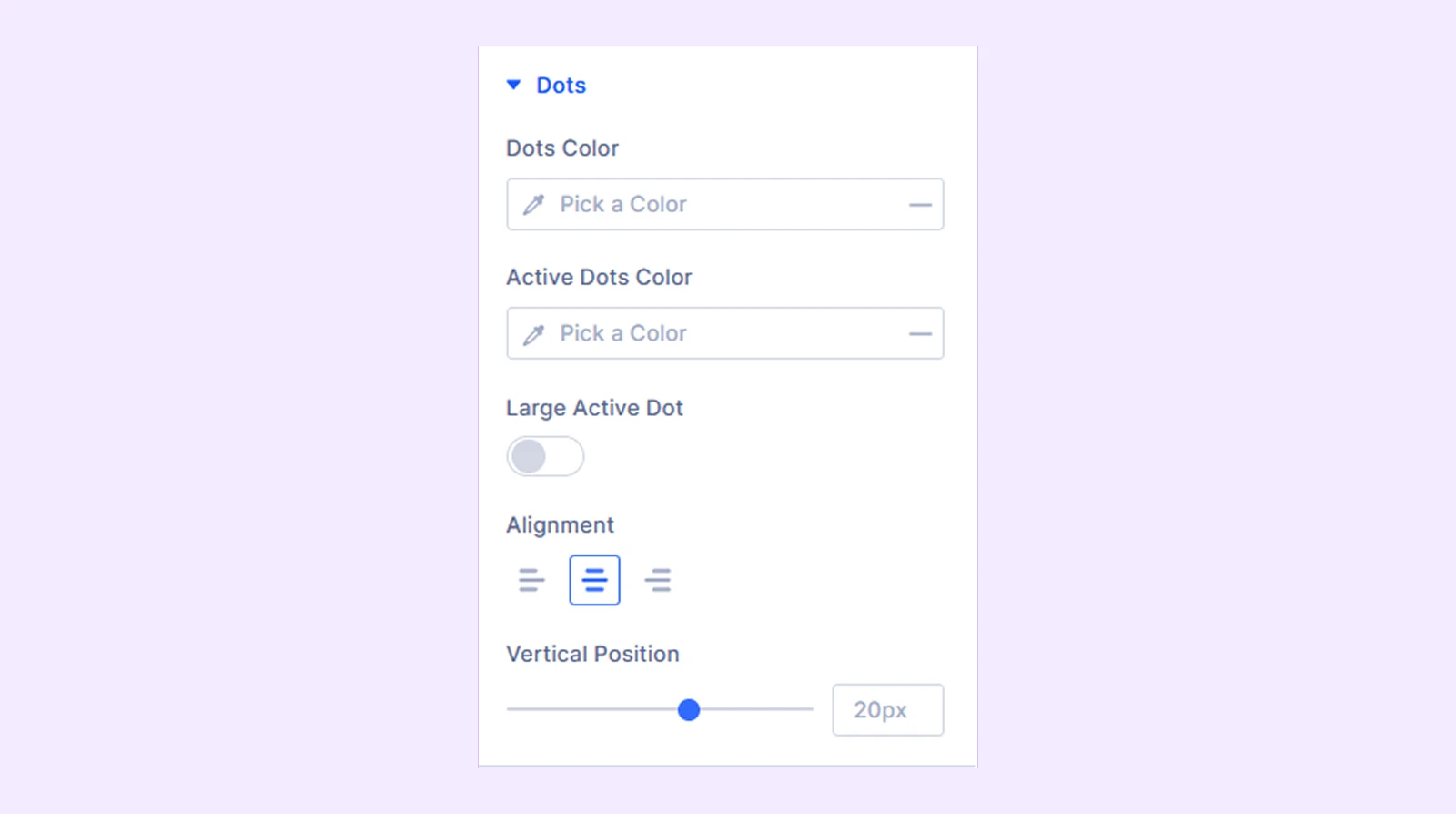
These settings are available when Carousel is selected from Content → Card Settings → Layout and Dot Navigation is enabled in Content → Carousel Settings.
- Dots Color: Choose the navigation dot color.
- Active Dots Color: Choose the active dot color.
- Large Active Dot: Enlarge the currently active navigation dot.
- Alignment: Align the dots to the Left, Center, or Right.
- Vertical Position: Adjust the vertical position of the dot navigation.
Review Text
- Display Order: Control where the review text appears among the card elements.
- Number of Lines: Set how many lines of review text remain visible before the text is truncated. (Available only when Truncate (Line Clamp) or Read More Toggle is selected from Content → Card Elements → Review Text Overflow.)
When Scroll is selected from Content → Card Elements → Review Text Overflow, you’ll find these options below:
- Show Scrollbar: Choose whether the scrollbar is Always visible, appears On Hover, or stays Hidden.
- Scrollbar Track Color: Choose the scrollbar track color.
- Scrollbar Thumb Color: Choose the scrollbar thumb color.
- Max Height: Set the maximum height of the review text area.
- Scrollbar Width: Adjust the scrollbar width.
- Thumb Radius: Adjust the scrollbar thumb corner radius.
You will also find customization options such as text, background, spacing, border, and box shadow.

Sizing: Adjust the module's width, height, alignment, and overflow behavior.
Spacing: Add custom margin and padding around the module.
Border: Customize the module's border style, width, color, and corner radius.
Box Shadow: Add and customize shadow effects around the module.
Filters: Apply visual filters such as brightness, contrast, saturation, opacity, and blur.
Transform: Scale, move, rotate, or skew the module.
Animation: Apply Divi animation effects and control their timing and behavior.
Advanced Tab
The Advanced tab provides the standard Divi settings for custom CSS, visibility conditions, transitions, attributes, positioning, and other advanced controls.
Need Help?
If you have any questions or need assistance, contact our support team: [email protected]